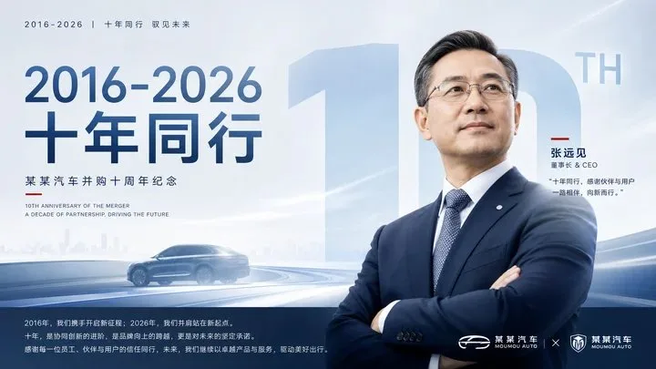
โปสเตอร์ครบรอบ 10 ปี การควบรวมแบรนด์รถยนต์
ที่มา: @xiaoxiaodong01โมเดล: ChatGPT
ภาพตัวอย่าง
พรอมต์ภาษาไทย
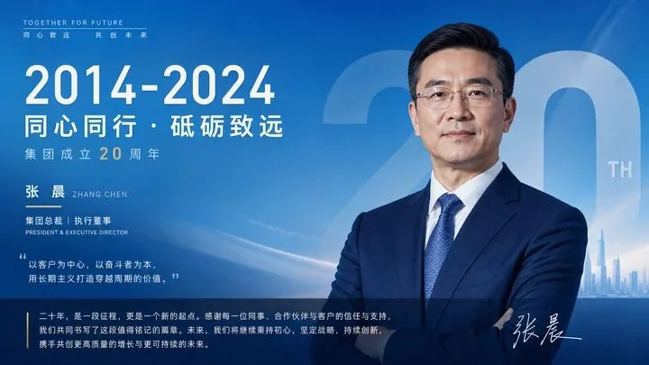
สร้างภาพที่สงบ ทรงอำนาจ และชัดเจนด้านข้อมูลเกี่ยวกับการครบรอบของ [หัวข้อ]: หน้าจอจะแสดงการระบุตัวตนขนาดเล็กและน้อยชิ้น และช่วงเวลาหรือชื่อเรื่องที่สะดุดตาอยู่ด้านบน จากนั้นเป็นภาพบุคคลหลักแบบโคลสอัพตรงกลาง ภาพบุคคลหลักจะถูกจัดวางชิดขอบจอด้วยการตัดขอบที่สะอาด หรือพื้นผิวภาพถ่ายที่ประณีต มีขอบที่ชัดเจน และสีหน้าหรือท่าทางที่มั่นคง ก่อให้เกิดการแสดงออกที่น่าเชื่อถือ พื้นหลังใช้พื้นที่ขนาดใหญ่ของช่องสีที่ชัดเจนซึ่งมาจากธีม โดยคงเลเยอร์ที่มีความสว่างสูงที่สดใสและสะอาด และไล่ระดับสีเล็กน้อย ให้สีหลักเป็นตัวกำหนดระเบียบและอารมณ์; ส่วนสีเข้มจะใช้เพื่อรองรับตัวแบบและข้อมูลด้านล่างเท่านั้น โดยคงไว้ซึ่งความสะอาดทางสายตา ไม่มีการตกแต่งให้ดูเก่า สกปรก หรือหม่นหมอง ขยายคำหลักที่สำคัญที่สุด ตัวเลขการครบรอบ หรือแนวคิดหลักในธีมให้เป็นเงาคำขนาดยักษ์แบบโปร่งแสง จมลงไปในพื้นหลังและถูกบดบังบางส่วนด้วยภาพบุคคลหลัก ตัวอักษรมีน้ำหนัก ขอบคมชัด และความโปร่งใสที่จำกัด สร้างความรู้สึกกดดันและจุดจดจำที่ 'ข้อความกลายเป็นกำแพงพื้นที่' การจัดเรียงข้อมูลใช้รูปแบบรายงานประจำปีขององค์กร: ระยะห่างตัวอักษรแคบๆ หรือคำบรรยายที่ด้านบนเพื่อเว้นที่ว่างให้หายใจ ชื่อเรื่องที่ใหญ่ที่สุดวางอยู่ตรงกลางด้านบน กลุ่มข้อความชื่อ/ตัวตน/คำอธิบายจะถูกวางถัดจากภาพบุคคลหลัก โดยมีเส้นเน้นแคบๆ เป็นจุดยึดทางสายตา และข้อความคำแถลงที่ยาวกว่าอยู่ด้านล่างโดยมีระยะห่างบรรทัดที่กว้าง น้ำหนักตัวอักษรที่แตกต่างกันอย่างชัดเจน และส่วนใหญ่จัดชิดซ้าย สีสันสกัดมาจากวัสดุ คุณสมบัติทางอุตสาหกรรม และอารมณ์ของธีมเอง โดยถูกปรับเป็นพื้นที่ขนาดใหญ่ของสีหลักที่ชัดเจน เลเยอร์โครงสร้างสีเข้มในสัดส่วนต่ำ ข้อความสีอ่อนที่สดใส และเส้นเน้นที่มีความอิ่มตัวสูงจำนวนเล็กน้อย คงไว้ซึ่งอารมณ์ที่สงบ แม่นยำ สะอาด และเคร่งขรึม; พื้นผิวโดยรวมคล้ายกับการสื่อสารเพื่อเฉลิมฉลององค์กรระดับสูง โดยมีเกรนละเอียดและรัศมีที่นุ่มนวลในพื้นหลัง ตัวแบบที่แท้จริงและคมชัด และลำดับชั้นของข้อความที่ชัดเจน หลีกเลี่ยงการตกแต่งที่รกและดราม่าที่มากเกินไป —————— เปลี่ยนฉากเป็น: โปสเตอร์ครบรอบ 10 ปีของการควบรวมแบรนด์รถยนต์ โดยคงภาพบุคคลผู้บริหาร ช่วงปี และเงาคำขนาดยักษ์สำหรับการครบรอบ ฉากการเผยแพร่: บัญชีสาธารณะ WeChat ขององค์กร, รูปภาพรีวิวครบรอบบน Weibo อย่างเป็นทางการ ข้อความที่จำเป็น: เน้น "2016-2026" และ "สิบปีร่วมกัน" โดยใช้ขนาดอัตราส่วน 16:9 แนวนอน
พรอมต์ภาษาอังกฤษ
Generate a calm, authoritative, and information-clear commemorative visual around any subject: The screen first reads the small and sparse identification and the eye-catching time span or theme title at the top, then the close-up main figure in the middle. The main figure is pressed to one side of the screen with a clean cutout or refined photographic texture, with clear edges and a stable expression or posture, forming a trustworthy public expression. The background uses a large area of clear color fields derived from the theme, retaining bright and clean high-brightness layers and slight gradients, letting the main color bear the order and emotion; the dark parts are only used to support the subject and the bottom information, keeping it optically clean, without old, ashy, or dirty treatment. Enlarge the most important keywords, commemorative numbers, or core concepts in the theme into semi-transparent giant word shadows, sinking into the background and partially blocked by the main figure. The font is heavy, the edges are hard, and the transparency is restrained, creating a sense of pressure and memory points where "text becomes a space wall." The information layout adopts a corporate annual report style order: small letter spacing or subtitles at the top to leave room for breathing, the largest title placed in the upper middle, a name/identity/description text group set next to the main figure with a narrow emphasis line as a visual anchor, and a longer statement text at the bottom with loose line spacing, distinct font weights, and mainly left-aligned. Colors are extracted from the material, industry attributes, and emotions of the theme itself, mapped into large areas of clear main colors, low-proportion dark structural layers, bright light-colored text, and a small amount of high-saturation emphasis lines, maintaining a calm, precise, clean, and solemn emotion; the overall texture is like high-end corporate commemorative communication, with fine grain and soft halos in the background, a real and sharp subject, and clear text hierarchy, avoiding cluttered decoration and excessive dramatization. —————— Change the screen to: 10th anniversary commemorative poster of an auto brand merger, retaining executive portraits, year span, and giant commemorative word shadows. Publishing scene: Corporate WeChat public account, official Weibo anniversary review images. Necessary text: Highlight "2016-2026" and "Ten Years Together," size using horizontal 16:9.
พรอมต์ภาษาจีน
围绕任意主题对象生成一张冷静、权威、信息清晰的纪念型视觉:画面先读到上方小而疏朗的身份标识与醒目的时间跨度或主题标题,再读到中部近距离主形体,主形体以干净抠像或精修摄影质感压在画面一侧,边缘清晰、神态或姿态稳定,形成可信赖的公共表达。背景使用主题派生的大面积清透色场,保留明亮洁净的高明度层次和轻微渐变,让主色承担秩序与情绪;暗部只用于托住主体和底部信息,保持光学干净,不做陈旧、烟灰或脏污处理。将主题中最重要的关键词、纪念数字或核心概念放大成半透明巨型字影,沉入背景并被主形体局部遮挡,字形厚重、边缘硬朗、透明度克制,制造“文字成为空间墙面”的压迫感和记忆点。信息排版采用企业年报式秩序:顶部小字母距或小标题留出呼吸,中上部放置最大标题,主形体旁设置姓名/身份/说明文字组,配一条细窄强调线作为视觉锚点,底部承载较长陈述文字,行距宽松、字重分明、左对齐为主。色彩从主题自身的材质、行业属性和情绪中提取,映射为大面积清透主色、低比例深色结构层、明亮浅色文字、少量高饱和强调线,维持冷静精确、洁净庄重的情绪;整体质感像高端企业纪念传播,背景有细腻颗粒和柔和光晕,主体真实锐利,文字层级清楚,避免杂乱装饰和过度戏剧化。 —————— 画面改成:汽车品牌并购十周年纪念海报,保留高管肖像、年份跨度和巨型纪念字影 发布场景:企业公众号、官方微博周年回顾配图 必要文字:突出“2016-2026”和“十年同行”,尺寸用横版 16:9
พรอมต์แนะนำ
8 พรอมต์คัดสรร
สาวผมแดงในสตูดิโอ: แฟชั่นมินิมัลลิสต์

สาวเอเชียในชุดคาร์ดิแกนสีฟ้ามิสต์กับกระโปรงขาว

สาวเอเชียในชุดสีน้ำเงิน บนโซฟาหรูในโรงแรม

โปสเตอร์อินโฟกราฟิกสูตรอาหารระดับพรีเมียม

สาวชุดว่ายน้ำขาว-ฟ้า สาดน้ำทะเลริมหาด

ถ่ายภาพคอสเพลย์ฤดูร้อนสไตล์เซลฟี่จากมือถือ
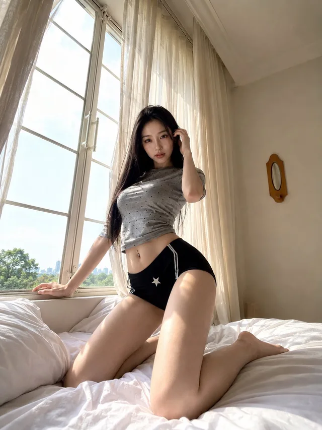
นางแบบในห้องนอนท่ามกลางแสงอรุณมุมสูง
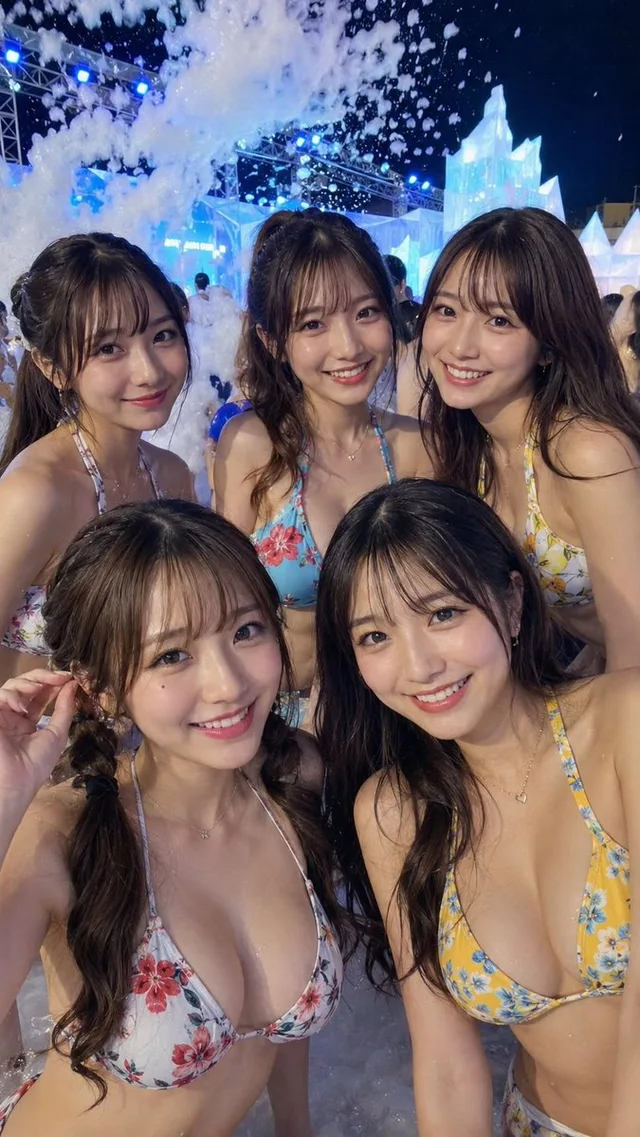
สร้างพรอมต์ภาพสาวญี่ปุ่นในเทศกาลโฟมน้ำแข็งยามค่ำคืน