โปสเตอร์ขนมหวานถ้วยเบอร์รี่ครีม
ที่มา: @xiaoxiaodong01โมเดล: ChatGPT
ภาพตัวอย่าง
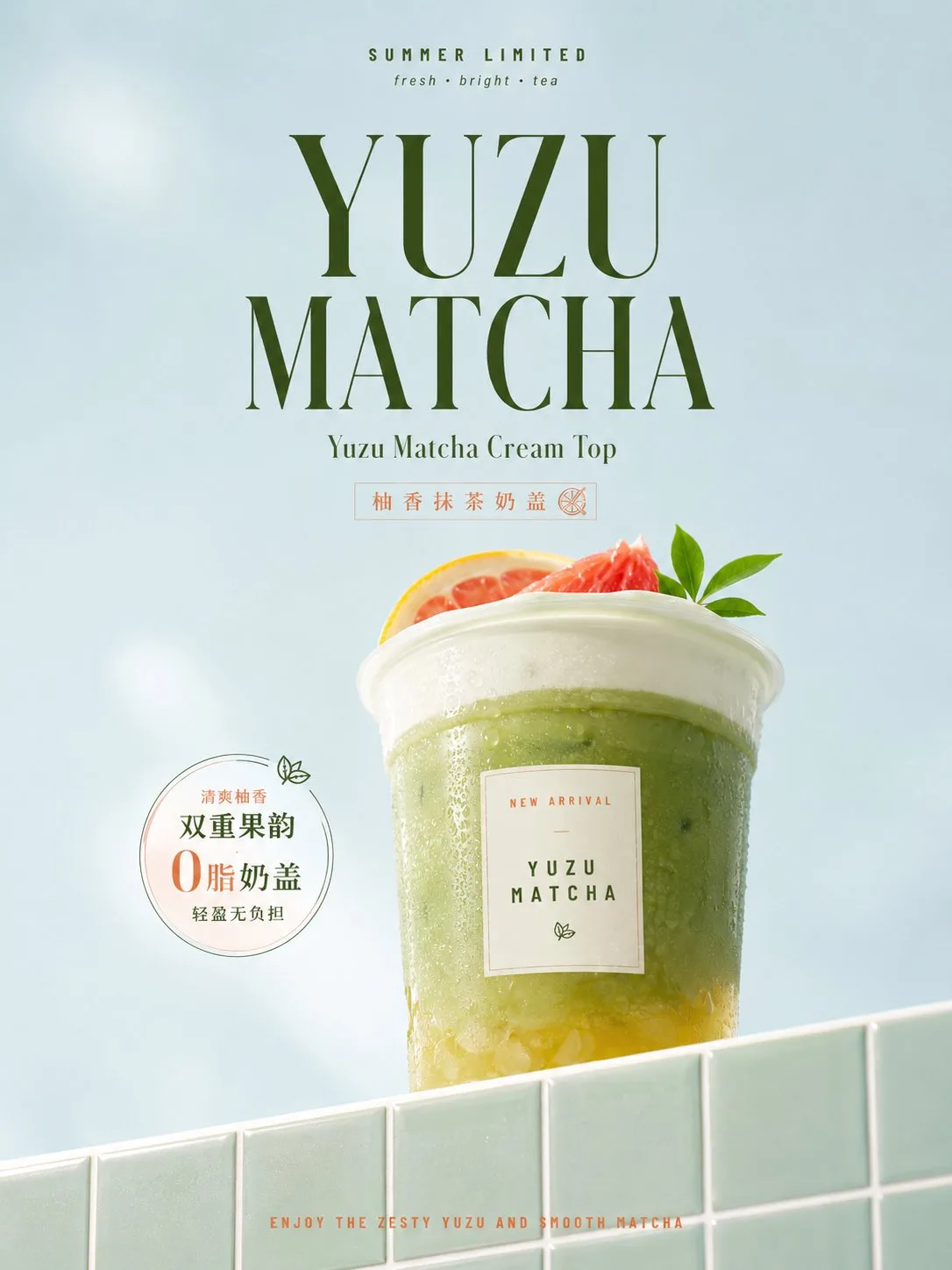
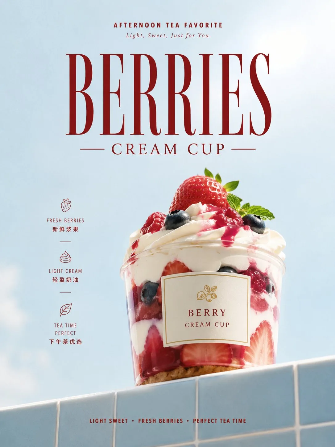
พรอมต์ภาษาไทย
ขยายภาพวิชวลแบบภาพนิ่งเชิงพาณิชย์โดยมีการปรับลดความนุ่มนวลแบบฟิล์มเล็กน้อยรอบๆ วัตถุที่เป็นธีม, โดยวางวัตถุที่จดจำได้ง่ายที่สุดชิ้นเดียวของธีมไว้ทางขวาเล็กน้อยของแกนกลาง, ขยายให้เป็นจุดศูนย์กลางของภาพด้วยพื้นผิวถ่ายจริงแบบโคลสอัพ; วัตถุโผล่ขึ้นมาจากด้านหลังเคาน์เตอร์กระเบื้องที่ตัดเข้ามาจากขอบด้านล่างจากซ้ายล่างถึงขวาบน, โดยส่วนฐานของมันถูกบดบังบางส่วนโดยเคาน์เตอร์, สร้างท่าทางที่สง่างามซึ่งถือไว้อย่างมั่นคงด้วยเส้นทแยงมุม เคาน์เตอร์กระเบื้องครอบคลุมพื้นที่เพียงเล็กน้อยของขอบด้านล่างของเฟรม, พร้อมเคลือบที่อบอุ่นและการสะท้อนที่ถูกควบคุม, รอยยาแนวสีอ่อนแคบๆ ละเอียดก่อตัวเป็นสี่เหลี่ยมจัตุรัสปกติที่ขยายออกไปพร้อมกับมุมมองทแยงมุม, สร้างมาตราส่วนในขณะที่ผลักสายตากลับไปยังจุดโฟกัส ครึ่งบนยังคงพื้นที่สีขาวโปร่งใสขนาดใหญ่, ใช้ความสว่างสูง, สีโทนเย็นที่ได้มาจากธีมซึ่งมีความอิ่มตัวต่ำถึงปานกลางเป็นพื้นหลังที่สะอาด, คงไว้เพียงเกรนที่ละเอียดมากและสม่ำเสมอ, การเลื่อนความสว่างเล็กน้อย, และหมอกสว่างนุ่มนวล, โดยรวมแล้วสว่าง, สดชื่น, พร้อมความนุ่มนวลเล็กน้อยของโฆษณาสีสไตล์เก่า, โดยไม่ต้องเพิ่มสิ่งสกปรก, การสึกหรอ, หรือฟิลเตอร์สีน้ำตาลเข้ม วัตถุที่เป็นธีมมีการส่งผ่านแสงที่น่าเชื่อถือ, การสะท้อน, ไฮไลท์ที่ละเอียดอ่อน, และชั้นภายในตามวัสดุของมัน, มีขอบที่ชัดเจนแต่ไม่คมชัดเกินไป; ดึงกลุ่มรายละเอียดแนบที่มีความอิ่มตัวสูงและมีปริมาณน้อยจากภาพธีม, รวมกันใกล้กับขอบด้านบนของวัตถุ, โดยมีพื้นผิวระบุตัวตนรูปสี่เหลี่ยมผืนผ้าสีอ่อนที่มีข้อมูลน้อยฝังอยู่ด้านหน้า, ปล่อยให้พื้นผิวทางกายภาพที่เข้มข้นและระนาบที่เงียบสงบสร้างการหยุดนิ่ง สีมาจากความหมายของธีม, ไม่ได้จำกัดอยู่กับเฉดสีที่เฉพาะเจาะจง: พื้นหลังพื้นที่ขนาดใหญ่คงความสว่าง, สว่าง, ความอิ่มตัวต่ำ, วัตถุและกระเบื้องพื้นที่ขนาดกลางแบ่งปันความสัมพันธ์ของสีที่อยู่ติดกันที่เข้มข้นและอิ่มตัวกว่า, สีที่โดดเด่นจำนวนเล็กน้อยกระจุกตัวอยู่ในรายละเอียดด้านบน, ชื่อหลัก, และประโยคสั้นๆ ด้านล่าง, สีกลางอ่อนใช้สำหรับไฮไลท์และพื้นผิวระบุตัวตน; รักษาความตัดกันระหว่างสีร้อน-เย็นที่ชัดเจน, ชั้นสีที่สะอาด, และจุดโฟกัสที่สดใสแต่ไม่เจิดจ้า ข้อความสร้างการอ่านที่หนาแน่นในแนวตั้งตามแกนกลาง: ข้อความขนาดเล็กมากสองบรรทัดแขวนอยู่ด้านบน, บรรทัดแรกใช้ฟอนต์แบบซองแคบตัวหนาตัวพิมพ์ใหญ่ทั้งหมดพร้อมระยะห่างตัวอักษรที่กว้างขึ้นเล็กน้อย, บรรทัดที่สองใช้ฟอนต์ตัวเอียงที่เบากว่าและเล็กกว่า; ใต้ลงมา, มีชื่อเรื่องแบบ serif ขนาดใหญ่มากและมีความคมชัดสูงประกอบด้วยคำหลักสั้นๆ, หน้าสูง, เส้นหนาและบางที่ชัดเจน, การวางตำแหน่งตรงกลางที่มั่นคง, โทนสีเข้มที่สะท้อนรายละเอียดที่โดดเด่นบนวัตถุ, ตามด้วยบรรทัดย่อยแบบ serif ขนาดเล็กกว่าที่ตามมาอย่างใกล้ชิด เว้นช่องว่างหายใจระหว่างชื่อเรื่องกับด้านบนของวัตถุ, ข้อความไม่กดทับกับวัตถุจริง; ส่วนล่างสุดวางบรรทัดคำแนะนำตัวพิมพ์ใหญ่ทั้งหมดขนาดเล็ก, กระชับ, สีโดดเด่นบนกระเบื้อง, สร้างการสะท้อนตั้งแต่ต้นจนจบ ข้อความทั้งหมดมาจากธีมปัจจุบัน, รักษาการจำกัดข้อมูล, การจัดแนวแกนกลาง, และการกระโดดขนาดฟอนต์ที่ชัดเจน; ภาพควรเป็นเหมือนโฆษณาสินค้าเก่าๆ ที่ถ่ายด้วยแสง high-key ธรรมชาติหลังจากการจัดวางอย่างระมัดระวัง, มีทั้งวัสดุจริงและการปรับลดแสงแบบออปติคอลที่อ่อนแอ, รวมถึงพื้นที่สีขาวที่โดดเด่น, การเคลื่อนที่ของแพลตฟอร์มในแนวทแยง, และลำดับกราฟิกที่ชัดเจน ธีม: โปสเตอร์ถ้วยขนมหวานเบอร์รี่ครีม เน้นผลิตภัณฑ์หวานเบาๆ เหมาะสำหรับชายามบ่าย เสริม: ปรากฏ 3 จุดข้อมูลที่เกี่ยวข้อง, คงการใช้งานของโปสเตอร์เชิงพาณิชย์ อัตราส่วนภาพ: แนวตั้ง 3:4
พรอมต์ภาษาอังกฤษ
Expand a commercial still life visual with slight film softening around any theme object, placing the single most recognizable object of the theme slightly to the right of the central axis, magnified as the visual center with a close-up real-shot texture; the object rises from behind a tile countertop that cuts in from the bottom edge from low-left to high-right, with its base partially obscured by the countertop, forming a monumental posture steadily held up by the diagonal line. The tile countertop occupies only a small area of the bottom edge of the frame, with a warm glaze and restrained reflections, fine narrow light-colored grouting forming regular squares extending with diagonal perspective, establishing scale while pushing the gaze back to the focus. The upper half retains a large area of transparent white space, using high-brightness, low-to-medium saturation theme-derived cool colors as a clean background, retaining only extremely fine uniform grains, slight brightness drift, and a soft bright mist, overall bright, refreshing, with a slight softness of old-style color advertisements, without adding dirt, wear, or heavy brown filters. The theme object presents credible light transmission, reflection, delicate highlights, and internal layers according to its own materials, with clear edges but not over-sharpened; extract a group of high-saturation, small-volume attachment details from the theme imagery, gathered near the upper edge of the object, with a low-information light-colored rectangular identification surface embedded on the front, letting the rich physical texture and quiet plane form a pause. Colors are derived from the theme semantics, not locked to specific hues: large area backgrounds maintain light, bright, low saturation, medium area objects and tiles share deeper, more saturated adjacent color relationships, a small amount of striking colors concentrated in top details, main titles, and bottom short sentences, light neutral colors used for highlights and identification surfaces; keep clear warm-cold contrast, clean color layers, and a vivid but not glaring focus. Text forms a vertically dense reading along the central axis: two lines of extremely small copy suspended at the top, the first line using a compact bold all-caps narrow font with slightly widened letter spacing, the second line using a lighter, smaller italic font; below it, a very large high-contrast serif title composed of a short theme word, tall face, distinct thick and thin strokes, stable centered positioning, dark color tone echoing the striking details on the object, followed by a line of smaller serif subtitles closely following. Leave a breathing space between the title and the top of the object, text does not press onto the physical entity; the very bottom places a line of small, compact, striking-colored all-caps instructions on the tiles, forming an echo from start to finish. All copy comes from the current theme, maintaining information restraint, central axis alignment, and obvious font size jumps; the image should be like a nostalgic product advertisement shot with natural high-key light after careful arrangement, with both real materials and weak optical softening, as well as bold white space, diagonal platform advancement, and clear graphic order. —————— Theme: Berry cream dessert cup poster, highlighting a light sweet product suitable for afternoon tea Supplement: Appear 3 relevant information points, keep commercial poster usable Aspect ratio: Vertical 3:4
พรอมต์ภาษาจีน
围绕任意主题对象展开带轻微胶片柔化的商业静物视觉,将主题中最具识别度的单一对象置于中轴略偏右,以近距离实拍质感放大为视觉重心;对象从下缘一条自左低向右高切入的瓷砖台面后方升起,底部被台面局部遮挡,形成被斜线稳稳托举的纪念碑式姿态。瓷砖台面只占画面下缘较小区域,釉面温润并带克制反光,细窄浅色勾缝组成规整方格,随斜向透视延展,既建立尺度又把视线推回焦点。上半部保留大块通透留白,使用高明度、低至中饱和的主题派生冷色作为洁净背景,仅保留极细均匀颗粒、轻微亮度漂移与一处柔和亮雾,整体明快、清爽、略带旧式彩色广告的柔润感,不加入脏污、磨损或厚重褐色滤镜。主题对象按自身材料呈现可信的透光、反射、细腻高光和内部层次,边缘清楚但不过度锐化;从主题意象提炼一组高饱和、小体量的附着细节,聚集在对象上缘附近,正面嵌入低信息的浅色矩形识别面,让丰富实体质感与安静平面形成停顿。色彩由主题语义派生,不锁定具体色相:大面积背景维持轻、亮、低饱和,中等面积对象与瓷砖共享更深、更饱和的邻近色关系,少量醒目色集中在顶部细节、主标题和底部短句,浅中性色用于高光与识别面;保持冷暖对照清晰、色层干净、焦点鲜活而不刺眼。文字沿中轴形成疏密分明的纵向阅读:顶部悬置两行极小文案,第一行用紧凑粗体全大写窄体字并稍微拉开字距,第二行用更轻、更小的倾斜字;其下以一个简短主题词构成超大高反差衬线标题,字面高挑、笔画粗细分明、居中稳定,深色字调呼应对象上的醒目细节,再以一行较小的衬线副标题贴近承接。标题与对象顶部之间留出呼吸间隔,文字不压住实体;最底部在瓷砖上放一行细小、紧凑、醒目色的全大写说明,形成首尾回声。所有文案均来自当前主题,保持信息克制、居中轴线和明显字号跳级;画面应像精心布置后用自然高调光拍摄的怀旧商品广告,既有真实材料与微弱光学柔化,又有大胆留白、斜台推进和清晰的图文秩序。 —————— 主题:莓果奶油甜品杯海报,突出一款适合下午茶的轻甜商品 补充:出现 3 个相关信息点,保持商业海报可用 画幅:竖版 3:4
พรอมต์แนะนำ
8 พรอมต์คัดสรร
สาวผมแดงในสตูดิโอ: แฟชั่นมินิมัลลิสต์

สาวเอเชียในชุดคาร์ดิแกนสีฟ้ามิสต์กับกระโปรงขาว

สาวเอเชียในชุดสีน้ำเงิน บนโซฟาหรูในโรงแรม

โปสเตอร์อินโฟกราฟิกสูตรอาหารระดับพรีเมียม

สาวชุดว่ายน้ำขาว-ฟ้า สาดน้ำทะเลริมหาด

ถ่ายภาพคอสเพลย์ฤดูร้อนสไตล์เซลฟี่จากมือถือ
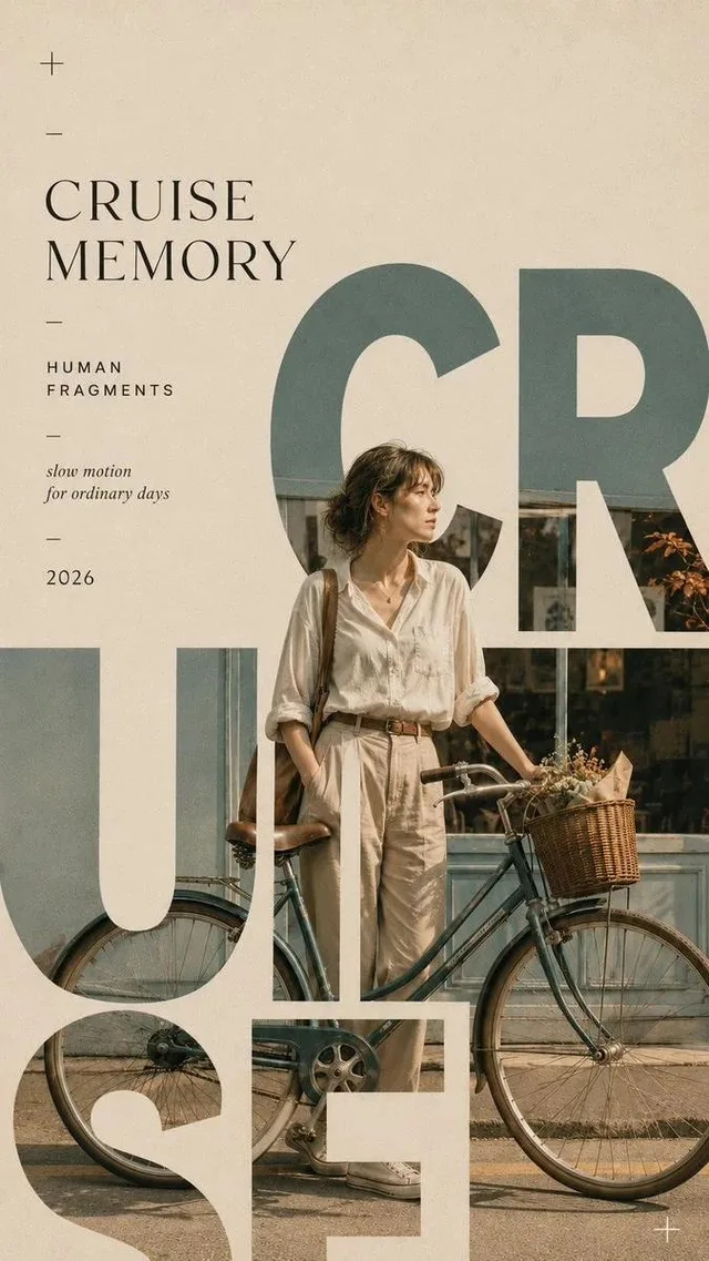
โปสเตอร์ตัวอักษรแนวสารคดีชีวิตประจำวัน
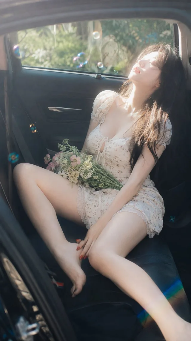
สาวญี่ปุ่นฤดูร้อนในรถยนต์ ย้อนแสงฉ่ำๆ