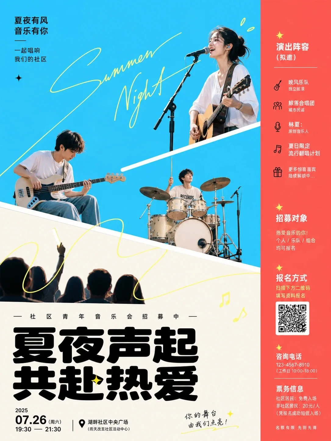
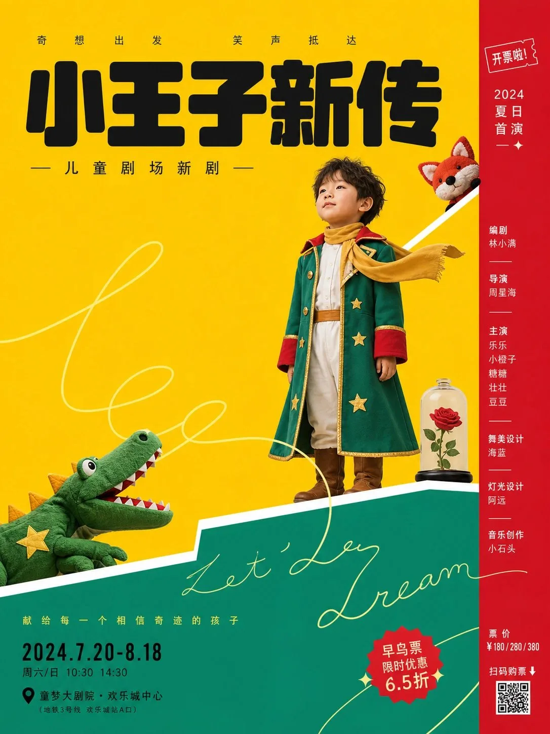
โปสเตอร์เวทีละครสว่าง สะอาดตา
ที่มา: @xiaoxiaodong01โมเดล: ChatGPT
ภาพตัวอย่าง
พรอมต์ภาษาไทย
จัดองค์ประกอบโดยมีวัตถุหลักเป็นศูนย์กลาง ใช้การออกแบบโปสเตอร์กราฟิกแนวละครเวทีที่สว่างและสะอาดตา: ภาพสร้างผลกระทบในทันทีด้วยพื้นที่ขนาดใหญ่ของระนาบสีทึบที่มีความสว่างสูง; สีหลักที่ได้จากวัตถุทำหน้าที่เป็นพื้นหลังเปิดโล่งหลัก ในขณะที่สีเสริมใช้โทนสีที่เข้มขึ้นหรืออบอุ่นขึ้นซึ่งถูกบีบไปด้านหนึ่งเป็นแถบแนวตั้งแคบๆ หรือบล็อกน้ำหนักที่ด้านล่าง; สีสว่างทำหน้าที่เป็นแพลตฟอร์มด้านหน้า และสีเข้มเกือบดำใช้สำหรับชื่อเรื่องหลักและข้อมูลสำคัญจำนวนเล็กน้อย; เฉดสีเปลี่ยนแปลงไปตามวัตถุ แต่ยังคงรักษาน้ำเสียงทางอารมณ์ของความสว่างสูง ความสะอาด การไล่ระดับสีน้อยที่สุด พื้นผิวน้อยที่สุด และการติดกันของบล็อกสีที่แข็งแกร่ง หลีกเลี่ยงหมอกสีเทาที่มีความอิ่มตัวต่ำและวัสดุที่ซับซ้อน ใช้เส้นทแยงสีขาวหนา 2 ถึง 3 เส้นเพื่อแบ่งกรอบออกเป็นแพลตฟอร์มที่เคลื่อนที่; เส้นขอบทำหน้าที่เหมือนขอบเวทีที่รองรับวัตถุ; ตัวละคร ผลิตภัณฑ์ สัญลักษณ์ หรือภาพหลักภายในธีมจะถูกประมวลผลเป็นภาพถ่ายที่ถูกตัดขอบคมชัดหรือภาพเงาที่ชัดเจน วางอยู่บนความสูงและบล็อกสีที่แตกต่างกัน: องค์ประกอบด้านข้างขนาดใหญ่กดทับบล็อกสีอ่อนด้านล่าง องค์ประกอบหลักตรงกลางอยู่ใกล้เส้นทแยง และองค์ประกอบทางอารมณ์ขนาดเล็กยื่นออกมาจากบล็อกสีด้านบน; พวกมันไม่ได้อยู่บนระนาบเดียวกันแต่ถูกร้อยเรียงเป็นเส้นทางการอ่านจากล่างซ้ายไปบนขวาด้วยเส้นทแยงและเส้นสายตา ซ้อนทับชุดเส้นลายมือที่ละเอียดมากในสีเหลืองมะนาวอ่อนหรือสีที่สว่างใกล้เคียงกับธีม; เส้นลายมีความผ่อนคลาย เป็นวงยาว พาดผ่านวัตถุและช่องว่าง ถูกบดบังบางส่วนโดยวัตถุหลัก เหมือนลายเซ็นต์สบายๆ ที่ยังไม่เสร็จมากกว่าจะเป็นลวดลายตกแต่ง; เส้นจะต้องตัดผ่านพื้นหลัง เส้นทแยง และพื้นที่ชื่อเรื่องเพื่อสร้างความรู้สึกใกล้ชิดและความต่อเนื่องของพื้นที่ ตั้งชื่อเรื่องข้อความสีดำขนาดใหญ่ไว้ที่ด้านล่าง; แบบอักษรมีน้ำหนักมาก จุดศูนย์ถ่วงต่ำ มีมุมโค้งมนและรอยพับสี่เหลี่ยมอยู่ร่วมกัน โดยมีการเว้นระยะห่างตัวอักษรที่กระชับแต่มีช่องว่างสีขาวภายในที่ชัดเจน; วางข้อความอธิบายขนาดเล็กที่มีการเว้นระยะห่างตัวอักษรที่กระจายอยู่เหนือชื่อเรื่อง จัดเรียงข้อมูลเช่น วันที่และสถานที่ที่ด้านล่างซ้าย และคอลัมน์แคบๆ ของชื่อและข้อมูลการจำหน่ายตั๋วเล็กๆ ในแถบสีด้านขวา; ข้อความทั้งหมดคงขอบการพิมพ์โปสเตอร์ที่ชัดเจน รูปลักษณ์โดยรวมเหมือนภาพตัดปะดิจิทัลบวกกับฉากละครเวทีแบบแบนราบ มีขอบที่สะอาด ไม่มีการเสื่อมสภาพ ไม่มีพื้นผิวของกระดาษ; รูปภาพบุคคลหรือวัตถุมีความรู้สึกของการบีบอัดภาพถ่ายเล็กน้อยและขอบที่ตัดคม ทำให้ความแบนราบของบล็อกสีและการแสดงออกที่นิ่งของวัตถุจริงสร้างความแตกต่างที่เงียบสงบและมีระยะห่างแบบละครเวทีเล็กน้อย
พรอมต์ภาษาอังกฤษ
Centered around any subject, adopt a bright and clean theatrical graphic poster treatment: the visual establishes immediate impact with large areas of high-brightness solid color planes; the primary color derived from the subject serves as the main open background, while auxiliary colors use deeper or warmer saturated tones pressed to one side as narrow vertical bars or bottom weight blocks; light bright colors serve as the foreground platform, and deep near-black is used for the core title and a small amount of key information; hues change with the subject, but maintain an emotional tone of high brightness, cleanliness, minimal gradients, minimal textures, and strong color block adjacency, avoiding low-saturation gray mist and complex materials. Use two to three thick white diagonal boundaries to cut the frame into displaced platforms; the boundaries act like a stage proscenium supporting the subject; the characters, products, symbols, or key visuals within the theme are processed as hard-edged photographic cutouts or clear image silhouettes, resting on different heights and different color blocks: a larger lateral element presses down on the lower light-colored block, a central core element sits near the diagonal line, and a small emotional element protrudes from the upper color block; they are not on the same horizon but are strung into a reading path from the bottom left to the top right by the diagonal lines and line of sight. Superimpose a set of ultra-fine handwritten lines in light lemon or a high-brightness neighbor color of the theme; the strokes are relaxed, long loops, passing through objects and blank spaces, partially obscured by the main subject, like an unfinished casual signature rather than a decorative pattern; the lines must cross the background, diagonal lines, and title area to create a light sense of intimacy and spatial continuity. Set a large black local text title at the bottom; the typeface is heavy, low-center-of-gravity, with rounded corners and square folds coexisting, with tight letter spacing but clear internal white space; place a line of small-sized explanatory text with dispersed letter spacing above the title, arrange information such as date and location in the bottom left, and a narrow column of names and tiny ticketing information in the right color bar; all text maintains clear poster printing edges. The overall look is like a digital collage plus a flat theater set, with clean edges, no aging, no paper texture; figures or subject images have a slight photographic compression feel and hard cut edges, making the flatness of the color blocks and the static expression of the real subject form a quiet, slightly staged-distanced contrast.
พรอมต์ภาษาจีน
围绕任意主题对象,采用明亮洁净的演出式图文海报处理:画面以大面积高明度纯色平场建立第一眼冲击,主题派生的主色承担主要开放背景,辅助色以更深或更暖的饱和色压在一侧形成窄竖栏或底部承重块,浅亮色作为前景台面,深近黑用于核心标题和少量关键信息;色相随主题变化,但保持高亮、干净、少渐变、少纹理、强色块邻接的情绪,避免低饱和灰雾和复杂材质。用两到三条粗白色斜向边界把画面切成错位平台,边界像舞台台口一样承托主题对象,主题中的人物、产品、符号或关键视觉被处理成硬边摄影切贴或清晰图像剪影,分别停在不同高度和不同色块上:一个较大的侧向元素压住下方浅色块,一个正面核心元素居中坐在斜线附近,一个小型情绪元素从上方色块探出,彼此不完全同地平线,却由斜线和视线方向串成从左下到右上的阅读路径。叠加一组浅柠檬或主题高明度近邻色的超细手写线条,笔画松弛、长回环、穿过对象与空白,局部被主体遮挡,像未完成的随笔签名而非装饰花纹;线条必须跨越背景、斜线和标题区,制造轻快的亲密感和空间连续性。底部设置大号黑色本地文字标题,字形厚重、低重心、圆角与方折并存,字距紧密但留出清晰内白;标题上方放一行小号分散字距的说明文字,左下排日期地点等信息,右侧色栏排窄列名单与细小票务信息,所有文字保持清楚的海报印刷边缘。整体像数字拼贴加平面剧场布景,边缘干净、无做旧、无纸纹,人物或主题图像带轻微摄影压缩感和硬切边,使色块的平面性与真实主体的静止表情形成安静、略带舞台距离的对照。
พรอมต์แนะนำ
8 พรอมต์คัดสรร
สาวผมแดงในสตูดิโอ: แฟชั่นมินิมัลลิสต์

สาวเอเชียในชุดคาร์ดิแกนสีฟ้ามิสต์กับกระโปรงขาว

สาวเอเชียในชุดสีน้ำเงิน บนโซฟาหรูในโรงแรม

โปสเตอร์อินโฟกราฟิกสูตรอาหารระดับพรีเมียม

สาวชุดว่ายน้ำขาว-ฟ้า สาดน้ำทะเลริมหาด

ถ่ายภาพคอสเพลย์ฤดูร้อนสไตล์เซลฟี่จากมือถือ

สาวญี่ปุ่นผมสั้น ถ่ายภาพในร่ม มุมเงย
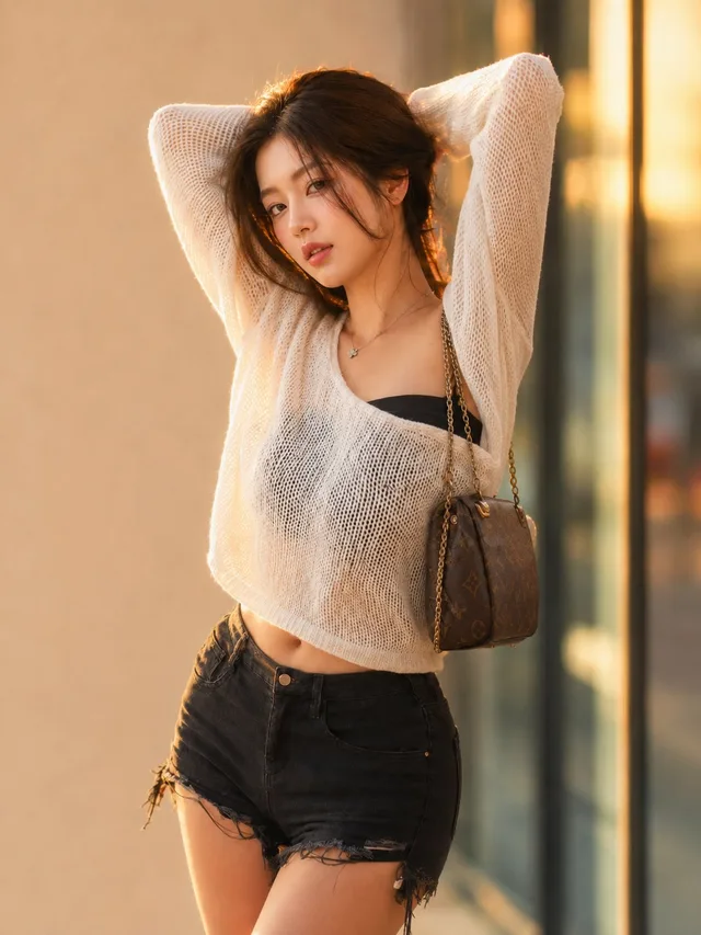
สาวเอเชียในเสื้อถักฉลุ แสงอุ่นย้อนหลัง