ดีไซน์หนังสือเรียนภาษาอังกฤษคลาสสิก
ที่มา: @knowledgefxgโมเดล: ChatGPT
ภาพตัวอย่าง
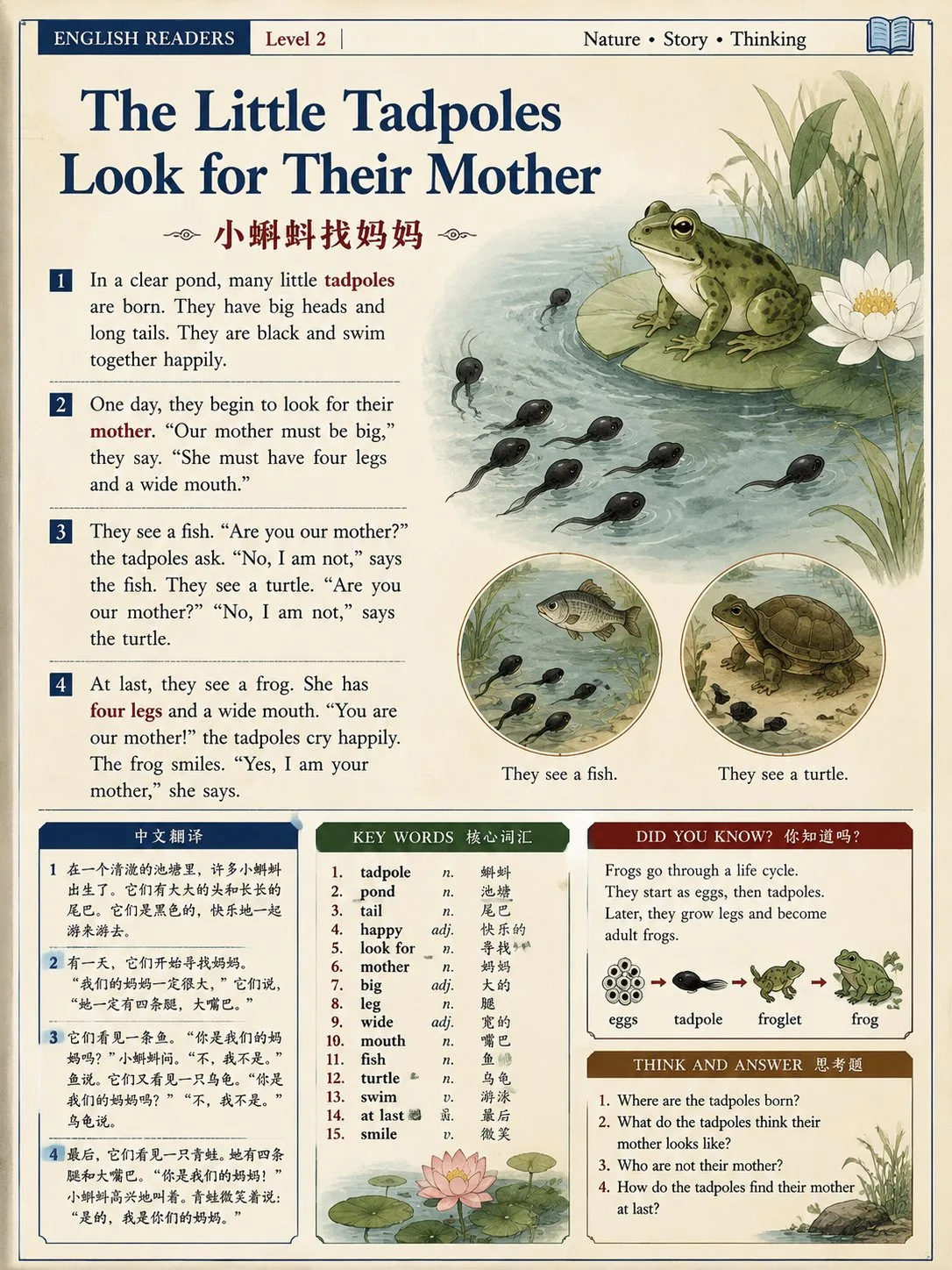
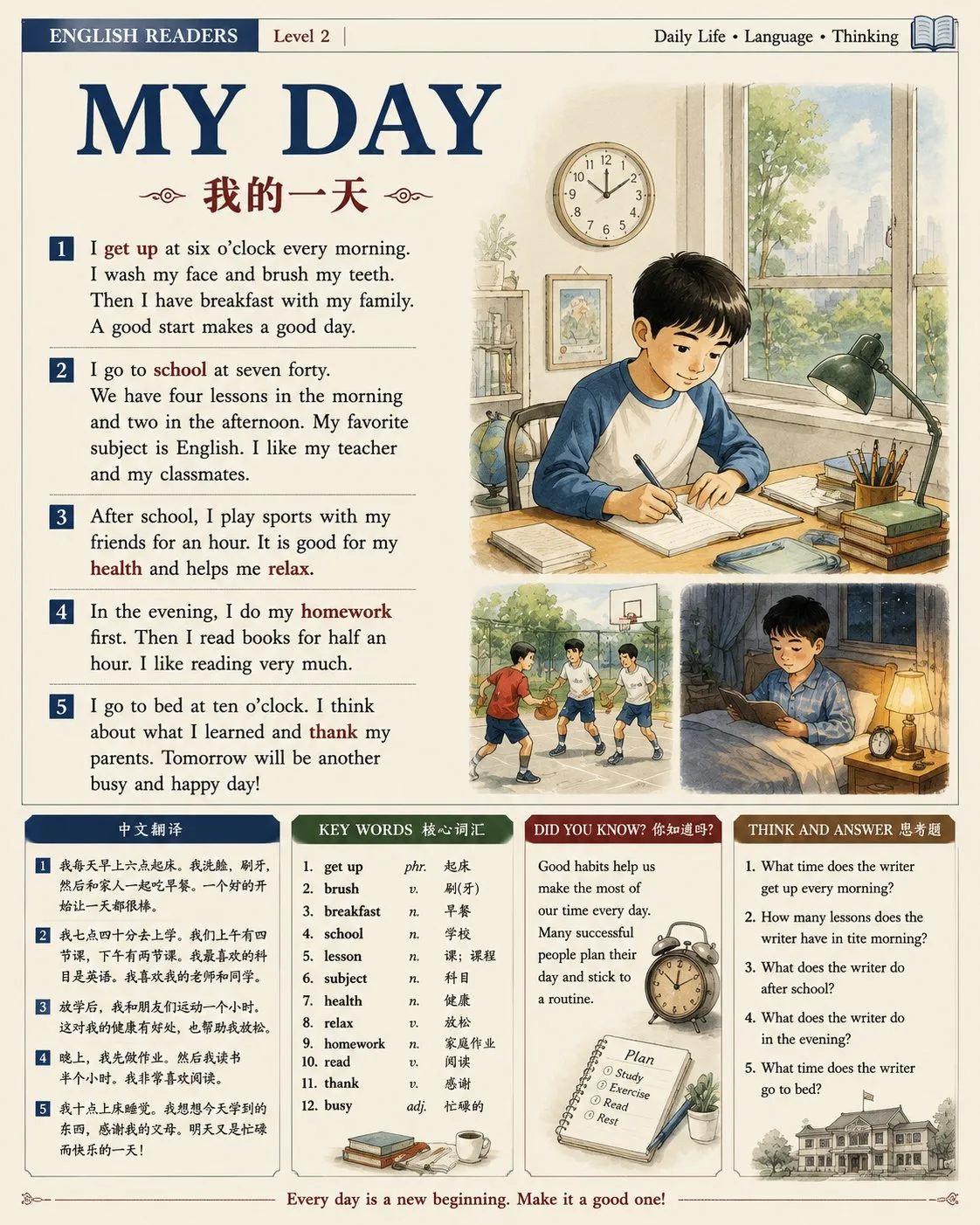
พรอมต์ภาษาไทย
ออกแบบอินโฟกราฟิกหนังสือเรียนภาษาอังกฤษแบบสองภาษา (จีน-อังกฤษ) แนวตั้ง ในธีม "[Theme]" การออกแบบโดยรวมนำสไตล์การจัดพิมพ์ของหนังสือเรียนภาษาอังกฤษคลาสสิกและสื่อการอ่านนอกหลักสูตรมาใช้ โดยอ้างอิงการจัดวางแบบมืออาชีพของสิ่งพิมพ์ในศตวรรษที่ 20 การจัดวางเป็นทางการ ชัดเจน และทนทาน ให้ประสบการณ์การอ่านหนังสือเรียนแบบกระดาษแบบดั้งเดิม คงโครงสร้างการจัดวางหนังสือเรียนแบบตายตัวที่ไม่เปลี่ยนแปลงตรรกะการจัดวางตามธีม สไตล์ภาพ สไตล์ภาพประกอบ และองค์ประกอบทางวัฒนธรรมสามารถปรับได้อย่างอิสระตามเนื้อหาบทความ ตั้งคอลัมน์หลักสูตรที่กระชับ ป้ายบท หรือข้อมูลระดับการอ่านที่ด้านบนของหน้า วางหัวข้อหลักภาษาอังกฤษที่โดดเด่น "[English Title]" ไว้ตรงกลาง โดยมีหัวข้อภาษาจีนขนาดเล็กกว่า "[Chinese Title]" อยู่ด้านล่าง พื้นที่ข้อความหลักเน้นบทความอ่านภาษาอังกฤษ แบ่งเป็น 3 ถึง 5 ย่อหน้าสั้นๆ ด้วยภาษาที่เป็นธรรมชาติและกระชับ เหมาะสำหรับผู้เรียนภาษาอังกฤษระดับประถมศึกษาและมัธยมศึกษา สามารถใช้สีเน้นเล็กน้อยในเนื้อหาเพื่อเน้นคำศัพท์หลักหรือจุดไวยากรณ์ แต่ความรู้สึกโดยรวมยังคงความสุภาพและเป็นมืออาชีพเหมือนหนังสือเรียนที่พิมพ์ออกมา นำรูปแบบการจัดพิมพ์แบบโมดูลาร์ของหนังสือเรียนภาษาอังกฤษคลาสสิกมาใช้: ข้อความอ่านภาษาอังกฤษอยู่ทางซ้ายหรือด้านบน และมีภาพประกอบธีมหลักจัดเรียงอยู่ทางขวา ด้านล่างของหน้าถูกกำหนดให้เป็นพื้นที่เสริมการเรียนรู้ เช่น โมดูล "Chinese Translation", "Key Words", "Did You Know?", "Think and Answer" และอื่นๆ ขอบเขตระหว่างพื้นที่ข้อความ พื้นที่ภาพประกอบ และพื้นที่แบบฝึกหัดมีความชัดเจน เส้นทางการอ่านเป็นธรรมชาติ และเหมาะสำหรับการสอนในห้องเรียนและการพิมพ์ เนื้อหาของภาพประกอบหลักจะเปลี่ยนไปตามธีม เช่น เรื่องราวของตัวละคร วิทยาศาสตร์ธรรมชาติ เหตุการณ์ทางประวัติศาสตร์ ชีวิตในเมือง วัฒนธรรมประเพณี การสำรวจเทคโนโลยี โลกของสัตว์ ฉากการเดินทาง เป็นต้น ในขณะเดียวกัน สามารถเพิ่มภาพประกอบเล่าเรื่องขนาดเล็กเสริม 1 ถึง 2 ภาพเพื่อเสริมข้อมูลพื้นหลังหรือแสดงโครงเรื่องหลัก ภาพประกอบใช้สไตล์ภาพวาดมือแบบสิ่งพิมพ์คลาสสิก โดยเลือกภาษาภาพที่เหมาะสมตามธีม ซึ่งสามารถแสดงออกเป็น watercolor, light color, pen line drawing, vintage picture book, natural history illustration หรือ realistic textbook illustration style โครงสร้างของคน สัตว์ สิ่งของ และสิ่งแวดล้อมมีความถูกต้อง การสร้างแบบจำลองเป็นธรรมชาติ ไม่เกินจริง ไม่เด็ก และหลีกเลี่ยงเอฟเฟกต์การ์ตูน 3D ที่ทันสมัย สีโดยรวมถูกปรับตามธีม แต่ยังคงสไตล์หนังสือเรียนที่มีความอิ่มตัวต่ำ นุ่มนวล และมีพื้นผิวการพิมพ์ สามารถใช้สี off-white, light gray หรือ old paper เป็นพื้นหลังหลัก จับคู่กับสีเสริม เช่น deep blue, dark green, brownish red, terracotta หรือ gray-black หลีกเลี่ยงสีที่ตัดกันและมีความอิ่มตัวสูง สามารถเพิ่มพื้นผิวที่บางเบามาก องค์ประกอบสิ่งแวดล้อม หรือของตกแต่งที่เกี่ยวข้องกับธีมลงในพื้นหลังได้ แต่ต้องไม่ส่งผลต่อความชัดเจนของข้อความ ฟอนต์และการจัดวางยังคงความเป็นคลาสสิก มีเหตุผล และเป็นมืออาชีพ: ชื่อภาษาอังกฤษใช้ฟอนต์ serif ที่หนาและชัดเจน หรือฟอนต์ชื่อเรื่องหนังสือเรียนคลาสสิก และข้อความหลักใช้ฟอนต์ที่อ่านง่าย ชื่อภาษาจีนและข้อความเสริมยังคงกระชับและเป็นมาตรฐาน หลีกเลี่ยงฟอนต์ศิลปะที่หรูหรา สไตล์โปสเตอร์เชิงพาณิชย์ที่ทันสมัย หรือการตกแต่งที่มากเกินไป ข้อกำหนดโดยรวม: รูปแบบอินโฟกราฟิกหนังสือเรียนภาษาอังกฤษแบบตายตัว + สไตล์เนื้อหาและภาพประกอบที่เปลี่ยนไปตามธีม รักษาข้อมูลที่มีระดับความสมบูรณ์โดยไม่แออัด มีพื้นที่ว่างที่เหมาะสม ขอบเขตที่เรียบร้อย อัตราส่วนข้อความต่อรูปภาพที่สมดุล และพื้นผิวของสิ่งพิมพ์ที่เป็นมืออาชีพ เหมาะสำหรับเป็นหน้าเดียวของหนังสือเรียนภาษาอังกฤษ แผ่นพับในห้องเรียน หรือหน้าอ่านวิทยาศาสตร์วัฒนธรรม รูปแบบแนวตั้ง อัตราส่วน 3:4, high resolution, full page design, classic English textbook layout style, clear visual hierarchy, standardized editorial layout
พรอมต์ภาษาอังกฤษ
Design a vertical Chinese-English bilingual English reading textbook infographic with the theme "[Theme]". The overall design adopts the editorial style of classic English textbooks and extracurricular reading materials, referencing the professional layout of 20th-century publications. The layout is formal, clear, and durable, providing a traditional paper textbook reading experience. Maintain a fixed textbook layout structure that does not change its layout logic with the theme; visual styles, illustration styles, and cultural elements can be freely adjusted according to the article content. Set concise course columns, chapter labels, or reading level information at the top of the page; place a prominent English main title "[English Title]" in the center, with a smaller Chinese title "[Chinese Title]" below it. The main text area centers on an English reading article, divided into 3 to 5 short paragraphs, with natural and concise language suitable for primary and secondary school English learners. A small amount of emphasis colors can be used in the body to highlight key vocabulary or grammar points, but the overall feeling remains restrained and professional like a printed textbook. Adopt a modular editorial layout of classic English reading textbooks: the English reading text is on the left or upper part, and a main theme illustration is arranged on the right; the bottom of the page is fixed with a learning auxiliary area, such as "Chinese Translation", "Key Words", "Did You Know?", "Think and Answer" and other modules. The boundaries between the text area, illustration area, and exercise area are clear, the reading path is natural, and it is suitable for classroom teaching and printing. The content of the main illustration changes according to the theme, such as character stories, natural sciences, historical events, urban life, traditional culture, technological exploration, animal world, travel scenes, etc.; meanwhile, 1 to 2 auxiliary narrative small illustrations can be added to supplement background information or show key plots. Illustrations use a classic publication hand-drawn style, choosing an appropriate visual language based on the theme, which can be expressed as watercolor, light color, pen line drawing, vintage picture book, natural history illustration, or realistic textbook illustration style. The structures of people, animals, objects, and environments are accurate, the modeling is natural, not exaggerated, not childish, and avoids modern 3D cartoon effects. Overall colors are adjusted according to the theme but maintain a low-saturation, soft, and printed texture textbook style. Off-white, light gray, or old paper colors can be used as the base background, paired with auxiliary colors like deep blue, dark green, brownish red, terracotta, or gray-black; avoid high-saturation clashing colors. Very light textures, environmental elements, or theme-related decorations can be added to the background, but they must not affect text clarity. Fonts and layout remain classic, rational, and professional: English titles use bold and clear serif fonts or classic textbook title fonts, and the main text uses legible printed fonts; Chinese titles and auxiliary text remain concise and standard. Avoid fancy artistic fonts, modern commercial poster styles, or excessive decoration. Overall requirements: Fixed English textbook infographic layout + content and illustration styles that change according to the theme. Maintain rich information levels without being overcrowded, with reasonable white space, neat margins, a balanced text-to-image ratio, and a professional publication texture, suitable as a single page of an English reading textbook, classroom handout, or cultural science reading page. Vertical format, 3:4 ratio, high resolution, full page design, classic English textbook layout style, clear visual hierarchy, standardized editorial layout.
พรอมต์ภาษาจีน
设计一张竖版中英双语英语阅读教材信息图,主题为“【主题】”。整体采用经典英语教材与课外阅读读物的编辑设计风格,参考20世纪出版物的专业排版方式,版面正式、清晰、耐看,具有传统纸质教材的阅读体验。保持固定的教材版式结构,不随主题改变排版逻辑;视觉风格、插画风格、文化元素可根据文章内容自由调整。 页面顶部设置简洁的课程栏目、章节标签或阅读等级信息;中央放置醒目的英文主标题“【英文标题】”,下方配较小的中文标题“【中文标题】”。正文区域以英文阅读文章为核心,分为3至5个短段落,每段语言自然简洁,适合中小学生英语学习。正文中可使用少量强调色突出重点词汇或语法点,但整体保持克制、专业的教材印刷感。 采用经典英语阅读教材的模块化编辑排版:左侧或上半部分为英文阅读正文,右侧安排一幅主要主题插画;页面底部固定设置学习辅助区域,例如“中文翻译”“Key Words 核心词汇”“Did You Know? 文化小知识”“Think and Answer 思考题”等模块。文字区、插图区、练习区边界清晰,阅读路径自然,适合课堂教学和打印使用。 主插画内容根据主题变化,例如人物故事、自然科学、历史事件、城市生活、传统文化、科技探索、动物世界、旅行场景等;同时可加入1至2幅辅助叙事小插画,用于补充背景信息或展示关键情节。插画采用经典出版物手绘插图风格,根据主题选择合适的视觉语言,可表现为水彩、淡彩、钢笔线稿、复古绘本、自然历史插画或写实教材插图风格。人物、动物、物品和环境结构准确,造型自然,不夸张、不幼稚,避免现代3D卡通效果。 整体色彩根据主题调整,但保持低饱和、柔和、具有印刷质感的教材风格。可使用米白、浅灰、旧纸色等作为基础背景,搭配深蓝、墨绿、棕红、陶土色、灰黑等辅助色;避免高饱和撞色。背景可加入非常淡的纹理、环境元素或主题相关装饰,但不能影响文字清晰度。 字体与版式保持经典、理性、专业:英文标题使用厚重清晰的衬线字体或经典教材标题字体,正文使用易读的印刷体;中文标题与辅助文字保持简洁规范。避免花哨艺术字、现代商业海报风格或过度装饰。 整体要求:固定英语教材信息图版式 + 根据主题变化的内容与插画风格。保持丰富的信息层级但不过度拥挤,留白合理,边距整齐,图文比例平衡,具有专业出版物质感,适合作为英语阅读教材单页、课堂讲义、文化科普阅读页。 竖版画幅,3:4比例,高分辨率,完整页面设计,经典英语教材排版风格,清晰视觉层级,规范编辑布局。
พรอมต์แนะนำ
8 พรอมต์คัดสรร
สาวผมแดงในสตูดิโอ: แฟชั่นมินิมัลลิสต์

สาวเอเชียในชุดคาร์ดิแกนสีฟ้ามิสต์กับกระโปรงขาว

สาวเอเชียในชุดสีน้ำเงิน บนโซฟาหรูในโรงแรม

โปสเตอร์อินโฟกราฟิกสูตรอาหารระดับพรีเมียม

สาวชุดว่ายน้ำขาว-ฟ้า สาดน้ำทะเลริมหาด

ถ่ายภาพคอสเพลย์ฤดูร้อนสไตล์เซลฟี่จากมือถือ
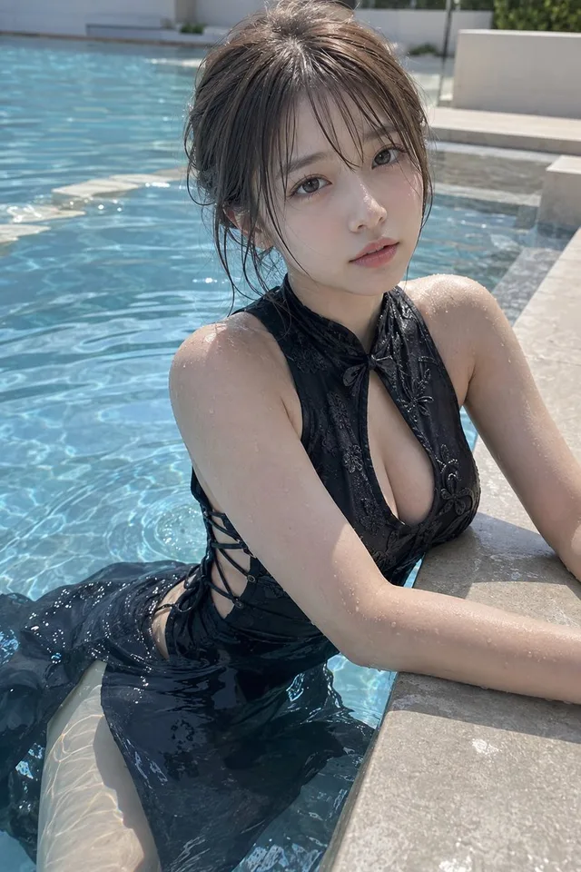
ไอดอลสาวญี่ปุ่นริมสระน้ำ สไตล์ Gravure
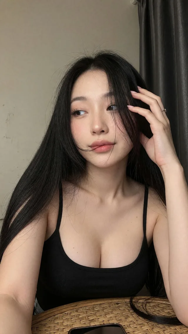
เซลฟี่สาวเอเชียในเสื้อสายเดี่ยวสีดำ