โปสเตอร์สีน้ำบนกระดาษ: ฤดูร้อนสดใส
ที่มา: @xiaoxiaodong01โมเดล: ChatGPT
ภาพตัวอย่าง
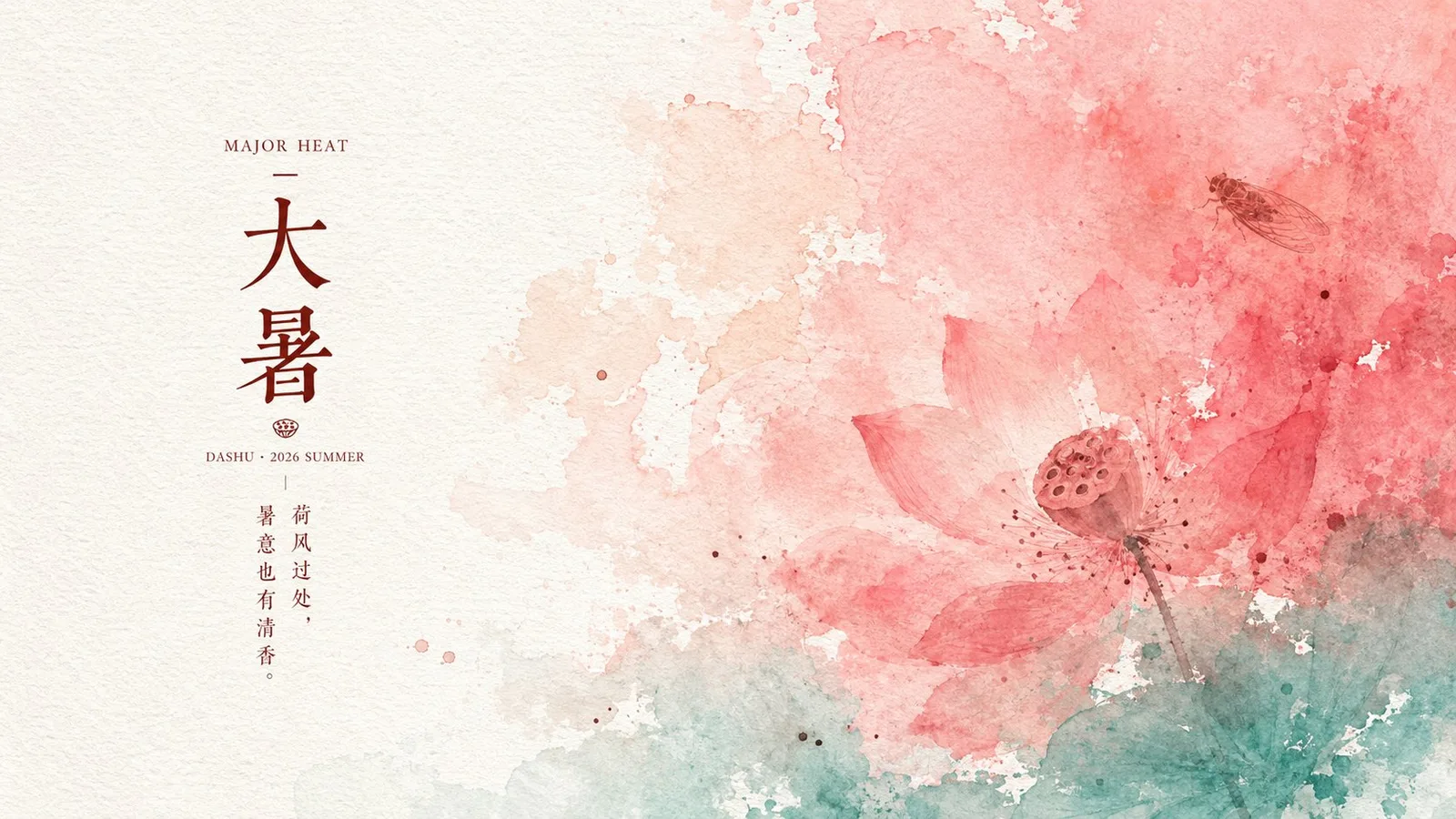
พรอมต์ภาษาไทย
สร้างโปสเตอร์บนกระดาษที่ดูสะอาดตาในธีมหรือหัวข้อใดก็ได้: ปล่อยให้อารมณ์หลักของธีมนั้นเปลี่ยนเป็นพื้นที่ขนาดใหญ่ของสีเปียกที่ละลายเข้าหากัน โดยไหลเข้ามาจากด้านใดด้านหนึ่งหรือด้านบนของเฟรมอย่างเป็นธรรมชาติ ครอบคลุมน้ำหนักภาพหลัก โดยที่ขอบแสดงรูปแบบที่ไม่สม่ำเสมอของการซึมของสีน้ำ การทับถมของเม็ดสี การย้อมสีแบบเลเยอร์โปร่งแสง และการฉีกขาดของพื้นที่สีขาวเฉพาะจุด; อีกด้านหนึ่งยังคงรักษากระดาษสีขาวขนาดใหญ่ใกล้เคียงสีขาวล้วน ทำให้กลุ่มข้อความวางตัวอยู่ใกล้บริเวณรอยต่อระหว่างพื้นที่สีขาวและการละลายของสีน้ำ สร้างสมดุลแบบอสมมาตรระหว่างกลุ่มสีสันที่สดใสกับพื้นที่หายใจ สีที่ใช้มาจากธีม โดยคงโทนสีสว่างและสะอาด (high-key): สีโทนอุ่นที่มีความอิ่มตัวสูงหรือสีหลักของธีมจะครอบคลุมพื้นที่ที่ใหญ่ที่สุด สีอ่อนที่มีความอิ่มตัวต่ำจะทำหน้าที่เป็นสีไล่ระดับการเปลี่ยนผ่าน และส่วนล่างหรือขอบใช้สีเสริมที่เย็นกว่าเพื่อกั้นกรอบ; สัญลักษณ์คล้ายจุดสีเข้มไม่กี่จุดที่มาจากรายละเอียดเชิงสัญลักษณ์ของธีมจะกระจายอยู่ภายในบริเวณสีน้ำที่ละลายเหมือนหยดหมึกที่กระจายตัวด้วยน้ำ จำกัดจำนวนด้วยขอบที่นุ่มนวลและพร่าเลือน วัสดุที่ใช้คือกระดาษใยละเอียดเป็นพื้นฐาน พื้นผิวมีการนูนต่ำที่สม่ำเสมอและอนุภาคที่ดูดซับหมึกเล็กน้อย; สีที่ใช้ไม่ใช่การไล่ระดับสีที่เรียบเนียน แต่ทิ้งความผันผวนเล็กน้อยเช่นรอยวน รอยยับ และรอยแปรงบนพื้นผิวของกระดาษ ในขณะที่ส่วนที่เป็นไฮไลท์ยังคงสะอาดโดยไม่มีสิ่งสกปรกหรือรอยคราบเหลืองที่เกิดจากอายุเพิ่มเติม ข้อความประกอบด้วยชื่อเรื่องภาษาอังกฤษแบบมีเชิง (serif) ขนาดเล็ก อักษรจีนหลักของธีมขนาดใหญ่ ข้อมูลเสริมสไตล์พินอินหรือวันที่ และคำบรรยายสั้นๆ ที่จัดเรียงในรูปแบบคอลัมน์แคบ โดยมีระยะห่างระหว่างตัวอักษรที่กว้างขวาง; สีของข้อความถูกดึงมาจากสีของธีมในโทนที่เข้มขึ้น โดยรวมแล้วดูเหมือนบันทึกตามฤดูกาลที่พิมพ์ลงบนกระดาษ; ข้อความไม่แข่งขันกับตัวแบบสีน้ำที่ละลาย ทำหน้าที่เป็นเพียงจุดยึดที่จัดเรียงอย่างเป็นระเบียบภายในพื้นที่สีขาว รักษาข้อมูลภาพให้น้อยที่สุด ความรู้สึกโปร่งสบาย และความรู้สึกของการไหลในขอบเขตของบล็อกสี; หลีกเลี่ยงการเปลี่ยนสีน้ำที่ละลายให้เป็นภาพประกอบที่มีขอบคม สีน้ำมันที่ดูหนัก ฉากที่ซับซ้อน หรือการตกแต่งเต็มหน้าจอ ธีม: Great Heat Solar Term Poster, Aspect Ratio 16:9
พรอมต์ภาษาอังกฤษ
Generate a clear paper-based poster around any theme or subject: let the core emotion of the theme first transform into large areas of wet color washing, naturally flowing in from one side or the top of the frame, covering the main visual weight, with edges showing irregular forms of watercolor infiltration, pigment deposition, translucent layered dyeing, and local white space tearing; the other side retains large blocks of near-white paper surface, allowing the text groups to rest quietly near the junction of white space and color washing, forming an asymmetrical balance between vibrant color blocks and breathing space. Colors are derived from the theme, maintaining a bright and clean high-key tone: a high-saturation warm color or the main theme color occupies the largest area, a low-saturation light color serves as a transition gradient, and the bottom or edges use a cooler auxiliary color to hold the frame; a few dark dot-like symbols derived from symbolic details of the theme are distributed within the color washing area like ink dots dispersed by water, restrained in quantity with soft and blurred edges. The material uses fine fiber paper as the base, the surface has uniform low-relief-like embossing and slight ink-absorbing particles; pigments are not smooth gradients but leave tiny fluctuations like swirls, crumples, and brush marks on the paper texture, while highlights remain clean without added dirt or aged browning. Text is composed of small English serif titles, larger Chinese theme characters, pinyin or date-style auxiliary information, and short phrase descriptions arranged in a narrow column layout, with spacious character spacing; colors are extracted as darker versions from the theme colors, overall looking like seasonal notes printed on paper; text does not compete with the color washing subject, serving only as orderly anchor points within the white space. Maintain minimal visual information, a sense of airiness, and a feeling of flow in the color block boundaries; avoid turning the color wash into hard-edged illustrations, heavy oil paints, complex scenes, or full-screen decorations. Theme: Great Heat Solar Term Poster, Aspect Ratio 16:9
พรอมต์ภาษาจีน
围绕任意主题对象生成清透纸面海报:让主题的核心情绪先化为大面积湿润彩洗,从画面一侧或上方自然漫入,覆盖主要视觉重量,边缘呈水彩浸润、颜料沉积、半透明叠染和局部留白撕开的不规则形态;另一侧保留大块近白纸面,让文字组安静落在留白与彩洗交界附近,形成热烈色块与呼吸空间的非对称平衡。色彩由主题派生,保持明亮洁净的高键基调:一个高饱和暖色或主题主色承担最大面积,一个低饱和浅色作为过渡晕染,底部或边缘用偏清凉的辅助色托住画面,少量深色点状符号来自主题的象征细节,像被水浸散的墨点一样分布在彩洗区域内,数量克制、边缘柔糊。材质以细密纤维纸为底,表面有均匀浅浮雕般的压纹和轻微吸墨颗粒,颜料不是平滑渐变,而是在纸纹上留下旋涡状、揉皱状、刷痕状的微小起伏,亮部仍保持干净,不增加脏污或陈旧褐化。文字采用小型英文衬线标题、较大的中文主题字、拼音或日期式辅助信息、短句说明组成窄列排版,字距疏朗,颜色从主题色中提取较深版本,整体像印在纸上的节令札记;文字不抢占彩洗主体,只作为留白中的秩序锚点。保持画面信息少、空气感足、色块边界有流动感,避免把彩洗做成硬边插画、厚重油彩、复杂场景或满屏装饰。 主题:大暑节气海报 比例16:9
พรอมต์แนะนำ
8 พรอมต์คัดสรร
สาวผมแดงในสตูดิโอ: แฟชั่นมินิมัลลิสต์

สาวเอเชียในชุดคาร์ดิแกนสีฟ้ามิสต์กับกระโปรงขาว

สาวเอเชียในชุดสีน้ำเงิน บนโซฟาหรูในโรงแรม

โปสเตอร์อินโฟกราฟิกสูตรอาหารระดับพรีเมียม

สาวชุดว่ายน้ำขาว-ฟ้า สาดน้ำทะเลริมหาด

ถ่ายภาพคอสเพลย์ฤดูร้อนสไตล์เซลฟี่จากมือถือ
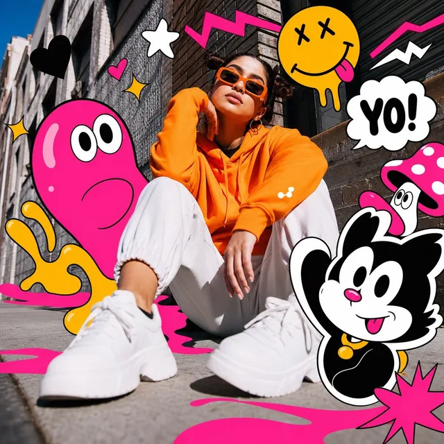
ภาพบุคคลแนวป๊อปอาร์ต ผสมผสานสื่อหลากหลายในเมือง
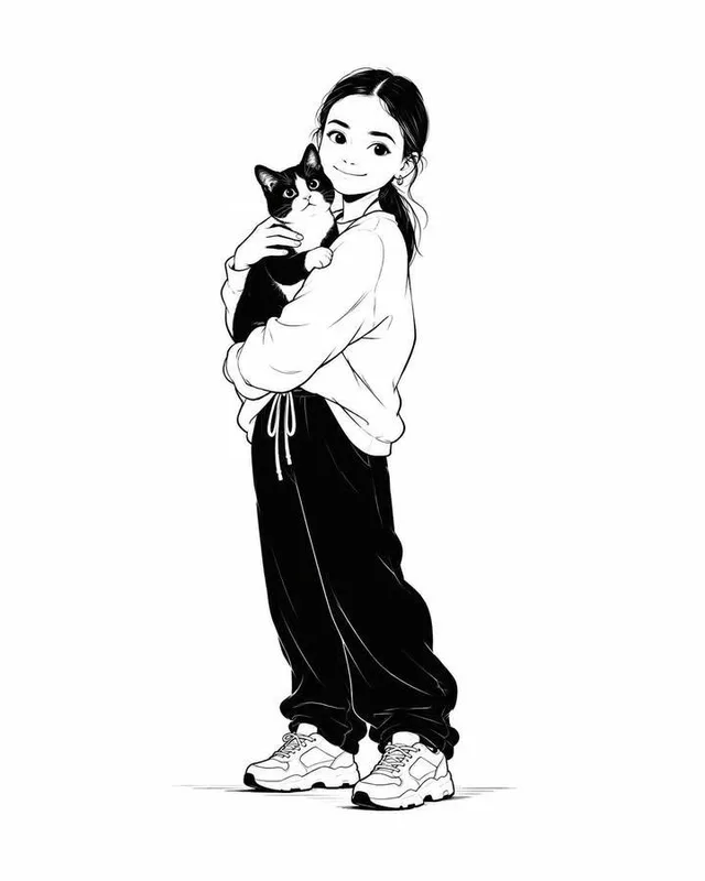
ออกแบบตัวละครภาพประกอบแฟชั่นขาวดำมินิมอล