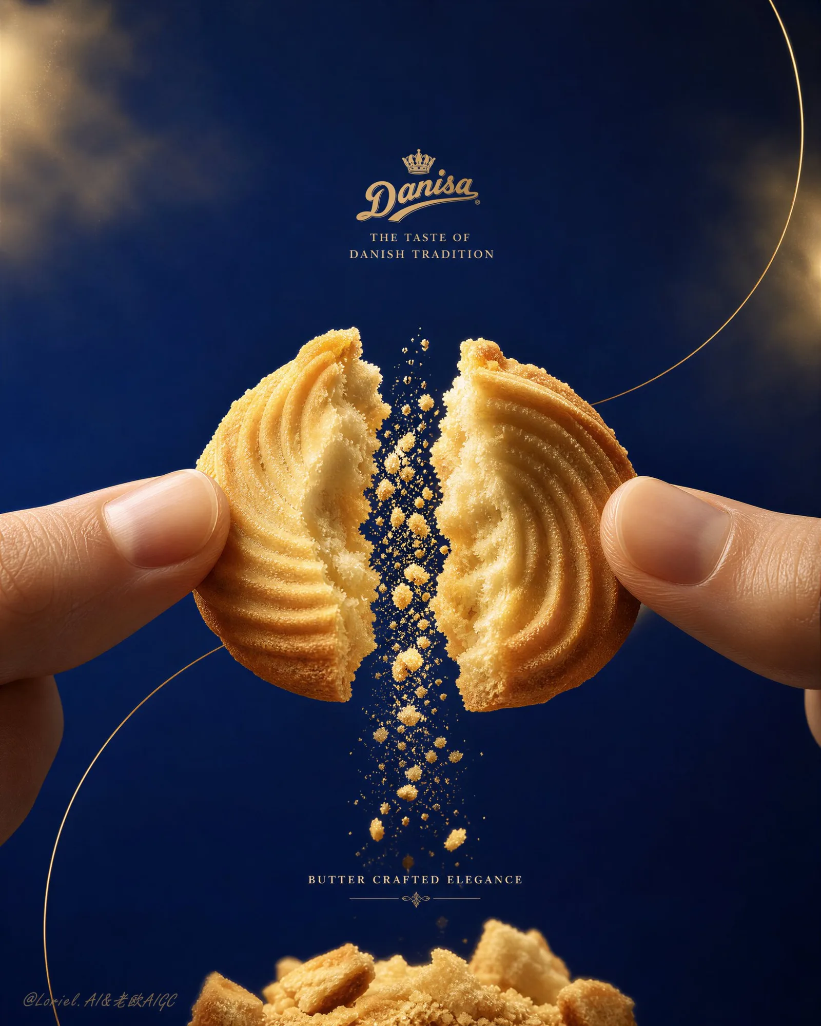
โปสเตอร์สุดหรู: คุกกี้ DANISA แตกหักอย่างงดงาม
ที่มา: @ou_zhen599โมเดล: ChatGPT
ภาพตัวอย่าง
พรอมต์ภาษาไทย
สร้างโปสเตอร์เชิงพาณิชย์ระดับพรีเมียมสำหรับ DANISA Butter Cookies โดยเน้นแนวทาง Milk Cloud Orbit ให้ถึงขีดสุด ในขณะที่ขยาย Negative space ให้กว้างขึ้น เพิ่มความเข้มข้นของบรรยากาศหรูหราด้วยสี royal-blue และ champagne-gold และขยายแรงตึงของรอยแตกตรงกลาง ภาพต้องเน้นคุกกี้ Danisa butter cookie แท้หนึ่งชิ้นที่ถูกนิ้วมือที่สง่างามสองข้างหักออกอย่างประณีต หยุดนิ่งในชั่ววินาทีของการแตกหัก โดยมีช่องว่างที่แคบและตึงเครียดระหว่างสองซีก และมีเกล็ดบิสกิตเนยและฝุ่นบิสกิตละเอียดตกลงมาตรงกลางอย่างหรูหรา ผลงานสุดท้ายต้องให้ความรู้สึกระดับนักสะสม, สง่างามราวกับกล่องอัญมณี, hyper-realistic และระดับโลกเหมือนแคมเปญแบรนด์ Danish butter-cookie ระดับโลก ใช้การสร้างแบรนด์ที่เน้นภาษาอังกฤษเป็นหลัก โดยมีโลโก้ Danisa อย่างเป็นทางการน้อยที่สุดและใช้ typography ระดับพรีเมียมอย่างจำกัดมาก Core composition: ใช้องค์ประกอบแนวตั้งสูง โดยมีคุกกี้เนยพระเอกอยู่กึ่งกลางเฟรมอย่างแม่นยำ ถูกจับอย่างประณีตด้วยปลายนิ้วสองข้างที่เข้ามาจากขอบซ้ายและขวา คุกกี้ต้องถูกแบ่งออกเป็นสองซีกที่สมดุลโดยมีรอยแตกที่ตระการตาและหยุดนิ่งอยู่ตรงแกนกลาง ขยายพื้นที่ว่างที่สะอาดรอบๆ อย่างมีนัยสำคัญ เพื่อให้ผลิตภัณฑ์ครอบครองพื้นที่ตรงกลางที่กระชับขึ้น และส่วนที่เหลือของเฟรมหายใจด้วยความยับยั้งชั่งใจที่หรูหรา องค์ประกอบต้องให้ความรู้สึกเป็นไอคอน, ยกระดับ และมุ่งเน้นไปที่ช่วงเวลาของการหักอย่างเต็มที่ Central fracture tension: สิ่งนี้สำคัญมาก รอยแตกต้องรู้สึกคมชัดขึ้น แน่นขึ้น และน่าตื่นเต้นขึ้น ราวกับว่าคุกกี้เพิ่งถึงเสี้ยววินาทีที่สวยงามที่สุดของการแตกออก สองซีกควรให้ความรู้สึกตึงเครียดทางสายตา โดยมีเส้นรอยแตกที่คมชัด, อนุภาคเกล็ดที่แขวนอยู่, เศษเนยทรายที่ละเอียดอ่อน และการตกลงมาของเกล็ดในแนวตั้งที่ควบคุมได้ผ่านช่องว่างตรงกลาง รอยแตกตรงกลางต้องกลายเป็นแกนหลักทางอารมณ์และภาพของโปสเตอร์อย่างแท้จริง Milk Cloud Orbit enhancement: ผลักดันความสมจริงของพื้นผิวให้ลึกซึ้งยิ่งขึ้น ภายในที่แตกหักต้องให้ความรู้สึกเป็นเนยมากขึ้น เป็นทรายมากขึ้น ละเอียดอ่อนมากขึ้น และน่าสัมผัสมากขึ้น เสริมความละเอียดของเม็ดเกล็ด, ความเข้มข้นของเนยแห้ง, พื้นผิวร่อง, ความคมของขอบ, ชั้นเกล็ดที่ตกลงมา, ความสมจริงของผิวปลายนิ้ว และฝุ่นละอองที่ส่องสว่างอย่างอบอุ่น เพื่อให้ทุกพื้นผิวรู้สึกระดับนักสะสม คุกกี้ควรดูเข้มข้น, หนาแน่น, เปราะบาง และเพิ่งแตกใหม่ๆ Hero product logic: ผลิตภัณฑ์ต้องอ่านได้ทันทีว่าเป็น Danisa Danish butter cookies แท้ๆ แสดงให้เห็นพื้นผิวคุกกี้เนยที่เข้มข้นแบบคลาสสิก, ร่องพื้นผิวที่สง่างาม, ขอบสีทองที่อบอย่างละเอียดอ่อน และลักษณะบิสกิตระดับพรีเมียมที่หนาแน่นแต่ร่วนซุย ภายในที่แตกหักต้องให้ความรู้สึกเป็นเนย, เป็นชั้น, เป็นทราย และเปราะบางอย่างประณีต โดยมีเม็ดเกล็ดที่มองเห็นได้และรายละเอียดรอยแตกที่ละเอียด คุกกี้ต้องให้ความรู้สึกหนา, พรีเมียม และมีมรดกที่ยาวนาน ไม่ใช่แบบอุตสาหกรรมหรือของปลอม Finger styling: ปลายนิ้วต้องให้ความรู้สึกสะอาด, สง่างาม, เป็นธรรมชาติ และพรีเมียม พื้นผิวผิวหนังควรนุ่มและสมจริง ด้วยท่าทางที่ละเอียดอ่อนและไม่มีสิ่งรบกวน บทบาทเดียวของมันคือการสนับสนุนช่วงเวลาของการหัก, เน้นขนาดของพื้นผิว และจัดกรอบรอยแตกตรงกลางอย่างสวยงาม Crumb cascade and base: ปล่อยให้ฝุ่นคุกกี้ละเอียดและอนุภาคที่แตกหักขนาดใหญ่กว่าตกลงมาจากช่องว่างตรงกลางเป็นกองเกล็ดเนยที่ละเอียดอ่อน และชิ้นส่วนคุกกี้ที่แตกหักสองสามชิ้นด้านล่าง ฐานเกล็ดด้านล่างต้องให้ความรู้สึกสดใหม่, สัมผัสได้ และหรูหรา โดยมีความหลากหลายที่ชัดเจนตั้งแต่ผงจนถึงชิ้นส่วนขนาดใหญ่ ควบคุมการตกลงมาให้เป็นรูปปั้น และน่ารับประทาน Negative space: สิ่งนี้สำคัญมาก ขยายพื้นที่ว่างรอบๆ ให้กว้างขึ้น เพื่อให้คุกกี้พระเอกและรอยแตกของมันรู้สึกยกระดับมากขึ้น, ดูเหมือนในภาพยนตร์มากขึ้น และพรีเมียมมากขึ้น พื้นที่ที่ไม่ได้ใช้งานต้องให้ความรู้สึกตั้งใจ, หรูหรา และขับเคลื่อนด้วยแบรนด์ ทำให้ช่วงเวลาของการหักตรงกลางอ่านได้เหมือนวัตถุอัญมณีภายในโปสเตอร์หรูหรา อย่าทำให้พื้นที่นี้รกไปด้วยอุปกรณ์ประกอบฉากหรือข้อความขนาดใหญ่เกินไป Blue-and-gold atmosphere: ผลักดันเอกลักษณ์ royal-blue และ champagne-gold ให้หนักขึ้น ปล่อยให้พื้นหลัง, แสงเน้น และอารมณ์โดยรวมของโปสเตอร์เปลี่ยนไปสู่ระบบความหรูหราที่เย็นกว่า, สูงส่งกว่า, เหมือนอัญมณีมากขึ้น ความคมชัดระหว่างพื้นที่เงาสี deep royal blue และไฮไลต์สี warm butter-gold ต้องให้ความรู้สึกเข้มข้นและมีเกียรติมากขึ้น ในขณะที่ตัวคุกกี้ยังคงอบอุ่น, เป็นเนย และสมจริง ภาพควรให้ความรู้สึกเหมือนแคมเปญมรดกกล่องดีบุกระดับพรีเมียมที่ยกระดับเป็นผลงานชิ้นเอกของแบรนด์ยุคใหม่ Background and environment: ใช้พื้นหลังที่เรียบง่ายและเรียบเนียน โดยมีสี deep royal blue, warm ivory และ champagne-gold ที่ละเอียดอ่อนเป็นโทนสีที่เปลี่ยนผ่านไปมา ให้มันดูสะอาด, สง่างาม และมีบรรยากาศที่นุ่มนวล โดยไม่มีสิ่งรบกวนและไม่มีฉากพิเศษ พื้นหลังควรทำหน้าที่เหมือนเวทีหรูหราสำหรับคุกกี้และเกล็ดที่ตกลงมา Typography and branding: ใช้ typography ที่เน้นภาษาอังกฤษเป็นหลัก โดยมีข้อความสั้นๆ ที่ละเอียดอ่อน เช่น “Butter Crafted Elegance” หรือ “The Taste of Danish Tradition” รักษา typography ให้กระชับ, สง่างาม และเป็นรองภาพ เพิ่มโลโก้ Danisa อย่างเป็นทางการที่ดูเรียบง่ายเท่านั้น โปสเตอร์ต้องยังคงเน้นภาพมากกว่าข้อความ Lighting: ใช้แสงเชิงพาณิชย์ระดับ high-end ที่ละเอียดอ่อนอย่างยิ่ง ด้วยการจัดแสงแบบ cinematic ที่อบอุ่น ให้แสงเผยให้เห็นเนื้อคุกกี้, ขอบรอยแตก, ฝุ่นเกล็ด, รายละเอียดปลายนิ้ว และอนุภาคที่ตกลงมาด้วยการลดแสงไฮไลต์แบบพรีเมียมที่สง่างาม ฉากต้องเปล่งประกายด้วยความอบอุ่นของเนย ในขณะที่ยังคงความลึกของเงาที่นุ่มนวลและคอนทราสต์ที่หรูหราแบบ blue-gold Material realism: ผลักดันความสมจริงให้ถึงขีดสุด คุกกี้เนยต้องให้ความรู้สึกหนาแน่น, เป็นทราย, กรอบ และเปราะบาง ขอบรอยแตกต้องแสดงโครงสร้างเกล็ดที่น่าเชื่อถือ อนุภาคที่ตกลงมาต้องให้ความรู้สึกมีน้ำหนักและเป็นธรรมชาติ ชิ้นเกล็ดขนาดใหญ่ต้องให้ความรู้สึกกรอบและเพิ่งแตกใหม่ๆ ผิวหนัง, เกล็ด และพื้นผิวคุกกี้ทั้งหมดต้องให้ความรู้สึกระดับนักสะสมและสัมผัสได้ Color direction: ใช้ชุดสีหรูหราที่ละเอียดอ่อนของ butter gold, baked biscuit beige, royal blue, warm ivory และ champagne-gold highlights ที่ละเอียดอ่อน ภาพต้องให้ความรู้สึกหรูหรา, กระตุ้นความอยากอาหาร และมีเอกลักษณ์ของ Danisa ในอารมณ์ โดยมีชื่อเสียงแบบ blue-gold ที่แข็งแกร่งกว่าเดิม Mood: Danish butter-cookie luxury, jewel-box heritage elegance, central snap tension, premium biscuit realism, collector-grade confectionery campaign, refined indulgence, blue-gold prestige Rendering style: ultra-premium biscuit advertising poster, Milk Cloud Orbit enhancement, centered broken Danisa butter cookie held by fingertips, enlarged negative space, intensified central fracture tension, suspended crumb cascade, stronger royal-blue and champagne-gold atmosphere, minimal heritage branding, soft cinematic lighting, extreme fracture realism, editorial confectionery campaign aesthetic, 8k Negative prompt: cheap supermarket flyer style, oversized text, messy hands, fake cookie texture, plastic-looking crumbs, weak fracture detail, cluttered background, cartoon styling, greasy look, low-resolution texture, chaotic props, distorted branding, weak product focus, insufficient negative space
พรอมต์ภาษาอังกฤษ
Create an ultra-premium commercial poster for DANISA Butter Cookies, pushing the Milk Cloud Orbit direction to the extreme while further enlarging the negative space, intensifying the royal-blue and champagne-gold luxury atmosphere, and amplifying the central fracture tension. The image must center on one authentic Danisa butter cookie being cleanly snapped open by two elegant fingertips, frozen at the exact peak instant of breakage, with a narrow high-tension gap between the halves and a luxurious cascade of buttery crumbs and fine biscuit dust falling through the center. The final artwork must feel collector-grade, jewel-box elegant, hyper-realistic, and globally premium, like a world-class Danish butter-cookie brand campaign. Use English-first branding only, with minimal official Danisa logo presence and extremely restrained premium typography. Core composition: Use a tall vertical composition with the hero butter cookie exactly centered in the frame, held delicately by two fingertips entering from the left and right edges. The cookie must be split into two balanced halves with a dramatic suspended break aligned to the center axis. Expand the surrounding clean space significantly so the product occupies a tighter central zone and the rest of the frame breathes with expensive restraint. The composition must feel iconic, elevated, and fully focused on the snap moment. Central fracture tension: This is critical. The break must feel sharper, tighter, and more dramatic, as if the cookie has just reached the most beautiful millisecond of snapping apart. The two halves should feel visually loaded with tension, with crisp fracture lines, suspended crumb particles, delicate butter-sand debris, and a controlled vertical fall of crumbs through the center gap. The middle break must become the absolute emotional and visual core of the poster. Milk Cloud Orbit enhancement: Push tactile realism much further. The broken interior must feel more buttery, more sandy, more delicate, and more touchable. Enhance the fine crumb granules, dry-butter richness, ridge texture, edge sharpness, falling crumb layers, fingertip skin realism, and warm illuminated particle dust so every surface feels collector-grade. The cookie should look rich, dense, fragile, and freshly broken. Hero product logic: The product must read instantly as authentic Danisa Danish butter cookies. Show the classic rich butter-cookie texture, elegant ridged surface logic, delicate baked golden edges, and dense yet crumbly premium biscuit character. The broken interior must feel buttery, layered, sandy, and exquisitely fragile, with visible crumb granules and refined fracture detail. The cookie must feel thick, premium, and heritage-rich, never industrial or fake. Finger styling: The fingertips must feel clean, elegant, natural, and premium. Skin texture should be soft and realistic, with refined pose logic and no distraction. Their only role is to support the snap moment, emphasize texture scale, and frame the central fracture beautifully. Crumb cascade and base: Let fine cookie dust and larger broken particles fall from the center gap into a refined pile of buttery crumbs and a few broken cookie chunks below. The lower crumb bed must feel fresh, tactile, and luxurious, with clear variation from powder to chunk. Keep the fall controlled, sculptural, and appetizing. Negative space: This is critical. Further enlarge the empty surrounding space so the hero cookie and its fracture feel more elevated, more cinematic, and more premium. The unused space must feel intentional, expensive, and brand-led, making the central snap moment read like a jewel object inside a luxury poster. Do not clutter this space with props or oversized text. Blue-and-gold atmosphere: Push the royal-blue and champagne-gold identity much harder. Let the background, light accents, and overall poster mood shift into a cooler, nobler, more jewel-like luxury system. The contrast between deep royal blue shadow fields and warm butter-gold highlights must feel richer and more prestigious, while the cookie itself remains warm, buttery, and realistic. The image should feel like a premium tin-box heritage campaign elevated into a modern brand masterpiece. Background and environment: Use a minimal smooth background with deep royal blue, warm ivory, and restrained champagne-gold tonal transitions. Keep it clean, elegant, and softly atmospheric, with no clutter and no extra scenery. The background should function like a luxury stage for the cookie and falling crumbs. Typography and branding: Use English-first typography with a very short refined line such as “Butter Crafted Elegance” or “The Taste of Danish Tradition”. Keep the typography compact, elegant, and secondary to the image. Add only a discreet official Danisa logo presence. The poster must remain image-led rather than text-led. Lighting: Use extremely delicate high-end commercial lighting with warm cinematic shaping. Let the light reveal cookie grain, fracture edges, crumb dust, fingertip detail, and falling particles with graceful premium highlight rolloff. The scene must glow with buttery warmth while maintaining soft shadow depth and blue-gold luxury contrast. Material realism: Push realism to the maximum. The butter cookie must feel dense, sandy, crisp, and fragile. The break edge must show believable crumb structure. The falling particles must feel weighty and natural. Larger crumb chunks must feel crisp and freshly broken. Skin, crumbs, and cookie surfaces must all feel collector-grade and touchable. Color direction: Use a refined luxury palette of butter gold, baked biscuit beige, royal blue, warm ivory, and restrained champagne-gold highlights. Keep the image luxurious, appetite-driven, and distinctly Danisa in mood, with stronger blue-gold prestige than before. Mood: Danish butter-cookie luxury, jewel-box heritage elegance, central snap tension, premium biscuit realism, collector-grade confectionery campaign, refined indulgence, blue-gold prestige Rendering style: ultra-premium biscuit advertising poster, Milk Cloud Orbit enhancement, centered broken Danisa butter cookie held by fingertips, enlarged negative space, intensified central fracture tension, suspended crumb cascade, stronger royal-blue and champagne-gold atmosphere, minimal heritage branding, soft cinematic lighting, extreme fracture realism, editorial confectionery campaign aesthetic, 8k Negative prompt: cheap supermarket flyer style, oversized text, messy hands, fake cookie texture, plastic-looking crumbs, weak fracture detail, cluttered background, cartoon styling, greasy look, low-resolution texture, chaotic props, distorted branding, weak product focus, insufficient negative space
พรอมต์ภาษาจีน
为皇冠丹麦曲奇(DANISA Butter Cookies)制作一张超高端商业海报,将“牛奶云轨道”方向推向极致,同时进一步扩大留白,强化皇室蓝与香槟金的奢华氛围,并放大中央断裂的张力。画面必须以一块真实的皇冠丹麦曲奇为中心,它被两个优雅的指尖干净利落地掰开,冻结在破碎的最巅峰瞬间,两半之间留有一条窄窄的高张力缝隙,奢华的黄油碎屑和精细的饼干粉末从中心倾泻而下。最终的作品必须具有收藏级质感、珠宝盒般的优雅、超写实且具备全球顶尖品质,就像一场世界级的丹麦曲奇品牌活动。仅使用英语优先的品牌设计,带有极简的皇冠官方标志,以及极其克制的高级排版。 核心构图: 采用高耸的垂直构图,主角曲奇准确位于画面中央,由从左右边缘伸入的两个指尖细腻地捏住。曲奇必须分成平衡的两半,并在中轴线上呈现充满戏剧性的悬浮断裂。大幅扩展周围的干净空间,使产品占据更紧凑的中心区域,而画面的其余部分则散发着昂贵的克制感。构图必须具有标志性、高级感,并完全聚焦于折断的瞬间。 中央断裂张力: 这是至关重要的。断裂感必须更锋利、更紧凑、更有戏剧性,仿佛曲奇刚刚达到掰开时最美的毫秒瞬间。两半曲奇在视觉上应充满张力,拥有清晰的断裂纹路、悬浮的碎屑颗粒、细腻的黄油沙质残渣,以及碎屑穿过中心缝隙受控的垂直落下。中间的断裂必须成为海报绝对的情感和视觉核心。 牛奶云轨道增强: 进一步提升触觉写实感。破碎的内部必须感觉更有黄油感、更具沙质、更细腻、更真实可感。增强细小的碎屑颗粒、干黄油的丰盈度、纹路质感、边缘锐度、掉落的碎屑层、指尖皮肤的写实感以及温暖的照明微尘,使每个表面都达到收藏级水平。曲奇看起来应该浓郁、致密、脆弱且新鲜折断。 主角产品逻辑: 产品必须能让人立刻认出是正宗的皇冠丹麦曲奇。展示经典的浓郁黄油曲奇质感、优雅的棱纹表面逻辑、细腻的烘烤金色边缘,以及致密而酥脆的高级饼干特性。破碎的内部必须感觉充满黄油、层次分明、呈沙状且精致脆弱,带有可见的碎屑颗粒和精细的断裂细节。曲奇必须感觉厚实、高端且富有传承感,绝非工业化或虚假的产品。 手指造型: 指尖必须感觉干净、优雅、自然且高端。皮肤纹理应柔软写实,具有精细的姿势逻辑且不产生干扰。它们的唯一作用是支撑折断瞬间,强调质感比例,并精美地框住中央断裂处。 碎屑倾泻与基底: 让细小的饼干粉尘和较大的破碎颗粒从中心缝隙掉落,落入下方由黄油碎屑和几块破碎曲奇块组成的精制堆簇中。底部的碎屑层必须感觉新鲜、真实且奢华,从粉末到碎块有明显的视觉变化。保持掉落过程受控、具有雕塑感且令人垂涎。 留白: 这是至关重要的。进一步扩大周围的空白区域,使主角曲奇及其断裂感显得更高级、更具电影感且更高端。未使用的空间必须感觉是有意为之的、昂贵的且由品牌主导的,使中央的折断瞬间读起来就像奢华海报中的珠宝首饰。不要用道具或过大的文字塞满这个空间。 蓝金氛围: 更强力地推行皇室蓝与香槟金的身份识别。让背景、光影细节和整体海报氛围转向更冷色调、更显赫、更像珠宝般的奢华体系。深邃的皇室蓝阴影区域与温暖的黄油金色高光之间的对比必须感觉更丰富、更威严,而曲奇本身则保持温暖、黄油感和写实感。图像应感觉像是一场提升为现代品牌杰作的高端铁盒传承活动。 背景与环境: 使用极简的光滑背景,带有深皇室蓝、暖象牙色和克制的香槟金影调过渡。保持干净、优雅且柔和的氛围,没有杂乱,没有额外场景。背景应像一个为曲奇和掉落碎屑准备的奢华舞台。 排版与品牌: 使用英语优先的排版,搭配非常简洁精炼的短句,如“Butter Crafted Elegance”或“The Taste of Danish Tradition”。保持排版紧凑、优雅,并次于图像。仅添加低调的皇冠官方标志。海报必须保持图像主导,而非文字主导。 灯光: 使用极其细腻的高端商业照明,带有温暖的电影感塑造。让光线展现曲奇纹理、断裂边缘、碎屑粉尘、指尖细节和掉落颗粒,并带有优雅的高级高光衰减。场景必须焕发出黄油般的温暖,同时保持柔和的阴影深度和蓝金奢华对比。 材质写实感: 将写实感推向极致。黄油曲奇必须感觉致密、沙质、酥脆且脆弱。断裂边缘必须展示可信的碎屑结构。掉落的颗粒必须感觉有重量感且自然。较大的碎屑块必须感觉酥脆且新鲜折断。皮肤、碎屑和曲奇表面都必须感觉是收藏级的且真实可感。 色彩方向: 使用由黄油金、烘烤饼干米色、皇室蓝、暖象牙色和克制的香槟金高光组成的精制奢华调色板。保持图像奢华、激发食欲,并具有明显的皇冠品牌氛围,具有比以前更强的蓝金威望感。 情绪: 丹麦黄油曲奇奢华感,珠宝盒传承优雅,中央折断张力,高端饼干写实感,收藏级糖果活动,精致的享受,蓝金威望感 渲染风格: 超高端饼干广告海报,牛奶云轨道增强,指尖捏住的居中断裂皇冠丹麦曲奇,扩大的留白空间,强化的中央断裂张力,悬浮的碎屑倾泻,更强的皇室蓝与香槟金氛围,极简传承品牌,柔和的电影感灯光,极致的断裂写实感,社论糖果活动美学,8k 负面提示词: 廉价超市传单风格,过大的文字,凌乱的手,虚假的曲奇质感,塑料感的碎屑,微弱的断裂细节,杂乱的背景,卡通造型,油腻感,低分辨率纹理,混乱的道具,扭曲的品牌设计,弱化的产品焦点,留白不足
พรอมต์แนะนำ
8 พรอมต์คัดสรร
สาวผมแดงในสตูดิโอ: แฟชั่นมินิมัลลิสต์

สาวเอเชียในชุดคาร์ดิแกนสีฟ้ามิสต์กับกระโปรงขาว

สาวเอเชียในชุดสีน้ำเงิน บนโซฟาหรูในโรงแรม

โปสเตอร์อินโฟกราฟิกสูตรอาหารระดับพรีเมียม

สาวชุดว่ายน้ำขาว-ฟ้า สาดน้ำทะเลริมหาด

ถ่ายภาพคอสเพลย์ฤดูร้อนสไตล์เซลฟี่จากมือถือ

สาวงามฮ่องกงยุค 80s ริมทะเลสาบ

สาวเกาหลี 20 ต้นๆ: ภาพบุคคลระยะใกล้สมจริง