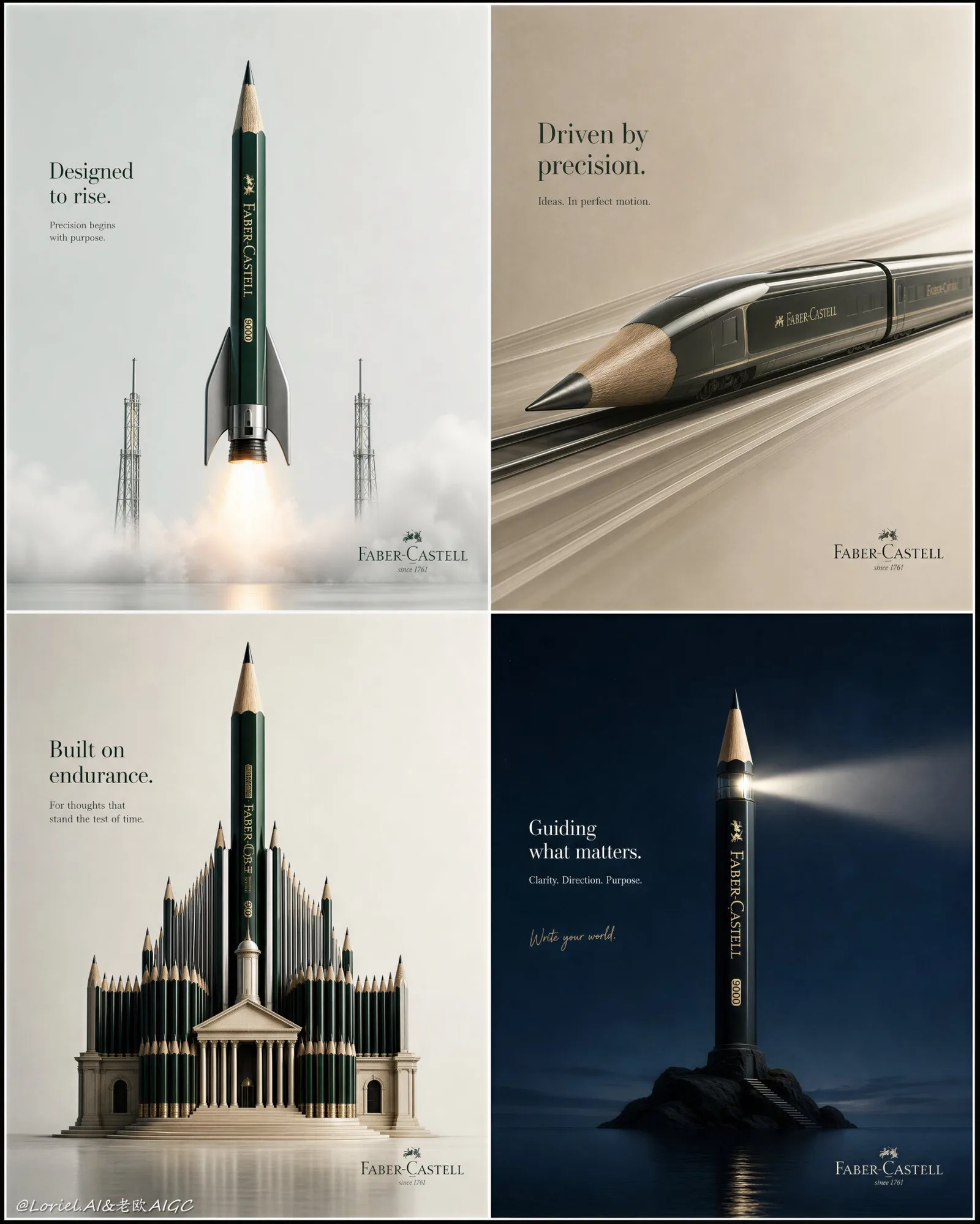
แคมเปญบอร์ด Faber-Castell: ดินสอในคอนเซ็ปต์หรู 4 ช่อง
ที่มา: @ou_zhen599โมเดล: ChatGPT
ภาพตัวอย่าง
พรอมต์ภาษาไทย
สร้างแคมเปญบอร์ดแนวตั้ง 4 ช่องแบบ ultra-premium สำหรับดินสอ Faber-Castell ซึ่งออกแบบเป็นตาราง 2x2 ที่ประณีตของโปสเตอร์โฆษณามินิมอล 4 ชิ้นที่สะสมได้ โดยรวมเป็นแผ่นนำเสนอที่หรูหราหนึ่งเดียว รักษาแนวคิดหลักเดียวกันของภาพปาฏิหาริย์ที่ใช้ดินสอเป็นพื้นฐานสี่แบบที่แตกต่างกัน แต่ผลักดันแคมเปญไปในทิศทางที่แพงขึ้น สุขุมขึ้น และมีคุณภาพระดับแกลเลอรีมากขึ้น: ความคมชัดของสีที่แข็งแกร่งขึ้นระหว่างสี่ช่องว่าง มีพื้นที่หายใจมากขึ้น มี negative space มากขึ้น ข้อความน้อยลง และให้ความรู้สึกเหมือนหนังสือออกแบบระดับสากลที่ซับซ้อนยิ่งขึ้น แต่ละช่องทั้งสี่จะต้องนำเสนอ Faber-Castell pencil จริงในฐานะผลิตภัณฑ์ที่เป็นฮีโร่หลักอย่างแท้จริง ซึ่งถูกเปลี่ยนให้เป็นแนวคิด object-fusion ที่สร้างสรรค์สูงแบบต่างๆ ด้วยความสมจริงที่ไร้รอยต่อ และไม่มีความรู้สึกไม่เป็นธรรมชาติในการมองเห็นเลย ทุกช่องจะต้องให้ความรู้สึกเหมือนเป็นโฆษณาสิ่งพิมพ์ระดับพรีเมียมที่สามารถยืนเดี่ยวได้ แต่เมื่อรวมกันแล้ว ควรให้ความรู้สึกเหมือนเป็นบอร์ดนำเสนอข้อเสนอแบรนด์ระดับสูง ตัวผลิตภัณฑ์เองจะต้องยังคงมีความสมจริงสูงและจดจำได้เสมอ: สัดส่วนที่แท้จริงของ Faber-Castell, ตัวด้ามที่เคลือบเงาจริง, ลายไม้ที่เหลาแล้ว, texture ของปลายกราไฟต์, รายละเอียดแบรนด์ที่พิมพ์อย่างพรีเมียม และความเที่ยงตรงของวัสดุที่ไร้ที่ติ ผลักดันความหรูหราทางสายตาให้มากขึ้นอีกโดยทำให้ทั้งสี่ช่องสะอาดตาและกว้างขวางขึ้น ให้แต่ละช่องมีพื้นหลังที่ว่างเปล่ามากขึ้น มีความสุภาพเรียบร้อยอย่างเป็นทางการมากขึ้น และจัดวางวัตถุฮีโร่ได้อย่างสง่างามมากขึ้น หลีกเลี่ยงการเติมเต็มกรอบมากเกินไป ปล่อยให้วัตถุปาฏิหาริย์อยู่ในสนามของ negative space ที่ทรงพลังมากขึ้น เพื่อให้แต่ละแนวคิดรู้สึกเป็นสัญลักษณ์และมีราคาแพงมากขึ้น การจัดเรียงตัวอักษรจะต้องลดลงกว่าเดิม: มีเพียงพาดหัวภาษาอังกฤษที่กระชับ, บรรทัดสนับสนุนเล็กๆ, เครื่องหมายแบรนด์ Faber-Castell อย่างเป็นทางการที่ละเอียดอ่อน, และหากต้องการ วลีเน้นสไตล์ลายมือที่สุภาพหนึ่งวลี ข้อความจะต้องให้ความรู้สึกเบาลง เงียบขึ้น และมั่นใจมากขึ้น ไม่เคยเสียงดังหรือยุ่งเหยิง ทำให้ระบบสีทั้งสี่มีความแตกต่างกันอย่างชัดเจนและหรูหรามากขึ้นในความคมชัดซึ่งกันและกัน: ช่องที่ 1: แนวคิด pencil-rocket แห่งอนาคตในพื้นที่สีเทาอ่อนหรือสีขาวนวล โดยมีดินสอเปลี่ยนเป็นยานยิงที่เพรียวบาง ใช้ชุดสีพรีเมียมที่เย็นตา เช่น emerald green, metallic silver, graphite black, และ faint launch-fire amber วัตถุควรให้ความรู้สึกที่ถูกออกแบบทางวิศวกรรม, มีหลักอากาศพลศาสตร์, และคมชัดทางสายตา ล้อมรอบด้วย negative space ที่สะอาด และความรู้สึกของการทะยานขึ้นอย่างละเอียดอ่อน ช่องที่ 2: แนวคิด pencil-high-speed-train โดยมีปลายกราไฟต์ที่เหลาแล้วเป็นจมูกที่มีหลักอากาศพลศาสตร์ และตัวด้ามขยายออกไปเป็นเครื่องจักรรางที่เพรียวบาง ใช้ชุดสีที่แตกต่างไปจากเดิมอย่างสิ้นเชิง เช่น warm stone beige, charcoal, muted olive, และ brushed steel ฉากควรให้ความรู้สึกรวดเร็วแต่สงบนิ่ง สง่างามแต่แม่นยำ พร้อมพื้นหลังที่น้อยลงและมีสัญญาณการเคลื่อนไหวที่ประณีตมากขึ้น ช่องที่ 3: แนวคิด pencil-architecture ที่ดินสอก่อตัวเป็นอนุสาวรีย์ทางวัฒนธรรมอันยิ่งใหญ่หรือห้องสมุด โดยมีดินสอตั้งตรงที่โดดเด่นหนึ่งแท่งเป็นยอดแหลมกลาง ใช้ชุดสีที่เข้มข้นแต่มีระเบียบวินัย เช่น soft limestone, ivory, deep forest green, และ antique bronze องค์ประกอบควรเป็นแนวหน้า, สง่างาม, และยิ่งใหญ่ ด้วยศักดิ์ศรีในแนวตั้งที่แข็งแกร่ง และ negative space ที่กว้างขวางรอบโครงสร้าง ช่องที่ 4: แนวคิด pencil-object metaphor ด้วยความฉลาดแบบมินิมอลที่ยิ่งใหญ่กว่า เช่น ดินสอที่เปลี่ยนเป็นประภาคาร, สะพาน, คทาของวาทยกร, หรือเครื่องมือปีนเขา แนวคิดจะต้องให้ความรู้สึกที่เป็นบทกวี, ระดับปรมาจารย์, และบริสุทธิ์ทางสายตา ใช้ชุดสีที่โดดเด่นและแตกต่างจากอีกสามช่องอย่างสิ้นเชิง เช่น deep midnight blue, warm ivory, และ accent สีเดี่ยวที่อิ่มตัว หรือ rich burgundy กับ pale blush และ matte black รักษามันให้เป็นช่องที่สุภาพและมีศิลปะมากที่สุดในบรรดาสี่ช่อง ทั้งสี่ช่องจะต้องไม่ให้ความรู้สึกซ้ำซาก แต่ละช่องควรใช้จังหวะการจัดองค์ประกอบ, สเกล, ตรรกะของมุมมอง, และโทนอารมณ์ที่แตกต่างกัน แต่ทั้งหมดควรมี realism ระดับพรีเมียมและความฉลาดแบบมินิมอลที่เหมือนกัน ความคมชัดของสีระหว่างโปสเตอร์ทั้งสี่ควรชัดเจนตั้งแต่แรกเห็น แต่แต่ละชุดสีจะต้องยังคงความสง่างามและควบคุมได้ ไม่ใช่เสียงดัง แผ่นงานทั้งหมดควรให้ความรู้สึกเหมือนแคมเปญแบรนด์ที่ได้รับเลือกให้ลงใน Annual การออกแบบระดับสากล การจัดเรียงตัวอักษรทั่วทั้งโปสเตอร์ทั้งสี่ควรเป็นทางการ, ระดับพรีเมียม, และมีความสุภาพเรียบร้อยสูง ใช้เพียงชื่อภาษาอังกฤษที่กระชับ พร้อมสำเนาสนับสนุนที่น้อยที่สุด และการระบุโลโก้ที่ละเอียดอ่อนมาก วลีลายมือ หากรวมอยู่ ควรมีขนาดเล็ก, สง่างาม, และเป็นรอง ข้อความไม่ควรแข่งขันกับผลิตภัณฑ์ มันควรทำหน้าที่เหมือนเสียงกระซิบจากบรรณาธิการมากกว่าเสียงตะโกนโฆษณา ปล่อยให้ negative space และแนวคิดผลิตภัณฑ์เป็นตัวนำพาความหรูหราไป แสงจะต้องนุ่มนวลเป็นพิเศษ, แม่นยำ, และมีคุณภาพเชิงพาณิชย์ระดับพรีเมียมทั่วทั้งสี่ช่อง ใช้ clean directional highlights, crisp edge definition, refined shadow control, subtle reflective behavior, และ tactile material realism เพิ่ม atmospheric cues เพียงเล็กน้อยตามความเหมาะสม เช่น refined motion blur, soft air particles, หรือ delicate launch glow แต่ควบคุมทุกอย่างให้ดี จบแผง 4 ช่องทั้งหมดด้วย subtle heavy print grain และ razor-sharp detail เหมือนกับวัตถุใน luxury print portfolio
พรอมต์ภาษาอังกฤษ
Create an ultra-premium vertical 4-panel campaign board for Faber-Castell pencils, designed as a refined 2x2 grid of four collectible minimalist advertising posters unified into one luxury presentation sheet. Preserve the same core concept of four different pencil-based miracle images, but push the campaign into a more expensive, more restrained, more gallery-grade direction: stronger color contrast between the four panels, more breathing room, more negative space, less text, and a more sophisticated international design-book feeling. Each of the four panels must feature a real Faber-Castell pencil as the absolute hero product, transformed into a different highly creative object-fusion concept with seamless realism and zero visual awkwardness. Every panel must feel like a premium stand-alone print ad, but together they should read like an elite brand proposal board. The product itself must always remain hyper-realistic and recognizable: authentic Faber-Castell proportions, real lacquered body, sharpened wood grain, graphite tip texture, premium printed branding detail, and impeccable material fidelity. Push the visual luxury much further by making the four panels cleaner and more spacious. Give each panel more empty background, more formal restraint, and more elegant placement of the hero object. Avoid filling the frame too much. Let the miracle object sit in a more powerful field of negative space, so each concept feels more iconic and expensive. Typography must be more reduced than before: only a concise English headline, a tiny supporting line, a subtle official Faber-Castell brand mark, and if desired one restrained handwritten-style accent phrase. The text must feel lighter, quieter, and more confident, never loud or busy. Make the four color systems clearly distinct and more luxurious in contrast with each other: Panel 1: a futuristic pencil-rocket concept in a pale cool grey or off-white space, with the pencil transformed into a sleek launch vehicle. Use a cold premium palette of emerald green, metallic silver, graphite black, and faint launch-fire amber. The object should feel engineered, aerodynamic, and visually sharp, surrounded by clean negative space and a subtle sense of lift-off. Panel 2: a pencil-high-speed-train concept, with the sharpened graphite tip forming the aerodynamic nose and the body extending into a streamlined rail machine. Use a completely different palette, such as warm stone beige, charcoal, muted olive, and brushed steel. The scene should feel fast yet calm, elegant yet precise, with even more minimal background and refined motion cues. Panel 3: a pencil-architecture concept, where pencils form a grand cultural monument or library with one dominant upright pencil as the central spire. Use a richer but disciplined palette such as soft limestone, ivory, deep forest green, and antique bronze. The composition should be frontal, poised, and monumental, with strong vertical dignity and generous negative space around the structure. Panel 4: a pencil-object metaphor concept with even greater minimalist intelligence, such as the pencil transformed into a lighthouse, a bridge, a conductor’s baton, or an ascent tool. The concept must feel poetic, master-level, and visually pure. Use a bold contrasting palette that is entirely different from the other three, such as deep midnight blue, warm ivory, and a single saturated accent, or rich burgundy with pale blush and matte black. Keep it the most restrained and artful of all four panels. The four panels must not feel repetitive. Each should use a different compositional rhythm, scale, perspective logic, and emotional tone, but all should share the same premium realism and minimalist intelligence. The color contrast between the four posters should be clear at first glance, yet each palette must remain elegant and controlled rather than noisy. The whole sheet should feel like a brand campaign selected for an international design annual. Typography across all four posters should be official, premium, and highly restrained. Use concise English titles only, with minimal supporting copy and very subtle logo identification. The handwritten phrase, if included, should be tiny, elegant, and secondary. Text should never compete with the product. It should function more like editorial whisper than advertising shout. Allow the negative space and the product idea to carry the luxury. Lighting must be exceptionally soft, precise, and commercial-premium across all four panels. Use clean directional highlights, crisp edge definition, refined shadow control, subtle reflective behavior, and tactile material realism. Add only minimal atmospheric cues where appropriate, such as refined motion blur, soft air particles, or delicate launch glow, but keep everything controlled. Finish the entire 4-panel board with subtle heavy print grain and razor-sharp detail, like a luxury print portfolio object. Avoid childish illustration style, avoid cluttered props, avoid repeated colors, avoid repeated compositions, avoid noisy text, avoid generic school-product advertising, avoid flat lighting, avoid cheap surrealism, avoid awkward product distortion, avoid overfilled layouts, avoid excessive graphic decoration.
พรอมต์ภาษาจีน
为辉柏嘉铅笔创作一个超高端的垂直四格活动展示板,设计成一个由四张具有收藏价值的极简主义广告海报组成的精致2x2网格,统一在一个奢华的展示页面中。保留四个不同的基于铅笔的神奇图像的核心概念,但将活动推向更昂贵、更克制、更画廊级的方向:四个板块之间有更强的色彩对比,更多的负空间,更少的文字,以及更精致的国际设计书感。 四个板块中的每一个都必须以一支真实的辉柏嘉铅笔作为绝对的主角产品,通过无缝的现实主义和零视觉尴尬感,转化为不同的极具创意的物体融合概念。每个板块都必须感觉像是一个高端的独立平面广告,但组合在一起时,它们应该读起来像是一个精英品牌提案板。产品本身必须始终保持超现实且可识别:真实的辉柏嘉比例、真实的漆面笔身、削尖的木纹、石墨笔尖纹理、高端印刷的品牌细节以及无懈可击的材料保真度。 通过让四个板块更整洁、更宽敞,进一步提升视觉奢华感。给每个板块更多的空白背景、更多的形式克制和更优雅的主角物体摆放。避免画面过于拥挤。让神奇物体处于一个更强大的负空间场中,使每个概念都感到更加标志性和昂贵。排版必须比以前更加简化:只有一个简明扼要的英文标题,一行微小的辅助文字,一个微妙的官方辉柏嘉品牌标志,如果需要,还可以有一个克制的手写风格点缀短语。文字必须感觉更轻盈、更安静、更自信,绝不喧闹或杂乱。 让四个色彩系统清晰区分,并在相互对比中显得更奢华: 板块 1:浅冷灰色或米白色空间中的未来主义铅笔火箭概念,铅笔被转化为流线型的运载火箭。使用由祖母绿、金属银、石墨黑和微弱的发射火焰琥珀色组成的冷色调高端调色板。物体应具有工程感、空气动力学感和视觉锐度,周围环绕着干净的负空间和微妙的升空感。 板块 2:铅笔高铁概念,削尖的石墨笔尖形成空气动力学鼻锥,笔身延伸为流线型铁路机器。使用完全不同的调色板,例如暖石色、木炭色、柔和的橄榄色和拉丝钢色。场景应感觉快速而平静,优雅而精确,背景更加极简,动态暗示更加精致。 板块 3:铅笔建筑概念,铅笔构成宏伟的文化纪念碑或图书馆,一支占主导地位的直立铅笔作为中心尖塔。使用更丰富但有节制的调色板,如软石灰石色、象牙色、深森林绿和古董青铜色。构图应是正面的、沉稳的、宏伟的,具有强烈的垂直尊严,建筑周围有大量的负空间。 板块 4:具有更高极简智慧的铅笔物体隐喻概念,例如将铅笔转化为灯塔、桥梁、指挥棒或登山工具。这个概念必须具有诗意、大师级水平且视觉纯净。使用与其他三个完全不同的鲜明对比色调,例如深夜蓝、暖象牙色和单一饱和的点缀色,或深勃艮第红搭配淡粉色和哑光黑。保持它是四个板块中最克制、艺术感最强的一个。 四个板块不得感到重复。每个板块应使用不同的构图节奏、比例、透视逻辑和情感基调,但都应具备相同的高端写实感和极简智慧。四张海报之间的色彩对比应一眼可见,但每个调色板必须保持优雅受控,而非嘈杂。整个页面应感觉像是入选国际设计年鉴的品牌活动。 四张海报的排版应是官方的、高端的且高度克制的。仅使用简短的英文标题,配以极少的辅助文案和非常微妙的标志标识。如果包含手写短语,它应该是微小的、优雅的且次要的。文字绝不能与产品竞争。它的作用应该更像编辑式的低语,而不是广告式的呐喊。让负空间和产品创意来承载奢华感。 光照必须格外柔和、精准且具备商业高端感。使用干净的方向性高光、清晰的轮廓定义、精致的阴影控制、微妙的反射行为和触觉材料写实感。仅在适当的地方添加极少的环境提示,如精致的动态模糊、柔软的空气颗粒或细腻的发射光芒,但保持一切受控。以微妙的重型印刷颗粒和锐利的细节完成整个四格展示板,就像一个奢侈印刷作品集。 避免幼稚的插画风格,避免杂乱的道具,避免重复的颜色,避免重复的构图,避免嘈杂的文字,避免通用的学校产品广告,避免平淡的光照,避免廉价的超现实主义,避免尴尬的产品扭曲,避免过度填充的布局,避免过度的图形装饰。
พรอมต์แนะนำ
8 พรอมต์คัดสรร
สาวผมแดงในสตูดิโอ: แฟชั่นมินิมัลลิสต์

สาวเอเชียในชุดคาร์ดิแกนสีฟ้ามิสต์กับกระโปรงขาว

สาวเอเชียในชุดสีน้ำเงิน บนโซฟาหรูในโรงแรม

โปสเตอร์อินโฟกราฟิกสูตรอาหารระดับพรีเมียม

สาวชุดว่ายน้ำขาว-ฟ้า สาดน้ำทะเลริมหาด

ถ่ายภาพคอสเพลย์ฤดูร้อนสไตล์เซลฟี่จากมือถือ
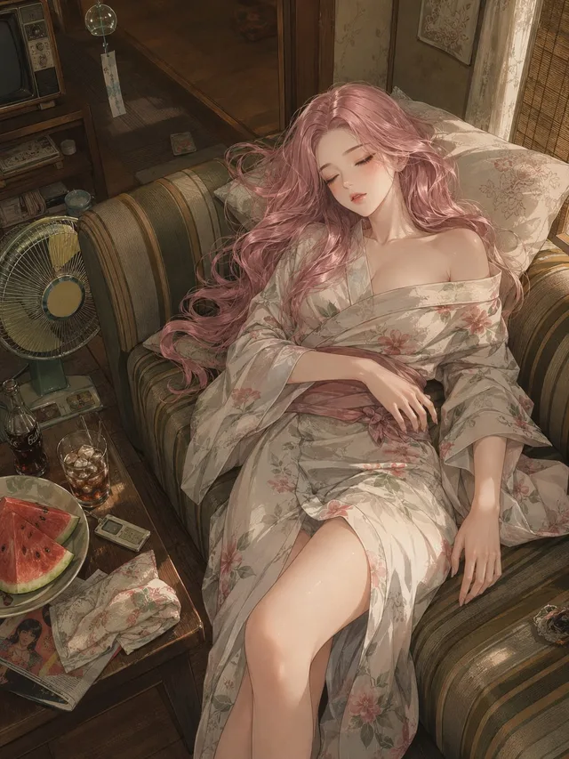
ภาพอนิเมะฤดูร้อนยุคโชวะ: บ่ายวันหยุดที่น่าคิดถึง

สาววินเทจชุดสปอร์ตกับตู้เก็บของ