การออกแบบบรรจุภัณฑ์แตงโมคิรินพรีเมียมสำหรับอีคอมเมิร์ซ
ที่มา: @songguoxiansenโมเดล: ChatGPT
ภาพตัวอย่าง
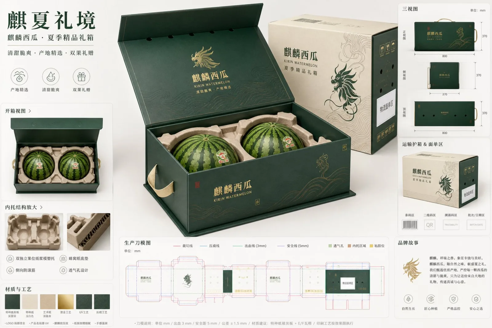
พรอมต์ภาษาไทย
ภารกิจ: ออกแบบบอร์ดนำเสนอแนวคิดบรรจุภัณฑ์สำหรับอีคอมเมิร์ซผลไม้ระดับพรีเมียมสำหรับ "แตงโมคิริน" โดยมีธีม "ฉีเซี่ยหลี่จิง" (ดินแดนฤดูร้อนแห่งของขวัญคิริน) กลุ่มเป้าหมายคือการให้ของขวัญแก่ครอบครัวในเมืองระดับกลางถึงสูง การจัดซื้อเป็นกลุ่มขององค์กร และสถานการณ์กล่องของขวัญบูติกสำหรับอีคอมเมิร์ซผลไม้สด ผลลัพธ์ที่ได้ควรเป็นบอร์ดนำเสนอการออกแบบบรรจุภัณฑ์ที่เป็นมืออาชีพ สุขุม สมจริง และสามารถนำไปปฏิบัติได้จริง มากกว่าโปสเตอร์โฆษณาทั่วไป การกำหนดตำแหน่งแบรนด์และกลุ่มเป้าหมาย: บรรจุภัณฑ์ของขวัญสำหรับอีคอมเมิร์ซผลไม้สดระดับพรีเมียมสำหรับแตงโมคิริน ของขวัญทางการเกษตรที่หรูหราอย่างสุขุม น่าเชื่อถือ สดใหม่ พรีเมียม สุนทรียศาสตร์จีนสมัยใหม่ กลุ่มเป้าหมายได้แก่ ครอบครัวในเมือง ผู้ซื้อของขวัญตามฤดูกาลในฤดูร้อน การจัดซื้อสวัสดิการองค์กร และผู้บริโภคอีคอมเมิร์ซอาหารสดบูติก โครงสร้างบรรจุภัณฑ์หลัก: จุดศูนย์กลางของเฟรมจะมีบรรจุภัณฑ์หลักขนาดใหญ่พิเศษวางทำมุม 45 องศา กินพื้นที่ประมาณ 50% ของหน้าจอ บรรจุภัณฑ์ใช้ตรรกะโครงสร้างของ "กล่องของขวัญฝาพับแบบหนังสือในตัว + เคสป้องกันการจัดส่งภายนอก" กล่องของขวัญเป็นรูปทรงสี่เหลี่ยมผืนผ้าแนวนอนที่มีสัดส่วนมั่นคงและมุมคม เมื่อฝาเปิดออกจนสุดจะเห็นถาดด้านในและช่องวางผลไม้สองลูก เคสป้องกันการจัดส่งจะปรากฏที่ด้านข้างเป็นโมดูลรอง แสดงให้เห็นถึงความทนทานต่อการบีบอัด การป้องกัน และพื้นที่สำหรับฉลากการจัดส่งในลักษณะที่กระชับ หูหิ้วของกล่องของขวัญไม่ควรเป็นช่องเจาะที่เปราะบาง แต่ควรเป็นหูหิ้วแบบผ้าเสริมแรงหรือโครงสร้างยกด้านข้างแบบซ่อน โครงสร้างด้านล่างต้องหนา มีการล็อกด้านล่างหรือตรรกะการรับน้ำหนักแบบถาด บรรจุภัณฑ์ทั้งหมดต้องไม่ดูบางหรือราคาถูก และต้องมีความหนาของแผ่นแข็งและโครงสร้างลูกฟูกที่เป็นจริง ผลไม้และตรรกะถาดด้านใน: แตงโมคิรินมีขนาดใหญ่และมีน้ำหนักมาก ข้อเสนอใช้วิธีบรรจุผลไม้ 2 ลูก ด้านในเป็นชุดช่องวางผลไม้แยก 2 ช่อง โดยใช้แม่พิมพ์เยื่อกระดาษขึ้นรูป / ถาดเยื่อกระดาษพร้อมการรองรับตามรูปทรง แตงโมแต่ละลูกจะวางลงในเบาะรองรูปทรง พร้อมเบาะรองรังผึ้งด้านล่าง วงแหวนรัดด้านบน ซี่โครงกันการพลิกด้านข้าง พื้นที่ว่างใต้ฝาที่ชัดเจน และช่องระบายอากาศที่มองเห็นได้ ผลไม้ต้องไม่แขวนอยู่กลางอากาศ ต้องไม่เบียดกัน และต้องไม่รับน้ำหนักหรือชนผิวโดยตรง โมดูลการแกะกล่องควรแสดงช่องวางผลไม้สองช่อง วงแหวนรัด เบาะรองด้านล่าง ตำแหน่งมือจับยก และช่องระบายอากาศอย่างชัดเจน สามารถรวมแตงโมหั่นชิ้นเดียวเป็นรายการเสริมขนาดเล็กเพื่อเน้นการระบุประเภท แต่ไม่ควรบดบังหัวข้อหลัก ระบบอัตลักษณ์ทางภาพ: รูปแบบโดยรวมเป็นการออกแบบบรรจุภัณฑ์ของขวัญทางการเกษตรแบบโอเรียนทัลระดับไฮเอนด์ บอร์ดบรรจุภัณฑ์พรีเมียมที่สะอาด อารมณ์การพิมพ์ภาษาจีนสมัยใหม่ องค์ประกอบที่เป็นสุขุม สีหลักคือเขียวเข้มและขาวหยก โดยมีเหลืองอ่อนของเถาวัลย์เป็นสีเสริม และแตะด้วยสีแดงเนื้อแตงโมและสีทองฟอยล์ที่มีความอิ่มตัวต่ำ ภาษาภาพมาจาก "ลวดลายคิรินที่ถูกทำให้เป็นนามธรรม + ส่วนโค้งของเถาแตงโม + พื้นผิวลมร้อนฤดูร้อน" แต่ต้องเรียบง่ายและเป็นระเบียบ เหมาะสำหรับบรรจุภัณฑ์พื้นที่ขนาดใหญ่ หลีกเลี่ยงการซ้อนทับแบบ "กัวเฉา" ที่ซับซ้อนแบบดั้งเดิม วัสดุพื้นผิวแสดงเป็นกระดาษพิเศษที่ติดบนแผ่นแข็งสีเทา โลโก้ฟอยล์ทองบางส่วน ชื่อผลิตภัณฑ์ UV บางส่วน และการนูนละเอียด จำนวนกระบวนการควรถูกจำกัด ไม่เกินสามเอฟเฟกต์หลัก พื้นผิวของกระดาษ ความหนาขอบลูกฟูก และพื้นผิวเส้นใยของถาดเยื่อกระดาษขึ้นรูป ควรแสดงให้เห็นอย่างชัดเจน องค์ประกอบบอร์ดนำเสนอ: ใช้บอร์ดนำเสนอสตูดิโอที่สะอาดพร้อมพื้นหลังสีขาวอบอุ่นอ่อนๆ และไล่ระดับสีหยกเล็กน้อย นอกจากบรรจุภัณฑ์หลักตรงกลางแล้ว จะมีโมดูลเสริม 7 ถึง 8 โมดูลจัดเรียงในตารางโมดูลาร์รอบๆ ดังนี้: 1. มุมมองแกะกล่อง: แสดงโครงสร้างถาดด้านในสำหรับผลไม้สองลูกหลังจากเปิดฝาพับ 2. ภาพสามมุมมอง: ภาพขนาดเล็กของด้านหน้า ด้านข้าง และด้านบนของบรรจุภัณฑ์ภายนอก 3. การขยายโครงสร้างถาดด้านใน: แสดงถาดเยื่อกระดาษ เบาะรองรังผึ้งด้านล่าง วงแหวนรัดด้านบน และตำแหน่งมือจับยก 4. โมดูลเคสป้องกันการจัดส่ง: แสดงกล่องป้องกันภายนอก พื้นที่ฉลากการจัดส่ง พื้นที่บาร์โค้ด และพื้นที่ตัวแทนรหัส QR 5. แผนภาพโครงสร้างไดคัท: การแสดงภาพไดคัทเพื่อการผลิต ไม่ได้ปลอมแปลงเป็นไฟล์พร้อมผลิตเต็มรูปแบบ 6. แถบตัวอย่างวัสดุและกระบวนการ: กระดาษพิเศษ ถาดเยื่อกระดาษ ฟอยล์ทอง UV บางส่วน การนูน 7. คำอธิบายประกอบขนาดที่สำคัญ: ขนาดภายนอกของกล่องของขวัญ พื้นที่สุทธิสำหรับผลไม้หนึ่งลูก ตำแหน่งหูหิ้ว และตรรกะการหลีกเลี่ยงช่องระบายอากาศ 8. โมดูลเรื่องราวแบรนด์ขนาดเล็ก: การแสดงพื้นที่ขนาดเล็กของวลีการวางตำแหน่ง "ของขวัญแตงโมบูติกฤดูร้อน" และตราสัญลักษณ์แหล่งกำเนิด คำอธิบายประกอบไดคัทและการผลิต: จัดเรียงโมดูลไดคัทที่อ่านได้แต่ไม่รบกวนไว้ที่ด้านล่างขวาหรือด้านล่าง ใช้คำอธิบายมาตรฐาน: เส้นทึบสีแดงสำหรับการตัด เส้นประสีน้ำเงินสำหรับการพับ สีเขียวสำหรับการฉีกขาด สีม่วงสำหรับเส้นความปลอดภัย สีเขียวอ่อนสำหรับช่องระบายอากาศ สีน้ำตาลอ่อนสำหรับพื้นที่รองรับถาดด้านใน และสีเหลืองสำหรับตำแหน่งกาว คำอธิบายประกอบควรเป็นคำอธิบายประกอบแบบโมดูลาร์ที่สะอาด หน่วยเป็นมิลลิเมตร ระยะเผื่อ 3 มม. ระยะขอบปลอดภัย 5 มม. ความคลาดเคลื่อนของขนาดสำเร็จรูป + -1 มม. ความคลาดเคลื่อนของการไดคัท + -0.5 มม. ความคลาดเคลื่อนของการลงทะเบียนการพิมพ์ + -0.3 มม. โซนฉลากโลจิสติกส์ ตัวแทนบาร์โค้ด ตัวแทน QR ตัวแทนรหัสตรวจสอบย้อนกลับ ตัวแทนชุด/วันที่ โปรดทราบว่าพื้นที่รหัสทั้งหมดต้องเป็นโซนตัวแทนที่ระบุไว้อย่างชัดเจน ไม่ใช่รหัสที่อ่านได้ปลอม แสงและเลนส์: แสงสตูดิโอที่นุ่มนวล การถ่ายภาพบรรจุภัณฑ์เชิงพาณิชย์ระดับพรีเมียม เงาที่สมจริง การสะท้อนที่ละเอียดอ่อน พื้นหลังสีขาวที่สมดุล โฟกัสที่คมชัด ความละเอียดสูง บอร์ดออกแบบอุตสาหกรรมมืออาชีพ การจัดตำแหน่งที่สะอาด พื้นที่ว่างเชิงลบที่กว้างขวาง ขนาดที่สมจริง บอร์ดข้อเสนออีคอมเมิร์ซสุดหรู องค์ประกอบแนวนอน อัตราส่วน 16:9 บรรจุภัณฑ์หลักโดดเด่นที่สุด และโมดูลเสริมมีความชัดเจนแต่เล็กกว่า ภาพรวมดูเหมือนบอร์ดแนวคิดบรรจุภัณฑ์จริงที่นำเสนอต่อลูกค้า บล็อกข้อความบนบรรจุภัณฑ์: พยายามแสดงข้อความสั้นและชัดเจนบนบรรจุภัณฑ์ภายในฉาก หลีกเลี่ยงย่อหน้ายาวๆ ที่หนาแน่น ข้อความที่มองเห็นได้ถูกควบคุมให้มีเพียงไม่กี่คำสั้นๆ: ชื่อแบรนด์หลัก: แตงโมคิริน คำบรรยายภาษาอังกฤษ: KIRIN WATERMELON ชื่อข้อเสนอ: กล่องของขวัญบูติกฤดูร้อน วลีเสริม: หวานกรอบ / แหล่งกำเนิดที่คัดสรร / ของขวัญผลไม้คู่ ตัวแทนป้ายมุม: ตราสัญลักษณ์แหล่งกำเนิด / โซนข้อมูลที่เปลี่ยนแปลงได้ / โซนฉลากโลจิสติกส์ / โซนบาร์โค้ด / โซนรหัส QR โปรดปฏิบัติต่อข้อความทั้งหมดเป็นรูปแบบการพิมพ์ฉลากสั้นๆ โดยยังคงรักษาความรู้สึกของคุณภาพสูงและพื้นที่ว่างสีขาว และอย่าสร้างบล็อกข้อความขนาดใหญ่ที่อ่านยาก ข้อกำหนดผลลัพธ์สุดท้าย: บอร์ดนำเสนอแนวคิดบรรจุภัณฑ์อีคอมเมิร์ซผลไม้พรีเมียมที่เป็นมืออาชีพ บรรจุภัณฑ์หลักขนาดใหญ่พิเศษหนึ่งชิ้นวางทำมุม 45 องศา พื้นผิวกระดาษและลูกฟูกที่สมจริง แผ่นรองป้องกันผลไม้หนัก โครงสร้างการเปิดที่สอดคล้องกัน ตรรกะกล่องของขวัญแข็งบวกปลอกหุ้มสำหรับจัดส่งที่สมจริง การแสดงภาพไดคัทเพื่อการผลิต อัตลักษณ์แบรนด์การเกษตรหรูหราอย่างสุขุม คำอธิบายประกอบทางเทคนิคที่สะอาด โครงสร้างที่สมจริง การนำเสนอการออกแบบบรรจุภัณฑ์จีนระดับไฮเอนด์ที่สง่างาม
พรอมต์ภาษาอังกฤษ
Task: Design a high-end fruit e-commerce packaging proposal board for "Kirin Watermelon," with the theme "Qi Xia Li Jing" (Summer Realm of Kirin Gifts), targeting urban mid-to-high-end family gifting, corporate group buying, and fresh e-commerce boutique gift box scenarios. The output should be a professional, restrained, realistic, and executable packaging design proposal board, rather than a generic advertising poster. Brand Positioning and Audience: premium fresh fruit ecommerce gift packaging for Kirin watermelon, restrained luxury agricultural gifting, trustworthy, fresh, premium, modern Chinese aesthetic, audience includes urban families, summer seasonal gifting buyers, enterprise welfare procurement, boutique fresh-food ecommerce consumers. Hero Packaging Structure: The center of the frame features an oversized 45-degree hero package, occupying about 50% of the screen. The packaging adopts the structural logic of an "integrated book-style flip-top gift box + external shipping protective case." The gift box is a horizontal rectangular parallelepiped with stable proportions and sharp corners; when the lid is fully unfolded, the inner tray and dual fruit positions are visible. The shipping protective case appears on the side as a secondary module, showing its compression resistance, protection, and shipping label area in a concise manner. The gift box handle should not be fragile cutouts but replaced with reinforced webbing handles or a hidden side-lift structure. The bottom structure must be thick, with a lock-bottom or tray-style load-bearing logic. The entire package must not look thin or cheap and must have realistic rigid board and corrugated structure thickness. Fruit and Inner Tray Logic: Kirin watermelons are large and heavy; the proposal uses a 2-fruit pack. The interior is a dual independent fruit position array, using molded pulp insert / paper-pulp tray with contour support, each watermelon seated into a shaped cradle, with honeycomb-paper bottom cushion, top stabilizing ring, side anti-roll ribs, clear lid clearance, visible ventilation path. Fruits must not be suspended, must not squeeze each other, and must not bear weight or collide directly on the skin. The unboxing module should clearly show two fruit positions, limiting rings, bottom cushioning, lifting hand positions, and ventilation paths. A single sliced watermelon can be included as a small-area auxiliary item to emphasize category identification, but it should not overwhelm the main subject. Visual Identity System: The overall style is high-end Oriental agricultural gift packaging, clean premium packaging board, modern Chinese typography mood, restrained composition. The main colors are deep dark green and jade white, with pale vine yellow as an auxiliary, and small accents of watermelon pulp red and low-saturation gold foil. The graphic language comes from "abstracted Kirin patterns + watermelon vine curves + summer wind field textures," but it must be minimalist and orderly, suitable for large-area packaging, avoiding traditional complex "Guochao" stacking. Surface materials are represented as specialty paper mounted on grey board, partial gold foil logo, partial UV product name, and fine embossing. The number of processes should be restrained, with no more than three key effects. Paper texture, corrugated edge thickness, and molded pulp tray fiber texture should all be clearly visible. Proposal Board Composition: Use a clean studio presentation board with a light warm white background and a slight jade-colored gradient. In addition to the central hero package, 7 to 8 auxiliary modules are arranged in a modular grid around it: 1. Unboxing view: showing the dual-fruit inner tray structure after the flip-top is opened. 2. Three-view drawing: small images of the front, side, and top packaging exterior. 3. Inner tray structure enlargement: showing the pulp tray, honeycomb bottom cushion, top limiting ring, and lifting hand positions. 4. Shipping protective case module: showing the outer protective box, shipping label area, barcode area, and QR code placeholder area. 5. Die-line structure diagram: production-intent dieline visualization, not disguised as a fully production-ready file. 6. Material and process swatches: specialty paper, pulp tray, gold foil, partial UV, embossing. 7. Key dimension annotations: outer dimensions of the gift box, net space for a single fruit, handle position, and ventilation hole avoidance logic. 8. Brand story small module: small-area display of the "Summer Boutique Melon Gift" positioning phrase and origin emblem. Dieline and Production Annotations: Arrange a readable but non-distracting dieline module in the lower right or bottom. Use standard legends: red solid line for cutting, blue dashed line for creasing, green for bleed, purple for safety line, light green for ventilation holes, light brown for inner tray cushioning area, and yellow for adhesive positions. Annotations should be clean modular annotations, unit mm, bleed 3 mm, safety margin 5 mm, finished-size tolerance +-1 mm, die-cut tolerance +-0.5 mm, print registration tolerance +-0.3 mm, logistics label zone, barcode placeholder, QR placeholder, traceability code placeholder, batch/date placeholder. Note that all code areas must be clearly labeled placeholder zones, not fake readable codes. Lighting and Lens: soft studio lighting, premium commercial packaging photography, realistic shadows, subtle reflections, balanced white background, sharp focus, high resolution, professional industrial design board, clean alignment, generous negative space, realistic scale, luxury ecommerce proposal board, landscape composition, 16:9 ratio. The hero package is the most prominent, and auxiliary modules are clear but smaller; the whole thing looks like a real packaging concept board presented to a client. Packaging Copy Blocks: Try to render short and clear text on the packaging within the scene, avoiding dense long paragraphs. Visible text is controlled to a few short words: Brand main title: Kirin Watermelon English subtitle: KIRIN WATERMELON Proposal title: Summer Boutique Gift Box Auxiliary phrases: Sweet and Crisp / Selected Origin / Dual Fruit Gift Corner labels placeholders: Origin emblem / Variable info zone / Logistics label zone / Barcode zone / QR code zone Please treat all text as short label-style typography, maintaining a sense of high quality and white space, and do not generate large blocks of hard-to-read text. Final Effect Requirements: professional premium fruit ecommerce packaging proposal board, one oversized 45-degree hero package, photorealistic paper and corrugated texture, heavy-fruit protective insert, coherent opening structure, realistic rigid gift box plus shipping sleeve logic, production-intent dieline visualization, restrained luxury agricultural brand identity, clean technical annotations, physically plausible structure, elegant high-end Chinese packaging presentation.
พรอมต์ภาษาจีน
任务:为“麒麟西瓜”设计一张高端水果电商包装提案板,主题为“麒夏礼境”,面向城市中高端家庭送礼、企业团购、生鲜电商精品礼盒场景。输出应是一张专业、克制、真实可落地的包装设计 proposal board,而不是普通广告海报。 品牌定位与受众:premium fresh fruit ecommerce gift packaging for Kirin watermelon, restrained luxury agricultural gifting, trustworthy, fresh, premium, modern Chinese aesthetic, audience includes urban families, summer seasonal gifting buyers, enterprise welfare procurement, boutique fresh-food ecommerce consumers. 英雄包装结构:画面中心为一个超大 45-degree hero package,占画面 50% 左右。包装采用“一体式书型翻盖礼盒 + 外部运输护箱”的结构逻辑。礼盒为横向长方体,比例稳重,边角挺括,盖面完整展开后能看到内托与双果位;运输护箱作为次级模块出现在侧边,以较简洁方式展示其抗压、防护与面单区。礼盒提手不要做脆弱挖孔,改为加固织带提手或隐藏式侧提结构。底部结构必须厚实,有锁底或托盘式承重逻辑。整个包装不能显得轻薄廉价,必须有 realistic rigid board and corrugated structure thickness. 水果与内托逻辑:麒麟西瓜为大果重果,方案采用 2果装。内部为双独立果位阵列,使用 molded pulp insert / paper-pulp tray with contour support, each watermelon seated into a shaped cradle, with honeycomb-paper bottom cushion, top stabilizing ring, side anti-roll ribs, clear lid clearance, visible ventilation path. 果实不得悬空,不得互相挤压,不得靠果皮直接承重碰撞。开箱模块中应清楚看到两个果位、限位环、底部缓冲、提取手位和透气孔路径。可以加入单个切面西瓜作为小面积辅助物,强调品类识别,但不能喧宾夺主。 视觉识别系统:整体风格为高端东方农业礼品包装,clean premium packaging board, modern Chinese typography mood, restrained composition. 主色为深墨绿色、玉白色,辅助为淡藤黄色,点缀少量西瓜瓤红与低饱和烫金。图形语言来自“麒麟纹样抽象化 + 西瓜藤蔓曲线 + 夏季风场纹理”,但必须极简、规整、可用于大面积包装,不要传统复杂国潮堆砌。表面材质表现为特种纸裱灰板、局部烫金 logo、局部 UV 产品名、细腻压纹。工艺数量要克制,不超过三种重点效果。纸张纹理、瓦楞边厚度、模塑纸托纤维感都应清晰可见。 提案板构成:使用 clean studio presentation board,浅暖白背景带轻微玉色渐层。除中央英雄包装外,周围以模块化网格排布 7 到 8 个辅助模块: 1. 开箱视图:展示翻盖打开后的双果位内托结构 2. 三视图:正面、侧面、顶部的包装外观小图 3. 内托结构放大:显示纸浆托、蜂窝底垫、顶部限位环、提取手位 4. 运输护箱模块:显示外护箱、面单区、条码区、二维码占位区 5. 刀模结构示意:production-intent dieline visualization,不要伪装成完全可生产文件 6. 材质与工艺 swatches:特种纸、纸浆托、烫金、局部UV、压纹 7. 关键尺寸注释:礼盒外尺寸、单果位净空、提手位置、透气孔避让逻辑 8. 品牌故事小模块:小面积展示“夏季精品瓜礼”的定位语和产地徽记 刀模与生产标注:在右下或下方安排一个可读但不抢戏的 dieline module。使用标准图例表达:红色实线裁切线、蓝色虚线压痕线、绿色出血线、紫色安全线、浅绿色透气孔、浅棕色内托缓冲区域、黄色粘胶位。标注内容要是 clean modular annotations, unit mm, bleed 3 mm, safety margin 5 mm, finished-size tolerance +-1 mm, die-cut tolerance +-0.5 mm, print registration tolerance +-0.3 mm, logistics label zone, barcode placeholder, QR placeholder, traceability code placeholder, batch/date placeholder。注意所有码区都必须是 clearly labeled placeholder zones, not fake readable codes. 灯光与镜头:soft studio lighting, premium commercial packaging photography, realistic shadows, subtle reflections, balanced white background, sharp focus, high resolution, professional industrial design board, clean alignment, generous negative space, realistic scale, luxury ecommerce proposal board, landscape composition, 16:9 ratio. 英雄包装最突出,辅助模块清晰但更小,整体像真正给客户汇报的 packaging concept board。 包装文案块:在画面中尝试渲染简短且清晰的上包装文字,避免密集长段落。可见文字控制为少量短词: 品牌主标:麒麟西瓜 英文副标:KIRIN WATERMELON 提案标题:夏季精品礼箱 辅助语:清甜脆爽 / 产地精选 / 双果礼赠 角标占位:产地徽记 / 可变信息区 / 物流面单区 / 条码区 / 二维码区 请将所有文字视为短标签式排版,保持高级感和留白,不要生成大段难读文本。 最终效果要求:professional premium fruit ecommerce packaging proposal board, one oversized 45-degree hero package, photorealistic paper and corrugated texture, heavy-fruit protective insert, coherent opening structure, realistic rigid gift box plus shipping sleeve logic, production-intent dieline visualization, restrained luxury agricultural brand identity, clean technical annotations, physically plausible structure, elegant high-end Chinese packaging presentation.
พรอมต์แนะนำ
8 พรอมต์คัดสรร
สาวผมแดงในสตูดิโอ: แฟชั่นมินิมัลลิสต์

สาวเอเชียในชุดคาร์ดิแกนสีฟ้ามิสต์กับกระโปรงขาว

สาวเอเชียในชุดสีน้ำเงิน บนโซฟาหรูในโรงแรม

โปสเตอร์อินโฟกราฟิกสูตรอาหารระดับพรีเมียม

สาวชุดว่ายน้ำขาว-ฟ้า สาดน้ำทะเลริมหาด

ถ่ายภาพคอสเพลย์ฤดูร้อนสไตล์เซลฟี่จากมือถือ

ภาพบุคคลกลางคืน: มุมต่ำ, แฟลชตรง, อารมณ์ลึกซึ้ง

ภาพอนิเมะฤดูร้อนยุคโชวะ: บ่ายวันหยุดที่น่าคิดถึง