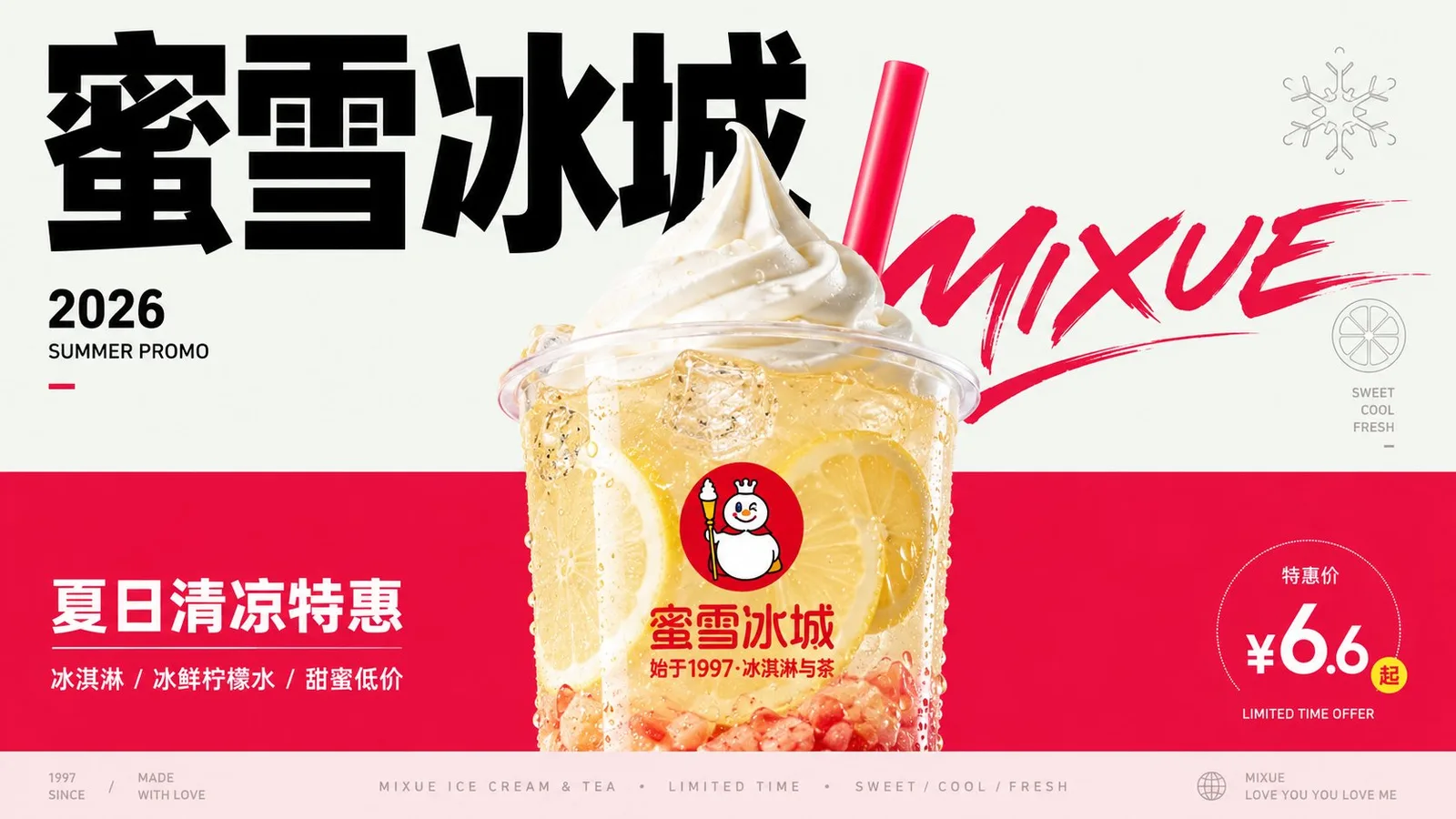
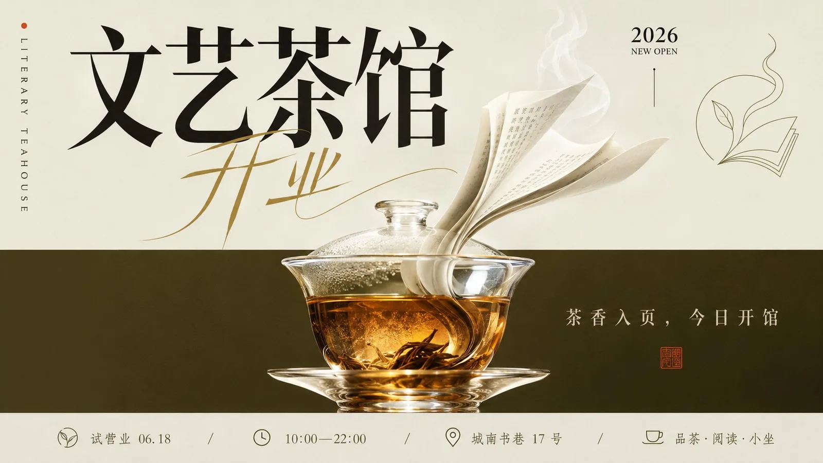
โปสเตอร์แนะนำหนังสือ 'เสียงเรียก' ของหลูซวิ่น
ที่มา: @xiaoxiaodong01โมเดล: ChatGPT
ภาพตัวอย่าง
พรอมต์ภาษาไทย
สร้างโปสเตอร์แนวตั้งสไตล์โฆษณาบรรณาธิการ โดยอิงจากเนื้อหาธีมที่เฉพาะเจาะจง โดยแบ่งธีมออกเป็นสองส่วนที่มองเห็นได้ ส่วนบนเป็นพื้นที่แนวคิดแบบเบา โล่ง ความอิ่มตัวต่ำ บรรจุชื่อเรื่อง สัญลักษณ์น้ำหนักเบา เครื่องหมายระบุปี และ 'ลมหายใจแห่งการอ่าน'; ส่วนล่างเป็นพื้นที่ประสบการณ์ทางกายภาพที่มีความอิ่มตัวสูง มีองค์ประกอบสนับสนุนหลัก วัสดุ ประโยคสั้นๆ และอุณหภูมิทางอารมณ์ รักษาระหว่างสองส่วนด้วยเส้นแบ่งที่คมชัด หรือการเปลี่ยนผ่านระนาบสีที่ใกล้เคียงกับเส้นแบ่งที่คมชัด เส้นแบ่งนี้เปรียบเสมือนโครงสร้างการจัดวางมากกว่าทิวทัศน์ธรรมชาติ โดยไม่ต้องใช้ฉากที่ซับซ้อนเพื่ออธิบายธีม วัตถุหลักจะอยู่บนแกนกลาง ค่อนข้างต่ำกว่า และครอบคลุมทั้งสองส่วน โดยส่วนบนหรือขอบนอกจะอยู่ในพื้นที่แนวคิด และมวลหลักจะจมลงในพื้นที่ประสบการณ์ ขอบจะรวมความโปร่งใส ความสัมพันธ์ของการสะท้อน การแบ่งชั้นสีเดียวกัน การบีบอัดรูปทรง และการสะท้อนของแสงเล็กน้อย โดยผสมผสานกับพื้นหลังทั้งสองส่วนเล็กน้อย ทำให้วัตถุเปรียบเสมือนสะพานเชื่อมความหมายสองประการ แทนที่จะเป็นวัสดุที่วางอยู่บนสีพื้นหลัง ความหนาแน่นของรายละเอียดสูงสุดจะกระจุกตัวอยู่ภายในวัตถุหลักเท่านั้น โดยแสดงวัสดุ พื้นผิว การหักเห แอนุภาค ชั้นภายใน และความสมจริงที่สัมผัสได้ พื้นหลัง ไอคอน และข้อความจะยังคงแบน เรียบ และมีเสียงรบกวนต่ำ การใช้สีจะใช้ความสัมพันธ์แบบลำดับชั้นของสีโครงสร้างพื้นที่ขนาดใหญ่ ข้อความสีเข้มคมชัด ไฮไลท์สีขาวหรือความสว่างสูง และสีที่กระตุ้นธีมพื้นที่ขนาดเล็ก เมื่อธีมเปลี่ยน ให้เปลี่ยนเฉดสีและอุณหภูมิ แต่คงสัดส่วนของพื้นที่บนที่สว่าง พื้นที่ล่างที่หนัก ข้อความสีเข้ม วัตถุที่สว่าง และสีที่กระตุ้นที่เล็กแต่ชัดเจน ให้หัวข้อหลักกลายเป็นโครงสร้างกราฟิกในครึ่งบนของภาพ โดยใช้ความแตกต่างของขนาดที่สูงมาก สีดำที่ควบคุม และโครงสร้างตัวอักษรที่แข็งแรง และตั้งเหตุการณ์ glyph ที่มีความตึงโค้งมากขึ้นหรือความคมชัดสูงเพื่อเข้าร่วมในการซ้อนทับและจังหวะ ทำให้ข้อความเปรียบเสมือนวิถีการมองเห็นของกลิ่น ความเร็ว หรืออารมณ์ ข้อความเสริมจะถูกบีบอัดเป็นคำอธิบายประกอบขอบ ประโยคสั้นๆ ใต้หัวข้อ และเมตาดาต้าขนาดเล็กที่มีคอนทราสต์ต่ำที่ด้านล่าง ด้านล่างสามารถสร้างแถบข้อมูลที่ตื้นมาก จบลงอย่างเงียบๆ เหมือนเชิงอรรถของสิ่งพิมพ์ จัดเรียงสัญลักษณ์เส้นเดียวที่กลวงซึ่งมาจากความหมายเชิงธีมในพื้นที่แนวคิด ด้วยเส้นสายเรียบง่าย ความหนาแน่นต่ำ และทำหน้าที่เป็นหลักฐานทางประสาทสัมผัสหรือแนวคิดเท่านั้น การออกแบบโดยรวมยังคงรักษพื้นที่สีขาวกว้างและการสมดุลที่ไม่สมมาตร โดยมีหัวข้อกลางที่มั่นคง ข้อความขอบที่สร้างแรงกดเล็กน้อย และแถบข้อมูลด้านล่างที่ปิดท้ายการจัดวาง การมองเห็นครั้งแรกจะเห็นสองส่วนที่คมชัด วัตถุที่ข้ามส่วน ตัวอักษรสีดำขนาดใหญ่ สัญลักษณ์ปริมาณน้อย และระเบียบกราฟิกที่ทันสมัยและสะอาดตา —————— ธีมสำหรับเซสชันนี้: โปสเตอร์แนะนำหนังสือ 'เสียงเรียก' ของหลูซวิ่น อัตราส่วน 16:9 แนวนอน
พรอมต์ภาษาอังกฤษ
Generate a vertical editorial advertising-style visual poster based on specific theme content, first splitting the theme into two visible fields. The upper part is a lighter, emptier, lower-saturation conceptual air field, carrying the title, lightweight symbols, a sense of the year markers, and reading breath; the lower part is a more saturated, more supportive physical experience field, carrying the main subject, materials, short sentences, and emotional temperature. Maintain a clear hard-cut boundary or an approximate hard-cut color plane transition between the two fields; the boundary line is like a layout structure rather than natural scenery, without using complex scenes to explain the theme. The core object is located on the central axis, slightly lower, and spans the boundary, with the top or outer edge entering the conceptual field and the main mass sinking into the experience field; the edges integrate transparency, reflective relationships, same-color layering, contour compression, and highlight refraction, slightly merging with the two background fields, making the object like a bridge connecting two semantics rather than material pasted on a background color. The highest detail density is only concentrated inside the core object, expressing its material, texture, refraction, particles, internal layers, and touchable realism; the background, icons, and text remain flat, clean, and low-noise. The colors adopt a hierarchical relationship of large-area structural colors, sharp dark text, white or high-brightness highlights, and small-area theme trigger colors; when the theme changes, change the hue and temperature, but maintain the proportion of light upper field, heavy lower field, dark text, bright subject, and small but accurate trigger colors. Let the main title become a graphic structure in the upper half of the image, using strong scale differences, restrained black, and a tough font skeleton, and set a glyph event with more curved tension or high contrast to participate in overlay and rhythm, making the text like a visible trajectory of smell, speed, or emotion. Auxiliary text is compressed into edge annotations, short sentences below the subject, and low-contrast miniature metadata at the bottom; the bottom can form a very shallow information band, ending quietly like a publication footer. Arrange a hollow single-line symbol derived from the thematic semantics in the conceptual field, with simple lines, low density, and serving only as sensory or conceptual evidence. The overall design retains wide white space and asymmetrical balance, with a stable central subject, edge text forming slight pressure, and the bottom information band closing the layout; the first visual glance sees the hard-cut dual fields, the cross-field subject, huge black characters, low-volume symbols, and clean modern graphic order. —————— Theme for this session: Lu Xun's book "Call to Arms" recommendation poster Ratio 16:9 landscape
พรอมต์ภาษาจีน
围绕具体主题内容生成一张竖版编辑广告式视觉海报,先把主题拆成两种可见场域。上方是更浅、更空、更低饱和的概念空气场,承载标题、轻量符号、年份感标记和阅读呼吸;下方是更饱和、更有承托感的实体体验场,承接主体、材质、短句和情绪温度。两场之间保留明确的硬切分界或近似硬切的色面转折,分界线像版面结构而不是自然风景,不用复杂场景解释主题。核心对象位于中轴偏下并跨越分界,顶部或外缘进入概念场,主体质量沉入体验场,边缘综合透明感、反光关系、同色叠合、轮廓压缩与高光折射,和两个背景场发生轻微融合,使对象像连接两种语义的桥,而不是贴在底色上的素材。最高细节密度只集中在核心对象内部,表现其材质、纹理、折射、颗粒、内部层次和可触摸的真实感,背景、图标和文字保持平面、干净、低噪声。色彩采用大面积结构色、锐利深色文字、白色或高明度高光、小面积主题触发色的层级关系;主题变化时改变色相和温度,但保持上场轻、下场重、文字深、主体亮、触发色小而准确的比例。上半画面让主标题成为图形结构,使用强尺度差、克制黑色、硬朗字形骨架,并设置一个更具曲线张力或高反差的字形事件参与叠压和节奏,让文字像气味、速度或情绪的可见轨迹。辅助文字压缩为边缘注释、主体下方短句和底部低对比微型 metadata,底部可形成很浅的信息带,像出版物页脚一样安静收束。概念场中安排一个由主题语义派生的空心单线符号,线条简洁、低密度、只作为感官或概念旁证。整体保留宽阔留白和非对称平衡,中心主体稳定,边缘文字形成轻微压力,底部信息带收住版面,视觉第一眼看到硬切双场、跨场主体、巨大黑字、低声量符号和清洁的现代平面秩序。 —————— 本次主题:鲁迅书籍 《呐喊》推荐海报 比例16:9 横版
พรอมต์แนะนำ
8 พรอมต์คัดสรร
สาวผมแดงในสตูดิโอ: แฟชั่นมินิมัลลิสต์

สาวเอเชียในชุดคาร์ดิแกนสีฟ้ามิสต์กับกระโปรงขาว

สาวเอเชียในชุดสีน้ำเงิน บนโซฟาหรูในโรงแรม

โปสเตอร์อินโฟกราฟิกสูตรอาหารระดับพรีเมียม

สาวชุดว่ายน้ำขาว-ฟ้า สาดน้ำทะเลริมหาด

ถ่ายภาพคอสเพลย์ฤดูร้อนสไตล์เซลฟี่จากมือถือ
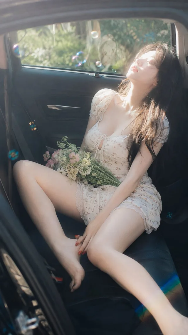
สาวญี่ปุ่นฤดูร้อนในรถยนต์ ย้อนแสงฉ่ำๆ
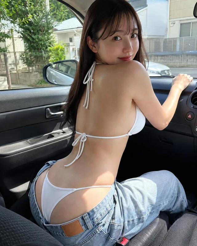
สาวญี่ปุ่นบิกินีเปลือยหลังในรถ