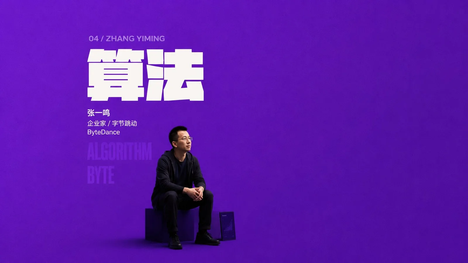
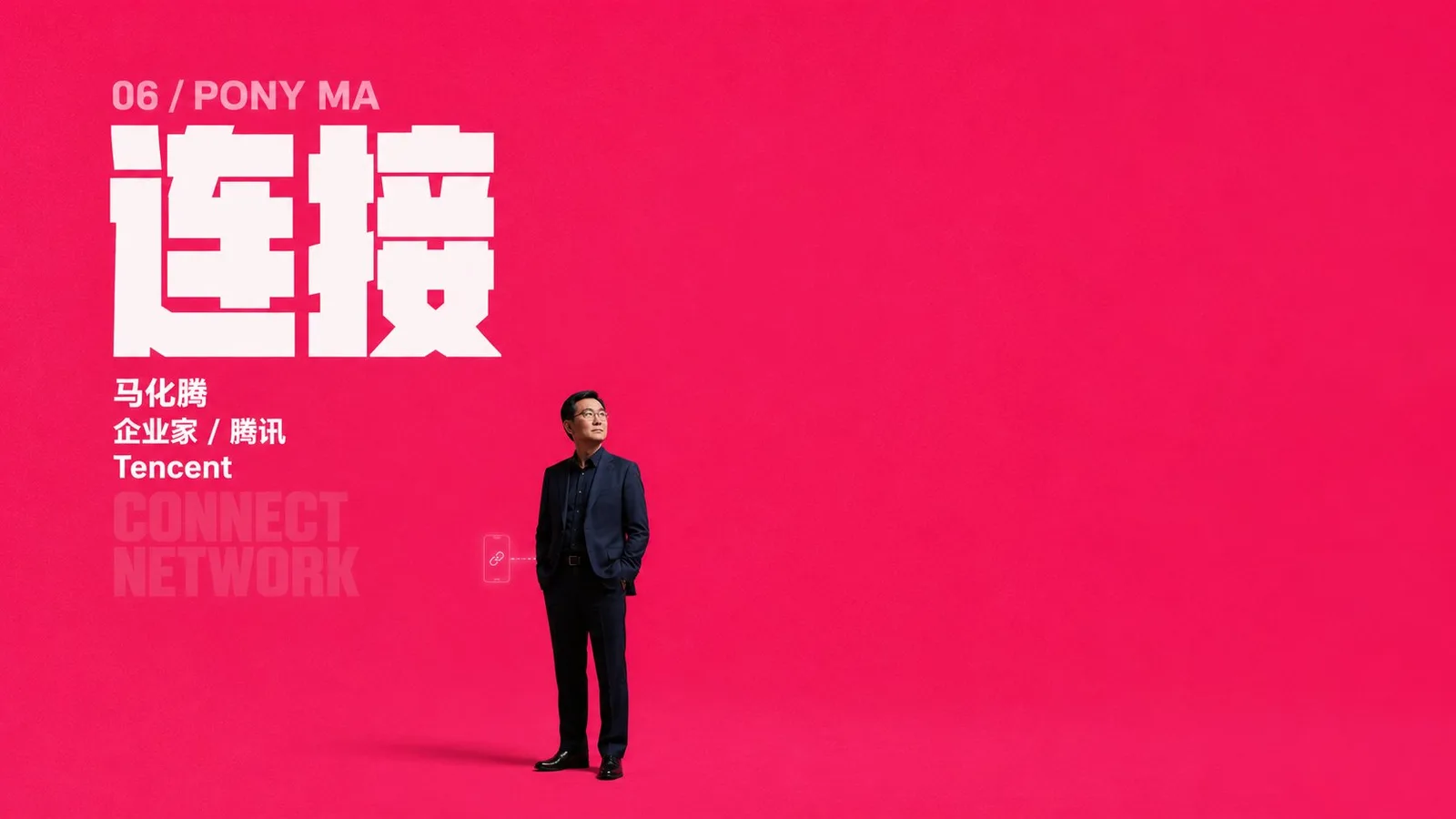
โปสเตอร์เปิดตัวเรียบง่ายแต่ทรงพลัง
ที่มา: @xiaoxiaodong01โมเดล: ChatGPT
ภาพตัวอย่าง
พรอมต์ภาษาไทย
สร้างโปสเตอร์เปิดตัวที่เรียบง่ายและดูทรงพลังสำหรับหัวข้อ [Theme]: ฉากเต็มไปด้วยสีหลักบริสุทธิ์สูงที่มาจากธีม สีหลักครอบครองพื้นที่ส่วนใหญ่ คงความสว่าง สะอาด พร้อมเกรนละเอียดอ่อนเหมือนกระดาษด้านหรือผ้า ไม่มีการใช้ฉากที่ซับซ้อน มีเพียงความผันผวนของความสว่างเล็กน้อยและเงาสัมผัสพื้นดินที่บ่งบอกถึงพื้นที่ ข้อมูลหลักจัดวางในคอลัมน์แคบที่ตำแหน่งบนซ้ายของกึ่งกลาง สร้างจังหวะการอ่านที่ลดหลั่นลงมาทีละลำดับ ตั้งแต่ภาษาอังกฤษหรือตัวเลขสีอ่อน ตัวอักษรจีนขนาดยักษ์สีขาวตัวหนา คำอธิบายขนาดเล็กสีขาว ไปจนถึงข้อความสะท้อนที่มีความโปร่งใสต่ำ; ตัวอักษรยักษ์ต้องหนามาก เป็นเหลี่ยม และแบนราบในแนวนอน เส้นของตัวอักษรเหมือนบล็อกทึบ และรูปทรงเชิงลบภายในถูกบีบอัดให้เป็นรอยตัดที่คมชัด ระยะห่างตัวอักษรชิดกัน และระยะห่างบรรทัดแน่น กลายเป็นน้ำหนักที่หนักที่สุดบนหน้าจอ ข้อความเสริมใช้โครงสร้างแบบ sans-serif ที่แข็งแรงแบบเดียวกัน มีขนาดเล็กกว่าตัวอักษรยักษ์อย่างเห็นได้ชัด โดยรักษาระยะชิดซ้ายและความหนาแน่นของบรรทัดสั้น ข้อมูลเปรียบเสมือนเครื่องหมายสีขาวที่ปักอยู่บนผืนสี ผู้คน ผลิตภัณฑ์ หรือสัญลักษณ์ในธีมจะปรากฏเป็นเพียงเอนทิตีขนาดเล็กในตำแหน่งต่ำ วางอยู่ด้านล่างและทางขวาของคอลัมน์ข้อความ แสงและเงาที่สมจริงมีความชัดเจนแต่ไม่ดึงดูดสายตามากเกินไป ใช้ตัวตัวหลักสีเข้มและสีสว่างโทนเดียวกันในปริมาณเล็กน้อยเพื่อเชื่อมโยงกับพื้นที่สีหลัก ทิ้งเงาสัมผัสที่นุ่มนวลที่เท้าหรือด้านล่าง เพื่อให้พื้นที่ว่างขนาดใหญ่ดูเปิดกว้างมากขึ้น ข้อความที่แสดงแบบจางๆ ใช้สีหลักโทนสว่างหรือการซ้อนทับด้วยสีเดียวกันที่มีความโปร่งใสต่ำ ซ่อนอยู่เหนือและใต้กับชื่อเรื่องหลักราวกับชั้นความทรงจำที่ถูกดูดซับโดยพื้นหลัง และต้องไม่ดึงดูดสายตามากไปกว่าชื่อเรื่องหลักสีขาว โทนสีโดยรวมถูกกำหนดโดยเฉดสีเฉพาะของธีมในอนาคต แต่ต้องรักษาความสัมพันธ์ของสีหลักสีเดียวที่ครอบงำพื้นที่ขนาดใหญ่ ความคมชัดสูงสำหรับข้อมูลสีขาว การสะท้อนสีเดียวกันที่มีความโปร่งใสต่ำ และเอนทิตีในพื้นที่ที่เป็นสีเข้มหนัก หากสีของธีมเป็นโทนเย็นหรือสว่าง ก็ยังคงต้องรักษาสนามสีที่มีความอิ่มตัวสูง พื้นผิวที่สะอาด และความรู้สึกถึงระยะห่างที่เคร่งขรึมและเงียบสงบ หลีกเลี่ยงการเติมเต็มพื้นหลัง หลีกเลี่ยงลวดลายตกแต่ง และหลีกเลี่ยงการทำให้เอนทิตีเป็นตัวเอก ความตึงเครียดหลักมาจากการความไม่สมดุลของขนาดระหว่างบล็อกข้อมูลตัวอักษรยักษ์และเอนทิตีขนาดเล็กด้านล่าง รวมถึงการหยุดชะงักที่เกิดจากพื้นที่ว่างขนาดใหญ่ ธีม: ผู้ประกอบการชาวจีน + คำที่เกี่ยวข้อง ———— แต่ละภาพมีฉากที่เข้ากับธีม โดยมีตรรกะสีที่แตกต่างกัน ผู้ประกอบการที่แตกต่างกัน และคำที่แตกต่างกัน รวมทั้งหมด 10 ภาพ อัตราส่วนภาพ 16:9
พรอมต์ภาษาอังกฤษ
Generate a restrained and oppressive launch poster around any subject: The screen is spread with a full piece of high-purity main color derived from the theme. The main color occupies the vast majority of the area, remaining bright, clean, with subtle grains like matte paper or fabric. No complex scenery is used; only slight brightness fluctuations and ground contact shadows suggest space. Main information is concentrated in a narrow column area in the upper left of center, forming a reading rhythm that descends step-by-step from light-colored English or numbers, strong white Chinese giant characters, white small-sized descriptions, to low-transparency echo text; giant characters must be extremely thick, square, and horizontally flattened. Strokes are like solid blocks, and internal negative shapes are squeezed into sharp cuts. Character spacing is tight, and line spacing is tight, becoming the heaviest weight on the screen. Auxiliary text uses the same tough sans-serif skeleton, significantly smaller in size than the giant characters, maintaining left alignment and short line density. Information is like white markers pinned on the color field. People, products, or symbols in the theme appear only as small-scale entities at low positions, placed below and to the right of the text column. Realistic lighting and shadows are clear but not overly eye-catching. Use a dark main body and a small amount of local homologous bright colors to connect with the main color field. Leave soft contact shadows at the feet or bottom to make the huge blank space appear wider. Weakly displayed text uses light bright variants of the main color or the same color low-transparency overprinting, hidden above and below the main title like a memory layer absorbed by the background, and must not be more eye-catching than the white main title. The overall color scheme is determined by the future theme's specific hue, but must maintain the relationship of a single main color dominating a large area, strong contrast for white information, low-transparency same-color echoes, and heavy dark local entities; if the theme color is cool or light, it must still maintain a high-saturation home field, clean surface, and a sense of solemn, silent distance. Avoid filling the background, avoid decorative patterns, and avoid making the entity the protagonist. The core tension comes from the disparity in scale between the giant character information block and the small entity below, as well as the pause caused by large empty spaces. Theme: A Chinese entrepreneur + a corresponding word ———— Each image features a scene matching the theme, with different color logic, different entrepreneurs, and different words A total of 10 images Aspect ratio 16:9
พรอมต์ภาษาจีน
围绕任意主题对象生成克制而有压迫感的发布海报:画面以一整片主题派生的高纯度主色铺开,主色承担绝大多数面积,保持明亮、洁净、略带哑光纸面或织物般的细微颗粒,不做复杂景物,只用轻微明度起伏和地面接触阴影暗示空间。主要信息集中在左上偏中的窄列区域,形成从浅色英文或数字、强白中文巨字、白色小号说明、低透明回声文字逐级下落的阅读节奏;巨字必须极粗、方正、横向压扁,笔画像实心块面,内部负形被挤压成锐利切口,字距紧、行距紧,成为画面最大重量。辅助文字使用同样硬朗的无衬线骨架,尺寸显著小于巨字,保持左齐和短行密度,信息像钉在色场上的白色标记。主题中的人物、产品或象征物只作为低处的小尺度实体出现,放在文字列下方偏右位置,真实光影清晰但不过度抢眼,用深色主体和少量同系亮色局部承接主色场,脚下或底部留下柔软接触阴影,让巨大的空白显得更宽。弱显文字使用主色的浅亮变体或同色低透明叠印,藏在主标题上下,像被背景吸收的记忆层,不能比白色主标题更醒目。整体配色由未来主题决定具体色相,但必须保持单一主色大面积统治、白色信息强对比、低透明同色回声、实体局部暗色压重的关系;若主题色偏冷或偏浅,也要维持高饱和主场、干净表面和庄重静默的距离感。避免填满背景、避免装饰图案、避免让实体变成主角,核心张力来自巨字信息块和低处小实体之间的悬殊尺度,以及大片空场造成的停顿。 主题:一个中国企业家+一个对应的词汇 ———— 每张一个符合主题的画面, 不同的配色逻辑,不同的企业家和词汇 一共10张图 比例16:9
พรอมต์แนะนำ
8 พรอมต์คัดสรร
สาวผมแดงในสตูดิโอ: แฟชั่นมินิมัลลิสต์

สาวเอเชียในชุดคาร์ดิแกนสีฟ้ามิสต์กับกระโปรงขาว

สาวเอเชียในชุดสีน้ำเงิน บนโซฟาหรูในโรงแรม

โปสเตอร์อินโฟกราฟิกสูตรอาหารระดับพรีเมียม

สาวชุดว่ายน้ำขาว-ฟ้า สาดน้ำทะเลริมหาด

ถ่ายภาพคอสเพลย์ฤดูร้อนสไตล์เซลฟี่จากมือถือ
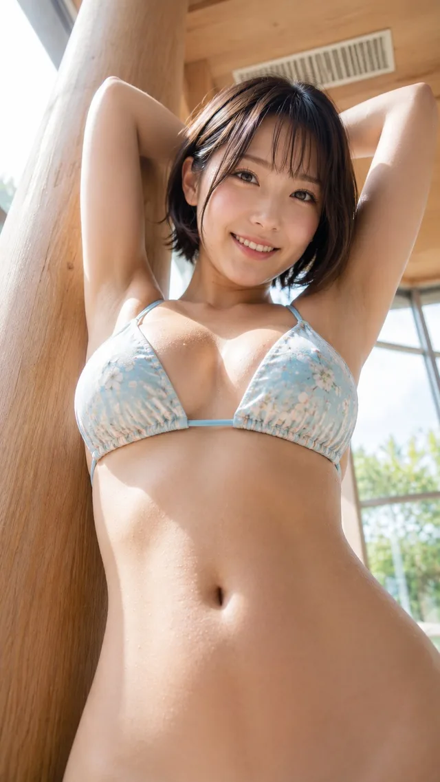
สาวญี่ปุ่นผมสั้น ถ่ายภาพในร่ม มุมเงย
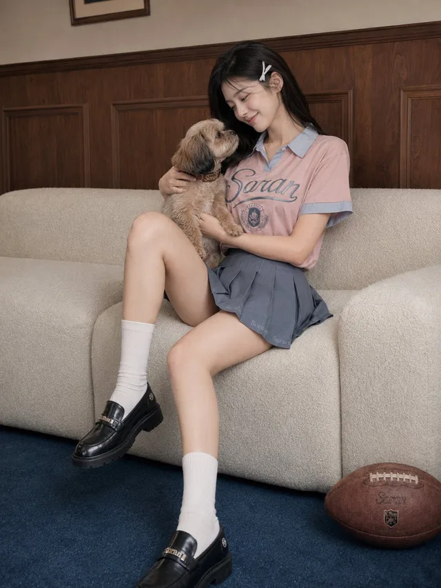
สาวนักเรียนในห้องสไตล์วินเทจกับโซฟาสีคอรัล