ระบบ PPT สไตล์ International Typographic ดีไซน์ทันสมัย
ที่มา: @xiaoxiaodong01โมเดล: ChatGPT
ภาพตัวอย่าง
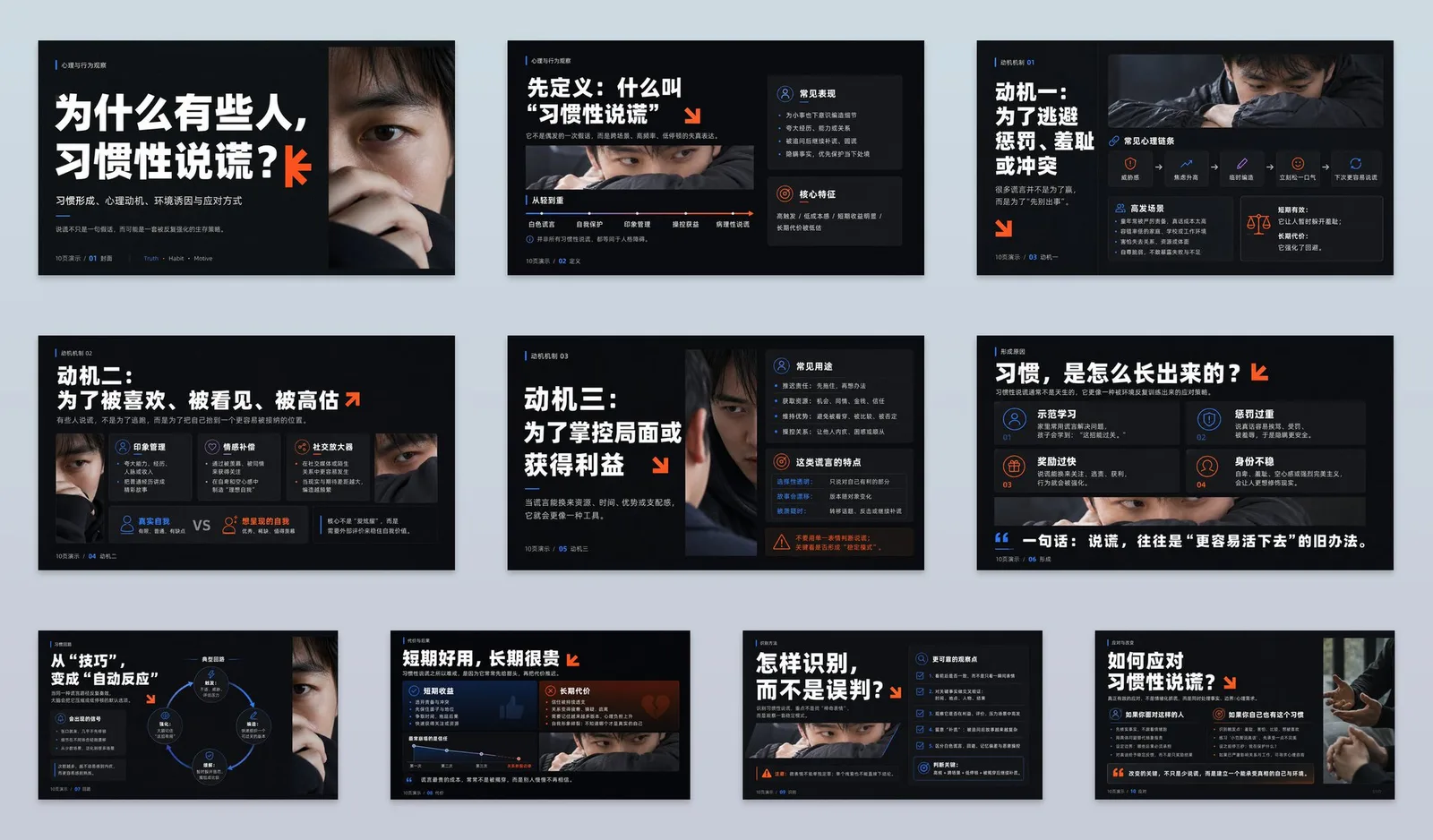
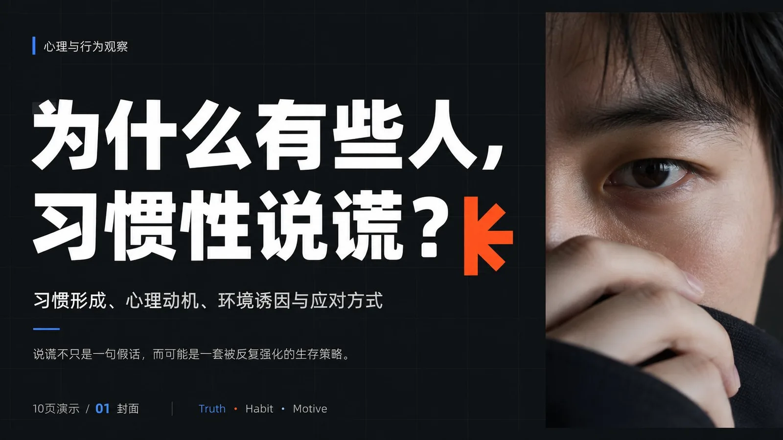
พรอมต์ภาษาไทย
สร้างระบบ PPT ที่ทันสมัย ผสมผสานความเปรียบต่างสูงแบบ Dark Field, หัวข้อตัวหนา และสไลด์ภาพสี่เหลี่ยม: โดยใช้ทฤษฎี International Typographic Style เป็นแกนหลัก, ใช้ Modular Grids, Unified Margins และ Baseline Rhythm เพื่อทำให้ข้อมูลมีความเสถียร; ใช้ Functional Asymmetry ของ New Typography เพื่อสร้าง Spanning Columns, Misalignments และ Scale Transitions; ใช้ Gestalt Laws of Proximity และ Common Region เพื่อจัดกลุ่มหัวข้อ, คำอธิบาย, ข้อมูล และรูปภาพให้เป็นโมดูลที่ชัดเจน; ใช้ Itten's Light-Dark และ Area Contrast เพื่อให้สัญลักษณ์ที่มีพื้นที่เล็กความบริสุทธิ์สูงสร้างโฟกัสทันทีเมื่อเทียบกับพื้นหลังที่มีพื้นที่ใหญ่ความอิ่มตัวต่ำ ยืม Mathematical Grids และ Objective Hierarchy ของ Josef Müller-Brockmann เพื่อประสานงานทั้งซีรีส์, ดูดซับ Dynamic White Space และ Unequal Blocks ของ Jan Tschichold เพื่อนำสายตา, ใช้ Conceptualized Geometric Symbols ของ Paul Rand เพื่อการจดจำที่ง่าย, และจากนั้นใช้ Bold Cropping และ Text-Image Dialogue ของ Alexey Brodovitch เพื่อเปลี่ยนความหนาแน่นของหน้า, โดยแต่ละส่วนมีการแบ่งงานโดยไม่ซ้ำซ้อนกัน โทนสีใช้บทบาทที่เปลี่ยนได้สี่ประเภท: พื้นหลังสีเข้มความสว่างต่ำความอิ่มตัวต่ำคิดเป็น 65%—80%, สีข้อมูลความสว่างสูงคิดเป็น 15%—25%, รูปภาพตามธีมยังคงความสว่างปานกลาง-สูงและความอิ่มตัวปานกลางคิดเป็น 15%—35%, และสีเน้นเฉพาะจุดความบริสุทธิ์สูงโทนเย็นและโทนอุ่นรวมกันไม่เกิน 8%; เน้นเฉพาะจุดที่อยู่ติดกับปลายหัวข้อ, ตัวเลขสำคัญ และ Node ทิศทาง, เพิ่มความสว่างผ่าน Simultaneous Contrast, สีธีมหรือสีแบรนด์ใดๆ จะต้องถูกแมปหนึ่งครั้งตามบทบาท, รักษาพื้นที่, ลำดับความสว่าง, ความแตกต่างของความอิ่มตัว, ความตึงเครียดของโทนเย็น-อุ่น และความชัดเจนของการฉายภาพให้ไม่เปลี่ยนแปลง องค์ประกอบใช้ Modular Grid แบบยืดหยุ่น 4—8 คอลัมน์, โดยอ่านหัวข้อก่อน, รูปภาพหลักเป็นอันดับสอง, และคำอธิบายและข้อมูลเป็นอันดับสุดท้าย; หน้าปกอนุญาตให้หัวข้อขนาดใหญ่ครอบคลุมหลายคอลัมน์, หน้าเนื้อหาหมุนเวียนระหว่างการแบ่งซ้าย-ขวา, ระดับที่จัดเรียงเหลื่อมกันขึ้น-ลง, และ White Space ขนาดใหญ่, รูปภาพสี่เหลี่ยมทำหน้าที่เป็น Visual Mass ที่ไม่เท่ากันเพื่อสร้างสมดุลแบบไดนามิกกับพื้นที่ข้อความ, อนุญาตให้มีสัญลักษณ์เพียงหนึ่งเดียวข้ามเส้นคอลัมน์เพื่อควบคุมการแบ่ง Grid พื้นหลังใช้ระนาบด้านเรียบสม่ำเสมอเป็นฐาน, โดยมีช่องสี่เหลี่ยมความเปรียบต่างต่ำที่ละเอียดมากซ้อนทับบนหน้าปก, ในขณะที่หน้าเนื้อหายังคงเป็นสีบริสุทธิ์; การถ่ายภาพใช้แสงธรรมชาติแบบกระจาย, โทนสีสมจริง, การคร็อปแบบ Close-Up และ Hard-Edged Rectangular Masks โดยไม่มีฟิลเตอร์ตกแต่ง; Radial Petals, Sharp-Angled Intersections และ Folded-Angle Linear Shapes ถูกสร้างขึ้นเป็น Stroke-less Vector Flat Fills, มีขอบคม, การกดขอบบางส่วนหรือ Semi-Bleeding, เพื่อรับผิดชอบจังหวะของบท, ทิศทาง และการหยุดพัก หัวข้อและเนื้อหาใช้ Rounded Geometric Sans-Serif Family ที่มีโครงสร้างสม่ำเสมอ: หัวข้อเป็น Extra Bold, ระยะห่างตัวอักษรชิด, ระยะห่างบรรทัดชิด และแบ่งเป็นบรรทัดสั้นๆ, เนื้อหาเป็น Regular Weight, ขนาดฟอนต์เล็ก, ระยะห่างบรรทัดหลวม; ตัวอักษรจีนและตะวันตกได้รับการแก้ไขตาม Visual Face, Counter Density และ Baseline, ไม่ได้จัดตำแหน่งอย่างเคร่งครัดตาม Nominal Font Size, สัญลักษณ์ในหัวข้อจะพอดีกับ Endpoints หรือ Negative Spaces เท่านั้น, ไม่บั่นทอนความสามารถในการอ่าน ความรู้สึกโดยรวมคือสดใส, ตรงไปตรงมา, ทันสมัย, คล่องตัว, ชัดเจน และน่าเชื่อถือ หัวข้อ: ทำไมคนบางคนถึงชอบโกหก? อุดมด้วยองค์ความรู้ การจัดวางแต่ละหน้าแตกต่างกันเพื่อหลีกเลี่ยงการซ้ำซาก ทั้งหมด 10 หน้า
พรอมต์ภาษาอังกฤษ
Establish a modern PPT system collaborating dark field high contrast, bold titles, and rectangular photographic slices: take International Typographic Style theory as the main axis, using modular grids, unified margins, and baseline rhythm to stabilize information; use the functional asymmetry of New Typography to create spanning columns, misalignments, and scale transitions; use Gestalt laws of proximity and common region to cluster titles, descriptions, data, and images into clear modules; use Itten's light-dark and area contrast to let small-area high-purity symbols form instantaneous focus against large-area low-chroma backgrounds. Borrow Josef Müller-Brockmann's mathematical grids and objective hierarchy to coordinate the entire series, absorb Jan Tschichold's dynamic white space and unequal blocks to guide the line of sight, use Paul Rand's conceptualized geometric symbols to provide light recognition, and then use Alexey Brodovitch's bold cropping and text-image dialogue to change page density, with each dividing labor without replicating individual works. The color scheme adopts four types of replaceable roles: deep low-brightness low-chroma background accounts for 65%—80%, high-brightness information color accounts for 15%—25%, thematic photos retain medium-high brightness and medium chroma accounting for 15%—35%, and high-purity cool and warm localized accent colors total no more than 8%; emphasis is only placed adjacent to title endpoints, key numbers, and directional nodes, enhancing brightness through simultaneous contrast, any theme or brand colors must be mapped once according to roles, maintaining area, brightness order, chroma difference, cool-warm tension, and projection readability unchanged. The composition uses a 4—8 column elastic modular grid, with titles read first, focal images second, and descriptions and data last; covers allow oversized titles to span columns, content pages rotate between left-right splitting, up-down staggered levels, and large blocks of white space, rectangular images serve as unequal visual mass to dynamically balance with text areas, allowing only one symbol to cross column lines for controlled breaking of the grid. The background uses a uniform matte plane as the base, with extremely fine low-contrast squares overlaid on the cover, while content pages remain pure; photography adopts natural diffused light, realistic tones, close-up cropping, and hard-edged rectangular masks without decorative filters; radial petals, sharp-angled intersections, and folded-angle linear shapes are produced as stroke-less vector flat fills, with sharp edges, partial edge-pressing or semi-bleeding, undertaking the rhythm of chapters, directions, and pauses. Titles and body text use a rounded geometric sans-serif family with consistent skeletons: titles are extra bold, tight letter spacing, tight line spacing and broken into short lines, body text is regular weight, small font size, loose line spacing; Chinese and Western characters are corrected according to visual face, counter density, and baseline, not strictly aligned by nominal font size, title symbols only fit endpoints or negative spaces, not eroding readability. The overall feeling is bright, direct, young, agile, clear, and credible. Topic: Why do some people habitually lie? Rich in knowledge points. Each layout varies to avoid repetition. A total of 10 pages.
พรอมต์ภาษาจีน
建立暗场高反差、粗体标题与矩形摄影切片协同的现代PPT系统:以国际主义版式理论为主轴,用模块网格、统一边距和基线节奏稳定信息;以新字体排印的功能性非对称制造跨栏、错位与尺度跃迁;以格式塔接近律和共同区域把标题、说明、数据与图像聚成清晰模块;以伊顿明暗及面积对比让小面积高纯度符号在大面积低彩背景中形成瞬时焦点。借鉴约瑟夫·米勒-布罗克曼的数学网格与客观层级统筹全系列,吸收扬·奇肖尔德的动态留白和不等量区块引导视线,运用保罗·兰德的概念化几何符号提供轻快识别,再以阿历克谢·布罗多维奇的大胆裁切与图文对话改变页面密度,彼此分工而不复刻个人作品。配色采用四类可替换角色:深低明度低彩背景占65%—80%,高明度信息色占15%—25%,主题照片保留中高明度与中等彩度占15%—35%,高纯度冷暖分置的强调色合计不超过8%;强调仅贴邻标题端点、关键数字和方向节点,以同时对比增强亮度,任何主题或品牌色均须按角色一次映射,并保持面积、明度次序、彩度差、冷暖张力与投影可读性不变。构图使用4—8列弹性模块网格,标题先读、焦点图像次读、说明与数据后读;封面允许超大标题跨列,内容页在左右分栏、上下错层与大块留白间轮换,矩形图像作为不等量视觉质量与文字区动态平衡,仅让一处符号越过栏线形成受控破格。背景以均匀哑光平面为底,封面叠加极细低对比方格,内容页保持纯净;摄影采用自然漫射光、真实色调、近距离裁切和硬边矩形蒙版,不加装饰滤镜;径向齿瓣、尖角交叉和折角线性形以无描边矢量平涂制作,边缘锐利,局部压边或半出血,承担章节、方向和停顿节拍。标题与正文采用骨架一致的圆润几何无衬线家族:标题超粗、紧字距、紧行距并拆成短行,正文常规字重、小字号、宽松行距;中西文按视觉字面、字腔密度与基线校正,不按名义字号硬齐,标题符号只贴合端点或负形,不侵蚀识读。整体感受明快、直接、年轻、机敏、清晰、可信。 主题:为什么有些人,习惯性说谎? 知识点丰富 每张排版多变避免雷同 一共 10 张
พรอมต์แนะนำ
8 พรอมต์คัดสรร
สาวผมแดงในสตูดิโอ: แฟชั่นมินิมัลลิสต์

สาวเอเชียในชุดคาร์ดิแกนสีฟ้ามิสต์กับกระโปรงขาว

สาวเอเชียในชุดสีน้ำเงิน บนโซฟาหรูในโรงแรม

โปสเตอร์อินโฟกราฟิกสูตรอาหารระดับพรีเมียม

สาวชุดว่ายน้ำขาว-ฟ้า สาดน้ำทะเลริมหาด

ถ่ายภาพคอสเพลย์ฤดูร้อนสไตล์เซลฟี่จากมือถือ
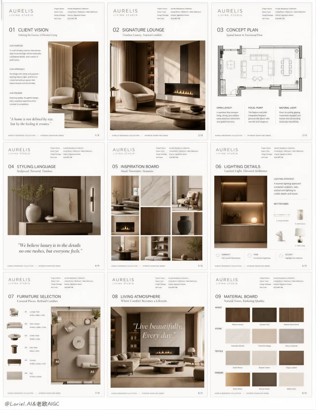
โปสเตอร์นำเสนอการออกแบบภายในคฤหาสน์หรู AURELIS
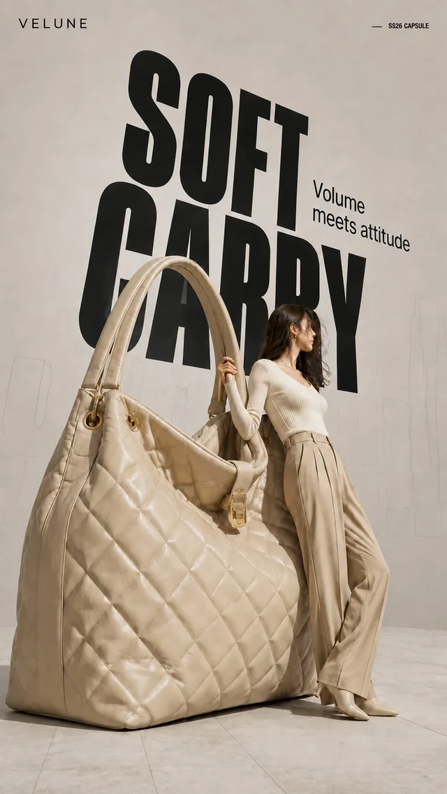
โปสเตอร์แฟชั่น: ผลิตภัณฑ์ขนาดยักษ์ สไตล์ Hi-Fashion