หนังสือพิมพ์เก่า: วัฒนธรรมอรุณสวัสดิ์ของเมือง
ที่มา: @xiaoxiaodong01โมเดล: ChatGPT
ภาพตัวอย่าง
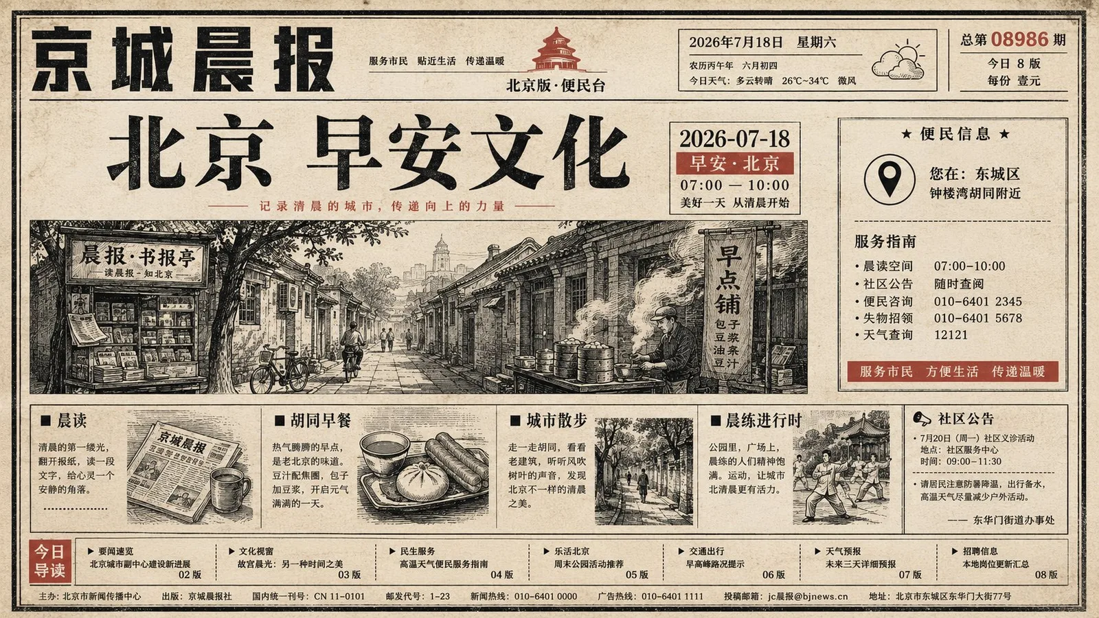
พรอมต์ภาษาไทย
สร้างชุดภาพหน้าหนึ่งหนังสือพิมพ์เก่าในธีมใดก็ได้: ภาพรวมเริ่มต้นเหมือนรายงานเต็มหน้าจากหนังสือพิมพ์ท้องถิ่น โดยมีกระดาษข่าวสีขาวอบอุ่นอ่อนๆ เป็นหลัก; กรอบสีดำละเอียด, คอลัมน์ข้อความแคบๆ, มาสต์เฮดด้านบน, คอลัมน์แนวตั้งหรือแนวนอนที่หนาแน่นทางซ้ายและขวา, และแถบโฆษณาตารางเล็กๆ ที่ด้านล่างจะสร้างลำดับการอ่าน; จากนั้น, ภาพประกอบขนาดใหญ่แบบแบนที่ได้จากธีมจะแทรกเข้ามาในเลย์เอาต์และระหว่างคอลัมน์ทันที, โดยมีโครงร่างรูปวงกลม สี่เหลี่ยมผืนผ้า หรือใบไม้ที่ผิดปกติหลายแบบทับซ้อนอยู่บนข้อความในสเกลที่ดูเป็นธรรมชาติ, ขอบที่แสดงการพิมพ์ทับซ้อนและหมึกซึมลงกระดาษเล็กน้อย, ลดรูปให้เหลือเพียงรูปทรงที่ชัดเจน, ไม่กี่เส้น, และดวงตากลมเล็กๆ สองคู่, เปลี่ยนหนังสือพิมพ์ที่จริงจังให้เป็นประกาศสาธารณะที่เข้าถึงง่าย. พาดหัวหลักใช้ฟอนต์ Mincho-style สีดำหนา, ระยะห่างตัวอักษรชิด, และระยะห่างบรรทัดสม่ำเสมอ, วางอยู่ด้านล่างหรือข้างภาพประกอบเพื่อสร้างจุดพักที่แข็งแกร่ง; หัวข้อย่อยและเนื้อหายังคงรักษาบล็อกข้อความสีเทาดำความหนาแน่นสูงของหนังสือพิมพ์จริง, โดยมีรูปภาพสารคดีขนาดเล็กและคอลัมน์ Q&A ขอบบางฝังอยู่ในพื้นที่, แต่อย่าให้รูปภาพแย่งจุดศูนย์กลางของเลย์เอาต์. สีได้มาจากธีมเอง, ควบคุมให้อยู่ในสีพื้นฐานของกระดาษข่าว, ข้อความสีดำและเทา, บล็อกภาพประกอบขนาดใหญ่แบบ spot color สองถึงสามสีที่มีความอิ่มตัวสูง, และสีเสริมที่มีความอิ่มตัวต่ำจำนวนเล็กน้อย: บล็อกสีขนาดใหญ่มีความสดใสและสะอาด แต่มีเกรนของการพิมพ์, แสดงเส้นใยกระดาษในบางส่วน, รอยเปื้อนเล็กน้อย, รอยยับ, รอยเหลืองจากการสแกน, และหมึกที่ไม่สม่ำเสมอ; ความเก่าแก่ส่วนใหญ่เกิดขึ้นบนกระดาษ, ขอบข้อความสีดำ, และภายในบล็อกสีทึบ, โดยไม่มีคราบสีน้ำตาลที่สกปรกสม่ำเสมอ. เลย์เอาต์จะอนุญาตให้มีการจัดเรียงที่แน่น, เหลื่อมล้ำ, และการจัดตำแหน่งที่คลาดเคลื่อนเล็กน้อย, รักษาอารมณ์ขันแบบภาพวาดเด็กที่มีดวงตากลม, ความน่าเชื่อถือที่เรียบง่ายของข่าวท้องถิ่น, และการขัดจังหวะการอ่านที่เกิดจากภาพประกอบที่แทรกอยู่กับข้อความ; หลีกเลี่ยงพื้นที่ว่างสไตล์นิตยสารสมัยใหม่, เวกเตอร์ที่เรียบเนียน, พื้นผิวสตูดิโอเชิงพาณิชย์, และการจัดวางตัวอักษรที่ประณีตเกินไป. ธีม: เมือง + วัฒนธรรมอรุณสวัสดิ์ (Good Morning Culture) + 2026-07-18
พรอมต์ภาษาอังกฤษ
Generate a set of old newspaper front-page visuals around any theme: the overall look starts like a full-page report from a local newspaper, with light warm white newsprint dominating; fine black frames, narrow text columns, a top masthead, dense vertical or horizontal columns on the left and right, and a strip of small grid advertisements at the bottom establish the reading order; subsequently, huge flat illustrations derived from the theme suddenly break into the layout and between columns, with several irregular circular, rectangular, or leaf-shaped outlines pressing over the text at a naive scale, edges showing slight overprint offset and paper ink absorption, simplified to only clear shapes, a few lines, and pairs of small round eyes, turning the serious newspaper into an approachable public notice. The core headline uses heavy black Mincho-style font, tight character spacing, and steady line spacing, placed below or beside the illustration to create a strong pause; subheadlines and body text maintain the high-density gray-black text blocks of a real newspaper, with small documentary photos and thin-bordered Q&A columns embedded locally, but do not let the photos take away the layout center. Colors are derived from the theme itself, controlled to the newsprint base color, black and gray text, two to three high-saturation spot color large illustration blocks, and a small amount of low-saturation auxiliary colors: large color blocks are bright and clean but with printing grain, locally revealing paper fibers, slight stains, creases, scanning yellowing, and uneven ink; aging mainly occurs on the paper, black text edges, and inside solid color blocks, without uniform brown dirtying. The layout allows for crowding, staggering, and slight misalignment, retaining child-painting-like round-eye humor, the simple credibility of local news, and the reading interruption caused by illustrations interspersed with text; avoid modern magazine whitespace, smooth vectors, commercial studio textures, and overly refined typography. Theme: City + Good Morning Culture + 2026-07-18
พรอมต์ภาษาจีน
围绕任意主题对象生成一套旧报纸头版式视觉:整体先像地方报刊的整页报道,浅暖白新闻纸占主导,细黑线框、窄栏正文、顶部报头、左右密集竖排或横排栏目、底部小格广告带共同建立阅读秩序;随后由主题派生的巨大扁平插画突然闯入版心和栏间,几枚不规则圆形、长条形或叶片状轮廓以天真尺度压过文字,边缘略有套印偏移和纸面吸墨,简化到只有清楚外形、少量线条和成对小圆眼,让严肃报纸变成亲近的公共告示。核心标题使用厚重黑色明朝感字形,字距紧、行距稳,放在插画下方或旁侧形成强烈停顿;小标题和正文保持真实报刊的高密度灰黑文本块,局部嵌入小幅纪实照片和细边框问答栏,但不要让照片夺走版心。色彩由主题自身派生,控制为新闻纸底色、黑灰文字、两到三种高饱和专色大块插画和少量低饱和辅助色:大色块明亮、干净但带印刷颗粒,局部露出纸纤维、轻微污点、折痕、扫描泛黄和墨色不均,旧化主要发生在纸张、黑字边缘和实色块内部,不做统一褐色脏化。版面允许拥挤、错落和轻微不对齐,保留儿童画般的圆眼幽默、地方新闻的朴素可信感、插画穿插文字造成的阅读中断;避免现代杂志留白、光滑矢量、商业摄影棚质感和过度精致排版。 主题:城市+早安文化+2026-07-18
พรอมต์แนะนำ
8 พรอมต์คัดสรร
สาวผมแดงในสตูดิโอ: แฟชั่นมินิมัลลิสต์

สาวเอเชียในชุดคาร์ดิแกนสีฟ้ามิสต์กับกระโปรงขาว

สาวเอเชียในชุดสีน้ำเงิน บนโซฟาหรูในโรงแรม

โปสเตอร์อินโฟกราฟิกสูตรอาหารระดับพรีเมียม

สาวชุดว่ายน้ำขาว-ฟ้า สาดน้ำทะเลริมหาด

ถ่ายภาพคอสเพลย์ฤดูร้อนสไตล์เซลฟี่จากมือถือ

เซลฟี่หน้ากระจกสไตล์สมจริง: หญิงสาวผมยาว
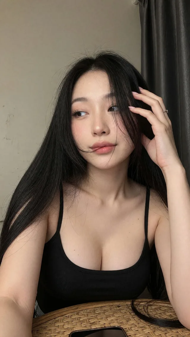
เซลฟี่สาวเอเชียในเสื้อสายเดี่ยวสีดำ