โปสเตอร์ศิลปะจัดวางแนวตะวันออก
ที่มา: @MrLarusโมเดล: ChatGPT
ภาพตัวอย่าง
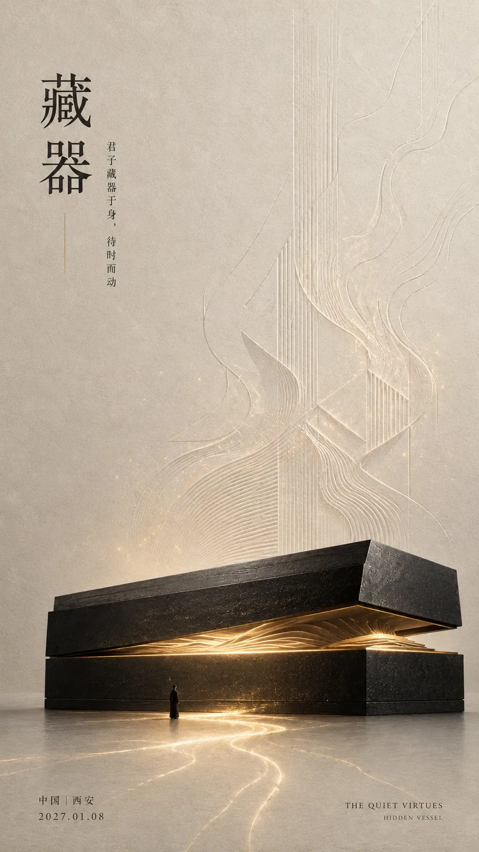
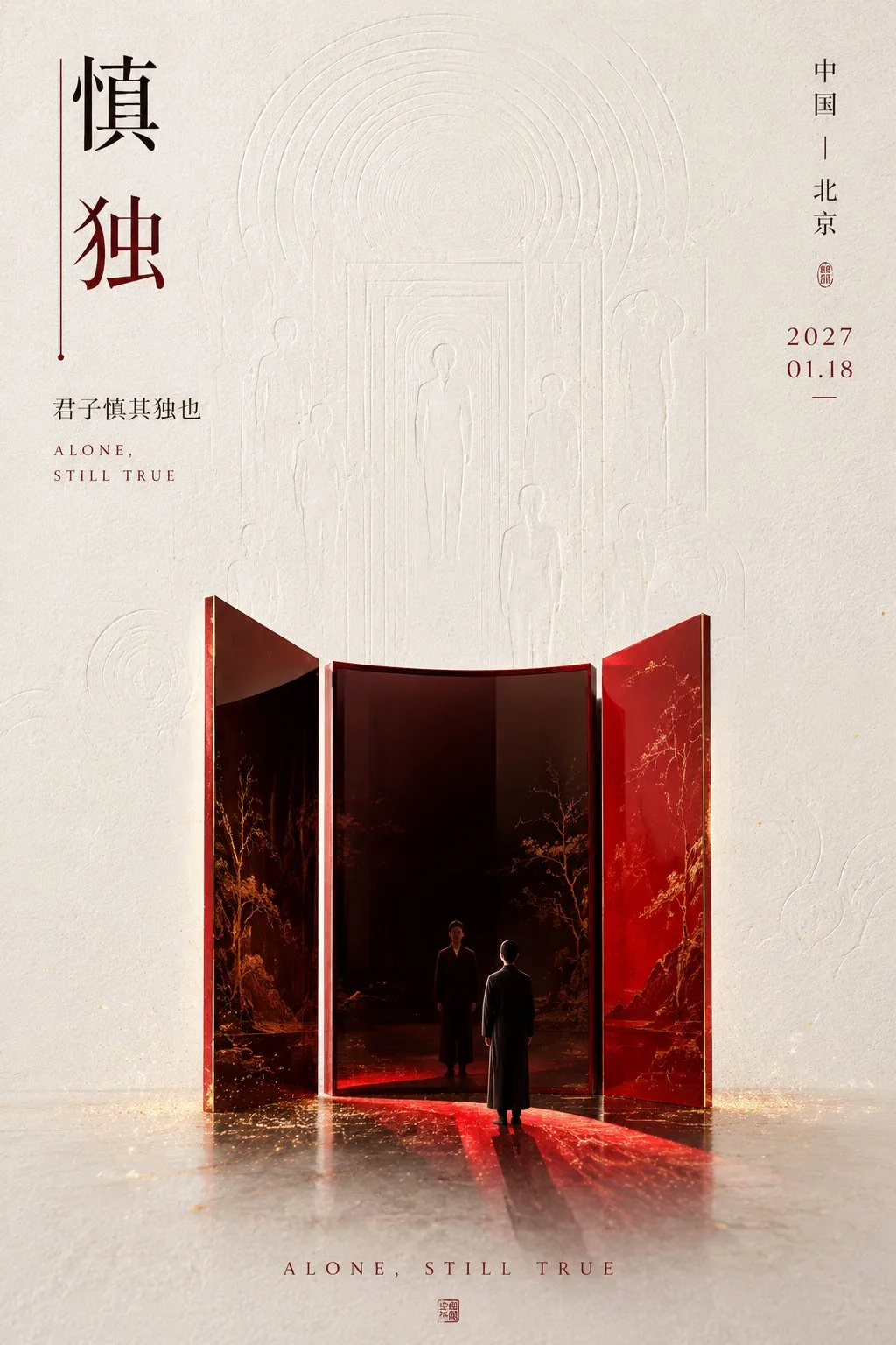
พรอมต์ภาษาไทย
[คติบ่มเพาะ]: [เติมประโยคสั้นๆ คลาสสิก] [ธีมสองพยางค์]: [คัดมาจากประโยคสั้นๆ] [ความหมายหลัก]: [การรอคอย / การสำรวจตนเอง / การรักษาความจริง / การกลับคืนสู่ต้นกำเนิด ฯลฯ] [วัสดุหลัก]: [โลหะสีดำ / กระจกเคลือบชาด / เครื่องลายคราม / ไม้ดิบ / แก้วหลากสี ฯลฯ] [ระบบสีหลัก]: [เติม 2—4 สีเฉพาะ] [อุปลักษณ์ทางภาพ]: [การเปิด / การตัดกัน / การคงไว้ / การลอกออก / การกลับคืน ฯลฯ] [ลายนูนพื้นหลัง]: [โครงสร้างภายใน / โครงร่างสะท้อน / ลวดลายภาชนะ / วงปีต้นไม้ ฯลฯ] [สถานที่และวันที่]: [เติม] สร้างโปสเตอร์ศิลปะแนว Oriental negative space แบบแนวตั้ง 9:16 ที่แปลง [คติบ่มเพาะ] ให้เป็นอุปลักษณ์ทางภาพที่ให้ความรู้สึกของศิลปะจัดวางร่วมสมัย ใช้กระดาษอาร์ตทำมือระดับพรีเมียมที่มีเส้นใย รอยบุ๋ม และอนุภาคเยื่อกระดาษจริงเป็นพื้นหลัง โดยคงพื้นที่ว่างขนาดใหญ่ และเพิ่มลายนูนต่ำความคมชัดต่ำ [ลายนูนพื้นหลัง] ที่เกี่ยวข้องกับธีม ลายนูนต้องมีส่วนร่วมในการแสดงความหมาย โดยถูกจำกัดจากระยะไกล และมีรายละเอียดปรากฏให้เห็นเมื่อตรวจสอบอย่างใกล้ชิดเท่านั้น ฉากประกอบด้วย [วัสดุหลัก] ที่มีโครงร่างชัดเจน ปริมาตรจริง และพื้นผิววัสดุ ที่แสดง [ความหมายหลัก] ผ่าน [อุปลักษณ์ทางภาพ] เพิ่มคนตัวเล็กๆ ที่กินพื้นที่ประมาณ 1%—2% ของกรอบภาพ เพื่อสร้างความสัมพันธ์ขนาดระหว่างวัตถุขนาดใหญ่กับมนุษย์ ใช้ [ระบบสีหลัก] สำหรับสี ซึ่งสามารถเป็นสีที่โดดเด่นและสดใส แต่คงบทบาทหลักและรองที่ชัดเจน ให้สีเข้าสู่พื้นที่ผ่านเคลือบ รอยแตก การสะท้อน แสงที่ไหล พื้นผิวแล็กเกอร์ หรือภายในของวัสดุ; อย่าจำกัดอยู่แค่สีดำ สีขาว และสีเทา และอย่าใช้เอฟเฟกต์นีออนราคาถูก ชื่อภาษาจีนหลักใช้ [ธีมสองพยางค์] โดยใช้ฟอนต์ Songti, Mingti หรือฟอนต์ Serif สไตล์แกะสลักที่ทันสมัย สามารถเพิ่มความรู้สึกในการออกแบบผ่านการเว้นระยะตัวอักษร การจัดแนวที่ไม่ตรงกัน เส้นโค้ง หรือเส้นสั้นๆ แต่ตัวอักษรจีนต้องสมบูรณ์ ถูกต้อง และชัดเจน รวมถึง [คติบ่มเพาะ] สถานที่ วันที่ และชื่อภาษาอังกฤษสั้นๆ ด้วยฟอนต์ขนาดเล็ก การนำเสนอโดยรวมคือการผสมผสานระหว่างการบ่มเพาะแบบตะวันออก ศิลปะวัสดุ ศิลปะจัดวางร่วมสมัย และโปสเตอร์นิตยสารระดับไฮเอนด์
พรอมต์ภาษาอังกฤษ
[Cultivation Maxim]: [Fill in a classic short sentence] [Two-character Theme]: [Extracted from the short sentence] [Core Meaning]: [Waiting / Self-reflection / Preserving Truth / Returning to Origin, etc.] [Subject Material]: [Black Metal / Cinnabar Lacquer Mirror / Blue and White Porcelain / Raw Wood / Colored Glaze, etc.] [Primary Color System]: [Fill in 2—4 specific colors] [Visual Metaphor]: [Opening / Contrast / Retention / Peeling / Returning, etc.] [Background Embossing]: [Internal structure / Reflection outline / Vessel lines / Tree rings, etc.] [Location and Date]: [Fill in] Generate a 9:16 vertical Oriental negative space art poster, transforming the [Cultivation Maxim] into a visual metaphor with a sense of contemporary installation. Use premium handmade art paper with real fibers, indentations, and pulp particles as the background, maintaining large areas of white space, and adding low-contrast bas-relief [Background Embossing] related to the theme. The embossing must participate in expressing the meaning, restrained from a distance, with details revealed only upon close inspection. The scene features a [Subject Material] with a clear outline, real volume, and material texture, expressing the [Core Meaning] through a [Visual Metaphor]. Add a tiny person occupying about 1%—2% of the frame to establish a scale relationship between the colossal object and the human. Use the [Primary Color System] for colors, which can be bold and vivid but maintain clear primary and secondary roles. Let the colors enter the space through glazes, cracks, reflections, flowing light, lacquer surfaces, or the interior of the materials; do not stay limited to black, white, and gray, and do not use cheap neon effects. The main Chinese title uses the [Two-character Theme], using modern Songti, Mingti, or carved-style serif fonts. Design sense can be added through letter spacing, misalignment, curves, or short lines, but the Chinese characters must be complete, accurate, and clear. Also include the [Cultivation Maxim], location, date, and a short English title in small font. The overall presentation is a combination of Oriental cultivation, material art, contemporary installation, and high-end editorial posters.
พรอมต์ภาษาจีน
【修养箴言】:【填写经典短句】 【两字主题】:【从短句中提炼】 【核心含义】:【等待 / 自省 / 守真 / 归本等】 【主体材料】:【黑金属 / 朱漆镜 / 青花瓷 / 原木 / 琉璃等】 【主色体系】:【填写 2—4 种明确颜色】 【视觉隐喻】:【开启 / 对照 / 保留 / 剥离 / 回归等】 【背景压纹】:【内部结构 / 倒影轮廓 / 器形线 / 年轮等】 【地点与日期】:【填写】 生成一张 9:16 竖版东方留白艺术海报,将【修养箴言】转化为具有当代装置感的视觉隐喻。 使用带有真实纤维、压痕和纸浆颗粒的高级手工艺术纸作为背景,保留大面积留白,并加入与主题有关的低对比浅浮雕【背景压纹】。压纹必须参与表达含义,远看克制,近看才发现细节。 画面设置一个轮廓清晰、具有真实体积和材质触感的【主体材料】,通过【视觉隐喻】表现【核心含义】。加入一个占画面约 1%—2% 的极小人物,建立巨物与人的尺度关系。 色彩使用【主色体系】,可以大胆、鲜明,但保持明确主次。让颜色通过釉光、裂隙、倒影、流光、漆面或材料内部进入空间,不要始终局限于黑白灰,也不要使用廉价霓虹特效。 中文主标题使用【两字主题】,采用现代宋体、明朝体或雕刻感衬线字体。可以通过字距、错位、弧线或短线增加设计感,但必须保证汉字完整、准确、清晰。 同时加入小字号的【修养箴言】、地点、日期和简短英文标题。整体呈现东方修养、材料艺术、当代装置与高级编辑海报的结合。
พรอมต์แนะนำ
8 พรอมต์คัดสรร
สาวผมแดงในสตูดิโอ: แฟชั่นมินิมัลลิสต์

สาวเอเชียในชุดคาร์ดิแกนสีฟ้ามิสต์กับกระโปรงขาว

สาวเอเชียในชุดสีน้ำเงิน บนโซฟาหรูในโรงแรม

โปสเตอร์อินโฟกราฟิกสูตรอาหารระดับพรีเมียม

สาวชุดว่ายน้ำขาว-ฟ้า สาดน้ำทะเลริมหาด

ถ่ายภาพคอสเพลย์ฤดูร้อนสไตล์เซลฟี่จากมือถือ
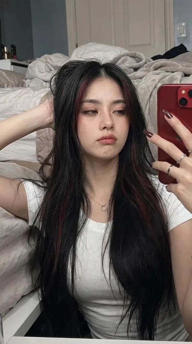
เซลฟี่หน้ากระจกสไตล์สมจริง: หญิงสาวผมยาว
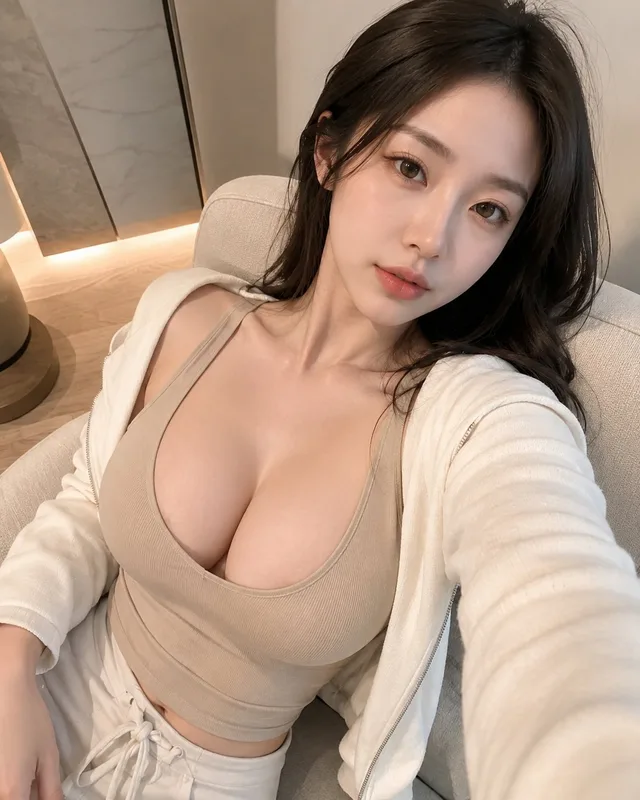
สาวเกาหลี 20 ต้นๆ: ภาพบุคคลระยะใกล้สมจริง