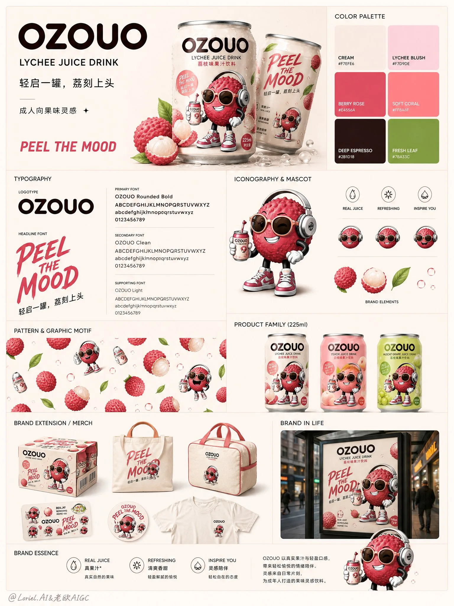
โปสเตอร์ระบบอัตลักษณ์แบรนด์ OZOUO (ภาพที่ 5)
ที่มา: @ou_zhen599โมเดล: ChatGPT
ภาพตัวอย่าง
พรอมต์ภาษาไทย
สร้างสรรค์ภาพที่ห้าของระบบภาพแบบครบวงจร (图1) สำหรับแบรนด์เครื่องดื่มผลไม้ “OZOUO” โดยออกแบบให้เป็นบอร์ดระบบอัตลักษณ์แบรนด์ / โปสเตอร์แนวทางภาพลักษณ์ที่ขัดเกลาแล้ว คง DNA ของแบรนด์เดิมของระบบเครื่องดื่มลิ้นจี่ OZOUO ไว้ทุกประการ: รูปแบบเครื่องหมายคำ OZOUO แบบเดียวกัน, สัดส่วนกระป๋องขนาด 225 มล. แบบกะทัดรัดแบบเดียวกัน, มาสคอตลิ้นจี่ที่มุ่งเป้าผู้ใหญ่แบบเดียวกัน, พื้นฐานสีกลางครีมแบบเดียวกัน, โทนสีเน้นสีชมพูลิ้นจี่และแดงเบอร์รี่แบบเดียวกัน, ตัวอักษรสีน้ำตาลเอสเพรสโซเข้มแบบเดียวกัน, โทนสโลแกนแบบเดียวกัน เช่น “PEEL THE MOOD” และความสมดุลระหว่างความขี้เล่นและความเป็นผู้ใหญ่แบบเดียวกัน ภาพนี้ต้องมีบทบาทที่แตกต่างจากแผ่นบรรจุภัณฑ์ก่อนหน้า, โปสเตอร์กลุ่มรสชาติ, คอลลาจแคมเปญ และบอร์ดจุดสัมผัสการค้าปลีก หน้าที่ของมันคือการสรุปโลกของแบรนด์ OZOUO ในฐานะระบบอัตลักษณ์ที่สมบูรณ์แบบ เช่น บอร์ดแนวทางแบรนด์ FMCG สมัยใหม่ องค์ประกอบโดยรวม: ใช้เลย์เอาต์คอลลาจแบบโมดูลาร์ที่สะอาดตาบนพื้นหลังสีเบจอ่อนนุ่มหรือสีครีม, ได้แรงบันดาลใจจากบอร์ดนำเสนอแนวทางแบรนด์ระดับพรีเมียม เลย์เอาต์ควรรู้สึกว่ามีโครงสร้าง, สมดุล และได้รับการออกแบบมาอย่างดี โดยมีโซนเนื้อหาสี่เหลี่ยมหลายโซนจัดเรียงเป็นตารางที่เรียบร้อย ภาพทั้งหมดควรรู้สึกเหมือนภาพรวมอัตลักษณ์ภาพมืออาชีพสำหรับแบรนด์เครื่องดื่มจริง ส่วนสำคัญที่ต้องรวม: 1. บล็อกโลโก้แบรนด์ โลโก้ OZOUO ขนาดใหญ่ในพื้นที่ด้านบนเป็นจุดยึดหลัก แสดงโลโก้อย่างชัดเจนบนพื้นหลังที่สะอาดตา โดยมีพื้นที่หายใจที่ชัดเจน เพิ่มคำอธิบายแบรนด์สั้นๆ กระชับ เช่น: “OZOUO” “[LYCHEE JUICE DRINK]” “成人向果味灵感” “PEEL THE MOOD” 2. ภาพถ่ายกระป๋องเด่น แสดงกระป๋องลิ้นจี่ OZOUO ขนาด 225 มล. หนึ่งหรือสองกระป๋องในภาพถ่ายสินค้าสตูดิโอระดับพรีเมียมพร้อมหยดน้ำเกาะและผิวอะลูมิเนียมที่สมจริง กระป๋องจะต้องเป็นแบบเดียวกันกับดีไซน์บรรจุภัณฑ์ OZOUO ที่มีอยู่ 3. บล็อกโทนสี นำเสนอระบบสีของแบรนด์ในส่วนจานสีที่สะอาดตา ใช้โทนสีที่กำหนดของ OZOUO: ครีมเบจ, ชมพูบรัชลิ้นจี่, แดงเบอร์รี่โรส, ส้มคอรัลอ่อน, น้ำตาลเอสเพรสโซเข้ม, สำเนียงเขียวใบไม้สด แสดงให้เห็นเป็นตัวอย่างสีธรรมดาพร้อมความรู้สึกเป็นแนวทางระดับพรีเมียม 4. บล็อกตัวอักษร แสดงระบบตัวอักษรของ OZOUO ด้วยตัวอย่างตัวอักษรขนาดใหญ่และการจัดลำดับชั้นที่ชัดเจน นำเสนอรูปแบบโลโก้และตัวอักษรสนับสนุนราวกับว่าเป็นคู่มือแบรนด์จริง ตัวอักษรควรรู้สึกมีสไตล์, โค้งมน, เป็นมิตรกับผู้ใหญ่ และพร้อมวางจำหน่าย 5. บล็อกมาสคอตและระบบไอคอน แสดงมาสคอตลิ้นจี่ที่มุ่งเป้าผู้ใหญ่ในพื้นที่นำเสนอตัวละครที่สะอาดตา พร้อมไอคอนกราฟิกสนับสนุนหนึ่งหรือสองแบบ เช่น หยดผลไม้, ใบไม้, ฟองอากาศ หรือเครื่องหมายแสดงอารมณ์เล็กๆ น้อยๆ ทั้งหมดอยู่ในภาษาภาพประกอบ OZOUO แบบเดียวกัน 6. บล็อกลวดลายหรือลวดลายกราฟิก แสดงลวดลายแบรนด์ OZOUO ซ้ำๆ เช่น ผลลิ้นจี่ลอยน้ำ, ฟองอากาศ, รูปทรงใบไม้ หรือมาสคอตรูปแบบซ้ำที่เรียบง่าย จัดเรียงเป็นตัวอย่างลวดลายที่สะอาดตา ควรรู้สึกเป็นกราฟิกและสามารถนำไปใช้กับบรรจุภัณฑ์และสินค้าได้ 7. แถบกลุ่มผลิตภัณฑ์ แสดงกระป๋อง OZOUO ขนาด 225 มล. ที่จัดเรียงเป็นแถวประสานกัน โดยเฉพาะอย่างยิ่งลิ้นจี่บวกกับรสชาติเพิ่มเติมอีก 2 รสชาติในระบบแบรนด์เดียวกัน เพื่อแสดงให้เห็นถึงความสามารถในการปรับขนาดในขณะที่ยังคงให้ลิ้นจี่เป็นรสชาติหลัก 8. บล็อกส่วนขยายแบรนด์ / สินค้า แสดงวัตถุส่วนขยายแบรนด์หนึ่งหรือสองชิ้น เช่น กล่องแพ็ครวมแบรนด์, ถุงผ้า, กระเป๋าเก็บความเย็นขนาดเล็ก, เสื้อยืด, แผ่นสติกเกอร์ หรือลูกบาศก์ดิสเพลย์ ทั้งหมดใช้ระบบภาพ OZOUO แบบเดียวกัน การใช้งานควรรู้สึกสะอาดตาและน่าเชื่อถือ 9. บล็อกไลฟ์สไตล์หรือการใช้งานโปสเตอร์ รวมภาพแนวแคมเปญขนาดเล็กหนึ่งภาพหรือภาพการใช้งานไลฟ์สไตล์หนึ่งภาพที่แสดงให้เห็นว่าอัตลักษณ์ OZOUO มีลักษณะอย่างไรในโลกแห่งความเป็นจริง แต่ให้เป็นรองจากเลย์เอาต์ของระบบ โทนภาพ: บอร์ดทั้งหมดควรรู้สึกขี้เล่น, ทันสมัย, พร้อมสำหรับ FMCG, กราฟิก, สะอาดตา, แอบซุกซนเล็กน้อย และระดับพรีเมียม ควรมองดูเหมือนบอร์ดระบบอัตลักษณ์แบรนด์จริงสำหรับสตาร์ทอัพเครื่องดื่มผลไม้ที่ดูอ่อนเยาว์และมีเสน่ห์ดึงดูดใจบนชั้นวางอย่างมาก มันต้องไม่รู้สึกเหมือนเด็กๆ, สกปรก หรือทั่วไป ความต่อเนื่องของรสชาติ: ให้ลิ้นจี่เป็นจุดยึดอัตลักษณ์หลัก มาสคอต, กระป๋อง, องค์ประกอบผลไม้ และระบบสำเนียงสีชมพูควรรักษาการยึดรากฐานอย่างชัดเจนในโลกของรสชาติลิ้นจี่ที่กำหนดไว้ในการออกแบบบรรจุภัณฑ์ OZOUO ที่มีอยู่ ข้อเสนอแนะเกี่ยวกับตัวอักษร: ใช้ข้อความที่กระชับเท่านั้น เช่น: “OZOUO” “[LYCHEE JUICE DRINK]” “PEEL THE MOOD” “轻启一罐,荔刻上头” “成人向果味灵感” “BRAND IDENTITY SYSTEM” “[COLOR PALETTE]” “[TYPOGRAPHY]” “[ICONOGRAPHY]” “[PATTERN]” “[PRODUCT FAMILY]” “[BRAND ESSENCE]” อารมณ์: สะอาดตา, สอดคล้องกับแบรนด์, กราฟิก, อ่อนเยาว์, ขี้เล่นแบบผู้ใหญ่, มีโครงสร้าง, ระดับพรีเมียม, ทันสมัย, FMCG, เน้นการออกแบบ, พร้อมสำหรับการนำเสนอ, จดจำได้ด้วยภาพ การเรนเดอร์: แบบจำลองกระป๋อง 225 มล. ที่มีรายละเอียดสูง, การตกแต่งงานพิมพ์ระดับพรีเมียม, ภาพประกอบมาสคอตที่คมชัด, เลย์เอาต์ตารางที่สะอาดตา, แสงสตูดิโอที่ขัดเงา, แบบจำลองสินค้าที่สมจริง, สุนทรียภาพของแนวทางแบรนด์, 8k, น่าเชื่อถือในเชิงพาณิชย์ พรอมต์เชิงลบ: เฉพาะบอร์ดบรรจุภัณฑ์ทางเทคนิคเท่านั้น, เลย์เอาต์ที่มีบาร์โค้ดจำนวนมาก, สไตล์มาสคอตที่ไม่สอดคล้องกัน, รสชาติที่ไม่เกี่ยวข้องแบบสุ่ม, การสร้างแบรนด์เครื่องดื่มสำหรับเด็กที่ไม่เหมาะสม, คอลลาจที่ยุ่งเหยิง, ระบบตัวอักษรที่อ่อนแอ, รายละเอียดต่ำ, สัดส่วนกระป๋องที่ไม่ตรงกัน, การสร้างแบรนด์ซูเปอร์มาร์เก็ตทั่วไป, การจัดเรียงที่รก, จานสีไม่สอดคล้องกัน
พรอมต์ภาษาอังกฤษ
Create the fifth image of the unified visual system图1 for the fruit drink brand “OZOUO”, designed as a polished brand identity system board / visual guideline poster. Keep exactly the same brand DNA as the established OZOUO lychee drink system: same OZOUO wordmark style, same 225ml compact can proportion, same adult-oriented lychee mascot, same creamy neutral base, same lychee pink and berry-red accent palette, same deep espresso-brown typography, same slogan tone such as “PEEL THE MOOD”, and the same balance between playful and grown-up. This image must serve a different role from the previous packaging sheet, flavor family poster, campaign collage, and retail touchpoint board. Its responsibility is to summarize the OZOUO brand world as a complete identity system, like a modern FMCG brand guideline board. Overall composition: Use a clean modular collage layout on a soft warm beige or creamy background, inspired by a premium brand guideline presentation board. The layout should feel structured, balanced, and highly designed, with multiple rectangular content zones arranged in a neat grid. The whole image should feel like a professional visual identity overview for a real beverage brand. Core sections to include: 1. Brand logo block A large OZOUO logo in the upper area as the main anchor. Show the logo clearly on a clean background, with strong breathing room. Add a short concise brand descriptor such as: “OZOUO” “LYCHEE JUICE DRINK” “成人向果味灵感” “PEEL THE MOOD” 2. Hero can photography Show one or two hero OZOUO 225ml lychee cans in a premium studio product shot with condensation and realistic aluminum finish. The can should be unmistakably the same as the established OZOUO packaging design. 3. Color palette block Present the brand color system in a clean palette section. Use OZOUO’s established tones: cream beige, lychee blush pink, berry rose, soft coral, deep espresso brown, fresh leaf green accent. Display them as simple color swatches with a premium guideline feel. 4. Typography block Show the OZOUO typography system with large sample letters and clean hierarchy. Present the logotype style and supporting typography as if this were a real brand manual. The type should feel stylish, rounded, adult-friendly, and shelf-ready. 5. Mascot and icon system block Show the adult-oriented lychee mascot in a clean character presentation area, with one or two supporting graphic icons such as fruit droplets, leaves, bubbles, or tiny expression marks, all in the same OZOUO illustration language. 6. Pattern or graphic motif block Show repeating OZOUO brand motifs such as floating lychee fruits, bubbles, leaf shapes, or simplified mascot repeats, arranged as a clean pattern sample. It should feel graphic and usable across packaging and merch. 7. Product lineup strip Show a row of coordinated OZOUO 225ml cans, preferably lychee plus 2 additional flavor variants in the same brand system, to demonstrate scalability while keeping lychee as the hero flavor. 8. Brand extension / merch block Show one or two brand-extension objects such as a branded carton multipack, tote bag, mini cooler bag, T-shirt, sticker sheet, or display cube, all using the same OZOUO visual system. Keep the application clean and believable. 9. Lifestyle or poster application block Include one small campaign-style visual or lifestyle application image that shows how the OZOUO identity looks in the real world, but keep it secondary to the system layout. Visual tone: The entire board should feel playful, modern, FMCG-ready, graphic, clean, slightly cheeky, and premium. It should look like a true brand identity system board for a youthful fruit drink startup with strong shelf appeal. It must not feel childish, messy, or generic. Flavor continuity: Keep lychee as the lead identity anchor. The mascot, can, fruit elements, and pink accent system should remain clearly rooted in the lychee flavor world established in the existing OZOUO packaging design. Typography suggestions: Use concise text only, such as: “OZOUO” “LYCHEE JUICE DRINK” “PEEL THE MOOD” “轻启一罐,荔刻上头” “成人向果味灵感” “BRAND IDENTITY SYSTEM” “COLOR PALETTE” “TYPOGRAPHY” “ICONOGRAPHY” “PATTERN” “PRODUCT FAMILY” “BRAND ESSENCE” Mood: clean, brand-cohesive, graphic, youthful, adult playful, structured, premium, modern, FMCG, design-forward, presentation-ready, visually memorable. Rendering: hyper-detailed 225ml can mockups, premium print finishes, crisp mascot illustration, clean grid layout, polished studio lighting, realistic merch mockups, brand-guideline aesthetic, 8k, commercially believable. Negative prompt: technical packaging board only, barcode-heavy layout, inconsistent mascot style, random unrelated flavors, childish kids drink branding, messy collage, weak typography system, low detail, mismatched can proportions, generic supermarket branding, cluttered arrangement, inconsistent color palette
พรอมต์ภาษาจีน
Create the fifth image of the unified visual system图1 for the fruit drink brand “OZOUO”, designed as a polished brand identity system board / visual guideline poster. Keep exactly the same brand DNA as the established OZOUO lychee drink system: same OZOUO wordmark style, same 225ml compact can proportion, same adult-oriented lychee mascot, same creamy neutral base, same lychee pink and berry-red accent palette, same deep espresso-brown typography, same slogan tone such as “PEEL THE MOOD”, and the same balance between playful and grown-up. This image must serve a different role from the previous packaging sheet, flavor family poster, campaign collage, and retail touchpoint board. Its responsibility is to summarize the OZOUO brand world as a complete identity system, like a modern FMCG brand guideline board. Overall composition: Use a clean modular collage layout on a soft warm beige or creamy background, inspired by a premium brand guideline presentation board. The layout should feel structured, balanced, and highly designed, with multiple rectangular content zones arranged in a neat grid. The whole image should feel like a professional visual identity overview for a real beverage brand. Core sections to include: 1. Brand logo block A large OZOUO logo in the upper area as the main anchor. Show the logo clearly on a clean background, with strong breathing room. Add a short concise brand descriptor such as: “OZOUO” “LYCHEE JUICE DRINK” “成人向果味灵感” “PEEL THE MOOD” 2. Hero can photography Show one or two hero OZOUO 225ml lychee cans in a premium studio product shot with condensation and realistic aluminum finish. The can should be unmistakably the same as the established OZOUO packaging design. 3. Color palette block Present the brand color system in a clean palette section. Use OZOUO’s established tones: cream beige, lychee blush pink, berry rose, soft coral, deep espresso brown, fresh leaf green accent. Display them as simple color swatches with a premium guideline feel. 4. Typography block Show the OZOUO typography system with large sample letters and clean hierarchy. Present the logotype style and supporting typography as if this were a real brand manual. The type should feel stylish, rounded, adult-friendly, and shelf-ready. 5. Mascot and icon system block Show the adult-oriented lychee mascot in a clean character presentation area, with one or two supporting graphic icons such as fruit droplets, leaves, bubbles, or tiny expression marks, all in the same OZOUO illustration language. 6. Pattern or graphic motif block Show repeating OZOUO brand motifs such as floating lychee fruits, bubbles, leaf shapes, or simplified mascot repeats, arranged as a clean pattern sample. It should feel graphic and usable across packaging and merch. 7. Product lineup strip Show a row of coordinated OZOUO 225ml cans, preferably lychee plus 2 additional flavor variants in the same brand system, to demonstrate scalability while keeping lychee as the hero flavor. 8. Brand extension / merch block Show one or two brand-extension objects such as a branded carton multipack, tote bag, mini cooler bag, T-shirt, sticker sheet, or display cube, all using the same OZOUO visual system. Keep the application clean and believable. 9. Lifestyle or poster application block Include one small campaign-style visual or lifestyle application image that shows how the OZOUO identity looks in the real world, but keep it secondary to the system layout. Visual tone: The entire board should feel playful, modern, FMCG-ready, graphic, clean, slightly cheeky, and premium. It should look like a true brand identity system board for a youthful fruit drink startup with strong shelf appeal. It must not feel childish, messy, or generic. Flavor continuity: Keep lychee as the lead identity anchor. The mascot, can, fruit elements, and pink accent system should remain clearly rooted in the lychee flavor world established in the existing OZOUO packaging design. Typography suggestions: Use concise text only, such as: “OZOUO” “LYCHEE JUICE DRINK” “PEEL THE MOOD” “轻启一罐,荔刻上头” “成人向果味灵感” “BRAND IDENTITY SYSTEM” “COLOR PALETTE” “TYPOGRAPHY” “ICONOGRAPHY” “PATTERN” “PRODUCT FAMILY” “BRAND ESSENCE” Mood: clean, brand-cohesive, graphic, youthful, adult playful, structured, premium, modern, FMCG, design-forward, presentation-ready, visually memorable. Rendering: hyper-detailed 225ml can mockups, premium print finishes, crisp mascot illustration, clean grid layout, polished studio lighting, realistic merch mockups, brand-guideline aesthetic, 8k, commercially believable. Negative prompt: technical packaging board only, barcode-heavy layout, inconsistent mascot style, random unrelated flavors, childish kids drink branding, messy collage, weak typography system, low detail, mismatched can proportions, generic supermarket branding, cluttered arrangement, inconsistent color palette
พรอมต์แนะนำ
8 พรอมต์คัดสรร
สาวผมแดงในสตูดิโอ: แฟชั่นมินิมัลลิสต์

สาวเอเชียในชุดคาร์ดิแกนสีฟ้ามิสต์กับกระโปรงขาว

สาวเอเชียในชุดสีน้ำเงิน บนโซฟาหรูในโรงแรม

โปสเตอร์อินโฟกราฟิกสูตรอาหารระดับพรีเมียม

สาวชุดว่ายน้ำขาว-ฟ้า สาดน้ำทะเลริมหาด

ถ่ายภาพคอสเพลย์ฤดูร้อนสไตล์เซลฟี่จากมือถือ
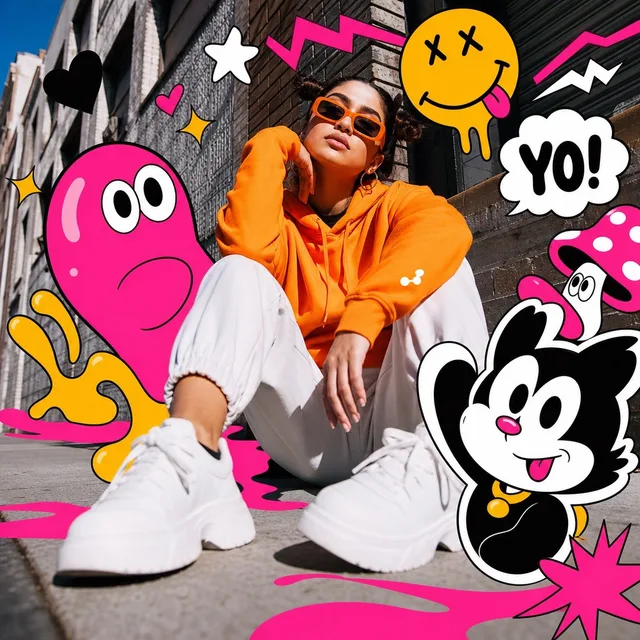
ภาพบุคคลแนวป๊อปอาร์ต ผสมผสานสื่อหลากหลายในเมือง
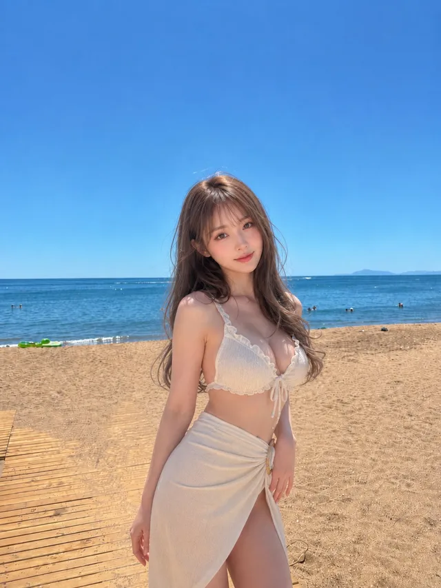
สาวบิกินีริมหาดใต้ท้องฟ้ากว้าง