แอปพลิเคชันภาพ OZOUO สำหรับค้าปลีก (ผลไม้ลิ้นจี่)
ที่มา: @ou_zhen599โมเดล: ChatGPT
ภาพตัวอย่าง
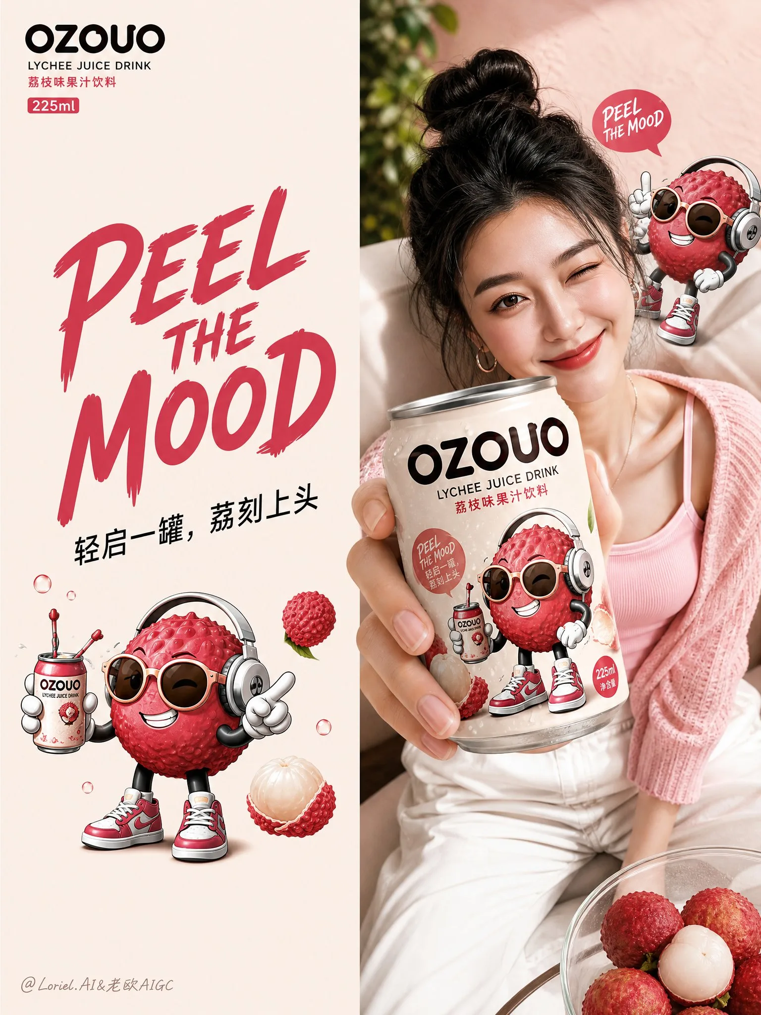
พรอมต์ภาษาไทย
สร้างภาพที่สี่ของระบบภาพแบรนด์รวมสำหรับเครื่องดื่มผลไม้ “OZOUO” โดยคงเอกลักษณ์ของแบรนด์, สไตล์ภาพของมาสคอต, ระบบตัวอักษร, สัดส่วนกระป๋อง 225 มล., การออกแบบฮีโร่รสลิ้นจี่ และ DNA สีโดยรวม เหมือนกับระบบภาพของ OZOUO ที่กำหนดไว้ ภาพนี้ต้องมีหน้าที่ใหม่: จุดสัมผัสการค้าปลีกและแผงแอปพลิเคชันขยายแบรนด์ ไม่ใช่แผ่นบรรจุภัณฑ์, ไม่ใช่โปสเตอร์แสดงรสชาติ และไม่ใช่ภาพคอลลาจแคมเปญกว้างๆ บทบาทหลัก: ภาพนี้ควรแสดงให้เห็นว่าระบบแบรนด์ OZOUO ขยายไปสู่จุดสัมผัสผู้บริโภคจริงได้อย่างไร รวมถึงวัสดุ ณ จุดขาย, ส่วนขยายบรรจุภัณฑ์พร้อมขาย, ตู้แช่เย็น, อุปกรณ์เสริมไลฟ์สไตล์ที่มีตราสินค้า และช่วงเวลาปฏิสัมพันธ์กับผู้คน ควรให้ความรู้สึกเหมือนแผงแอปพลิเคชันแบรนด์ที่ประณีตสำหรับการเปิดตัวเครื่องดื่มยุคใหม่ องค์ประกอบโดยรวม: ใช้เลย์เอาต์หลายแผงที่สะอาดตาบนพื้นหลังสีเบจโทนอุ่นนุ่มนวลหรือสีกลางครีม โดยมี 5 หรือ 6 ส่วนจัดเรียงในคอลลาจนำเสนอแบรนด์ที่เป็นระเบียบเรียบร้อย แต่ละแผงควรให้ความรู้สึกแตกต่างกันทางภาพแต่ชัดเจนว่าเป็นส่วนหนึ่งของโลก OZOUO เดียวกัน ภาพทั้งหมดต้องคงความสงบ, พรีเมียม, ขี้เล่น และมีความสอดคล้องกันสูง ความสอดคล้องของแบรนด์: รักษาระบบเอกลักษณ์ OZOUO แบบเดียวกันทุกประการ: คำว่า “OZOUO” แบบเดียวกัน รสลิ้นจี่ฮีโร่แบบเดียวกัน มาสคอตลิ้นจี่การ์ตูนสำหรับผู้ใหญ่แบบเดียวกัน การออกแบบกระป๋องขนาดกะทัดรัด 225 มล. แบบเดียวกัน พื้นผิวสีครีม + สีชมพูลิ้นจี่ + ตัวอักษรสีน้ำตาลเข้มแบบเดียวกัน โทนเสียง “PEEL THE MOOD” แบบเดียวกัน ความสมดุลระหว่างความน่ารักและความเป็นผู้ใหญ่แบบเดียวกัน ทุกอย่างต้องให้ความรู้สึกเป็นแบรนด์เดียวกันอย่างชัดเจน โครงสร้างแผงที่แนะนำ: แผงที่ 1: วัสดุสิ่งพิมพ์ที่มีตราสินค้า เช่น โปสการ์ด, ใบปลิว, โปสเตอร์ขนาดเล็ก หรือบัตรรวมแบรนด์ที่จัดวางราบเรียบอย่างเป็นระเบียบ ใช้โลโก้ OZOUO, มาสคอตลิ้นจี่ และระบบสีชมพูครีมแบบเดียวกัน สไตล์ควรให้ความรู้สึกเรียบง่าย เป็นกราฟิก และน่าสะสม แผงที่ 2: ชุดแพ็คหลายชิ้นขนาดกะทัดรัดสำหรับค้าปลีก หรือกล่องของขวัญที่ออกแบบมาสำหรับกระป๋อง OZOUO 225 มล. แสดงถุงกระดาษที่มีตราสินค้าที่เหมือนจริง หรือชุดกล่องเล็กๆ โดยใช้มาสคอตและระบบตัวอักษรแบบเดียวกัน ควรให้ความรู้สึกที่เชื่อถือได้เชิงพาณิชย์และพร้อมสำหรับวางจำหน่าย แผงที่ 3: ตู้แช่เย็นสำหรับค้าปลีกพร้อมกระป๋อง OZOUO รสลิ้นจี่หลายกระป๋องที่จัดเรียงอย่างเป็นระเบียบภายในตู้แช่ กระป๋องควรดูเย็นสดใหม่ มีไอน้ำเกาะเล็กน้อย และเป็นที่จดจำได้ง่าย แผงนี้แสดงให้เห็นถึงผลกระทบต่อชั้นวางสินค้าและการมองเห็นในร้านค้าปลีก แผงที่ 4: หนุ่มสาวที่มีสไตล์กำลังถือหรือนำเสนอกระป๋อง OZOUO ในช่วงเวลาไลฟ์สไตล์ที่เป็นธรรมชาติ ทำให้บุคคลนั้นดูทันสมัย มีสไตล์ และเหมาะสมกับแบรนด์ โดยที่กระป๋องมองเห็นได้ชัดเจน บรรยากาศควรให้ความรู้สึกเป็นมิตร, มั่นใจ และเป็นคนเมือง ไม่ใช่ภาพสต็อกทั่วไป แผงที่ 5: กระเป๋าโท้ท, ถุงช้อปปิ้ง หรืออุปกรณ์เสริมไลฟ์สไตล์นุ่มๆ ที่มีตราสินค้าโดยใช้ระบบภาพของ OZOUO กระเป๋าควรให้ความรู้สึกทันสมัย มีประโยชน์ใช้สอย และพรีเมียม ขยายแบรนด์ไปสู่ชีวิตประจำวัน ใช้โลโก้และมาสคอตในลักษณะที่เป็นกราฟิกที่เรียบง่ายยิ่งขึ้น แผงเพิ่มเติมทางเลือกที่ 6: จุดแสดงสินค้าขนาดเล็ก หรือเคาน์เตอร์, แผ่นสติกเกอร์, วอบเบลอร์ที่ชั้นวาง หรือระบบสติกเกอร์ติดตู้แช่ที่มีตราสินค้า ซึ่งพิสูจน์ว่าภาษาการออกแบบของ OZOUO ใช้งานได้กับรายละเอียดการค้าปลีก โทนสีภาพ: แผงนี้ควรให้ความรู้สึกที่เป็นประโยชน์และเน้นการค้าปลีกมากกว่าภาพแคมเปญก่อนหน้านี้ ต้องสื่อสารว่า OZOUO ปรากฏในสภาพแวดล้อมการซื้อจริงและจุดสัมผัสผู้บริโภคที่มีตราสินค้าได้อย่างไร แต่ละแผงควรเรียบง่าย แข็งแกร่ง และสอดคล้องกับแบรนด์ การออกแบบตัวอักษร: การออกแบบตัวอักษรควรกระชับและเป็นที่จดจำได้สูง โดยใช้ระบบ OZOUO แบบเดียวกัน: “OZOUO” “LYCHEE JUICE DRINK” “PEEL THE MOOD” “轻启一罐,荔刻上头” “成人向果味灵感” ใช้ข้อความเท่าที่จำเป็นและมีกลยุทธ์ หลีกเลี่ยงข้อความที่รก โทนสี: ใช้โทนสีลิ้นจี่ของ OZOUO ที่กำหนดไว้: สีเบจอ่อนนุ่มนวล สีชมพูบลัชออนอ่อนๆ สีลิ้นจี่กุหลาบ สีชมพูเบอร์รี่เป็นจุดเด่น ตัวอักษรสีน้ำตาลเอสเปรสโซเข้ม ใบไม้สีเขียวสดเล็กๆ เป็นจุดเด่น แอปพลิเคชันทั้งหมดควรรู้สึกว่าเป็นส่วนหนึ่งของครอบครัวเดียวกันอย่างชัดเจน สไตล์: ขี้เล่นสำหรับผู้ใหญ่, มีสไตล์, พร้อมจำหน่าย, เป็นมิตรกับโซเชียลมีเดีย, สะอาด, ทันสมัย, การสร้างแบรนด์ FMCG พรีเมียม, น่ารักแต่ไม่เหมือนเด็ก, ประณีตและน่าเชื่อถือในเชิงพาณิชย์ การเรนเดอร์: แบบจำลองกระป๋อง 225 มล. ที่มีรายละเอียดสูง, วัสดุบรรจุภัณฑ์ที่สมจริง, การตกแต่งสิ่งพิมพ์ระดับพรีเมียม, องค์ประกอบคอลลาจที่สะอาด, ตู้เย็นที่แสดงผลอย่างสมจริง, ความสมจริงในการใช้งานไลฟ์สไตล์, เงาในสตูดิโอที่นุ่มนวล, ความละเอียด 8k, คุณภาพการนำเสนอแบรนด์ Negative prompt: แผงบรรจุภัณฑ์ทางเทคนิคซ้ำๆ, การออกแบบที่เต็มไปด้วยบาร์โค้ด, การเปลี่ยนรสชาติแบบสุ่ม, สไตล์มาสคอตที่ไม่สอดคล้องกัน, การสร้างแบรนด์เครื่องดื่มสำหรับเด็ก, คอลลาจที่ยุ่งเหยิง, ผลิตภัณฑ์ที่ไม่เกี่ยวข้องกัน, ความสมจริงในร้านค้าปลีกที่อ่อนแอ, รายละเอียดต่ำ, สัดส่วนกระป๋องที่ไม่สอดคล้องกัน, การสร้างแบรนด์ซูเปอร์มาร์เก็ตทั่วไป, เลย์เอาต์ที่รก
พรอมต์ภาษาอังกฤษ
Create the fourth image of the unified brand visual system for “OZOUO” fruit drinks, keeping exactly the same brand identity, mascot illustration style, typography system, 225ml can proportion, lychee flavor hero design, and overall color DNA as the established OZOUO visual system. This image must serve a new responsibility: a retail touchpoint and brand-extension application board, not a packaging sheet, not a flavor lineup poster, and not a broad campaign collage. Core role: This image should show how the OZOUO brand system extends into real consumer touchpoints, including point-of-sale materials, retail-ready packaging extensions, fridge display, branded lifestyle accessories, and human interaction moments. It should feel like a polished brand application board for a modern beverage launch. Overall composition: Use a clean multi-panel layout on a soft warm beige or creamy neutral background, with 5 or 6 sections arranged in a tidy brand-presentation collage. Each panel should feel visually distinct but clearly belong to the same OZOUO world. The whole image must remain calm, premium, playful, and highly coherent. Brand consistency: Keep exactly the same OZOUO identity system: same “OZOUO” wordmark, same lychee hero flavor, same adult-oriented cartoon lychee mascot, same 225ml compact can design, same creamy base + lychee pink + deep brown typography, same “PEEL THE MOOD” tone of voice, same balance between cute and grown-up. Everything must clearly feel like one brand. Suggested panel structure: Panel 1: Branded print materials such as postcards, flyers, mini posters, or brand cards laid flat in a neat presentation. Use the same OZOUO logo, lychee mascot, and creamy-pink color system. The style should feel simple, graphic, and collectible. Panel 2: A compact retail multipack or gift carton designed for the OZOUO 225ml cans. Show a realistic branded paper carrier or small boxed set using the same mascot and typography system. It should feel commercially believable and shelf-ready. Panel 3: A refrigerated retail shelf display with multiple OZOUO lychee cans lined up neatly inside a cooler. The cans should look cold, fresh, slightly condensed, and highly recognizable. This panel demonstrates shelf impact and retail visibility. Panel 4: A stylish young adult holding or presenting an OZOUO can in a natural lifestyle moment. Keep the person fashionable, modern, and brand-appropriate, with the can clearly visible. The mood should feel social, confident, and urban, not like a generic stock photo. Panel 5: A branded tote bag, shopping bag, or soft lifestyle accessory using the OZOUO visual system. The bag should feel trendy, useful, and premium, extending the brand into daily life. Use the logo and mascot in a more graphic, simplified way. Optional Panel 6: A small point-of-sale or countertop display, sticker sheet, shelf wobblers, or branded cooler decal system, proving the OZOUO design language works across retail details. Visual tone: The board should feel more practical and retail-facing than the previous campaign image. It must communicate how OZOUO appears in real purchase environments and branded consumer touchpoints. Each panel should be simple, strong, and brand-consistent. Typography: Typography should stay concise and highly recognizable, using the same OZOUO system: “OZOUO” “LYCHEE JUICE DRINK” “PEEL THE MOOD” “轻启一罐,荔刻上头” “成人向果味灵感” Use text sparingly and strategically. Avoid cluttered copy. Color palette: Use the established OZOUO lychee palette: creamy warm beige, soft blush pink, lychee rose, berry-pink accents, deep espresso-brown typography, small fresh green leaf accents. All applications should clearly feel part of the same family. Styling: Adult playful, stylish, retail-ready, social-media friendly, clean, modern, premium FMCG branding, cute but not childish, polished and commercially believable. Rendering: hyper-detailed 225ml can mockups, realistic packaging materials, premium print finishes, clean collage composition, realistic fridge display, lifestyle application realism, soft studio shadows, 8k, brand presentation quality. Negative prompt: repeated technical packaging board, barcode-heavy design, random flavor changes, inconsistent mascot style, childish kids drink branding, messy collage, unrelated products, weak retail realism, low detail, inconsistent can proportions, generic supermarket branding, cluttered layout
พรอมต์ภาษาจีน
Create the fourth image of the unified brand visual system for “OZOUO” fruit drinks, keeping exactly the same brand identity, mascot illustration style, typography system, 225ml can proportion, lychee flavor hero design, and overall color DNA as the established OZOUO visual system. This image must serve a new responsibility: a retail touchpoint and brand-extension application board, not a packaging sheet, not a flavor lineup poster, and not a broad campaign collage. Core role: This image should show how the OZOUO brand system extends into real consumer touchpoints, including point-of-sale materials, retail-ready packaging extensions, fridge display, branded lifestyle accessories, and human interaction moments. It should feel like a polished brand application board for a modern beverage launch. Overall composition: Use a clean multi-panel layout on a soft warm beige or creamy neutral background, with 5 or 6 sections arranged in a tidy brand-presentation collage. Each panel should feel visually distinct but clearly belong to the same OZOUO world. The whole image must remain calm, premium, playful, and highly coherent. Brand consistency: Keep exactly the same OZOUO identity system: same “OZOUO” wordmark, same lychee hero flavor, same adult-oriented cartoon lychee mascot, same 225ml compact can design, same creamy base + lychee pink + deep brown typography, same “PEEL THE MOOD” tone of voice, same balance between cute and grown-up. Everything must clearly feel like one brand. Suggested panel structure: Panel 1: Branded print materials such as postcards, flyers, mini posters, or brand cards laid flat in a neat presentation. Use the same OZOUO logo, lychee mascot, and creamy-pink color system. The style should feel simple, graphic, and collectible. Panel 2: A compact retail multipack or gift carton designed for the OZOUO 225ml cans. Show a realistic branded paper carrier or small boxed set using the same mascot and typography system. It should feel commercially believable and shelf-ready. Panel 3: A refrigerated retail shelf display with multiple OZOUO lychee cans lined up neatly inside a cooler. The cans should look cold, fresh, slightly condensed, and highly recognizable. This panel demonstrates shelf impact and retail visibility. Panel 4: A stylish young adult holding or presenting an OZOUO can in a natural lifestyle moment. Keep the person fashionable, modern, and brand-appropriate, with the can clearly visible. The mood should feel social, confident, and urban, not like a generic stock photo. Panel 5: A branded tote bag, shopping bag, or soft lifestyle accessory using the OZOUO visual system. The bag should feel trendy, useful, and premium, extending the brand into daily life. Use the logo and mascot in a more graphic, simplified way. Optional Panel 6: A small point-of-sale or countertop display, sticker sheet, shelf wobblers, or branded cooler decal system, proving the OZOUO design language works across retail details. Visual tone: The board should feel more practical and retail-facing than the previous campaign image. It must communicate how OZOUO appears in real purchase environments and branded consumer touchpoints. Each panel should be simple, strong, and brand-consistent. Typography: Typography should stay concise and highly recognizable, using the same OZOUO system: “OZOUO” “LYCHEE JUICE DRINK” “PEEL THE MOOD” “轻启一罐,荔刻上头” “成人向果味灵感” Use text sparingly and strategically. Avoid cluttered copy. Color palette: Use the established OZOUO lychee palette: creamy warm beige, soft blush pink, lychee rose, berry-pink accents, deep espresso-brown typography, small fresh green leaf accents. All applications should clearly feel part of the same family. Styling: Adult playful, stylish, retail-ready, social-media friendly, clean, modern, premium FMCG branding, cute but not childish, polished and commercially believable. Rendering: hyper-detailed 225ml can mockups, realistic packaging materials, premium print finishes, clean collage composition, realistic fridge display, lifestyle application realism, soft studio shadows, 8k, brand presentation quality. Negative prompt: repeated technical packaging board, barcode-heavy design, random flavor changes, inconsistent mascot style, childish kids drink branding, messy collage, unrelated products, weak retail realism, low detail, inconsistent can proportions, generic supermarket branding, cluttered layout
พรอมต์แนะนำ
8 พรอมต์คัดสรร
สาวผมแดงในสตูดิโอ: แฟชั่นมินิมัลลิสต์

สาวเอเชียในชุดคาร์ดิแกนสีฟ้ามิสต์กับกระโปรงขาว

สาวเอเชียในชุดสีน้ำเงิน บนโซฟาหรูในโรงแรม

โปสเตอร์อินโฟกราฟิกสูตรอาหารระดับพรีเมียม

สาวชุดว่ายน้ำขาว-ฟ้า สาดน้ำทะเลริมหาด

ถ่ายภาพคอสเพลย์ฤดูร้อนสไตล์เซลฟี่จากมือถือ
แฟชั่นแนวตะวันออกในห้องหนังสือย้อนยุค
ผู้หญิงชุดกีฬาในท่าโพสกับผนังสีเทา