โปสเตอร์แคมเปญเครื่องดื่มลิ้นจี่ OZOUO รวมทุกมิติ
ที่มา: @ou_zhen599โมเดล: ChatGPT
ภาพตัวอย่าง
พรอมต์ภาษาไทย
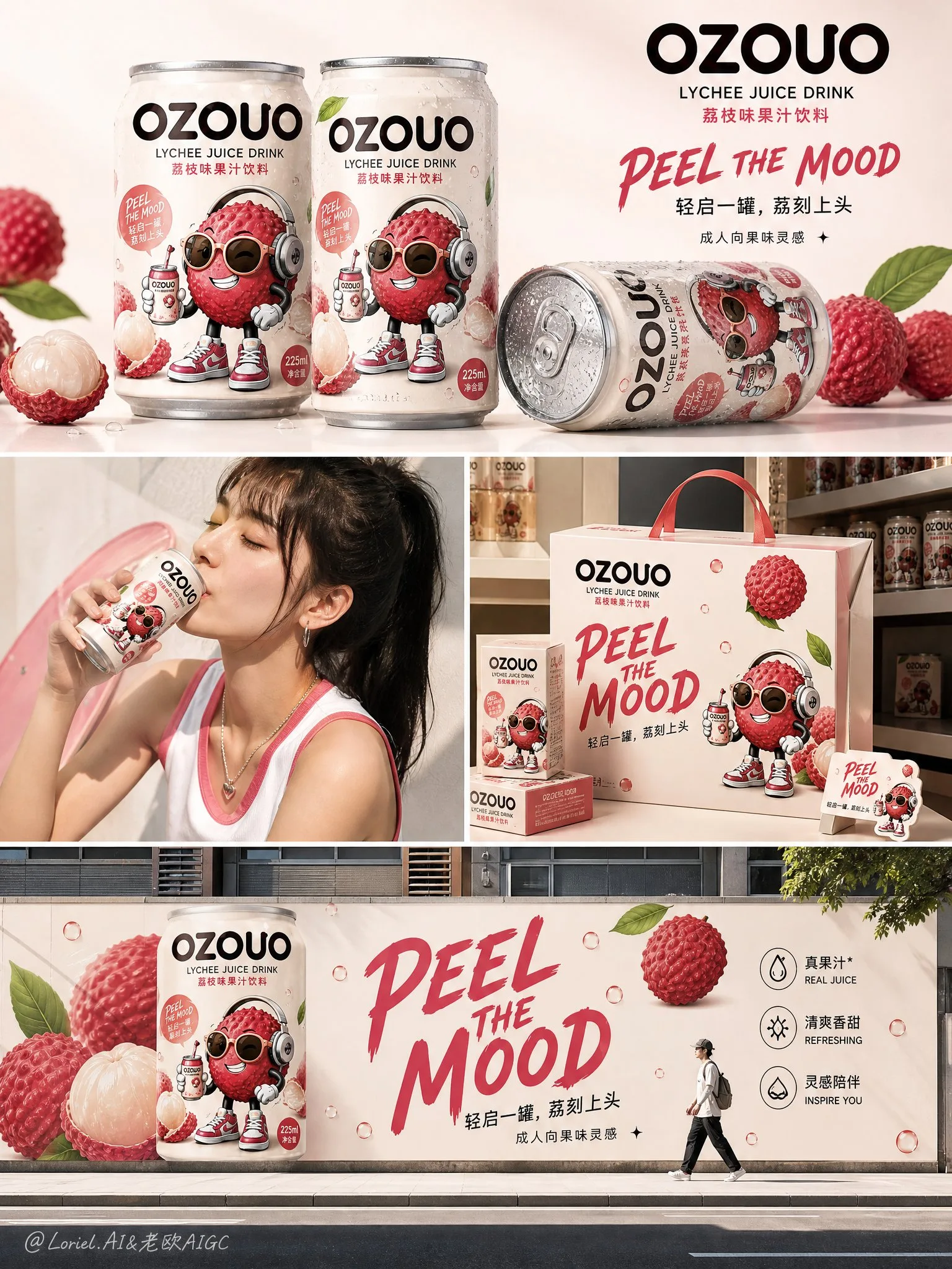
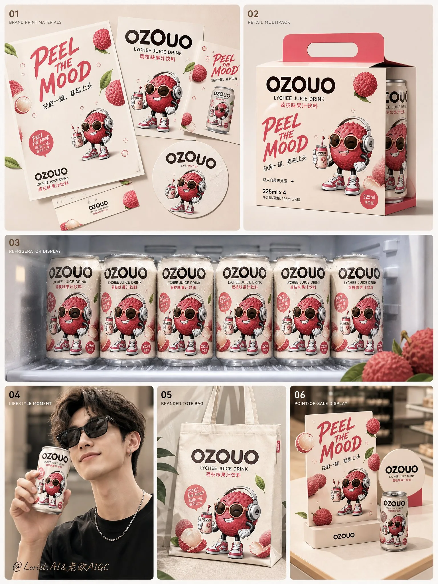
สร้างสรรค์ภาพที่สามของระบบภาพลักษณ์แบรนด์แบบครบวงจรสำหรับเครื่องดื่มผลไม้ “OZOUO” โดยคงเอกลักษณ์ของแบรนด์, สไตล์มาสคอต, การออกแบบตัวอักษร, ภาษาบรรจุภัณฑ์, สัดส่วนกระป๋อง และ DNA ทางภาพรวมทั้งหมดให้เหมือนกับระบบเครื่องดื่มลิ้นจี่ OZOUO ขนาด 225 มล. ที่มีอยู่แล้ว ภาพนี้ต้องมีหน้าที่แตกต่างจากบอร์ดออกแบบบรรจุภัณฑ์และโปสเตอร์ตระกูลรสชาติ: มันคือแอปพลิเคชันแคมเปญไลฟ์สไตล์ / ภาพคอลลาจการเปิดตัวแบรนด์ / ภาพสื่อสารการเปิดตัว บทบาทหลัก: ภาพนี้ควรนำเสนอว่าแบรนด์ OZOUO ดำเนินอยู่ในโลกแห่งความเป็นจริงผ่านคอลลาจแคมเปญหลายฉาก มันควรรู้สึกเหมือนบอร์ดการตลาดที่พร้อมเปิดตัว ซึ่งแสดงภาพผลิตภัณฑ์ที่สวยงาม การใช้งานในชีวิตประจำวัน การจัดแสดงสินค้า และผลกระทบของแบรนด์ภายนอกอาคาร ทั้งหมดนี้อยู่ภายในโปสเตอร์ที่สอดคล้องกันเพียงแผ่นเดียว ภาพต้องเป็นส่วนหนึ่งของระบบแบรนด์ OZOUO อย่างชัดเจน ไม่ใช่แบรนด์อื่น การจัดองค์ประกอบโดยรวม: ใช้เลย์เอาต์คอลลาจหลายช่องที่ดูสะอาดตา ซึ่งได้รับแรงบันดาลใจจากบอร์ดเปิดตัวผลิตภัณฑ์ FMCG สมัยใหม่ จัดองค์ประกอบเป็น 4 ส่วน โดยมีความชัดเจนทางภาพและพื้นที่หายใจที่ดี: ส่วนบนสุด: การจัดเรียงกระป๋องฮีโร่ / ภาพผลิตภัณฑ์ที่สวยงาม กลางซ้าย: ช่วงเวลาการดื่มในชีวิตประจำวัน กลางขวา: การจัดแสดงสินค้าที่มีตราสินค้า หรือกล่องของขวัญ / ฉากจัดแสดงในร้านค้าปลีก ส่วนล่าง: แคมเปญภายนอกอาคารที่โดดเด่น หรือป้ายบิลบอร์ดขนาดใหญ่ / โปสเตอร์ติดถนน ภาพทั้งหมดควรรู้สึกสะอาด มีสไตล์ ทันสมัย และน่าเชื่อถือในเชิงพาณิชย์ ความสอดคล้องของแบรนด์: รักษาการออกแบบ OZOUO ให้เหมือนกับข้อมูลอ้างอิงที่มีอยู่ทั้งหมด: โลโก้ “OZOUO” แบบเดียวกัน สัดส่วนกระป๋องขนาด 225 มล. แบบกะทัดรัดแบบเดียวกัน ดีไซน์ลิ้นจี่รสชาติฮีโร่แบบเดียวกัน มาสคอตลิ้นจี่การ์ตูนที่เน้นผู้ใหญ่แบบเดียวกัน พาเล็ตสีพื้นฐานสีครีมกลางๆ และสีชมพูลิ้นจี่สำหรับการเน้นแบบเดียวกัน ความเป็นจริงของ FMCG ระดับพรีเมียมแบบเดียวกัน ภาษาของสโลแกนแบบเดียวกัน เช่น “PEEL THE MOOD” สมดุลที่ลงตัวระหว่างความน่ารักและความเป็นผู้ใหญ่แบบเดียวกัน ภาพต้องรู้สึกเหมือนเป็นส่วนเสริมที่เป็นธรรมชาติของจักรวาลแบรนด์เดียวกัน จุดเน้นรสชาติ: ใช้ลิ้นจี่เป็นรสชาติหลักเพื่อรักษาความต่อเนื่อง การออกแบบกระป๋อง ภาพผลไม้ มาสคอต และโทนสีควรสอดคล้องกับระบบบรรจุภัณฑ์ลิ้นจี่ที่มีอยู่ กระป๋องฮีโร่ควรดูสดใหม่ เย็น และพรีเมียม พร้อมหยดน้ำเกาะที่สมจริงและพื้นผิวอะลูมิเนียมขัดมัน ฉากที่ 1 ส่วนบนสุด: แสดงกระป๋องลิ้นจี่ OZOUO ขนาด 225 มล. สองหรือสามกระป๋องในองค์ประกอบภาพผลิตภัณฑ์ที่สวยงาม อาจจะตั้งตรงและนอนลงบนพื้นผิวที่สะอาด โดยมีหยดน้ำเกาะ เงาที่สมจริง และให้ความรู้สึกสดชื่นแบบพรีเมียม คงสไตล์ให้เรียบง่าย ไม่รกรุงรัง ฉากนี้ควรนำเสนอกระป๋องในฐานะผลิตภัณฑ์ฮีโร่ที่แท้จริง ฉากที่ 2 กลางซ้าย: แสดงช่วงเวลาในชีวิตประจำวันที่แท้จริงของบุคคลที่กำลังดื่มลิ้นจี่ OZOUO ต้องการเพียงแค่บางส่วนของร่างกายหรือภาพบุคคลที่ถูกตัดมาเท่านั้น บุคคลนั้นควรรู้สึกเป็นวัยรุ่นตอนปลาย มีสไตล์ ทันสมัย และเหมาะสมกับแบรนด์ กระป๋องยังคงมองเห็นได้ชัดเจน บรรยากาศควรรู้สึกสดชื่น เหมาะกับการลงโซเชียลมีเดีย และเป็นธรรมชาติ ไม่ใช่ภาพสต็อกทั่วไป ฉากที่ 3 กลางขวา: แสดงการขยายแบรนด์ OZOUO เข้าสู่การจัดแสดงสินค้าขนาดเล็กหรือฉากจัดแสดงในร้านค้าปลีก เช่น กล่องของขวัญที่มีตราสินค้าซ้อนกัน คิวบ์จัดแสดง ณ จุดขาย หรือบรรจุภัณฑ์ชุดเปิดตัวขนาดเล็กในระบบภาพเดียวกัน กล่องควรใช้มาสคอตเดียวกัน แบบอักษรเดียวกัน พาเล็ตสีลิ้นจี่เดียวกัน และภาษาการสร้างแบรนด์ที่สะอาดตาเดียวกัน ส่วนนี้พิสูจน์ว่าระบบแบรนด์สามารถขยายเกินกว่ากระป๋องได้ ฉากที่ 4 ส่วนล่าง: แสดงการใช้งานแคมเปญภายนอกอาคารที่โดดเด่น: ภาพจิตรกรรมฝาผนังกระป๋องลิ้นจี่ OZOUO ขนาดใหญ่ ป้ายบิลบอร์ด หรือโปสเตอร์ติดผนังในบริบทเมือง คงความสะอาดและเป็นกราฟิก โดยมีกระป๋องขนาดยักษ์หรือสโลแกนขนาดยักษ์แสดงอยู่บนผนัง ป้ายบอร์ด หรือพื้นผิวอาคารที่หันออกสู่ถนน เพิ่มคนเดินเท้าตัวเล็กๆ หรือรูปปั้นในเมืองเล็กๆ หนึ่งคนเพื่อเปรียบเทียบขนาด ส่วนนี้ควรแสดงการปรากฏตัวต่อสาธารณะและผลกระทบทางภาพของแบรนด์ การออกแบบตัวอักษร: การออกแบบตัวอักษรควรเป็นทรัพย์สินหลักของแบรนด์ แต่ยังคงกระชับและควบคุมได้ ใช้สไตล์ OZOUO แบบเดียวกันกับระบบที่มีอยู่แล้ว: ตัวหนา โค้งมน เหมาะสำหรับผู้ใหญ่ พร้อมวางบนชั้นวางสินค้า มีสไตล์ และสะอาดตา รวมข้อความเช่น: “OZOUO” “LYCHEE JUICE DRINK” “PEEL THE MOOD” “轻启一罐,荔刻上头” (เปิดหนึ่งกระป๋อง สดชื่นถึงใจทันที) “成人向果味灵感” (แรงบันดาลใจจากผลไม้สำหรับผู้ใหญ่) สำหรับส่วนแคมเปญกลางแจ้ง ให้ใช้สโลแกนสั้นๆ ตัวหนา เช่น: “PEEL THE MOOD” หรือ “一罐进入果味状态” (ดื่มหนึ่งกระป๋อง ก็เข้าสู่โหมดผลไม้) อย่าเพิ่มข้อความมากเกินไป รักษาข้อความให้เป็นกลยุทธ์ เน้นภาพ และสอดคล้องกับแบรนด์ สไตล์ภาพ: บอร์ดทั้งหมดควรรู้สึกเหมือนการนำเสนอแคมเปญเปิดตัวที่ประณีตสำหรับสตาร์ทอัพเครื่องดื่มผลไม้สมัยใหม่: สะอาด, เป็นกราฟิก, สนุกสนานแบบผู้ใหญ่, พร้อมสำหรับโซเชียลมีเดีย, พร้อมสำหรับร้านค้าปลีก, สอดคล้องกันทั้งแบรนด์, มีสไตล์, สดใหม่, พรีเมียม, น่าเชื่อถือในเชิงพาณิชย์ ไม่ควรรู้สึกเหมือนภาพสี่ภาพที่ไม่เกี่ยวข้องกัน ฉากทั้งหมดต้องเชื่อมโยงกันด้วยระบบสีเดียวกัน การออกแบบกระป๋องเดียวกัน การออกแบบตัวอักษรเดียวกัน สไตล์มาสคอตเดียวกัน และโทนเสียงเดียวกัน จานสี: ใช้จานสีลิ้นจี่ OZOUO ที่มีอยู่แล้ว: สีเบจอบอุ่นแบบครีม, สีชมพูอ่อนแบบบลัช, สีชมพูลิ้นจี่, สีชมพูเบอร์รี่สำหรับการเน้น, การออกแบบตัวอักษรสีน้ำตาลเอสเพรสโซเข้ม, การเน้นด้วยใบไม้สีเขียวสดขนาดเล็ก บอร์ดแคมเปญควรรู้สึกสอดคล้องและจดจำได้ว่าเป็นแบรนด์เดียวกัน การเรนเดอร์: ภาพจำลองกระป๋องขนาด 225 มล. ที่มีรายละเอียดสูง, ภาพถ่ายไลฟ์สไตล์ที่สมจริง, ภาพจำลองสินค้าที่สวยงาม, การใช้งานแบรนด์ภายนอกอาคาร, เงาสตูดิโอที่อ่อนนุ่ม, องค์ประกอบที่สะอาดตา, การนำเสนอแคมเปญ FMCG ระดับพรีเมียม, 8k, น่าเชื่อถือในเชิงพาณิชย์, น่าจดจำทางสายตา ข้อความเชิงลบ: การจัดวางบรรจุภัณฑ์ทางเทคนิคซ้ำๆ, บอร์ดที่มีบาร์โค้ดจำนวนมาก, สัดส่วนกระป๋องไม่สอดคล้องกัน, สไตล์มาสคอตแตกต่างกัน, แบรนด์เครื่องดื่มเด็กที่ดูเป็นเด็ก, คอลลาจที่ยุ่งเหยิง, พื้นหลังแบบสุ่ม, เอกลักษณ์แบรนด์ที่อ่อนแอ, รสชาติมากเกินไป, รายละเอียดต่ำ, โฆษณาภาพสต็อกทั่วไป, การออกแบบบิลบอร์ดในเมืองที่ไม่เกี่ยวข้อง
พรอมต์ภาษาอังกฤษ
Create the third image of the unified brand visual system for “OZOUO” fruit drinks, keeping exactly the same brand identity, mascot style, typography, packaging language, can proportion, and overall visual DNA as the established OZOUO 225ml lychee drink system. This image must have a different responsibility from the packaging design board and the flavor-family poster: it is a lifestyle campaign application board / brand rollout collage / launch communication visual. Core role: This image should present how the OZOUO brand lives in the real world through a multi-scene campaign collage. It should feel like a launch-ready marketing board that shows product beauty shots, lifestyle use, merchandising, and outdoor brand impact, all within one coherent poster. The image must clearly belong to the same OZOUO brand system, not a different brand. Overall composition: Use a clean multi-panel collage layout inspired by a modern FMCG launch board. Arrange the composition in 4 sections with strong visual clarity and breathing room: top section: hero can lineup / product beauty shot middle left: lifestyle drinking moment middle right: branded merchandising or gift box / retail display scene bottom section: bold outdoor campaign or oversized billboard / street poster application The whole image should feel clean, stylish, youthful, and commercially convincing. Brand consistency: Keep exactly the same OZOUO system from the existing reference: same “OZOUO” wordmark same 225ml compact can proportion same lychee flavor hero design same adult-oriented cartoon lychee mascot same creamy neutral base and lychee-pink accent palette same premium FMCG realism same slogan language such as “PEEL THE MOOD” same balance between cute and grown-up The image must feel like a natural continuation of the same brand universe. Flavor focus: Keep lychee as the hero flavor to maintain continuity. The can design, fruit visuals, mascot, and tone should stay aligned with the established lychee packaging system. The hero can should appear fresh, cold, and premium, with realistic condensation and polished aluminum texture. Scene 1, top section: Show two or three OZOUO 225ml lychee cans in a product beauty composition. They can be standing and lying down on a clean surface, with condensation droplets, realistic shadows, and a fresh premium feel. Keep the styling minimal, not cluttered. This scene should showcase the can as a real product hero. Scene 2, middle left: Show a real lifestyle moment of a person drinking OZOUO lychee. Only partial figure or cropped portrait is needed. The person should feel young adult, stylish, modern, and brand-appropriate. The can remains clearly visible. The mood should feel refreshing, social-media friendly, and natural, not like a generic stock photo. Scene 3, middle right: Show OZOUO brand extension into a compact merch or retail-display scene, such as stacked branded gift boxes, point-of-sale display cubes, or small launch-kit packaging in the same visual system. The boxes should use the same mascot, same typography, same lychee color palette, and same clean branding language. This section proves the brand system can expand beyond the can. Scene 4, bottom section: Show a bold outdoor campaign application: an oversized OZOUO lychee can mural, billboard, or wall poster in an urban setting. Keep it clean and graphic, with a giant can or giant slogan displayed on a wall, poster board, or branded street-facing surface. Add one small walking person or urban figure for scale. This section should show the brand’s public presence and visual impact. Typography: Typography should be a major brand asset but remain concise and controlled. Use the same OZOUO style as the established system: bold, rounded, adult-friendly, shelf-ready, stylish, and clean. Include text such as: “OZOUO” “LYCHEE JUICE DRINK” “PEEL THE MOOD” “轻启一罐,荔刻上头” “成人向果味灵感” For the outdoor campaign section, use one short bold slogan such as: “PEEL THE MOOD” or “一罐进入果味状态” Do not add too much copy. Keep the text strategic, visual, and brand-consistent. Visual style: The whole board should feel like a polished launch campaign presentation for a modern fruit drink startup: clean, graphic, adult playful, social-media ready, retail-ready, brand-cohesive, stylish, fresh, premium, commercially believable. It should not feel like four unrelated images. All scenes must be tied together by the same color system, can design, typography, mascot style, and tone of voice. Color palette: Use the established OZOUO lychee palette: creamy warm beige, soft blush pink, lychee rose, berry-pink accents, deep espresso-brown typography, small fresh green leaf accents. The campaign board should feel consistent and recognizable as the same brand family. Rendering: hyper-detailed 225ml can mockups, realistic lifestyle photography, polished merch mockups, branded outdoor application, soft studio shadows, clean composition, premium FMCG campaign presentation, 8k, commercially believable, visually memorable. Negative prompt: technical packaging layout repeated, barcode-heavy board, inconsistent can proportions, different mascot style, childish kids drink brand, messy collage, random backgrounds, weak brand identity, too many flavors, low detail, generic stock-photo ad, unrelated urban billboard design
พรอมต์ภาษาจีน
Create the third image of the unified brand visual system for “OZOUO” fruit drinks, keeping exactly the same brand identity, mascot style, typography, packaging language, can proportion, and overall visual DNA as the established OZOUO 225ml lychee drink system. This image must have a different responsibility from the packaging design board and the flavor-family poster: it is a lifestyle campaign application board / brand rollout collage / launch communication visual. Core role: This image should present how the OZOUO brand lives in the real world through a multi-scene campaign collage. It should feel like a launch-ready marketing board that shows product beauty shots, lifestyle use, merchandising, and outdoor brand impact, all within one coherent poster. The image must clearly belong to the same OZOUO brand system, not a different brand. Overall composition: Use a clean multi-panel collage layout inspired by a modern FMCG launch board. Arrange the composition in 4 sections with strong visual clarity and breathing room: top section: hero can lineup / product beauty shot middle left: lifestyle drinking moment middle right: branded merchandising or gift box / retail display scene bottom section: bold outdoor campaign or oversized billboard / street poster application The whole image should feel clean, stylish, youthful, and commercially convincing. Brand consistency: Keep exactly the same OZOUO system from the existing reference: same “OZOUO” wordmark same 225ml compact can proportion same lychee flavor hero design same adult-oriented cartoon lychee mascot same creamy neutral base and lychee-pink accent palette same premium FMCG realism same slogan language such as “PEEL THE MOOD” same balance between cute and grown-up The image must feel like a natural continuation of the same brand universe. Flavor focus: Keep lychee as the hero flavor to maintain continuity. The can design, fruit visuals, mascot, and tone should stay aligned with the established lychee packaging system. The hero can should appear fresh, cold, and premium, with realistic condensation and polished aluminum texture. Scene 1, top section: Show two or three OZOUO 225ml lychee cans in a product beauty composition. They can be standing and lying down on a clean surface, with condensation droplets, realistic shadows, and a fresh premium feel. Keep the styling minimal, not cluttered. This scene should showcase the can as a real product hero. Scene 2, middle left: Show a real lifestyle moment of a person drinking OZOUO lychee. Only partial figure or cropped portrait is needed. The person should feel young adult, stylish, modern, and brand-appropriate. The can remains clearly visible. The mood should feel refreshing, social-media friendly, and natural, not like a generic stock photo. Scene 3, middle right: Show OZOUO brand extension into a compact merch or retail-display scene, such as stacked branded gift boxes, point-of-sale display cubes, or small launch-kit packaging in the same visual system. The boxes should use the same mascot, same typography, same lychee color palette, and same clean branding language. This section proves the brand system can expand beyond the can. Scene 4, bottom section: Show a bold outdoor campaign application: an oversized OZOUO lychee can mural, billboard, or wall poster in an urban setting. Keep it clean and graphic, with a giant can or giant slogan displayed on a wall, poster board, or branded street-facing surface. Add one small walking person or urban figure for scale. This section should show the brand’s public presence and visual impact. Typography: Typography should be a major brand asset but remain concise and controlled. Use the same OZOUO style as the established system: bold, rounded, adult-friendly, shelf-ready, stylish, and clean. Include text such as: “OZOUO” “LYCHEE JUICE DRINK” “PEEL THE MOOD” “轻启一罐,荔刻上头” “成人向果味灵感” For the outdoor campaign section, use one short bold slogan such as: “PEEL THE MOOD” or “一罐进入果味状态” Do not add too much copy. Keep the text strategic, visual, and brand-consistent. Visual style: The whole board should feel like a polished launch campaign presentation for a modern fruit drink startup: clean, graphic, adult playful, social-media ready, retail-ready, brand-cohesive, stylish, fresh, premium, commercially believable. It should not feel like four unrelated images. All scenes must be tied together by the same color system, can design, typography, mascot style, and tone of voice. Color palette: Use the established OZOUO lychee palette: creamy warm beige, soft blush pink, lychee rose, berry-pink accents, deep espresso-brown typography, small fresh green leaf accents. The campaign board should feel consistent and recognizable as the same brand family. Rendering: hyper-detailed 225ml can mockups, realistic lifestyle photography, polished merch mockups, branded outdoor application, soft studio shadows, clean composition, premium FMCG campaign presentation, 8k, commercially believable, visually memorable. Negative prompt: technical packaging layout repeated, barcode-heavy board, inconsistent can proportions, different mascot style, childish kids drink brand, messy collage, random backgrounds, weak brand identity, too many flavors, low detail, generic stock-photo ad, unrelated urban billboard design
พรอมต์แนะนำ
8 พรอมต์คัดสรร
สาวผมแดงในสตูดิโอ: แฟชั่นมินิมัลลิสต์

สาวเอเชียในชุดคาร์ดิแกนสีฟ้ามิสต์กับกระโปรงขาว

สาวเอเชียในชุดสีน้ำเงิน บนโซฟาหรูในโรงแรม

โปสเตอร์อินโฟกราฟิกสูตรอาหารระดับพรีเมียม

สาวชุดว่ายน้ำขาว-ฟ้า สาดน้ำทะเลริมหาด

ถ่ายภาพคอสเพลย์ฤดูร้อนสไตล์เซลฟี่จากมือถือ
ไอดอลสาวญี่ปุ่นริมสระน้ำ สไตล์ Gravure
ปรัชญาตะวันออก: ชายหนุ่มกับวัดโบราณยามอาทิตย์อัสดง