โปสเตอร์คอร์สเรียนสไตล์นำเสนอธุรกิจ
ที่มา: @xiaoxiaodong01โมเดล: ChatGPT
ภาพตัวอย่าง
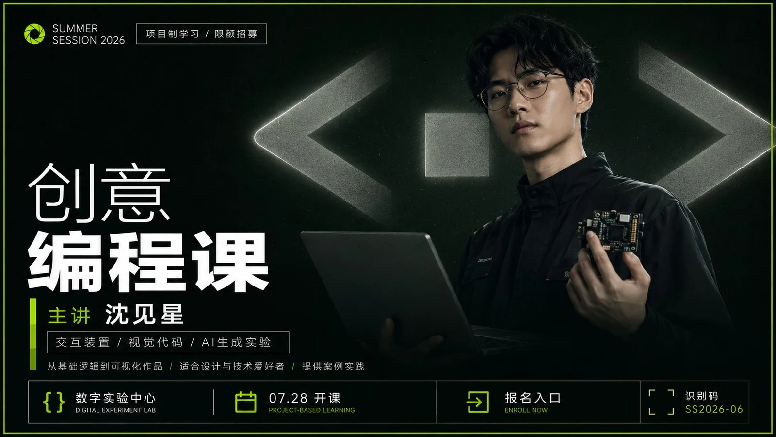
พรอมต์ภาษาไทย
สร้างโปสเตอร์เชิงพาณิชย์ที่ให้ความรู้สึกเหมือนกำลังนำเสนอเกี่ยวกับ [ประเภทสินค้า]: องค์ประกอบโดยรวมเริ่มต้นด้วยพื้นที่ขนาดใหญ่ของพื้นหลังสีเข้มที่มีความสว่างต่ำเพื่อเป็นพื้นหลังที่สงบ โดยมีกรอบด้านนอกแคบๆ ที่เกิดจากสีเน้นความอิ่มตัวสูงที่ได้มาจากธีมที่ขอบ ทำให้ภาพมีความรู้สึกถึงขอบเขตที่ถูกบีบอัดและจดจำได้ชัดเจน ในพื้นหลังมีสัญลักษณ์เรขาคณิตขนาดใหญ่หรือสัญลักษณ์นามธรรม (glyph) ที่มีความหมายเกี่ยวข้องกับธีม โดยมีขนาดใหญ่กว่าวัตถุหลักด้านหน้ามาก ใช้การเปลี่ยนผ่านจากสีเทากลางที่มีความอิ่มตัวต่ำไปสีเทาเข้ม ถูกตัดออกจากกรอบบางส่วน มีรัศมีอ่อนๆ และความหยาบเล็กน้อยที่ขอบ ทำให้ดูเหมือนทั้งป้ายจริงในอวกาศและป้ายบิลบอร์ดขนาดยักษ์ที่ถูกกลืนกินโดยพื้นที่มืด วัตถุหลักของเรื่องราวถูกวางไว้ตรงกลางด้านล่างและยื่นออกมาด้านหน้า โดยยังคงไว้ซึ่งพื้นผิวที่สมจริง สงบ และน่าเชื่อถือเหมือนกับการถ่ายภาพหรือการเรนเดอร์อย่างประณีต โครงร่างภายนอกของวัตถุถูกตัดออกจากด้านหน้าของสัญลักษณ์ขนาดยักษ์ โดยส่วนล่างค่อยๆ ถูกกลืนกินด้วยเงา ทำให้เกิดความสัมพันธ์ที่วัตถุหลักด้านหน้าบดบังส่วนหนึ่งของสัญลักษณ์ขนาดยักษ์ด้านหลัง และสัญลักษณ์ขนาดยักษ์ด้านหลังช่วยพยุงน้ำหนักของชื่อเรื่อง ระบบข้อความใช้ฟอนต์ Sans-serif สีขาวที่สะอาดตาและมีความคมชัดสูง โดยมีโลโก้แบรนด์ขนาดเล็กและประโยคสั้นๆ ขอบบางๆ ที่ด้านบน และชื่อเรื่องขนาดยักษ์สองระดับในส่วนกลางด้านบนเพื่อสร้างจุดโฟกัสในการอ่าน โดยบรรทัดแรกจะบางกว่าและบรรทัดที่สองจะหนาขึ้นอย่างชัดเจน ระยะห่างระหว่างตัวอักษรจะกระชับแต่มีช่องว่างให้หายใจ ชื่อเรื่องจะต้องไม่บดบังใบหน้าหลักหรือจุดสังเกตสำคัญของวัตถุหลักด้านหน้า ส่วนกลางด้านล่างใช้แถบแนวตั้งในสีเน้นเพื่อนำไปสู่ชื่อหรือคำสำคัญของธีม พร้อมด้วยแถบคำอธิบายขอบสีขาวบางๆ และข้อความอธิบายขนาดเล็กอีกหลายบรรทัด โดยมีตำแหน่ง, วันที่, ช่องทางติดต่อ, หรือรหัสระบุจัดเรียงอยู่ที่ด้านล่าง ทุกอย่างสร้างลำดับที่มั่นคงตามแกนกลางที่มองไม่เห็นและระยะขอบซ้ายขวา สีถูกกำหนดโดยโทนสีเฉพาะของธีม แต่ต้องคงไว้ซึ่งพื้นที่มืดที่ครอบครองพื้นที่ส่วนใหญ่ ข้อความสีขาวที่เน้น สัญลักษณ์ขนาดยักษ์สีเทาที่บอกปริมาตรเชิงพื้นที่ และสีเน้นที่ปรากฏเฉพาะในกรอบด้านนอก ตราสัญลักษณ์ แถบสั้นๆ และจุดเข้าถึงสองสามจุด ความสว่างโดยรวมถูกควบคุม สะอาดและโทนเย็น รักษาความผิดเพี้ยนเล็กน้อยเหมือนการพิมพ์ดิจิทัล ขอบที่อ่อนลง และขอบมืดเล็กน้อย โดยไม่มีการเพิ่มการตกแต่งที่ยุ่งเหยิง ข้อผิดพลาดที่พบบ่อยมักจะกลายเป็นการสร้างหน้าโปรโมทตัวละครธรรมดา สัญลักษณ์พื้นหลังที่เล็กหรือสว่างเกินไป ข้อความที่ดูเหมือนถูกแปะลงไปเหมือนการจัดวางอิสระ หรือสีเน้นที่ล้นเกินไป สัญลักษณ์ขนาดยักษ์จะต้องโดดเด่นในพื้นที่ วัตถุหลักจะต้องบดบังส่วนหนึ่ง และลำดับชั้นของข้อความสีขาวและสีเน้นจำนวนน้อยจะต้องควบคุมความสนใจในแวบแรก
พรอมต์ภาษาอังกฤษ
Generate a commercial poster with a strong sense of presentation around any subject object: the overall composition starts with a large area of low-brightness theme dark colors as a calm background, with a narrow outer frame formed by high-saturation accent colors derived from the theme on the edges, giving the image an immediate sense of pressurized boundaries and clear recognition; a giant geometric symbol or abstract glyph semantically related to the theme is placed in the background, with a size much larger than the foreground object, using low-saturation neutral light gray and dark gray transitions, partially cropped out of the frame, with soft halos and slight grain on the edges, making it look like both a physical sign in space and a giant billboard swallowed by the dark field. The core subject object is placed in the middle-lower area and pressed forward, maintaining a realistic, calm, and credible photographic or finely rendered texture, its outer silhouette cut out from in front of the giant symbol, with the bottom gradually swallowed by shadows, forming a relationship where the foreground object obscures the background giant symbol and the background giant symbol supports the weight of the title. The text system uses clean, high-contrast white sans-serif, with small brand lockups and fine-bordered short sentences at the top, and two levels of giant titles in the upper-middle to establish a reading focus, with the first line lighter and the second line significantly bolded, letter spacing is compact but with room to breathe, the title must not cover the core face or key recognition points of the foreground; the middle-lower part uses vertical bars in accent colors to lead into names or theme keywords, accompanied by fine white-bordered description bars and several lines of small text descriptions, with location, date, action entry, or identification codes arranged at the bottom, all forming a stable order along an invisible central axis and left-right margins. The color is determined by the specific hue of the theme, but it must maintain the dark field occupying the absolute area, white text highlighted, gray giant symbols bearing the spatial volume, and accent colors appearing only in the outer frame, emblems, short bars, and a few action points; overall brightness is restrained, clean and cool-toned, retaining subtle noise like digital printing, softened edges, and slight vignetting, without adding messy decorations. Failures usually turn into ordinary character promotional pages, background symbols that are too small or too bright, text that looks like it was pasted on as independent layout, or overflowing accent colors; the giant symbol must dominate the field, the subject must obscure, and the white text hierarchy and small amount of accent colors must jointly control the first glance. Theme: Course Poster
พรอมต์ภาษาจีน
围绕任意主题对象生成强宣讲感商业海报:整体先以大面积低明度主题暗色铺成沉静背景,边缘用主题派生的高饱和强调色形成窄外框,让画面一眼具有压迫边界和清晰识别;背景中放入一个与主题语义相关的巨大几何符号或抽象字形,尺寸远大于前景对象,采用低饱和中性亮灰与暗灰过渡,局部被裁出画外,边缘带柔和光晕和轻微颗粒,使它既像空间中的实体标识,又像被暗场吞没的巨幅标牌。主题核心对象置于中下区域并向前压近,保持真实、冷静、可信的摄影或精细渲染质感,外轮廓从巨符前方切出,底部逐渐被暗影吞入,形成前景对象遮挡背景巨符、背景巨符托起标题重量的关系。文字系统使用洁净高对比白色无衬线,顶部放小型品牌锁定和细边框短句,中上部用两级巨大标题建立阅读重心,第一行较轻、第二行明显加粗,字距紧凑但留出呼吸,标题不得遮住前景核心面部或关键识别点;中下部用强调色竖条引出姓名或主题关键词,再配细白框说明条和数行小字说明,底部安排地点、日期、行动入口或标识码,全部沿隐形中轴和左右边距形成稳定秩序。色彩由主题决定具体色相,但必须保持暗场占绝对面积、白字高亮、灰色巨符承担空间体量、强调色只出现在外框、徽记、短条和少数行动点;整体明亮度克制、洁净偏冷,保留数字印刷般的细微噪点、柔化边缘和轻微渐暗,不加入杂乱装饰。失败时通常会变成普通人物宣传页、背景符号太小或太亮、文字像独立排版贴上去、强调色泛滥;必须保持巨符压场、主体遮挡、白字层级和少量强调色共同控制第一眼。 主题:课程海报
พรอมต์แนะนำ
8 พรอมต์คัดสรร
สาวผมแดงในสตูดิโอ: แฟชั่นมินิมัลลิสต์

สาวเอเชียในชุดคาร์ดิแกนสีฟ้ามิสต์กับกระโปรงขาว

สาวเอเชียในชุดสีน้ำเงิน บนโซฟาหรูในโรงแรม

โปสเตอร์อินโฟกราฟิกสูตรอาหารระดับพรีเมียม

สาวชุดว่ายน้ำขาว-ฟ้า สาดน้ำทะเลริมหาด

ถ่ายภาพคอสเพลย์ฤดูร้อนสไตล์เซลฟี่จากมือถือ
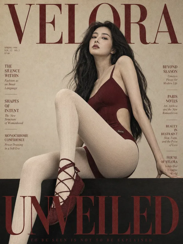
ปกนิตยสารย้อนยุค: สตรีเอเชียในชุดแดง Soran
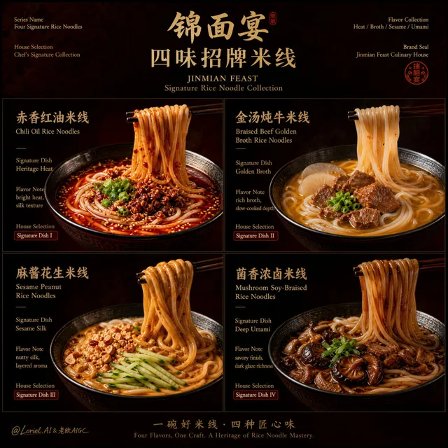
โปสเตอร์หรู: บะหมี่ข้าวสี่แบบ 锦面宴