โปสเตอร์ภาพเส้นเมืองโตเกียว สไตล์มินิมอล
ที่มา: @iamrealsnowโมเดล: ChatGPT
ภาพตัวอย่าง
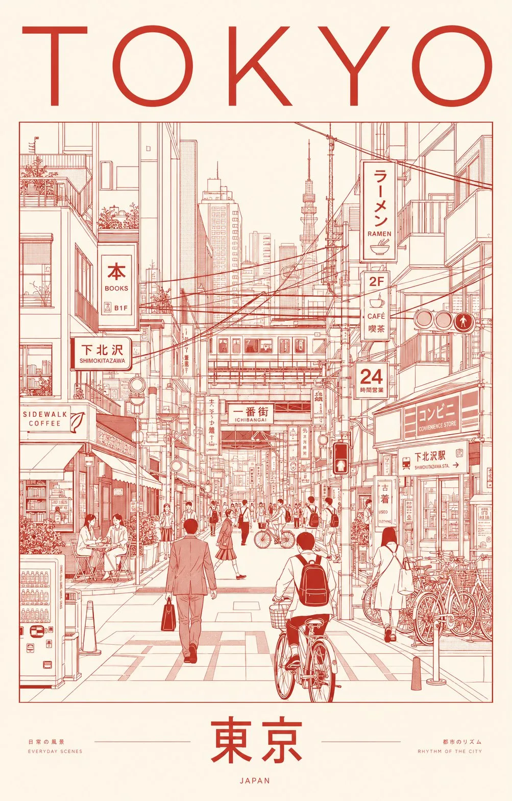
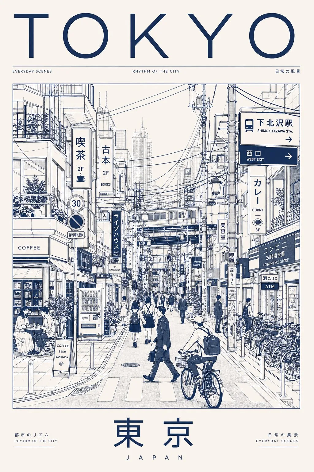
พรอมต์ภาษาไทย
สร้างโปสเตอร์ภาพเหมือนเมืองพรีเมียมพิเศษสไตล์มินิมอลของโตเกียว โดยจับภาพความซับซ้อนที่เงียบสงบและความโกลาหลที่เป็นระเบียบของชีวิตในเมืองประจำวันผ่านภาพประกอบสถาปัตยกรรมแบบเส้น แทนที่จะเน้นแลนด์มาร์กที่มีชื่อเสียง ให้แสดงฉากของย่านที่ผู้คนอาศัยอยู่ซึ่งกิจวัตรประจำวันเป็นตัวกำหนดเอกลักษณ์ของเมือง นำเสนอฉากถนนที่หนาแน่นแต่สง่างามที่ได้รับแรงบันดาลใจจากพื้นที่ต่างๆ เช่น ชิโมคิตะซาวะ นาคาเมกุโระ คิจิโจจิ โคเอนจิ หรือถนนด้านข้างของโตเกียวร่วมสมัยที่เต็มไปด้วยเอกลักษณ์ท้องถิ่น ฉาก องค์ประกอบหลักของภาพคือทางเดินเท้าที่พลุกพล่านเรียงรายไปด้วยร้านกาแฟขนาดเล็ก ร้านราเมน ร้านหนังสือ ร้านสะดวกซื้อ ที่จอดจักรยาน ตู้จำหน่ายสินค้าอัตโนมัติ โครงสร้างรางรถไฟ เสาไฟฟ้า ป้ายร้านค้าแคบๆ และป้ายภาษาญี่ปุ่นหลายชั้น ผู้คนในท้องถิ่นอยู่ในภาพนี้อย่างเป็นธรรมชาติ: * พนักงานออฟฟิศที่เดินทางไปทำงาน * นักเรียนที่ข้ามแยก * นักปั่นจักรยานที่ขับขี่ไปตามถนน * ลูกค้าคาเฟ่ที่นั่งอยู่ข้างนอก * นักช้อปที่ถือถุงสินค้า * คนท้องถิ่นที่รออยู่ที่ทางแยกหรือป้ายรถประจำทาง บรรยากาศควรรู้สึกเหมือนโตเกียวแท้ๆ—มีประสิทธิภาพ มีสไตล์ ขนาดเหมาะกับมนุษย์ และเป็นเมืองอย่างลึกซึ้ง โครงสร้างแลนด์มาร์กขนาดใหญ่อาจปรากฏเฉพาะในรูปภาพเงาที่อยู่ไกลออกไป ซึ่งถูกรวมเข้ากับเส้นขอบฟ้า และไม่เคยเป็นจุดโฟกัสหลัก รูปแบบภาพ * ภาพประกอบแนวบรรณาธิการร่วมสมัย * การวาดภาพสถาปัตยกรรมที่แม่นยำ * ศิลปะเส้นเดียวแบบมินิมอล * การออกแบบโปสเตอร์สไตล์สวิส อินเตอร์เนชั่นแนล * อิทธิพลการออกแบบกราฟิกของญี่ปุ่น * ความสวยงามของการสร้างแบรนด์เมืองคุณภาพระดับพิพิธภัณฑ์ * การเรนเดอร์เวกเตอร์ที่สะอาด * การสร้างมุมมองทางเรขาคณิต * การใช้พื้นที่ว่างอย่างโดดเด่น * ลำดับความสำคัญของภาพที่ซับซ้อน ลายเส้น * เส้นเดียวที่ละเอียดเป็นพิเศษ * ความแม่นยำของภาพประกอบทางเทคนิค * ไม่มีการร่างภาพ * รายละเอียดในเมืองที่หนาแน่น * จังหวะที่จัดเรียงอย่างเป็นระเบียบของหน้าต่าง สายเคเบิล ป้าย จักรยาน ป้ายร้านค้า ราวบันได และเฟอร์นิเจอร์ริมถนน * องค์ประกอบที่ซับซ้อนแต่ยังคงดูสงบและอ่านง่าย แนวคิดสี ใช้ระบบการพิมพ์ซิลค์สกรีนสองสีที่ดูเรียบง่าย: * สีหมึกที่เลือกอย่างพิถีพิถันหนึ่งสี * สีของกระดาษ/พื้นหลังที่ตัดกันหนึ่งสี เลือกสีที่สื่อถึงพลังงานในเมืองที่ละเอียดอ่อนของโตเกียวและวัฒนธรรมการออกแบบร่วมสมัย จานสีที่แนะนำ: * หมึกสีแดงเข้ม (Deep vermilion) บนกระดาษงาช้างสีข้าว (warm rice-paper ivory) * หรือ หมึกสีดำชาร์โคล (charcoal black) บนกระดาษสีครีมอ่อน (pale cream paper) * หรือ หมึกสีครามเที่ยงคืน (midnight indigo) บนกระดาษสีขาวนวล (soft off-white stock) หลีกเลี่ยงการไล่ระดับสี เอฟเฟกต์นีออน สีเน้นหลายสี หรือแสงแบบภาพถ่าย การพิมพ์ตัวอักษร ด้านบน: โตเกียว (TOKYO) ด้านล่าง: 東京 (TOKYO) การพิมพ์ตัวอักษรควรรู้สึกเหมือนกับสิ่งพิมพ์ดีไซน์หรูหราหรือโปสเตอร์นิทรรศการวัฒนธรรม * การจัดช่องไฟที่สมบูรณ์แบบ * การจัดวางแบบบรรณาธิการที่สะอาดตา * การพิมพ์ตัวอักษรแบบไม่มีเชิงที่ทันสมัย * ป้ายภาษาญี่ปุ่นแท้ตลอดทั้งภาพประกอบ * ไม่มีข้อความที่บิดเบือนหรืออ่านไม่ออก อารมณ์ ไม่ใช่สถานที่ท่องเที่ยว ไม่ใช่โปสการ์ด เป็นการเฉลิมฉลองด้วยภาพของความสง่างามในชีวิตประจำวัน จังหวะของเมือง วัฒนธรรมการออกแบบ และความหนาแน่นในสเกลมนุษย์ของโตเกียว โปสเตอร์ควรรู้สึกเหมือนอยู่ในพิพิธภัณฑ์ศิลปะร่วมสมัย นิตยสารท่องเที่ยวระดับพรีเมียม หรือนิทรรศการออกแบบระดับนานาชาติ ผลลัพธ์ * องค์ประกอบแนวตั้ง (อัตราส่วน 4:5 หรือ 2:3) * ความละเอียดสูงพิเศษ 8K * การออกแบบโปสเตอร์พร้อมพิมพ์ * การเรนเดอร์คุณภาพเวกเตอร์ที่คมชัด * การรักษาความละเอียดของรายละเอียดที่ยอดเยี่ยม * ความสวยงามของการรณรงค์สร้างแบรนด์เมืองหรูหรา
พรอมต์ภาษาอังกฤษ
Create an ultra-premium minimalist city portrait poster of TOKYO, capturing the quiet sophistication and organized chaos of everyday urban life through an architectural line-art illustration. Instead of highlighting famous landmarks, portray a lived-in neighborhood scene where daily routines define the city’s identity. Feature a dense yet elegant streetscape inspired by areas such as Shimokitazawa, Nakameguro, Kichijoji, Koenji, or a contemporary Tokyo side street filled with local character. SCENE The composition centers on a bustling pedestrian corridor lined with compact cafés, ramen counters, bookstores, convenience stores, bicycle parking, vending machines, rail infrastructure, utility poles, narrow storefronts, and layered Japanese signage. Residents naturally inhabit the scene: Office workers commuting Students crossing intersections Cyclists weaving through streets Café patrons sitting outdoors Shoppers carrying bags Locals waiting at crossings or transit stops The atmosphere should feel authentically Tokyo—efficient, stylish, human-scaled, and deeply urban. Large landmark structures may appear only as distant silhouettes integrated into the skyline, never as focal points. VISUAL STYLE Contemporary editorial illustration Precision architectural drawing Minimalist monoline artwork Swiss International Style poster design Japanese graphic design influence Museum-quality city branding aesthetic Clean vector rendering Geometric perspective construction Strong use of negative space Sophisticated visual hierarchy LINEWORK Extremely fine monoline strokes Technical illustration precision No sketchiness Dense urban detailing Organized rhythm of windows, cables, signs, bicycles, storefronts, railings, and street furniture Intricate composition that remains visually calm and readable COLOR CONCEPT Use a restrained two-color silkscreen system: One carefully selected ink color One contrasting paper/background color Choose colors that evoke Tokyo’s refined urban energy and contemporary design culture. Suggested palette: Deep vermilion ink on warm rice-paper ivory OR charcoal black ink on pale cream paper OR midnight indigo ink on soft off-white stock Avoid gradients, neon effects, multiple accent colors, or photographic lighting. TYPOGRAPHY Top: TOKYO Bottom: 東京 Typography should feel like a luxury design publication or cultural exhibition poster. Perfect kerning Clean editorial layout Modern sans-serif typography Authentic Japanese signage throughout the illustration No distorted or unreadable text MOOD Not a tourist destination. Not a postcard. A visual celebration of Tokyo’s everyday elegance, urban rhythm, design culture, and human-scale density. The poster should feel like it belongs in a contemporary art museum, premium travel journal, or international design exhibition. OUTPUT Vertical composition (4:5 or 2:3 ratio) Ultra-high-resolution 8K Print-ready poster design Crisp vector-quality rendering Exceptional detail retention Luxury city-brand campaign aesthetic
พรอมต์ภาษาจีน
Create an ultra-premium minimalist city portrait poster of TOKYO, capturing the quiet sophistication and organized chaos of everyday urban life through an architectural line-art illustration. Instead of highlighting famous landmarks, portray a lived-in neighborhood scene where daily routines define the city’s identity. Feature a dense yet elegant streetscape inspired by areas such as Shimokitazawa, Nakameguro, Kichijoji, Koenji, or a contemporary Tokyo side street filled with local character. SCENE The composition centers on a bustling pedestrian corridor lined with compact cafés, ramen counters, bookstores, convenience stores, bicycle parking, vending machines, rail infrastructure, utility poles, narrow storefronts, and layered Japanese signage. Residents naturally inhabit the scene: Office workers commuting Students crossing intersections Cyclists weaving through streets Café patrons sitting outdoors Shoppers carrying bags Locals waiting at crossings or transit stops The atmosphere should feel authentically Tokyo—efficient, stylish, human-scaled, and deeply urban. Large landmark structures may appear only as distant silhouettes integrated into the skyline, never as focal points. VISUAL STYLE Contemporary editorial illustration Precision architectural drawing Minimalist monoline artwork Swiss International Style poster design Japanese graphic design influence Museum-quality city branding aesthetic Clean vector rendering Geometric perspective construction Strong use of negative space Sophisticated visual hierarchy LINEWORK Extremely fine monoline strokes Technical illustration precision No sketchiness Dense urban detailing Organized rhythm of windows, cables, signs, bicycles, storefronts, railings, and street furniture Intricate composition that remains visually calm and readable COLOR CONCEPT Use a restrained two-color silkscreen system: One carefully selected ink color One contrasting paper/background color Choose colors that evoke Tokyo’s refined urban energy and contemporary design culture. Suggested palette: Deep vermilion ink on warm rice-paper ivory OR charcoal black ink on pale cream paper OR midnight indigo ink on soft off-white stock Avoid gradients, neon effects, multiple accent colors, or photographic lighting. TYPOGRAPHY Top: TOKYO Bottom: 東京 Typography should feel like a luxury design publication or cultural exhibition poster. Perfect kerning Clean editorial layout Modern sans-serif typography Authentic Japanese signage throughout the illustration No distorted or unreadable text MOOD Not a tourist destination. Not a postcard. A visual celebration of Tokyo’s everyday elegance, urban rhythm, design culture, and human-scale density. The poster should feel like it belongs in a contemporary art museum, premium travel journal, or international design exhibition. OUTPUT Vertical composition (4:5 or 2:3 ratio) Ultra-high-resolution 8K Print-ready poster design Crisp vector-quality rendering Exceptional detail retention Luxury city-brand campaign aesthetic
พรอมต์แนะนำ
8 พรอมต์คัดสรร
สาวผมแดงในสตูดิโอ: แฟชั่นมินิมัลลิสต์

สาวเอเชียในชุดคาร์ดิแกนสีฟ้ามิสต์กับกระโปรงขาว

สาวเอเชียในชุดสีน้ำเงิน บนโซฟาหรูในโรงแรม

โปสเตอร์อินโฟกราฟิกสูตรอาหารระดับพรีเมียม

สาวชุดว่ายน้ำขาว-ฟ้า สาดน้ำทะเลริมหาด

ถ่ายภาพคอสเพลย์ฤดูร้อนสไตล์เซลฟี่จากมือถือ
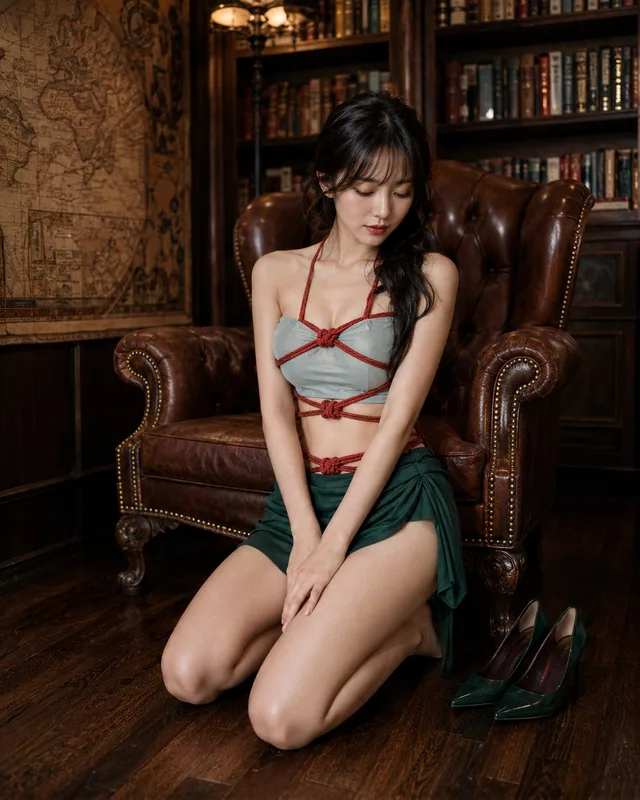
แฟชั่นแนวตะวันออกในห้องหนังสือย้อนยุค

สาวญี่ปุ่นหรูหรา: นิตยสารแฟชั่นทอง