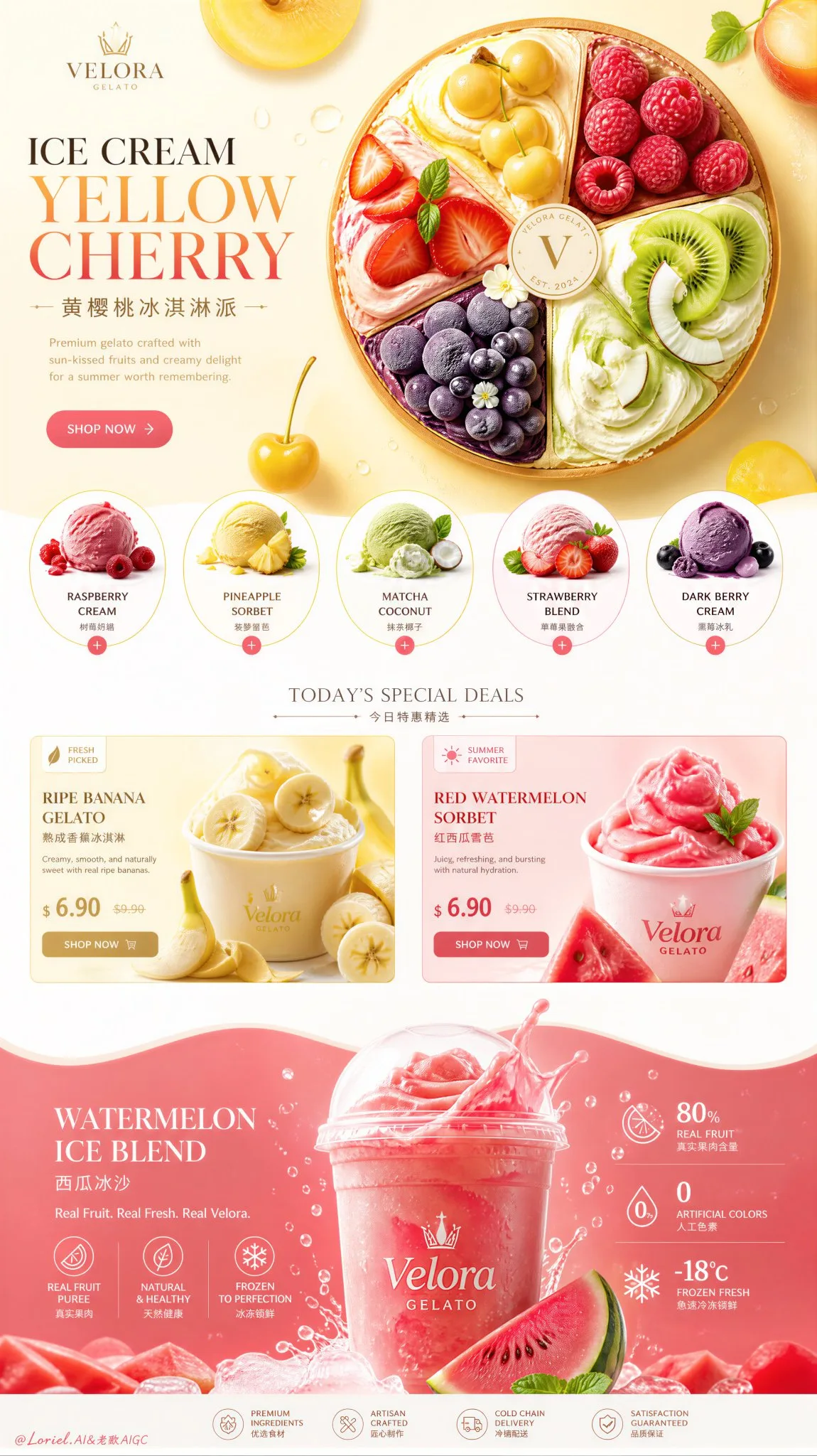
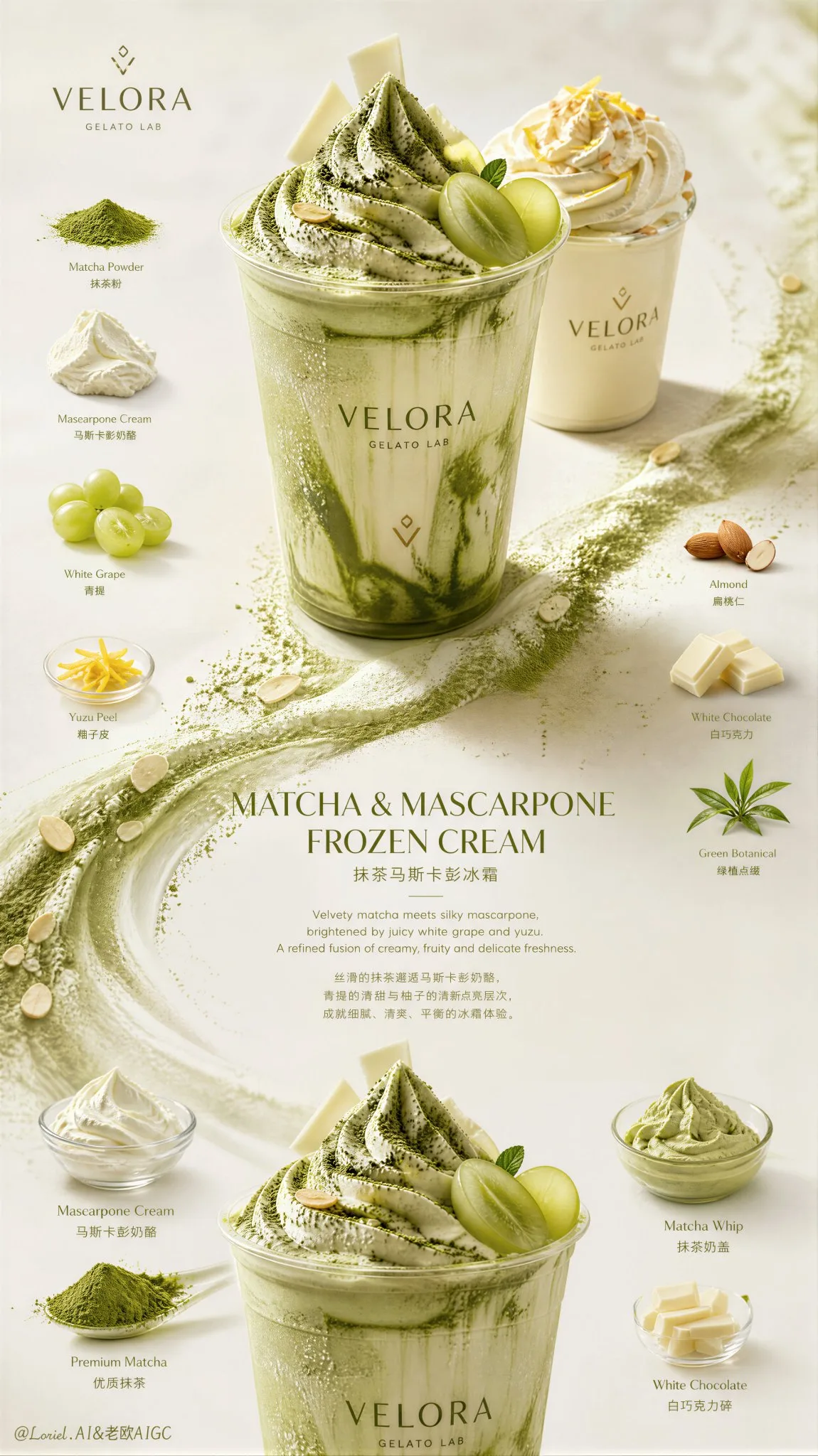
ดีไซน์หน้าสินค้าไอศกรีมพรีเมียมหรูหราสำหรับ E-commerce
ที่มา: @ou_zhen599โมเดล: ChatGPT
ภาพตัวอย่าง
พรอมต์ภาษาไทย
สร้างโปสเตอร์ขายสำหรับหน้ารายละเอียด E-commerce ของแบรนด์ไอศกรีมระดับพรีเมียมที่ผสมผสานความแม่นยำของแบรนด์เรือธง Cream Halo Transit เข้ากับความสมจริงของขนมแช่แข็งที่จับต้องได้ของ Milk Cloud Orbit โดยยังคงรักษาสูงานออกแบบเดิม โครงสร้างหน้ารายละเอียดหน้าเดียวในแนวตั้งไว้อย่างเคร่งครัด ห้ามเปลี่ยนตรรกะการจัดองค์ประกอบภาพ คงไว้ซึ่งส่วนหัว (hero banner) ที่สว่างสดใสพร้อมชื่อ/ข้อความ/CTA ทางซ้าย และองค์ประกอบขนมแช่แข็งทรงกลมขนาดใหญ่หนึ่งชิ้นทางขวา, แถวของการ์ดรสชาติทรงกลมด้านล่าง, โซน “ข้อเสนอ” ตรงกลางที่มีคุณสมบัติผลิตภัณฑ์สองอย่างเคียงข้างกัน และส่วนแถบสีเป็นคลื่นด้านล่างที่มีเครื่องดื่มผลไม้น้ำแข็งเด่นหนึ่งชิ้นพร้อมข้อมูลสถิติ/ส่วนผสมที่สนับสนุน ผลงานสุดท้ายจะต้องให้ความรู้สึกเหมือนเป็นภาพ Key visual สำหรับการขายที่ควรค่าแก่การสะสมมากกว่าหน้า E-commerce ทั่วไป: Hyper-real, สว่าง, พรีเมียม, ขี้เล่น และดูเป็นสากล Brand identity: สร้างบริษัทไอศกรีมพรีเมียมที่คิดค้นขึ้นเอง เช่น “VELORA GELATO”, “AUREL FRUIT CREAM” หรือ “MOSA FROST HOUSE” แบรนด์ต้องให้ความรู้สึกทันสมัย มีสีสัน อ่อนเยาว์ หรูหรา และเป็นเชิงพาณิชย์ระดับสูง ใช้โลโก้ขนาดเล็กที่ดูเป็นทางการ, ชื่อเรื่องหลักภาษาอังกฤษที่หรูหราพร้อมคำบรรยายภาษาจีนขนาดเล็ก และภาษาภาพที่เป็นเอกภาพของแบรนด์เรือธง Strict original structure: สิ่งนี้สำคัญมาก คงไว้ซึ่ง: 1. ส่วนหัว (hero section) ที่สว่างสดใสพร้อมพาดหัว/ข้อความ/CTA ทางซ้าย และรูปขนมแช่แข็งทรงกลมทางขวา 2. แถวของการ์ดรสชาติ/หมวดหมู่ทรงกลมด้านล่าง 3. โซนคุณสมบัติกลางที่มีบล็อกผลิตภัณฑ์ผลไม้สองบล็อกเคียงข้างกันและองค์ประกอบ UI ราคา/การขายที่ดูเหมือน UI 4. ส่วนหัว (hero section) แถบสีเป็นคลื่นด้านล่างที่มีเครื่องดื่มผลไม้น้ำแข็ง/ครีมแช่แข็งเด่นหนึ่งชิ้น 5. ชิ้นผลไม้ลอย, ใบไม้ และของตกแต่งเล็กๆ น้อยๆ ทั่วทั้งหน้า ห้ามออกแบบใหม่เป็นตาราง, Landing Page อื่น หรือระบบการ์ดอื่น Collector-grade sales visual upgrade: สิ่งนี้สำคัญมาก ทำให้หน้ารู้สึกเหมือนเป็นภาพ Key Visual สำหรับการขายที่น่าสะสมโดย: - ลดสิ่งรบกวนสายตา - ขยาย Negative space ภายในทุกโมดูล - ทำให้ผลไม้และวัตถุแช่แข็งแต่ละชิ้นดูเหมือนงานประติมากรรมมากขึ้น - ปรับปรุง CTA, การกำหนดราคา และการจัดการ micro UI - เสริมสร้างจังหวะระหว่างโมดูลขนาดใหญ่ - ให้บล็อกสี, พื้นผิวแช่แข็ง และความสมจริงของผลไม้ มีผลกระทบทางอารมณ์มากขึ้น หน้านี้ยังคงต้องเป็นเชิงพาณิชย์อย่างชัดเจน แต่หายากและคู่ควรแก่การจัดแสดงมากขึ้น Cream Halo Transit flagship precision: รวมทั้งหน้าให้เป็นระบบแบรนด์สากลที่แข็งแกร่งยิ่งขึ้น พาดหัว Hero, คำบรรยายภาษาจีน, ข้อความการ์ดรสชาติทรงกลม, ชื่อข้อเสนอตรงกลาง, ตรรกะการกำหนดราคา, ปุ่ม CTA, ป้ายกำกับขนาดเล็ก และบล็อกสถิติด้านล่าง ทั้งหมดต้องใช้ภาษาภาพที่เป็นระเบียบเดียวกัน โดยมีระยะห่างที่ดีขึ้น, ลำดับชั้นที่สงบขึ้น และการจัดวางที่พรีเมียมมากขึ้น หน้านี้ต้องให้ความรู้สึกเหมือนแคมเปญเรือธงอย่างเป็นทางการ มากกว่าการซ้อนส่วนเนื้อหา Milk Cloud Orbit frozen realism: ผลักดันความสมจริงที่จับต้องได้ไปสู่ระดับสูงสุด: - ความคมชัดของเจลาโต้/ครีมแช่แข็ง - อนุภาคน้ำแข็งและการควบแน่นของความเย็น - ความโปร่งแสงของเนื้อผลไม้และความเงาของน้ำผลไม้ - ความหนาของครีมและตรรกะขอบที่ตักแล้วนุ่ม - ความสมจริงของการกระเซ็นและการเปลี่ยนของเหลวแช่แข็ง - การสะท้อนของถ้วยและความชัดเจนของฝา - รูขุมขนของเปลือกผลไม้และความเปียกของพื้นผิวที่ตัด - ความเงาและความหนืดของซอสหรือเพียวเร่ ทุกอย่างต้องรู้สึกสัมผัสได้, de-AI, น่าสะสม และมีมูลค่าแพงในด้านวัสดุ Top hero section: รักษาสูงานออกแบบเดิม โครงสร้างซ้าย-ขวา ทางซ้าย ให้วางชื่อภาษาอังกฤษที่โดดเด่น เช่น “ICE CREAM YELLOW CHERRY” หรือ “FRUIT GELATO SPLIT”, คำบรรยายภาษาจีนขนาดเล็กหนึ่งคำ และ CTA ที่ประณีตหนึ่งรายการ ทางขวา ให้คงองค์ประกอบขนมแช่แข็งทรงกลมขนาดใหญ่หนึ่งชิ้นที่คล้ายกับทาร์ตไอศกรีมที่ตกแต่งด้วยผลไม้หรือวงล้อเจลาโต้ที่แบ่งเป็นส่วนผลไม้พรีเมียมที่มีสีสัน ทำให้ดูเหมือนงานประติมากรรมมากขึ้น, สะอาดขึ้น และน่าสะสมมากขึ้น Flavor-card row: รักษาสูงานออกแบบเดิม ตรรกะของการ์ดรสชาติทรงกลม แต่ทำให้ดูหรูหรามากขึ้น ใช้รสชาติที่แตกต่างกันหลายชนิดในซีรีส์เดียวกัน เช่น Raspberry Cream, Pineapple Sorbet, Matcha Coconut Gelato, Strawberry Fruit Blend และ Dark Berry Frozen Cream คงการ์ดให้จัดเรียงกัน, สว่าง และควบคุมได้อย่างดีเยี่ยม โดยมีความเปรียบต่างที่แข็งแกร่งขึ้นแต่มีสิ่งรบกวนสายตาน้อยลง Middle feature zone: รักษาสูงานออกแบบเดิม ตรรกะ “ข้อเสนอ” ตรงกลางพร้อมเรื่องราวผลิตภัณฑ์ที่เน้นผลไม้สองเรื่องเคียงข้างกัน เช่น กล้วยสุกและแตงโมแดง ปรับปรุงองค์ประกอบ UI, ป้ายลดราคา และบล็อกราคา เพื่อให้รู้สึกพรีเมียมมากกว่าการเน้นโปรโมชั่น ให้ภาพผลไม้และผลิตภัณฑ์แช่แข็งโดดเด่น Bottom hero section: รักษาสูงานออกแบบเดิม ส่วนล่างที่เป็นคลื่นและมีสีสันสดใสพร้อมเครื่องดื่มผลไม้น้ำแข็ง/ครีมแช่แข็งเด่นหนึ่งชิ้น ทำให้เครื่องดื่มน่าสะสมและมีคุณค่าทางวัสดุมากขึ้น: พื้นผิวแช่แข็งที่ลึกขึ้น, การกระเซ็นที่สง่างามมากขึ้น, การควบแน่นที่ละเอียดขึ้น และภาพส่วนผสมด้านข้างที่ประณีตยิ่งขึ้น คงบล็อกสถิติและข้อมูลด้านล่าง แต่รวมเข้าด้วยกันในจังหวะของแบรนด์เรือธงที่พรีเมียมยิ่งขึ้น Color direction: ใช้ชุดสีที่ประณีตแต่มีชีวิตชีวาของสีเหลืองอิ่มตัว, แดงเชอร์รี่, ชมพูแตงโม, ส้มซิตรัส, เขียวกีวี, ขาวครีม, ม่วงบลูเบอร์รี่ และเขียวใบมิ้นต์ คงบล็อกสีให้โดดเด่นแต่ดูเป็นผู้ใหญ่มากขึ้น, ควบคุมได้มากขึ้น และมีราคาแพงมากขึ้น Lighting: ใช้แสงสำหรับการถ่ายภาพขนมเชิงพาณิชย์ระดับสูง พร้อมไฮไลท์ที่คมชัดสดใหม่, แสงเงาที่ลดหลั่นลงมาอย่างสง่างาม, การสะท้อนที่ประณีตบนพื้นผิวแช่แข็งและผลไม้, และความสมจริงที่สวยงามตลอดทั้งหน้า หน้านี้ต้องให้ความรู้สึกสว่างไสว, สดชื่น, พรีเมียม และน่าสะสม Rendering style: Ultra-premium ice cream e-commerce detail page, strict original single-page vertical structure, Cream Halo Transit flagship brand precision, Milk Cloud Orbit tactile frozen realism, collector-grade sales key visual, bright hero banner with circular fruit frozen dessert composition, circular flavor-card row, centered deals zone, lower wavy fruit-ice drink hero section, elegant English main titles with smaller Chinese subtitles, award-winning commercial design, 8k, masterpiece quality Negative prompt: changed page structure, homepage redesign, random card layout, cheap dessert ad, fake cream texture, plastic fruit, cluttered page, messy typography, generic template, low-end packaging, oversaturated chaos, harsh flash lighting, noisy props, cartoon rendering
พรอมต์ภาษาอังกฤษ
Create an ultra-premium ice cream brand e-commerce detail-page sales poster that merges Cream Halo Transit flagship brand precision with Milk Cloud Orbit tactile frozen-dessert realism, while strictly preserving the exact original single-page vertical homepage-detail structure. Do not change the composition logic. Keep the same bright top hero banner with left-side title/copy/CTA and one large circular frozen dessert composition on the right, the same row of circular flavor cards beneath, the same centered middle “deals” zone with two side-by-side product features, and the same lower wavy color-band section with one dominant fruit-ice beverage hero and supporting stat / ingredient information. The final artwork must feel more like a collector-grade sales key visual than a standard e-commerce page: hyper-real, bright, premium, playful, and internationally polished. Brand identity: Create a self-invented premium ice cream company such as “VELORA GELATO”, “AUREL FRUIT CREAM”, or “MOSA FROST HOUSE”. The brand must feel modern, colorful, youthful, luxurious, and commercially elite. Use a minimal official logo mark, elegant English main titles with smaller Chinese subtitle support, and a fully unified flagship visual language. Strict original structure: This is critical. Preserve exactly: 1. Bright top hero section with left-side headline/copy/CTA and right-side circular frozen dessert hero. 2. Row of circular flavor / category cards below. 3. Centered middle feature zone with two side-by-side fruit product blocks and UI-like pricing/sale elements. 4. Lower wave-shaped color-band hero section with one dominant fruit ice drink / frozen cream beverage. 5. Decorative floating fruit slices, leaves, and small accents throughout. Do not redesign into a grid, a different landing page, or an alternative card system. Collector-grade sales visual upgrade: This is critical. Make the page feel like a collectible flagship sales visual by: - reducing visual noise - enlarging negative space inside all modules - making each fruit and frozen object more sculptural - refining CTA, pricing, and micro UI handling - strengthening the rhythm between the big modules - letting color blocks, frozen texture, and fruit realism carry more emotional impact It should still be clearly commercial, but far rarer and more display-worthy. Cream Halo Transit flagship precision: Unify the entire page into a stronger international brand system. Hero headline, Chinese subtitle, circular flavor-card text, middle deals-title, pricing logic, CTA buttons, small labels, and bottom stat blocks must all share one disciplined visual language with better spacing, calmer hierarchy, and more premium alignment. The page must feel like one official flagship campaign rather than stacked content sections. Milk Cloud Orbit frozen realism: Push tactile realism to the highest level: - gelato / frozen cream swirl definition - frost particles and cold condensation - fruit flesh translucency and juice sheen - creamy thickness and soft scoop edge logic - splash realism and frozen-liquid transition - cup reflections and lid clarity - fruit peel pores and cut-surface wetness - sauce or puree gloss and viscosity Everything must feel touchable, de-AI, collectible, and materially expensive. Top hero section: Keep the original left-right structure. On the left, place one bold English title such as “ICE CREAM YELLOW CHERRY” or “FRUIT GELATO SPLIT”, one smaller Chinese subtitle, and one refined CTA. On the right, keep one large circular frozen dessert composition resembling a fruit-topped ice cream tart or gelato wheel, divided into colorful premium fruit sections. Make it more sculptural, cleaner, and more collectible. Flavor-card row: Preserve the circular flavor-card logic but make it more luxurious. Use several distinct same-series flavors such as raspberry cream, pineapple sorbet, matcha coconut gelato, strawberry fruit blend, and dark berry frozen cream. Keep the cards aligned, bright, and highly controlled, with stronger contrast but less visual clutter. Middle feature zone: Keep the original central “deals” logic with two side-by-side fruit-centered product stories such as ripe bananas and red watermelon. Refine the UI elements, sale tags, and price blocks so they feel premium rather than promotional-heavy. Let the fruit and frozen product visuals dominate. Bottom hero section: Preserve the wavy saturated lower section with one dominant fruit ice beverage / frozen cream hero. Make the drink more collectible and materially rich: deeper frozen texture, more elegant splash, finer condensation, and more refined ingredient side visuals. Keep the lower stats and info blocks but unify them into a more premium flagship rhythm. Color direction: Use a refined but lively palette of saturated yellow, cherry red, watermelon pink, citrus orange, kiwi green, cream white, blueberry violet, and mint leaf green. Keep the color blocks bold but more mature, more controlled, and more expensive. Lighting: Use high-end commercial dessert lighting with crisp fresh highlights, elegant shadow falloff, refined reflections on frozen surfaces and fruit, and beautiful realism throughout. The page must feel luminous, joyful, premium, and collectible. Rendering style: ultra-premium ice cream e-commerce detail page, strict original single-page vertical structure, Cream Halo Transit flagship brand precision, Milk Cloud Orbit tactile frozen realism, collector-grade sales key visual, bright hero banner with circular fruit frozen dessert composition, circular flavor-card row, centered deals zone, lower wavy fruit-ice drink hero section, elegant English main titles with smaller Chinese subtitles, award-winning commercial design, 8k, masterpiece quality Negative prompt: changed page structure, homepage redesign, random card layout, cheap dessert ad, fake cream texture, plastic fruit, cluttered page, messy typography, generic template, low-end packaging, oversaturated chaos, harsh flash lighting, noisy props, cartoon rendering
พรอมต์ภาษาจีน
创建一个极致奢华的冰淇淋品牌电商详情页销售海报,将 Cream Halo Transit 旗舰品牌的精确性与 Milk Cloud Orbit 触感冷冻甜点现实主义相结合,同时严格保留原有的单页垂直首页详情结构。不要改变构图逻辑。保持相同的明亮顶部英雄横幅,左侧为标题/文案/CTA,右侧为一个大型圆形冷冻甜点构图,下方为同一排圆形口味卡片,中间为相同的居中“特惠”区域,包含两个并排的产品特性,以及相同的下方波浪色带部分,包含一个主导的水果冰饮英雄产品和辅助的统计/成分信息。最终的艺术作品必须感觉更像是一个收藏级的销售关键视觉,而不是标准的电商页面:超写实、明亮、高端、俏皮且具有国际化水准。 品牌身份: 创建一个自创的高级冰淇淋公司,例如“VELORA GELATO”、“AUREL FRUIT CREAM”或“MOSA FROST HOUSE”。品牌必须感觉现代、色彩丰富、年轻、豪华且商业精英化。使用极简的官方标志,优雅的英文主标题辅以较小的中文副标题,以及完全统一的旗舰视觉语言。 严格的原有结构: 这是至关重要的。准确保留: 1. 明亮的顶部英雄区域,左侧为大标题/文案/CTA,右侧为圆形冷冻甜点英雄视觉。 2. 下方一排圆形口味/类别卡片。 3. 居中的中间特色区域,有两个并排的水果产品块和类似 UI 的定价/促销元素。 4. 下方波浪形色带英雄区域,包含一个主导的水果冰饮/冷冻奶油饮料。 5. 贯穿始终的装饰性漂浮水果片、叶子和小点缀。 不要重新设计成网格、不同的落地页或替代的卡片系统。 收藏级销售视觉升级: 这是至关重要的。通过以下方式使页面感觉像是一个可收藏的旗舰销售视觉: - 减少视觉噪音 - 扩大所有模块内部的负空间 - 让每个水果和冷冻物体更具雕塑感 - 精炼 CTA、定价和微型 UI 处理 - 加强大型模块之间的节奏 - 让色块、冷冻质感和水果现实主义承载更多情感冲击 它仍然应该是明显的商业化,但要稀有得多且更值得展示。 Cream Halo Transit 旗舰精确性: 将整个页面统一到更强大的国际品牌体系中。英雄大标题、中文副标题、圆形口味卡片文本、中间特惠标题、定价逻辑、CTA 按钮、小标签和底部统计块都必须共享一种纪律严明的视觉语言,具有更好的间距、更平静的层次结构和更高端的对齐方式。页面必须感觉像是一个官方旗舰活动,而不是堆叠的内容部分。 Milk Cloud Orbit 冷冻现实主义: 将触感现实主义推向最高水平: - 意式冰淇淋/冷冻奶油漩涡的清晰度 - 霜粒和冷凝水珠 - 果肉的透明度和果汁的光泽 - 奶油的厚度和软勺边缘逻辑 - 飞溅的真实感和冻液转换 - 杯子反射和杯盖清晰度 - 果皮毛孔和切面湿润度 - 酱汁或果泥的光泽和粘度 一切都必须感觉可触摸、去 AI 化、可收藏且材质昂贵。 顶部英雄区域: 保持原有的左右结构。在左侧,放置一个醒目的英文标题,如“ICE CREAM YELLOW CHERRY”或“FRUIT GELATO SPLIT”,一个较小的中文副标题,以及一个精炼的 CTA。在右侧,保留一个大型圆形冷冻甜点构图,类似于水果覆盖的冰淇淋塔或意式冰淇淋轮,分为色彩丰富的优质水果部分。使其更具雕塑感、更简洁且更具收藏价值。 口味卡片行: 保留圆形口味卡片逻辑,但使其更显奢华。使用几种不同的同系列口味,如树莓奶油、菠萝雪芭、抹茶椰子意式冰淇淋、草莓水果混搭和深色浆果冷冻奶油。保持卡片对齐、明亮且高度受控,对比度更强但视觉杂乱更少。 中间特色区域: 保持原有的居中“特惠”逻辑,包含两个并排的以水果为中心的产品故事,如成熟的香蕉和红西瓜。精炼 UI 元素、促销标签和价格块,使其感觉高端而非促销沉重。让水果和冷冻产品视觉占据主导地位。 底部英雄区域: 保留波浪状饱和的下方区域,包含一个主导的水果冰饮/冷冻奶油英雄视觉。使饮品更具收藏价值且材质丰富:更深的冷冻质感、更优雅的飞溅、更精细的冷凝以及更精炼的成分侧面视觉。保留下方的统计数据和信息块,但将它们统一到更高端的旗舰节奏中。 色彩方向: 使用精致但活泼的色调,包括饱和黄、樱桃红、西瓜粉、柑橘橙、奇异果绿、奶油白、蓝莓紫和薄荷叶绿。保持色块大胆但更成熟、更受控且更昂贵。 光效: 使用高端商业甜点照明,具有清脆新鲜的高光、优雅的阴影衰减、冷冻表面和水果上的精细反射,以及贯穿始终的优美现实主义。页面必须感觉明亮、快乐、高端且可收藏。 渲染风格: 极致奢华冰淇淋电商详情页,严格的原有单页垂直结构,Cream Halo Transit 旗舰品牌精确性,Milk Cloud Orbit 触感冷冻现实主义,收藏级销售关键视觉,带有圆形水果冷冻甜点构图的明亮英雄横幅,圆形口味卡片行,居中特惠区域,下方波浪状水果冰饮英雄区域,优雅的英文主标题辅以较小的中文副标题,屡获殊荣的商业设计,8k,杰作质量 负向提示词: 改变的页面结构,首页重新设计,随机卡片布局,廉价甜点广告,假奶油质感,塑料水果,凌乱的页面,杂乱的排版,通用模板,低端包装,过度饱和的混乱,刺眼的闪光灯照明,嘈杂的道具,卡通渲染
พรอมต์แนะนำ
8 พรอมต์คัดสรร
สาวผมแดงในสตูดิโอ: แฟชั่นมินิมัลลิสต์

สาวเอเชียในชุดคาร์ดิแกนสีฟ้ามิสต์กับกระโปรงขาว

สาวเอเชียในชุดสีน้ำเงิน บนโซฟาหรูในโรงแรม

โปสเตอร์อินโฟกราฟิกสูตรอาหารระดับพรีเมียม

สาวชุดว่ายน้ำขาว-ฟ้า สาดน้ำทะเลริมหาด

ถ่ายภาพคอสเพลย์ฤดูร้อนสไตล์เซลฟี่จากมือถือ
สาวเอเชียสุดหรูในบาร์หรู

โปสเตอร์ Maersk: แคมเปญโลจิสติกส์ระดับโลก