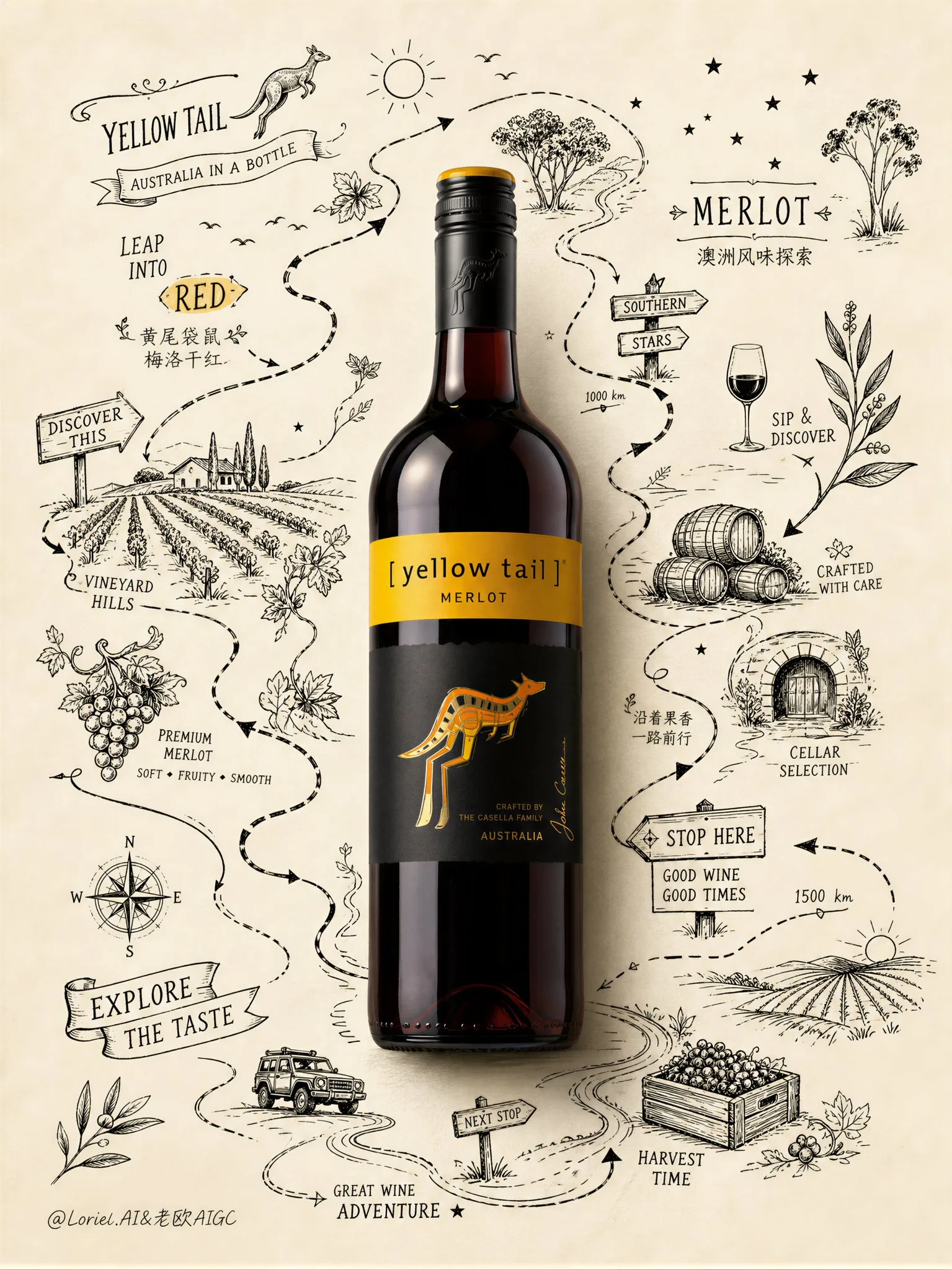
โปสเตอร์ไวน์ Yellow Tail Merlot: ผจญภัยบนแผนที่ไวน์
ที่มา: @ou_zhen599โมเดล: ChatGPT
ภาพตัวอย่าง
พรอมต์ภาษาไทย
สร้างโปสเตอร์โฆษณาพรีเมียมสำหรับไวน์แดง Yellow Tail Merlot โดยใช้ความแตกต่างที่เด่นชัดระหว่างขวดไวน์ที่สมจริงสูงกับโลกแห่งเส้นทางการสำรวจที่วาดด้วยมือที่มีชีวิตชีวา ภาพควรให้ความรู้สึกสะอาดตา, ชอบผจญภัย, มีกราฟิก, ขี้เล่น, พรีเมียม และมีเอกลักษณ์เฉพาะของแบรนด์สูง เหมือนโปสเตอร์ไวน์ภาพประกอบที่สะสมได้บนกระดาษมีพื้นผิว การจัดองค์ประกอบหลัก: วางขวด Yellow Tail Merlot ที่สมจริงหนึ่งขวดไว้ตรงกลางอย่างแม่นยำเป็นวัตถุเอกหลัก ขวดจะต้องสมจริงสูงและแสดงให้เห็นถึง Yellow Tail อย่างชัดเจน: แสงสีแดงเข้มของไวน์เมอร์ลอท, ฉลากที่คมชัด, ตราจิงโจ้สีเหลืองอันเป็นสัญลักษณ์ที่มองเห็นได้ชัดเจน, ฝาฟอยล์ที่หรูหรา, การสะท้อนแสงบนแก้วที่สมจริง, เงาที่สมจริง และการแสดงผลขวดไวน์ระดับพรีเมียม ขวดจะต้องเป็นวัตถุเดียวที่สมจริงอย่างสมบูรณ์ในภาพ พื้นหลัง: ใช้พื้นหลังกระดาษมีพื้นผิวสีงาช้างอุ่นอ่อนๆ หรือสีครีมอ่อนที่สะอาดมาก โดยมีพื้นที่ว่างเหลือเฟือ กระดาษควรรู้สึกพรีเมียมและสัมผัสได้เล็กน้อย เหมือนแผ่นโปสเตอร์ของศิลปิน ทำให้พื้นหลังเปิดโล่งและไม่รก ระบบภาพหลัก: รอบๆ ขวด ให้สร้างเส้นทางการสำรวจที่วาดด้วยหมึกสีดำที่โอบล้อมและเดินทางรอบๆ ขวดเหมือนเส้นทางผจญภัยบนแผนที่ งานเส้นไม่ควรเป็นเหมือนกรอบตกแต่งหรือภาพวาดเล่นแบบสุ่ม ต้องให้ความรู้สึกเหมือนแผนที่เส้นทางที่ถูกวาดกำลังคลี่ออกรอบๆ ขวด โดยมีเส้นทางที่คดเคี้ยว, ลูกศรบอกทิศทาง, ป้ายบอกทาง, ป้ายกำกับที่เขียนด้วยมือ, สัญลักษณ์เส้นทาง, ไอคอนขนาดเล็ก และการค้นพบภาพประกอบเล็กๆ น้อยๆ ที่วางอยู่ตามเส้นทาง การเล่าเรื่องเส้นทางการสำรวจ: ทำให้ขวดรู้สึกเหมือนเป็นจุดสังเกตสำคัญตรงกลางแผนที่การผจญภัยไวน์ของออสเตรเลีย ตลอดเส้นทาง ให้รวมสัญลักษณ์และสิ่งที่ค้นพบที่วาดด้วยมือขนาดเล็กที่เกี่ยวข้องกับ Yellow Tail และเอกลักษณ์ของ Australian Merlot: ไอคอนจิงโจ้กระโดด, เนินเขาไร่องุ่น, พวงองุ่น, กิ่งยูคาลิปตัส, สัญลักษณ์ดวงอาทิตย์, ถังไม้โอ๊ค, ลังเก็บเกี่ยว, สัญลักษณ์ถนนชนบท, ดาวใต้, นกตัวเล็กๆ, ไอคอนแก้วไวน์, ที่ราบเปิดโล่ง, ภาพร่างห้องเก็บไวน์ขนาดเล็ก, ลูกศรเส้นทาง, สัญลักษณ์บอกระยะทาง, บันทึกสถานที่ที่เขียนด้วยมือ, ตราสัญลักษณ์การสำรวจเล็กๆ, กราฟิกป้ายสไตล์ “หยุดที่นี่” หรือ “ค้นพบสิ่งนี้” ภาพวาดควรรู้สึกมีชีวิตชีวา, อยากรู้อยากเห็น, ขี้เล่นเล็กน้อย และเต็มไปด้วยการค้นพบ พฤติกรรมการจัดวาง: เส้นทางควรรอบขวดอย่างมีพลวัต ราวกับวนรอบและนำสายตาไปทั่วหน้า บางส่วนสามารถโค้งไปด้านหลังขวด, บางส่วนสามารถวิ่งไปข้างๆ, บางส่วนสามารถสร้างจุดหยุดเล็กๆ รอบด้านบนซ้าย, ด้านขวา, ด้านล่าง และพื้นที่ด้านล่าง องค์ประกอบควรรู้สึกเหมือนแผนที่การเดินทาง/การผจญภัยที่วาดด้วยมือโดยมีขวดเป็นศูนย์กลาง ห้ามทำให้งานเส้นสมมาตรหรือกระจายสม่ำเสมอ ให้ความรู้สึกเหมือนการสำรวจและเป็นธรรมชาติ สไตล์: งานเส้นควรเป็นหมึกดำที่คมชัดด้วยความรู้สึกของเอกลักษณ์ที่วาดด้วยมือระดับพรีเมียม โดยผสมผสานกราฟิกแผนที่เส้นทาง, ป้ายที่เขียนด้วยมือ และการเล่าเรื่องประกอบภาพที่เบาๆ เพิ่มอิทธิพล Art Nouveau เล็กน้อยเฉพาะในเส้นโค้งของเถาวัลย์ที่ Flow และการเคลื่อนไหวของเส้นที่เป็นจังหวะ แต่ยังคงความรู้สึกโดยรวมให้ทันสมัย, สะอาดตา และขับเคลื่อนด้วยแบรนด์ ระบบสี: พื้นหลังกระดาษสีงาช้างอุ่น, ขวดไวน์แดงเมอร์ลอทเข้ม, ภาพประกอบเส้นทางหมึกดำ, สำเนียงสีเหลือง Yellow Tail เล็กน้อย, สัมผัสสีเขียวของไร่องุ่นเล็กๆ น้อยๆ เฉพาะเมื่อจำเป็นเท่านั้น รักษาสีสันให้น้อยที่สุดเพื่อให้ขวดยังคงเป็นจุดโฟกัสที่อิ่มตัวและสมจริงที่สุด การใช้ตัวอักษร: รวมตัวอักษรเข้ากับโลกของแผนที่เส้นทางแทนที่จะใช้รูปแบบโฆษณามาตรฐาน ใช้ข้อความขนาดเล็กที่วาดด้วยมืออย่างหรูหราหรือข้อความสไตล์โปสเตอร์ที่ถักทออยู่ในเส้นทางการสำรวจ เช่น: “YELLOW TAIL” “MERLOT” “LEAP INTO RED” “EXPLORE THE TASTE” “AUSTRALIA IN A BOTTLE” ข้อความเหล่านี้ควรรู้สึกเหมือนป้ายกำกับเส้นทาง, ป้ายบอกทาง หรือบันทึกการค้นพบเล็กๆ รอบๆ ขวด ข้อความภาษาจีนเสริมสามารถรวมเข้ากับวิธีที่จำกัดคล้ายกัน: “黄尾袋鼠 梅洛干红” “澳洲风味探索” “沿着果香一路前行” ทำให้ภาษาจีนน้อยที่สุด, ประณีต และเป็นรอง อารมณ์: สะอาดตา, มีกราฟิก, ชอบผจญภัย, สไตล์ออสเตรเลีย, มีชีวิตชีวา, อิงเส้นทาง, เชิงสำรวจ, พรีเมียม, สะสมได้, มีคอนทราสต์สูง, วาดด้วยมือ, สดใหม่, ฉลาด, ขับเคลื่อนด้วยแบรนด์ การเรนเดอร์: ขวดไวน์ที่สมจริงละเอียดสูง, ภาพวาดเส้นทางหมึกดำที่คมชัด, พื้นหลังกระดาษมีพื้นผิวระดับพรีเมียม, พื้นที่ว่างที่หรูหรา, เงากระดาษที่ละเอียดอ่อน, คุณภาพโปสเตอร์แคมเปญสุดหรู, 8k, น่าจดจำทางสายตา พรอมต์เชิงลบ: ภาพวาดเล่นแบบสุ่ม, กรอบตกแต่ง, กรอบงานเส้นสมมาตร, พื้นหลังภูมิทัศน์ที่สมจริง, ภาพประกอบที่แออัด, สีมากเกินไป, จุดโฟกัสขวดอ่อนแอ, โฆษณาไวน์ทั่วไป, สไตล์การ์ตูนเด็ก, รายละเอียดต่ำ, ฉลากเบลอ, ข้อความรก, องค์ประกอบแบน
พรอมต์ภาษาอังกฤษ
Create an ultra-premium advertising poster for Yellow Tail Merlot red wine, built around a strong contrast between one highly realistic wine bottle and a surrounding world of lively hand-drawn exploration-route line art. The image should feel clean, adventurous, graphic, playful, premium, and highly brand-specific, like a collectible illustrated wine poster on textured paper. Main composition: Place one realistic bottle of Yellow Tail Merlot exactly at the center as the absolute hero object. The bottle must be highly realistic and unmistakably Yellow Tail: deep merlot-red wine glow, crisp label, iconic yellow kangaroo mark clearly visible, elegant foil capsule, glossy glass reflections, realistic shadow, and premium wine-bottle rendering. The bottle must be the only fully realistic object in the image. Background: Use a very clean warm ivory or pale cream textured paper background with generous negative space. The paper should feel premium and lightly tactile, like an artist’s poster sheet. Keep the background open and uncluttered. Core visual system: Around the bottle, create a hand-drawn black-ink exploration route that wraps and travels around the bottle like a map-based adventure path. The line art should not behave like a decorative frame or random doodles. It must feel like a drawn route map unfolding around the bottle, with winding paths, directional arrows, signposts, handwritten labels, route marks, tiny icons, and small illustrated discoveries placed along the journey. Exploration-route storytelling: Make the bottle feel like the key landmark in the middle of an Australian wine adventure map. Along the route, integrate small hand-drawn symbols and discoveries related to Yellow Tail and Australian Merlot identity: leaping kangaroo icon, vineyard hills, grape clusters, eucalyptus sprigs, sun symbols, wine barrels, harvest crate, country road marks, southern stars, tiny birds, wine glass icon, open plains, small cellar sketch, route arrows, distance marks, handwritten place notes, little exploration badges, “stop here” or “discover this” style sign graphics. The drawings should feel lively, curious, slightly playful, and full of discovery. Layout behavior: The route should move around the bottle in a dynamic way, as if circling and guiding the eye across the page. Some parts can curve behind the bottle, some can run beside it, some can create mini stops around top left, right side, lower side, and bottom areas. The composition should feel like a hand-drawn travel/adventure map centered on the bottle. Do not make the line art symmetrical or evenly distributed. Let it feel exploratory and organic. Style: The line art should be crisp black ink with a premium hand-drawn identity feel, combining route-map graphics, handwritten signage, and light illustrative storytelling. Add a subtle Art Nouveau influence only in the flowing vine curves and rhythmic line movement, but keep the overall feeling modern, clean, and brand-driven. Color system: warm ivory paper background, deep merlot red bottle, black ink route illustration, small Yellow Tail signature yellow accents, tiny touches of vineyard green only if necessary. Keep the palette highly restrained so the bottle remains the most saturated and realistic focal point. Typography: Integrate typography into the route-map world rather than using a standard ad layout. Use small elegant hand-drawn or poster-style phrases woven into the exploration route, such as: “YELLOW TAIL” “MERLOT” “LEAP INTO RED” “EXPLORE THE TASTE” “AUSTRALIA IN A BOTTLE” These text fragments should feel like route labels, signposts, or little discovery notes around the bottle. Optional subtle Chinese text can be integrated in a similarly restrained way: “黄尾袋鼠 梅洛干红” “澳洲风味探索” “沿着果香一路前行” Keep Chinese minimal, refined, and secondary. Mood: clean, graphic, adventurous, Australian, lively, route-based, exploratory, premium, collectible, high-contrast, hand-drawn, fresh, intelligent, brand-driven. Rendering: hyper-detailed realistic wine bottle, crisp black ink route drawing, premium textured paper background, elegant negative space, subtle paper shadows, luxury campaign poster quality, 8k, visually unforgettable. Negative prompt: random doodles, decorative border frame, symmetrical line-art frame, photorealistic landscape background, crowded illustration, too many colors, weak bottle focus, generic wine ad, childish cartoon style, low detail, blurry label, cluttered text, flat composition
พรอมต์ภาษาจีน
Create an ultra-premium advertising poster for Yellow Tail Merlot red wine, built around a strong contrast between one highly realistic wine bottle and a surrounding world of lively hand-drawn exploration-route line art. The image should feel clean, adventurous, graphic, playful, premium, and highly brand-specific, like a collectible illustrated wine poster on textured paper. Main composition: Place one realistic bottle of Yellow Tail Merlot exactly at the center as the absolute hero object. The bottle must be highly realistic and unmistakably Yellow Tail: deep merlot-red wine glow, crisp label, iconic yellow kangaroo mark clearly visible, elegant foil capsule, glossy glass reflections, realistic shadow, and premium wine-bottle rendering. The bottle must be the only fully realistic object in the image. Background: Use a very clean warm ivory or pale cream textured paper background with generous negative space. The paper should feel premium and lightly tactile, like an artist’s poster sheet. Keep the background open and uncluttered. Core visual system: Around the bottle, create a hand-drawn black-ink exploration route that wraps and travels around the bottle like a map-based adventure path. The line art should not behave like a decorative frame or random doodles. It must feel like a drawn route map unfolding around the bottle, with winding paths, directional arrows, signposts, handwritten labels, route marks, tiny icons, and small illustrated discoveries placed along the journey. Exploration-route storytelling: Make the bottle feel like the key landmark in the middle of an Australian wine adventure map. Along the route, integrate small hand-drawn symbols and discoveries related to Yellow Tail and Australian Merlot identity: leaping kangaroo icon, vineyard hills, grape clusters, eucalyptus sprigs, sun symbols, wine barrels, harvest crate, country road marks, southern stars, tiny birds, wine glass icon, open plains, small cellar sketch, route arrows, distance marks, handwritten place notes, little exploration badges, “stop here” or “discover this” style sign graphics. The drawings should feel lively, curious, slightly playful, and full of discovery. Layout behavior: The route should move around the bottle in a dynamic way, as if circling and guiding the eye across the page. Some parts can curve behind the bottle, some can run beside it, some can create mini stops around top left, right side, lower side, and bottom areas. The composition should feel like a hand-drawn travel/adventure map centered on the bottle. Do not make the line art symmetrical or evenly distributed. Let it feel exploratory and organic. Style: The line art should be crisp black ink with a premium hand-drawn identity feel, combining route-map graphics, handwritten signage, and light illustrative storytelling. Add a subtle Art Nouveau influence only in the flowing vine curves and rhythmic line movement, but keep the overall feeling modern, clean, and brand-driven. Color system: warm ivory paper background, deep merlot red bottle, black ink route illustration, small Yellow Tail signature yellow accents, tiny touches of vineyard green only if necessary. Keep the palette highly restrained so the bottle remains the most saturated and realistic focal point. Typography: Integrate typography into the route-map world rather than using a standard ad layout. Use small elegant hand-drawn or poster-style phrases woven into the exploration route, such as: “YELLOW TAIL” “MERLOT” “LEAP INTO RED” “EXPLORE THE TASTE” “AUSTRALIA IN A BOTTLE” These text fragments should feel like route labels, signposts, or little discovery notes around the bottle. Optional subtle Chinese text can be integrated in a similarly restrained way: “黄尾袋鼠 梅洛干红” “澳洲风味探索” “沿着果香一路前行” Keep Chinese minimal, refined, and secondary. Mood: clean, graphic, adventurous, Australian, lively, route-based, exploratory, premium, collectible, high-contrast, hand-drawn, fresh, intelligent, brand-driven. Rendering: hyper-detailed realistic wine bottle, crisp black ink route drawing, premium textured paper background, elegant negative space, subtle paper shadows, luxury campaign poster quality, 8k, visually unforgettable. Negative prompt: random doodles, decorative border frame, symmetrical line-art frame, photorealistic landscape background, crowded illustration, too many colors, weak bottle focus, generic wine ad, childish cartoon style, low detail, blurry label, cluttered text, flat composition
พรอมต์แนะนำ
8 พรอมต์คัดสรร
สาวผมแดงในสตูดิโอ: แฟชั่นมินิมัลลิสต์

สาวเอเชียในชุดคาร์ดิแกนสีฟ้ามิสต์กับกระโปรงขาว

สาวเอเชียในชุดสีน้ำเงิน บนโซฟาหรูในโรงแรม

โปสเตอร์อินโฟกราฟิกสูตรอาหารระดับพรีเมียม

สาวชุดว่ายน้ำขาว-ฟ้า สาดน้ำทะเลริมหาด

ถ่ายภาพคอสเพลย์ฤดูร้อนสไตล์เซลฟี่จากมือถือ

สาวเอเชียกับแฟชั่นหน้าร้อนในเบาะหลังรถสีดำ

สาวถ่ายเซลฟี่ในกระจกที่ร้านเสื้อผ้าสไตล์วินเทจ