ออกแบบสื่อโฆษณาภัตตาคารอาหารยูนนาน Xianyun Yehe
ที่มา: @xiaoxiaodong01โมเดล: ChatGPT
ภาพตัวอย่าง
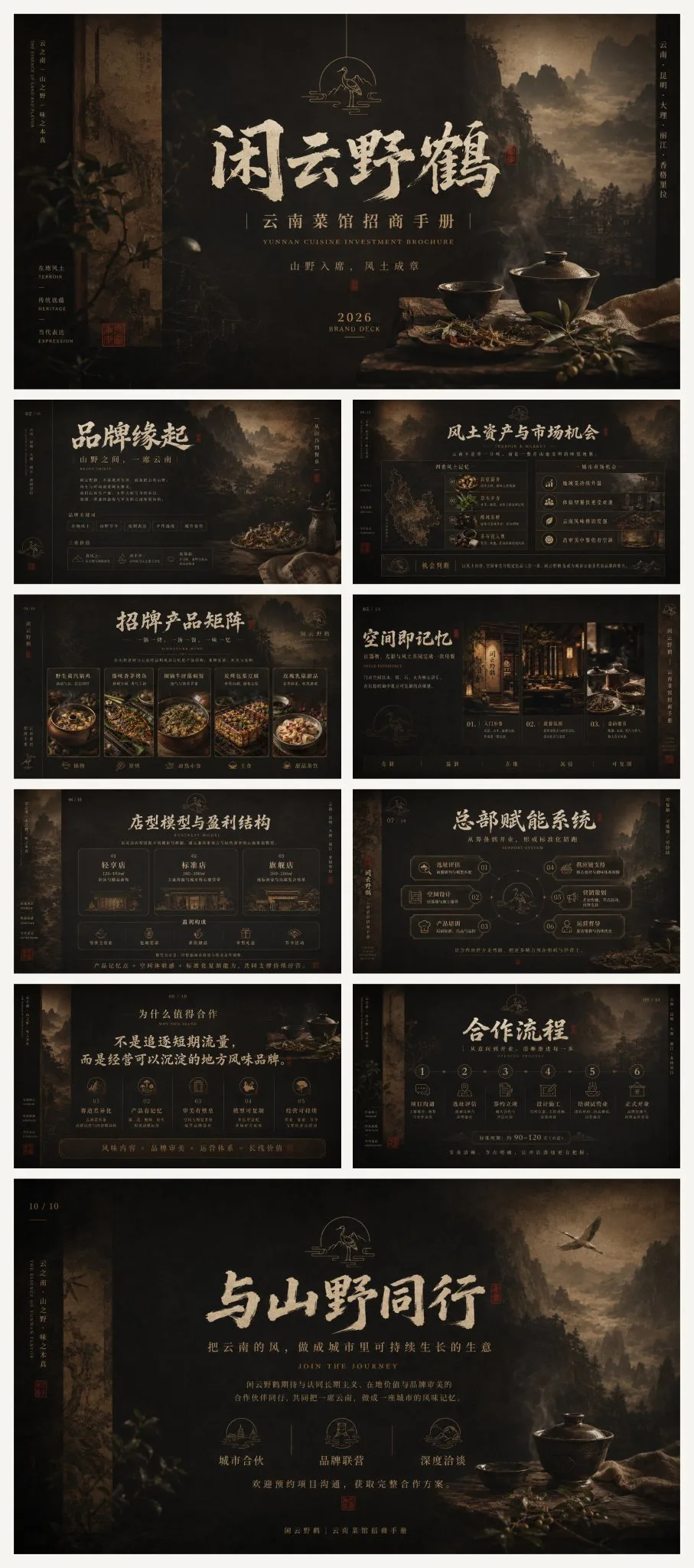
พรอมต์ภาษาไทย
ใช้ระบบทฤษฎีหลักของจีนโบราณที่ว่า 'จังหวะและเสน่ห์ที่สดใส, การใช้พื้นที่สีขาวเป็นสีดำ, การใช้สีตามหมวดหมู่, และการสร้างสรรค์ร่วมกันของความว่างเปล่าและความแข็งแกร่ง' โดยรวม Gestalt visual organization, Swiss International Style grids, the golden ratio, rhythm and repetition, figure-ground relationships, information hierarchy, และ modular narrative ใน editorial design; โดยได้รับความช่วยเหลือจาก white space และ tactile paper feel ของ Kenya Hara, การแปลสัญลักษณ์ตะวันออกที่ทันสมัยของ Alan Chan, high-density information order ของ Kohei Sugiura, เสน่ห์ที่เป็นนามธรรมของ Zao Wou-ki, และการจัดชั้นเชิงพื้นที่ภูมิทัศน์แบบ Fan Kuan-style, เป็นการหลอมรวมที่ยับยั้งชั่งใจมากกว่าการผสมผสานเชิงกลไก โทนสีเริ่มต้นใช้ภาพลักษณ์ของดินแดนยูนนานตอนใต้และไม้โบราณ: scorched tea, ochre, chestnut brown, smoke black, และสี rice xuan paper, โดยใช้ Munsell value layering, low-saturation analogous color harmony, ความแตกต่างของ warm-cool ที่ละเอียดอ่อน, area contrast, และอัตราส่วน 60/30/10, โดยมี red copper gold ที่มีความสว่างต่ำในบางส่วนเพื่อสร้าง visual anchors; รูปแบบโดยรวมยังคงพื้นหลังสีเข้มลึก, ตัวแบบโทนอบอุ่น, ไฮไลต์ที่นุ่มนวล, เงาที่มีคอนทราสต์ต่ำ, และพื้นผิวแบบ matte องค์ประกอบใช้แกนแนวตั้ง, center focus, foreground-background layering, picture-in-picture depth, asymmetrical balance, และพื้นที่สีดำขนาดใหญ่ (dark negative space), โดยมีตัวแบบหลักสร้างระเบียบที่สง่างามผ่านสัดส่วนสี่เหลี่ยมที่มั่นคง, ใช้ baseline grids, multi-column headers, density contrast, scale jumps, และ breathing spacing ภายในเพื่อสร้างจังหวะการอ่านจากไกลไปใกล้, จากนิ่งไปสู่ความเข้มข้น พื้นหลังใช้ movie-level low-key lighting, Rembrandt side lighting, aerial perspective, shallow depth of field, soft focus vignettes, และ local volumetric light เพื่อสร้างสภาพแวดล้อมที่ดื่มด่ำ; วัสดุภาพใช้ regional local documentary photography, natural texture macros, เทคนิค ancient rubbing, xuan paper fiber scans, woodcut grain, film noise, silver halide fading, local scorched darkening, และ layered mask fusion, เสริมสร้างความรู้สึกของเวลา, งานฝีมือ, และความหนาแน่นทางวัฒนธรรมท้องถิ่น ระบบการพิมพ์ใช้การผสมผสานสามระดับของ calligraphy display fonts, modern Song typeface, narrow sans-serif, และ small English caps; ชื่อหลักรวมโครงสร้าง Wei Bei เข้ากับลักษณะของอักษรหวัด (cursive momentum), เพิ่ม flying white, dry brush, ink smudge, edge fraying, misaligned overprinting, และ slight embossed relief, หัวข้อรองยังคงเส้น Song ที่บางและคอนทราสต์สูง, และเนื้อหาหลักยังคงความเป็นมืออาชีพด้วย tight tracking และ clear leading, โดยมีปริมาณเล็กน้อยของการจัดวางแนวตั้ง, seal-style frames, และ matte gold stamping เป็นการระบุทางวัฒนธรรม อารมณ์โดยรวมคือ high-end, มั่นคง, ดั้งเดิม, ชุ่มชื้น, ลึกลับ, ยับยั้งชั่งใจ, หนักแน่น, สง่างาม, ท้องถิ่น, น่าเชื่อถือ, พร้อมด้วยความรู้สึกของ brand epic, cultural collectibility, และ commercial persuasiveness หัวข้อ: Wild Crane (Xianyun Yehe), Yunnan Cuisine Restaurant, Investment Brochure อัตราส่วน 16:9 จุดประสงค์: รูปภาพ PPT สำหรับ Investment brochure ทั้งหมด 10 ภาพ คุณจัดระเบียบข้อมูลได้อย่างอิสระ ทำให้ผู้คนรู้สึกถึงความผันผวนทางอารมณ์หลังจากอ่าน และได้รับบางสิ่งบางอย่าง
พรอมต์ภาษาอังกฤษ
Using the core theoretical system of traditional Chinese 'vivid rhythm and charm, treating white space as black, applying color according to categories, and the mutual generation of void and solid,' integrating Gestalt visual organization, Swiss International Style grids, the golden ratio, rhythm and repetition, figure-ground relationships, information hierarchy, and modular narrative in editorial design; assisted by Kenya Hara's white space and tactile paper feel, Alan Chan's modern translation of Eastern symbols, Kohei Sugiura's high-density information order, Zao Wou-ki's abstract charm, and Fan Kuan-style landscape spatial layering, restrained fusion rather than mechanical collage. The default color scheme adopts the imagery of Southern Yunnan soil and ancient wood: scorched tea, ochre, chestnut brown, smoke black, and rice xuan paper color, utilizing Munsell value layering, low-saturation analogous color harmony, subtle warm-cool differences, area contrast, and a 60/30/10 ratio, with local low-brightness red copper gold forming visual anchors; the overall style maintains a deep dark background, warm-toned subjects, soft highlights, low-contrast shadows, and a matte texture. The composition uses vertical axes, center focus, foreground-background layering, picture-in-picture depth, asymmetrical balance, and large areas of dark negative space, with the main subject establishing a solemn order through stable rectangular proportions, using baseline grids, multi-column headers, density contrast, scale jumps, and breathing spacing internally to form a reading rhythm from far to near, from static to intense. The background uses movie-level low-key lighting, Rembrandt side lighting, aerial perspective, shallow depth of field, soft focus vignettes, and local volumetric light to shape an immersive environment; visual materials use regional local documentary photography, natural texture macros, ancient rubbing techniques, xuan paper fiber scans, woodcut grain, film noise, silver halide fading, local scorched darkening, and layered mask fusion, strengthening the sense of time, craftsmanship, and local cultural thickness. The typography system uses a three-tier combination of calligraphy display fonts, modern Song typeface, narrow sans-serif, and small English caps; the main title integrates Wei Bei skeleton with cursive momentum, adding flying white, dry brush, ink smudge, edge fraying, misaligned overprinting, and slight embossed relief, the subtitle maintains thin Song high-contrast strokes, and the body text maintains professionalism with tight tracking and clear leading, with small amounts of vertical arrangement, seal-style frames, and matte gold stamping as cultural identification. The overall temperament is high-end, steady, primitive, moist, mysterious, restrained, heavy, elegant, local, credible, with a sense of brand epic, cultural collectibility, and commercial persuasiveness. Subject: Wild Crane (Xianyun Yehe), Yunnan Cuisine Restaurant, Investment Brochure. Ratio 16:9. Purpose: Investment brochure PPT images. A total of 10 images. You organize information freely, making people feel emotional fluctuations after reading, and gain something.
พรอมต์ภาษาจีน
用中国传统“气韵生动、计白当黑、随类赋彩、虚实相生”理论体系为核心,融合格式塔视觉组织、瑞士国际主义网格、黄金分割、节奏与重复、图底关系、信息层级与编辑设计中的模块化叙事;以原研哉的留白与触觉纸感、陈幼坚的东方符号现代转译、杉浦康平的高密度信息秩序、赵无极的抽象气韵与范宽式山水空间层次辅助设计,克制融合而非机械拼贴。默认配色采用滇南土壤与古木意象:焦茶、赭石、栗棕、烟黑、米宣纸色,运用孟塞尔明度分层、低饱和同类色和谐、冷暖微差、面积对比与60/30/10比例,局部以低亮度赤铜金形成视觉锚点;整体保持深暗背景、暖色主体、柔和高光、低反差阴影与哑光质感。构图采用纵向轴线、中心聚焦、前后景套层、画中画式纵深、非对称平衡与大面积暗部留白,主体以稳定矩形比例建立庄重秩序,内部使用基线网格、跨栏标题、疏密对照、尺度跃迁和呼吸式间距,形成由远及近、由静至浓的阅读节奏。背景以电影级低调布光、伦勃朗式侧光、空气透视、浅景深、柔焦暗角与局部体积光塑造沉浸环境;视觉素材采用地域风土纪实摄影、自然肌理微距、古法拓印、宣纸纤维扫描、木刻颗粒、胶片噪点、银盐褪色、局部烧焦压暗与分层蒙版融合,强化时间感、手作感与地方文化厚度。字体体系采用书法展示字、现代宋体、窄体无衬线及小型英文大写的三级搭配;主标题以魏碑骨架融合行草势能,加入飞白、枯笔、墨晕、边缘毛化、错位叠印与轻微压印浮雕,副标题保持细宋高对比笔画,正文以紧凑字距和清晰行距维持专业度,少量竖排、印章式框线与烫哑金工艺作为文化识别。整体气质高级、沉稳、古朴、温润、神秘、克制、厚重、雅致、在地、可信、具有品牌史诗感、文化收藏感与商业说服力。 主题:闲云野鹤,云南菜馆,招商手册 比例16:9 用途:招商手册ppt图片 一共10张图片 你自由组织信息、让人读完情绪波动,且有所收获
พรอมต์แนะนำ
8 พรอมต์คัดสรร
สาวผมแดงในสตูดิโอ: แฟชั่นมินิมัลลิสต์

สาวเอเชียในชุดคาร์ดิแกนสีฟ้ามิสต์กับกระโปรงขาว

สาวเอเชียในชุดสีน้ำเงิน บนโซฟาหรูในโรงแรม

โปสเตอร์อินโฟกราฟิกสูตรอาหารระดับพรีเมียม

สาวชุดว่ายน้ำขาว-ฟ้า สาดน้ำทะเลริมหาด

ถ่ายภาพคอสเพลย์ฤดูร้อนสไตล์เซลฟี่จากมือถือ
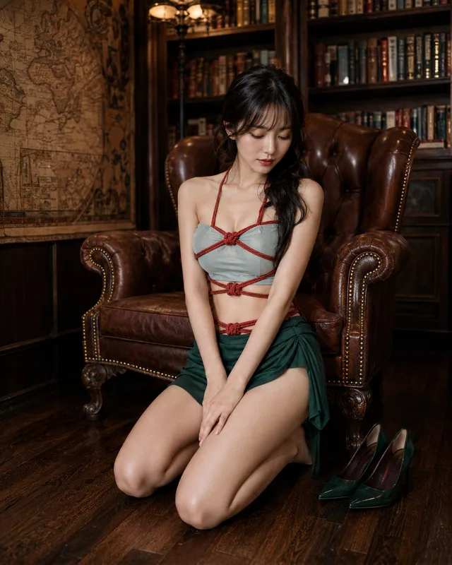
แฟชั่นแนวตะวันออกในห้องหนังสือย้อนยุค
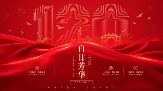
โปสเตอร์ฉลองครบรอบโรงเรียน: ความสง่างามและสดใส