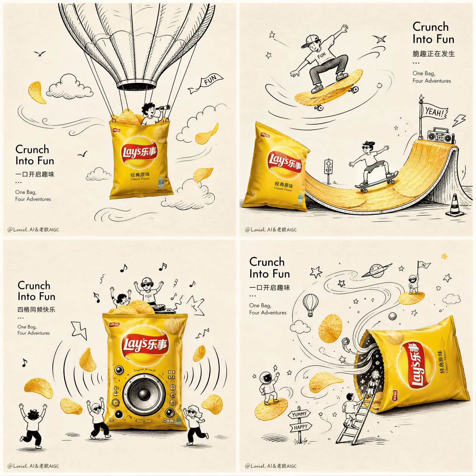
โฆษณาเลย์สี่ช่อง: ท่องโลกความสนุกในทุกคำ
ที่มา: @ou_zhen599โมเดล: ChatGPT
ภาพตัวอย่าง
พรอมต์ภาษาไทย
สร้างสรรค์งานศิลปะโฆษณาแบบพรีเมียมในรูปแบบตาราง 2x2 สำหรับมันฝรั่งทอด Lay's โดยเป็นภาพเดียวที่แบ่งออกเป็นสี่ช่องเท่าๆ กัน ทั้งหมดอยู่ในสไตล์แนวคิดที่สะอาดตาเหมือนกัน โปสเตอร์โดยรวมควรรู้สึกฉลาด สดใหม่ สนุกสนาน มีการออกแบบสูง และมีการโต้ตอบทางสายตาอย่างมาก พร้อมการกำกับศิลป์ที่แข็งแกร่งและคุณภาพของโปสเตอร์โฆษณาที่น่าสะสม ภาษาภาพหลัก: พื้นหลังสีขาวนวลอบอุ่นแบบมีพื้นผิวกระดาษที่เรียบง่าย มีพื้นที่ว่างเชิงลบที่สะอาดตาจำนวนมาก ภาพประกอบลายเส้นแฮนด์เมดสีขาวดำที่ประณีต ผสมผสานกับบรรจุภัณฑ์มันฝรั่งทอด Lay's ที่มีสีสันสมจริงและมันฝรั่งทอดสีทองเป็นสีเด่นเพียงอย่างเดียว อารมณ์คือความฉลาด มีอารมณ์ขัน เบา กราฟิก และพรีเมียม การจัดวาง: องค์ประกอบ 2x2 ที่สะอาดตา สี่ช่องสี่เหลี่ยม จัดเรียงเท่ากัน มีเว้นช่องว่างบางๆ ระหว่างช่อง จังหวะภาพที่เป็นอันหนึ่งอันเดียวกัน สไตล์ศิลปะเดียวกันทั่วทั้งสี่ฉาก เหมือนซีรีส์แคมเปญที่นำเสนอในหน้าเดียว ทำให้ภาพดูเรียบร้อย สมดุล และหรูหรา ผลิตภัณฑ์: ใช้บรรจุภัณฑ์ถุงมันฝรั่งทอด Lay’s ที่เป็นสัญลักษณ์และสมจริงเป็นวัตถุหลักในแต่ละช่อง ถุงควรดูเป็นของแท้ มันเงา พรีเมียม จดจำได้ทันที ด้วยปริมาตรที่สมจริง แสงเงาที่ชัดเจน และเอกลักษณ์ของแบรนด์ที่คมชัด ควรใช้แพ็ค Lay’s สีเหลืองสดคลาสสิกเป็นตัวเอกหลัก หรือใช้ตระกูลสี Lay’s ที่กลมกลืนกันหากจำเป็น แต่ยังคงรักษาความเป็นอันหนึ่งอันเดียวกันและความสะอาดของแคมเปญ แต่ละช่องทั้งสี่ช่องควรแสดงการโต้ตอบที่สนุกสนานที่แตกต่างกันระหว่างถุง Lay’s / มันฝรั่งทอดจริงกับโลกของภาพวาดเส้นสีดำ: ช่องที่ 1: ถุงมันฝรั่งทอด Lay’s ทำหน้าที่เป็นตะกร้าของบอลลูนลมร้อน ลอยขึ้นไปด้านบน หลังคาบอลลูนวาดด้วยมือ เมฆ นกตัวเล็กๆ เส้นทางการไหลของอากาศ ไอคอนการผจญภัยที่ร่าเริง มันฝรั่งทอดสีทองลอยอยู่รอบๆ เหมือนใบไม้ที่ปลิวตามลม ช่องที่ 2: ถุง Lay’s กลายเป็นสเก็ตบอร์ดหรือทางลาดสำหรับเล่นเซิร์ฟ ตัวละครลายเส้นสีดำไถลไปตามมันฝรั่งทอดที่โค้งงอราวกับเป็นทางลาดสเก็ตหรือคลื่น เส้นการเคลื่อนไหว ดาว ธงเล็กๆ สัญลักษณ์การกระทำที่สนุกสนาน ให้ความรู้สึกของการเคลื่อนไหวและพลังงานที่แข็งแกร่ง ช่องที่ 3: ถุง Lay’s ทำหน้าที่เป็นลำโพงดนตรีหรือเครื่องขยายเสียงในงานปาร์ตี้ คลื่นเสียงแบบวาดเส้น เส้นเต้นรำ โน้ตดนตรีเล็กๆ ตัวละครเล็กๆ ที่กำลังเต้น มันฝรั่งทอดกระเด็นออกมาเหมือนจังหวะดนตรี องค์ประกอบให้ความรู้สึกมีชีวิตชีวาและทรงพลัง แต่ยังคงความสะอาดของภาพ ช่องที่ 4: ถุง Lay’s กลายเป็นประตูหรือพอร์ทัลเข้าสู่จักรวาลของว่างแบบวาดเส้น ลวดลายเกลียว ดาว มันฝรั่งทอดลอย บันไดเล็กๆ ผู้คนเล็กๆ ที่ชอบผจญภัย ลูกศรที่สนุกสนาน และสัญลักษณ์ของว่างที่แปลกตาโผล่ออกมาจากช่องเปิดของถุง ฉากควรรู้สึกถึงจินตนาการและความสุข การกำกับศิลป์: ภาพวาดเส้นที่วาดด้วยมือจะต้องสง่างาม ควบคุมได้ มีไหวพริบ และฉลาดในการจัดองค์ประกอบ ไม่ใช่การขีดเขียนแบบเด็กๆ ใช้เส้นหมึกสีดำที่สะอาดตา ศิลปะการ์ตูนแบบเรียบง่าย Humor แบบอ่อนโยน และการเล่าเรื่องด้วยภาพที่ละเอียดอ่อน ผลิตภัณฑ์จริงควรโต้ตอบโดยตรงกับภาพวาดเส้นเพื่อให้ฉากรู้สึกผสมผสานกันอย่างชาญฉลาด ไม่ใช่แค่แปะทับ แต่ละช่องควรมีมุกตลกหรือการโต้ตอบด้วยภาพที่ชัดเจนหนึ่งอย่าง มันฝรั่งทอด: มันฝรั่งทอด Lay’s สีทองควรปรากฏในทั้งสี่ช่องเป็นตัวละครรองที่สมจริง กรอบ เบาเค็ม น่ารับประทาน ลอยอยู่หรือโต้ตอบกับโลกของภาพวาดเส้น มันฝรั่งทอดบางชิ้นสามารถทำหน้าที่เหมือนดวงอาทิตย์ ล้อ หินก้าว กระดานโต้คลื่น หรือวัตถุบินได้ แต่แนวคิดทั้งหมดต้องยังคงสะอาดตาและอ่านง่าย การพิมพ์: เพิ่มการพิมพ์แคมเปญที่เรียบง่ายแต่เป็นศิลปะ สะอาดตาและทันสมัย ผสมผสานเข้ากับการจัดวางโดยรวม ไม่ใช่หัวข้อข่าวขนาดใหญ่ที่รกรุงรัง ใช้การผสมผสานที่มีสไตล์ของภาษาอังกฤษและจีน ด้วยการเว้นวรรคที่ประณีตและความสง่างามของการออกแบบโฆษณา ข้อความแนะนำ: “Lay’s” “Crunch Into Fun” “One Bag, Four Adventures” ข้อความภาษาจีน: “乐事薯片” “一口开启趣味” “四格同频快乐” “脆趣正在发生” การพิมพ์ควรรู้สึกเหมือนบทบรรณาธิการ เบา พรีเมียม และสมดุลกับภาพ หลีกเลี่ยงฟอนต์ที่หยาบและหนัก ความรู้สึกโดยรวม: โปสเตอร์ภาพประกอบเชิงพาณิชย์ที่สะอาดตา โฆษณาบรรจุภัณฑ์เชิงแนวคิด การจัดวางแบบเรียบง่ายทันสมัย การโต้ตอบด้วยภาพที่ชาญฉลาด มีไหวพริบและสดใส แผงแคมเปญพรีเมียม สนุกสนานแต่ซับซ้อน การนำเสนอแบรนด์ระดับไฮเอนด์ พื้นหลังกระดาษอบอุ่น การถ่ายภาพผลิตภัณฑ์ที่สมจริงผสมผสานกับศิลปะลายเส้นหมึกดำ พื้นที่ว่างเชิงลบที่แข็งแกร่ง องค์ประกอบที่แข็งแกร่ง 8k รายละเอียดสูงเป็นพิเศษ มีเอกลักษณ์ น่าจดจำ ข้อความเชิงลบ: การจัดวางที่ยุ่งเหยิง พื้นหลังรก รายละเอียดต่ำ ภาพวาดเส้นแบบเด็กๆ การออกแบบราคาถูก บรรจุภัณฑ์บิดเบี้ยว โลโก้เบลอ วัตถุมากเกินไป โปสเตอร์ที่ตกแต่งมากเกินไป พื้นหลังมืด สีสุ่ม การโต้ตอบที่อ่อนแอ องค์ประกอบที่ราบเรียบ โฆษณาขนมขบเคี้ยวทั่วไป ข้อความที่อ่านไม่ออก ผลิตภัณฑ์เพิ่มเติม ภาพประกอบระดับล่าง
พรอมต์ภาษาอังกฤษ
Create a premium 2x2 grid advertising artwork for Lay’s potato chips, one single image divided into four equal panels, all in the same clean conceptual style. The overall poster should feel witty, fresh, playful, highly designed, and visually interactive, with strong art-direction and collectible ad-poster quality. Core visual language: minimal warm off-white paper-texture background, lots of clean negative space, refined black-and-white hand-drawn doodle illustration, combined with realistic colorful Lay’s potato chip packaging and golden chips as the only strong color highlights. The mood is smart, humorous, light, graphic, and premium. Layout: a clean 2x2 composition, four square panels, evenly aligned, thin subtle spacing between panels, unified visual rhythm, same art style across all four scenes, like a campaign series presented in one page. Keep the image neat, balanced, and high-end. Product: Use iconic realistic Lay’s potato chips bag packaging as the hero object in every panel. The bag should look authentic, glossy, premium, instantly recognizable, with strong realistic volume, shadows, highlights, and crisp brand identity. Prefer classic bright yellow Lay’s pack as the main hero, or use a harmonious family of Lay’s colors if needed, but keep the campaign unified and clean. Each of the four panels should show a different playful interaction between the real Lay’s bag / chips and the black doodle world: Panel 1: The Lay’s chip bag acts as a hot air balloon basket, floating upward. Hand-drawn doodle balloon canopy above, clouds, tiny birds, airflow lines, cheerful adventure icons. Golden potato chips fly around like wind-blown leaves. Panel 2: The Lay’s bag becomes a skateboard or surf ramp. Black line doodle characters slide across curved chips as if they are skate ramps or waves. Motion lines, stars, mini flags, playful action symbols. Strong sense of movement and energy. Panel 3: The Lay’s bag works as a music speaker or party amplifier. Doodle sound waves, dancing lines, tiny music notes, happy mini figures, chips bouncing outward like rhythm beats. The composition feels lively and punchy but still visually clean. Panel 4: The Lay’s bag becomes a doorway or portal into a doodle snack universe. Hand-drawn swirls, stars, floating chips, tiny ladders, adventurous mini people, playful arrows, and whimsical snack symbols emerging from the bag opening. The scene should feel imaginative and delightful. Art direction: The hand-drawn doodles must be elegant, controlled, witty, and compositionally smart, not childish scribbles. Use clean black ink lines, refined cartoon minimalism, soft humor, and subtle visual storytelling. The real product should interact directly with the doodles so the scene feels cleverly integrated, not pasted on top. Every panel should have one clear visual joke or interaction. Chips: Golden Lay’s potato chips should appear in all four panels as supporting heroes, realistic, crisp, lightly salted, appetizing, floating or interacting with the doodle world. Some chips can act like suns, wheels, stepping stones, surfboards, or flying objects, but all ideas must remain clean and readable. Typography: Add minimal but artistic campaign typography, clean and modern, integrated into the overall layout, not large messy headlines. Use a stylish mix of English and Chinese, with refined spacing and ad-design elegance. Suggested text: “Lay’s” “Crunch Into Fun” “One Bag, Four Adventures” Chinese text: “乐事薯片” “一口开启趣味” “四格同频快乐” “脆趣正在发生” Typography should feel editorial, light, premium, and balanced with the visuals. Avoid crude heavy fonts. Overall feel: clean commercial illustration poster, conceptual packaging ad, modern minimal layout, clever visual interaction, witty and bright, premium campaign board, playful but sophisticated, high-end brand presentation, warm paper background, realistic product photography mixed with black ink doodle art, strong negative space, strong composition, 8k, hyper-detailed, unique, memorable. Negative prompt: messy layout, cluttered background, low detail, childish doodles, cheap design, distorted packaging, blurry logo, too many objects, overdecorated poster, dark background, random colors, weak interaction, flat composition, generic snack ad, unreadable text, extra products, low-end illustration
พรอมต์ภาษาจีน
Create a premium 2x2 grid advertising artwork for Lay’s potato chips, one single image divided into four equal panels, all in the same clean conceptual style. The overall poster should feel witty, fresh, playful, highly designed, and visually interactive, with strong art-direction and collectible ad-poster quality. Core visual language: minimal warm off-white paper-texture background, lots of clean negative space, refined black-and-white hand-drawn doodle illustration, combined with realistic colorful Lay’s potato chip packaging and golden chips as the only strong color highlights. The mood is smart, humorous, light, graphic, and premium. Layout: a clean 2x2 composition, four square panels, evenly aligned, thin subtle spacing between panels, unified visual rhythm, same art style across all four scenes, like a campaign series presented in one page. Keep the image neat, balanced, and high-end. Product: Use iconic realistic Lay’s potato chips bag packaging as the hero object in every panel. The bag should look authentic, glossy, premium, instantly recognizable, with strong realistic volume, shadows, highlights, and crisp brand identity. Prefer classic bright yellow Lay’s pack as the main hero, or use a harmonious family of Lay’s colors if needed, but keep the campaign unified and clean. Each of the four panels should show a different playful interaction between the real Lay’s bag / chips and the black doodle world: Panel 1: The Lay’s chip bag acts as a hot air balloon basket, floating upward. Hand-drawn doodle balloon canopy above, clouds, tiny birds, airflow lines, cheerful adventure icons. Golden potato chips fly around like wind-blown leaves. Panel 2: The Lay’s bag becomes a skateboard or surf ramp. Black line doodle characters slide across curved chips as if they are skate ramps or waves. Motion lines, stars, mini flags, playful action symbols. Strong sense of movement and energy. Panel 3: The Lay’s bag works as a music speaker or party amplifier. Doodle sound waves, dancing lines, tiny music notes, happy mini figures, chips bouncing outward like rhythm beats. The composition feels lively and punchy but still visually clean. Panel 4: The Lay’s bag becomes a doorway or portal into a doodle snack universe. Hand-drawn swirls, stars, floating chips, tiny ladders, adventurous mini people, playful arrows, and whimsical snack symbols emerging from the bag opening. The scene should feel imaginative and delightful. Art direction: The hand-drawn doodles must be elegant, controlled, witty, and compositionally smart, not childish scribbles. Use clean black ink lines, refined cartoon minimalism, soft humor, and subtle visual storytelling. The real product should interact directly with the doodles so the scene feels cleverly integrated, not pasted on top. Every panel should have one clear visual joke or interaction. Chips: Golden Lay’s potato chips should appear in all four panels as supporting heroes, realistic, crisp, lightly salted, appetizing, floating or interacting with the doodle world. Some chips can act like suns, wheels, stepping stones, surfboards, or flying objects, but all ideas must remain clean and readable. Typography: Add minimal but artistic campaign typography, clean and modern, integrated into the overall layout, not large messy headlines. Use a stylish mix of English and Chinese, with refined spacing and ad-design elegance. Suggested text: “Lay’s” “Crunch Into Fun” “One Bag, Four Adventures” Chinese text: “乐事薯片” “一口开启趣味” “四格同频快乐” “脆趣正在发生” Typography should feel editorial, light, premium, and balanced with the visuals. Avoid crude heavy fonts. Overall feel: clean commercial illustration poster, conceptual packaging ad, modern minimal layout, clever visual interaction, witty and bright, premium campaign board, playful but sophisticated, high-end brand presentation, warm paper background, realistic product photography mixed with black ink doodle art, strong negative space, strong composition, 8k, hyper-detailed, unique, memorable. Negative prompt: messy layout, cluttered background, low detail, childish doodles, cheap design, distorted packaging, blurry logo, too many objects, overdecorated poster, dark background, random colors, weak interaction, flat composition, generic snack ad, unreadable text, extra products, low-end illustration