โปสเตอร์กาแฟ Luckin: ภาพวาดจีนหมึกสีอ่อน 9 ช่อง
ที่มา: @ou_zhen599โมเดล: ChatGPT
ภาพตัวอย่าง
พรอมต์ภาษาไทย
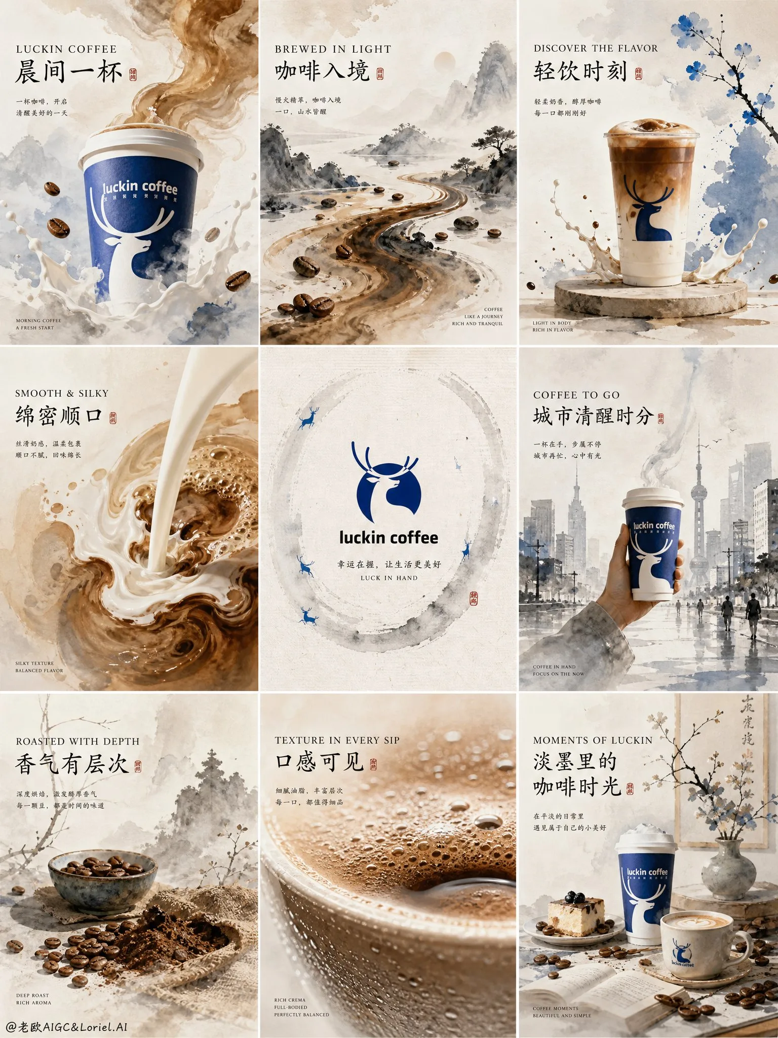
คอลลาจโฆษณาระดับพรีเมียมที่มีรายละเอียดสูงสำหรับ Luckin Coffee, จัดวางแบบตาราง 3x3 ที่หรูหราพร้อมฉากส่งเสริมการขายที่ไม่เหมือนใครเก้าฉาก, ออกแบบในแนวผสมผสานที่ประณีตของภาพวาดจีนสีอ่อน (淡彩国画), สุนทรียภาพหมึกจีนร่วมสมัย (水墨美学), และการสร้างแบรนด์เชิงพาณิชย์ระดับพรีเมียม ทั้งหมดนี้ควรรู้สึกเหมือนการนำเสนอแคมเปญศิลปะจีนระดับไฮเอนด์สำหรับ Luckin Coffee, ผสมผสานบรรยากาศหมึกอ่อน, โทนสีน้ำแร่บางเบา, การแสดงภาพผลิตภัณฑ์กาแฟพรีเมียม, พื้นที่ว่างแบบตะวันออกอันงดงาม (东方留白), และการเล่าเรื่องแบรนด์ที่ทันสมัย ไม่ใช่ใบปลิวร้านกาแฟทั่วไป, ไม่ใช่โปสเตอร์เชิงพาณิชย์ที่เสียงดัง จะต้องรู้สึกเหมือนบอร์ดแคมเปญหรูหราที่ได้รับการแนะนำบน Behance ด้วยรสนิยมภาพลักษณ์จีนระดับพิพิธภัณฑ์ ระบบภาพรวม: บอร์ดแคมเปญ Luckin Coffee ระดับพรีเมียม, ใช้สีน้ำล้างบางเบา, การกระจายหมึก, พื้นผิว 'กระดาษซับ', ขอบพู่กันที่สง่างาม, การจัดชั้นแบบมีหมอก, และองค์ประกอบโมดูลาร์ที่ทันสมัย แต่ละแผงควรรู้สึกเหมือนฉากที่ประณีตจากโลกแบรนด์ที่เป็นหนึ่งเดียวกัน: กลิ่นกาแฟ, ความสงบยามเช้า, บทกวีเมือง, เนื้อสัมผัสที่เนียนนุ่ม, ความลึกของการคั่ว, และสุนทรียศาสตร์จีนร่วมสมัย ใช้โครงสร้างองค์ประกอบที่แข็งแกร่งแต่พอเหมาะ, พื้นที่ว่างที่หายใจได้, จังหวะตารางที่ละเอียดอ่อน, และการพิมพ์ภาษาจีน-อังกฤษแบบศิลปะ ชุดสี: สีขาวกระดาษข้าวอุ่น, สีเบจกาแฟอ่อน, สีน้ำตาลคาราเมลอ่อน, สีมอคค่านุ่ม, สีเทาน้ำเงินอ่อน (淡蓝灰), สีดำหมึกมัว, สีเทาเขียวครามจาง, สีฟ้ากวาง (deer-blue) ที่เป็นเอกลักษณ์ของแบรนด์, สีงาช้างนวล, โทนสีน้ำตาลทองของการคั่วที่ละเอียดอ่อน ทำให้ทุกอย่างดูเบา, โปร่งสบาย, มีความเป็นบทกวี, และพรีเมียม แผงซ้ายบน: ถ้วยกาแฟ Luckin ขนาดใหญ่ลอยขึ้นจากเมฆหมึกสีอ่อน, โดยมีกลิ่นกาแฟกลายเป็นหมอกสีน้ำและลวดลายพู่กันอ่อนโยน รอบๆ มีเมล็ดกาแฟลอยอยู่, หยดนมจางๆ, และหมึกที่ diffuse อย่างละเอียดอ่อน พาดหัวที่หรูหรา: “LUCKIN COFFEE” “晨间一杯” (กาแฟยามเช้า) ถ้วยจะต้องจดจำได้ชัดเจนและดูพรีเมียม แผงกลางบน: ภาพทิวทัศน์หมึกจีนแบบบทกวีที่กาแฟที่ไหลกลายเป็นแม่น้ำของหมึกอ่อน (淡墨) และสีน้ำตาลอุ่น, ไหลคดเคี้ยวไปตามภูเขาที่เป็นนามธรรมและหมอกยามเช้า เมล็ดกาแฟลอยเหมือนก้อนหินในลำธาร, แสดงถึงกลิ่นหอมและความลึก พาดหัว: “BREWED IN LIGHT” “咖啡入境” (กาแฟสู่ดินแดน) แผงขวาบน: การแสดงผลิตภัณฑ์พรีเมียมหลักโดยมีถ้วย Luckin หรือกาแฟบรรจุขวดตั้งอยู่บนแท่นทรงกลมแบบมินิมอลที่วาดในสไตล์ 'พู่กันและสีน้ำ', ล้อมรอบด้วยหยดนมฟองอ่อนๆ, หยดกาแฟ, และองค์ประกอบสีฟ้ากวางที่ละเอียดอ่อน พาดหัว: “DISCOVER THE FLAVOR” “轻饮时刻” (ช่วงเวลาแห่งการดื่มเบาๆ) แผงซ้ายกลาง: องค์ประกอบที่แสดงถึงรสชาติโดยมีนมเนื้อครีมผสมผสานเข้ากับกาแฟในโทนสีไล่ระดับคล้ายหมึกที่สง่างาม, พร้อมพื้นผิวฟองนุ่ม, คลื่นเบาๆ, และขอบพู่กันที่ไหลลื่น ฉากนี้ควรสื่อถึงความนุ่มนวลและความสมดุลได้ทันที พาดหัว: “SMOOTH & SILKY” “绵密顺口” (นุ่มนวลละมุนลิ้น) แผงกลาง: การนำเสนอโลโก้ Luckin Coffee แบบมินิมอลที่อยู่ตรงกลางบนพื้นหลังกระดาษข้าวที่บริสุทธิ์พร้อมพื้นผิวใยที่ละเอียดอ่อน, เงาในสตูดิโอที่นุ่มนวล, รอยวงหมึกจางๆ, และองค์ประกอบสีฟ้ากวางขนาดเล็กที่ลอยอยู่ นี่คือแผงหลักของเอกลักษณ์ของแบรนด์บนบอร์ดทั้งหมด, สงบ, พรีเมียม, ทันสมัย, และเป็น Luckin อย่างชัดเจน แผงขวากลาง: แผงไลฟ์สไตล์การดื่มกาแฟแบบ take-away ที่ประณีต: ถ้วย Luckin ถูกถือผ่านเมืองจีนสมัยใหม่ที่มีหมอกปกคลุมที่วาดในสไตล์หมึกจีนร่วมสมัย, พร้อมเงาร่างสถาปัตยกรรมจางๆ, แสงยามเช้าที่นุ่มนวล, และไอน้ำที่ไหล พาดหัว: “COFFEE TO GO” “城市清醒时分” (ช่วงเวลาแห่งการตื่นตัวของเมือง) ความรู้สึกควรเป็นบทกวีเมืองสมัยใหม่, ไม่ใช่ความวุ่นวายบนท้องถนนตามตัวอักษร แผงซ้ายล่าง: ภาพนิ่งเมล็ดกาแฟและกาแฟคั่วระดับพรีเมียมที่วาดในสไตล์สีน้ำและหมึกที่ละเอียดอ่อน: เมล็ดกาแฟคั่ว, กาแฟบด, พื้นผิวผ้ากระสอบนุ่มๆ, เครื่องเคลือบเบาๆ, เส้นกลิ่นหอมที่ลอยอยู่, และสีน้ำที่จัดชั้นบางๆ พาดหัว: “ROASTED WITH DEPTH” “香气有层次” (กลิ่นหอมที่มีมิติ) แผงกลางล่าง: แผงมาโครที่เน้นพื้นผิวของเครมา, ฟองนม, คลื่นบนผิวกาแฟ, และการควบแน่นของไอน้ำบนถ้วย, แสดงออกด้วยความสมจริงทางสัมผัสที่มีรายละเอียดสูงผสมผสานกับขอบพู่กันที่นุ่มนวลและหมึกที่ซึมเล็กน้อย พาดหัว: “TEXTURE IN EVERY SIP” “口感可见” (สัมผัสได้ถึงรสชาติ) แผงขวาล่าง: ฉากโลกของแบรนด์พรีเมียมที่สมบูรณ์: การจัดวางบนโต๊ะที่เปิดกว้างพร้อมถ้วยกาแฟ Luckin, ขนมอบ, เมล็ดกาแฟ, ไอน้ำนุ่มๆ, เงาสีน้ำจางๆ, และการตกแต่งด้วยพืชพรรณที่วาดด้วยหมึกบางๆ, สร้างองค์ประกอบสุดท้ายที่สงบแต่ร่ำรวย พาดหัว: “MOMENTS OF LUCKIN” “淡墨里的咖啡时光” (ช่วงเวลาแห่งกาแฟในหมึกสีอ่อน) นี่ควรรู้สึกเหมือนแผงหลักปิดท้ายของแคมเปญกาแฟจีนสุดหรู การพิมพ์: การจัดวางตัวอักษรภาษาจีนและภาษาอังกฤษที่กำกับดูแลอย่างสวยงาม, ประณีต, มีความเป็นบรรณาธิการ, โปร่งสบาย, สมดุล, ไม่ใช่ข้อความตัวหนาหยาบๆ, ไม่ใช่การใช้ sans-serif ทั่วไปเท่านั้น ใช้ลำดับชั้นที่สง่างามด้วย serif ที่ทันสมัยหรือ sans-serif ที่สะอาดตาผสมผสานกับจังหวะลายมือที่ละเอียดอ่อน การพิมพ์ควรรู้สึกเหมือนเป็นส่วนหนึ่งของภาพวาดและการจัดวาง, ไม่ใช่ถูกวางทับลงไป สไตล์: คอลลาจเชิงพาณิชย์พรีเมียม, บอร์ดแคมเปญโมดูลาร์ 3x3, สีน้ำจีนที่ละเอียดอ่อน, สุนทรียภาพหมึกจีนร่วมสมัย, การสร้างแบรนด์ที่โทนสีอ่อน, โฆษณาร้านกาแฟหรูหรา, การเรนเดอร์ผลิตภัณฑ์ที่สมจริงผสมผสานกับการกระจายพู่กันแบบศิลปะ, พื้นผิวกระดาษ, แสงที่นุ่มนวล, พื้นที่ว่างที่สง่างาม, การกำกับศิลป์ระดับโลก, คุณภาพการนำเสนอระดับ Behance, 8K วัสดุและรายละเอียด: เกรนกระดาษข้าว, หมึกซึมอย่างนุ่มนวล, การรวมตัวของสีน้ำ, พื้นผิวฟองครีม, ผิวกาแฟที่มันวาว, การสะท้อนของถ้วยที่ละเอียดอ่อน, พื้นผิวเมล็ดกาแฟคั่ว, รอยขีดข่วนของพู่กันจางๆ, การจัดชั้นเม็ดสีอ่อนๆ, เงาที่หรูหรา, การพิมพ์โปสเตอร์พรีเมียม พรอมต์เชิงลบ: ใบปลิวร้านกาแฟราคาถูก, หมึกหนักมืดเกินไป, องค์ประกอบที่ยุ่งเหยิง, สีที่ดัง, โปสเตอร์ชานมทั่วไป, ภาพประกอบแบบเด็กๆ, ข้อความที่อ่านไม่ออก, ฟอนต์จีนหยาบคาย, แก้วกาแฟที่รายละเอียดต่ำ, เลย์เอาต์ที่รก, โฆษณาซูเปอร์มาร์เก็ต, สไตล์เชิงพาณิชย์แบบนีออน, แสงแบนๆ, กาแฟที่ดูเหมือนพลาสติก, ลายน้ำ, ความละเอียดต่ำ
พรอมต์ภาษาอังกฤษ
Ultra-detailed premium advertising collage for Luckin Coffee, elegant 3x3 grid layout with nine unique promotional scenes, designed in a refined fusion of淡彩国画, contemporary水墨美学, and premium commercial branding. The whole board should feel like a high-end Chinese artistic campaign presentation for Luckin Coffee, combining soft ink-wash atmosphere, light mineral watercolor tones, premium coffee product visualization, poetic东方留白, and modern brand storytelling. Not a generic café flyer, not a noisy commercial poster. It must feel like a Behance-featured luxury campaign board with museum-grade Chinese visual taste. Overall visual system: premium Luckin Coffee campaign board, using pale watercolor washes, ink diffusion, soft paper texture, elegant brush edges, misty layering, and modern modular composition. Every panel should feel like a refined scene from one unified brand world: coffee aroma, morning calm, urban poetry, creamy texture, roasted depth, and contemporary Chinese aesthetics. Use strong but restrained composition, breathable negative space, subtle grid rhythm, and artistic Chinese-English typography. Color palette: warm rice paper white, pale coffee beige, light caramel brown, soft mocha,淡蓝灰, misty ink black, washed celadon gray, faint deer-blue brand accents, creamy ivory, subtle gold-brown roast tones. Keep everything light, airy, poetic, and premium. Top Left Panel: A giant Luckin Coffee cup rising from pale ink-wash clouds, with coffee aroma turning into watercolor mist and soft brush-like swirls. Around it, floating coffee beans, faint milk splash arcs, and delicate ink diffusion. Elegant headline: “LUCKIN COFFEE” “晨间一杯” The cup must be clearly recognizable and premium. Top Center Panel: A poetic ink-wash landscape where flowing coffee becomes a river of淡墨 and warm brown wash, winding through abstract mountains and morning mist. Coffee beans drift like stones in a stream, proving aroma and depth. Headline: “BREWED IN LIGHT” “咖啡入境” Top Right Panel: A premium hero product display with a Luckin cup or bottled coffee standing on a minimal circular pedestal rendered in soft brush-and-wash style, surrounded by pale splashes of milk foam, coffee droplets, and subtle deer-blue accents. Headline: “DISCOVER THE FLAVOR” “轻饮时刻” Middle Left Panel: A flavor-proof composition showing creamy milk blending into coffee in elegant ink-like gradients, with soft foam texture, gentle ripples, and flowing brush edges. The scene should instantly communicate smoothness and balance. Headline: “SMOOTH & SILKY” “绵密顺口” Middle Center Panel: Minimalist centered Luckin Coffee logo presentation on a pristine rice-paper background with subtle fiber texture, soft studio shadow, pale ink ring marks, and tiny deer-blue floating accents. This is the identity anchor panel of the whole board, calm, premium, modern, unmistakably Luckin. Middle Right Panel: A refined takeaway lifestyle panel: a Luckin cup carried through a misty modern Chinese city rendered in contemporary ink wash, with faint architectural silhouettes, soft morning light, and flowing steam. Headline: “COFFEE TO GO” “城市清醒时分” The feeling should be modern urban poetry, not literal street clutter. Bottom Left Panel: A premium bean-and-roast still life rendered in delicate watercolor and ink: roasted coffee beans, grounds, soft burlap texture, light ceramic ware, drifting aroma lines, and pale layered washes. Headline: “ROASTED WITH DEPTH” “香气有层次” Bottom Center Panel: A macro texture panel focused on crema, milk foam, coffee surface ripples, and cup condensation, expressed with ultra-detailed tactile realism blended with soft brush edges and subtle ink bleed. Headline: “TEXTURE IN EVERY SIP” “口感可见” Bottom Right Panel: A complete premium brand-world scene: open tabletop arrangement with Luckin coffee cups, pastries, beans, soft steam, pale watercolor shadows, and light ink-wash botanical accents, forming a calm but rich final composition. Headline: “MOMENTS OF LUCKIN” “淡墨里的咖啡时光” This should feel like the closing hero panel of a luxury Chinese coffee campaign. Typography: beautifully art-directed Chinese and English typography, refined, editorial, airy, balanced, never crude bold text, never generic sans only. Use elegant hierarchy with modern serif or clean contemporary sans mixed with subtle calligraphic rhythm. Typography should feel like part of the painting and layout, not pasted on top. Style: premium commercial collage, 3x3 modular campaign board, delicate Chinese watercolor, contemporary ink-wash aesthetics, pale-tone branding, luxury café advertising, realistic product rendering blended with artistic brush diffusion, paper texture, soft lighting, elegant negative space, world-class creative direction, Behance-level presentation quality, 8K. Materials and details: rice paper grain, soft ink bloom, watercolor pooling, creamy foam texture, glossy coffee surface, subtle cup reflections, roasted bean texture, faint brush scratches, pale pigment layering, elegant shadows, premium print-poster finish. Negative prompt: cheap café flyer, dark heavy ink overload, messy composition, loud colors, generic milk tea poster, childish illustration, unreadable text, crude Chinese font, low-detail coffee cup, cluttered layout, supermarket ad, neon commercial style, flat lighting, plastic-looking coffee, watermark, low resolution
พรอมต์ภาษาจีน
Ultra-detailed premium advertising collage for Luckin Coffee, elegant 3x3 grid layout with nine unique promotional scenes, designed in a refined fusion of淡彩国画, contemporary水墨美学, and premium commercial branding. The whole board should feel like a high-end Chinese artistic campaign presentation for Luckin Coffee, combining soft ink-wash atmosphere, light mineral watercolor tones, premium coffee product visualization, poetic东方留白, and modern brand storytelling. Not a generic café flyer, not a noisy commercial poster. It must feel like a Behance-featured luxury campaign board with museum-grade Chinese visual taste. Overall visual system: premium Luckin Coffee campaign board, using pale watercolor washes, ink diffusion, soft paper texture, elegant brush edges, misty layering, and modern modular composition. Every panel should feel like a refined scene from one unified brand world: coffee aroma, morning calm, urban poetry, creamy texture, roasted depth, and contemporary Chinese aesthetics. Use strong but restrained composition, breathable negative space, subtle grid rhythm, and artistic Chinese-English typography. Color palette: warm rice paper white, pale coffee beige, light caramel brown, soft mocha,淡蓝灰, misty ink black, washed celadon gray, faint deer-blue brand accents, creamy ivory, subtle gold-brown roast tones. Keep everything light, airy, poetic, and premium. Top Left Panel: A giant Luckin Coffee cup rising from pale ink-wash clouds, with coffee aroma turning into watercolor mist and soft brush-like swirls. Around it, floating coffee beans, faint milk splash arcs, and delicate ink diffusion. Elegant headline: “LUCKIN COFFEE” “晨间一杯” The cup must be clearly recognizable and premium. Top Center Panel: A poetic ink-wash landscape where flowing coffee becomes a river of淡墨 and warm brown wash, winding through abstract mountains and morning mist. Coffee beans drift like stones in a stream, proving aroma and depth. Headline: “BREWED IN LIGHT” “咖啡入境” Top Right Panel: A premium hero product display with a Luckin cup or bottled coffee standing on a minimal circular pedestal rendered in soft brush-and-wash style, surrounded by pale splashes of milk foam, coffee droplets, and subtle deer-blue accents. Headline: “DISCOVER THE FLAVOR” “轻饮时刻” Middle Left Panel: A flavor-proof composition showing creamy milk blending into coffee in elegant ink-like gradients, with soft foam texture, gentle ripples, and flowing brush edges. The scene should instantly communicate smoothness and balance. Headline: “SMOOTH & SILKY” “绵密顺口” Middle Center Panel: Minimalist centered Luckin Coffee logo presentation on a pristine rice-paper background with subtle fiber texture, soft studio shadow, pale ink ring marks, and tiny deer-blue floating accents. This is the identity anchor panel of the whole board, calm, premium, modern, unmistakably Luckin. Middle Right Panel: A refined takeaway lifestyle panel: a Luckin cup carried through a misty modern Chinese city rendered in contemporary ink wash, with faint architectural silhouettes, soft morning light, and flowing steam. Headline: “COFFEE TO GO” “城市清醒时分” The feeling should be modern urban poetry, not literal street clutter. Bottom Left Panel: A premium bean-and-roast still life rendered in delicate watercolor and ink: roasted coffee beans, grounds, soft burlap texture, light ceramic ware, drifting aroma lines, and pale layered washes. Headline: “ROASTED WITH DEPTH” “香气有层次” Bottom Center Panel: A macro texture panel focused on crema, milk foam, coffee surface ripples, and cup condensation, expressed with ultra-detailed tactile realism blended with soft brush edges and subtle ink bleed. Headline: “TEXTURE IN EVERY SIP” “口感可见” Bottom Right Panel: A complete premium brand-world scene: open tabletop arrangement with Luckin coffee cups, pastries, beans, soft steam, pale watercolor shadows, and light ink-wash botanical accents, forming a calm but rich final composition. Headline: “MOMENTS OF LUCKIN” “淡墨里的咖啡时光” This should feel like the closing hero panel of a luxury Chinese coffee campaign. Typography: beautifully art-directed Chinese and English typography, refined, editorial, airy, balanced, never crude bold text, never generic sans only. Use elegant hierarchy with modern serif or clean contemporary sans mixed with subtle calligraphic rhythm. Typography should feel like part of the painting and layout, not pasted on top. Style: premium commercial collage, 3x3 modular campaign board, delicate Chinese watercolor, contemporary ink-wash aesthetics, pale-tone branding, luxury café advertising, realistic product rendering blended with artistic brush diffusion, paper texture, soft lighting, elegant negative space, world-class creative direction, Behance-level presentation quality, 8K. Materials and details: rice paper grain, soft ink bloom, watercolor pooling, creamy foam texture, glossy coffee surface, subtle cup reflections, roasted bean texture, faint brush scratches, pale pigment layering, elegant shadows, premium print-poster finish. Negative prompt: cheap café flyer, dark heavy ink overload, messy composition, loud colors, generic milk tea poster, childish illustration, unreadable text, crude Chinese font, low-detail coffee cup, cluttered layout, supermarket ad, neon commercial style, flat lighting, plastic-looking coffee, watermark, low resolution
พรอมต์แนะนำ
8 พรอมต์คัดสรร
สาวผมแดงในสตูดิโอ: แฟชั่นมินิมัลลิสต์

สาวเอเชียในชุดคาร์ดิแกนสีฟ้ามิสต์กับกระโปรงขาว

สาวเอเชียในชุดสีน้ำเงิน บนโซฟาหรูในโรงแรม

โปสเตอร์อินโฟกราฟิกสูตรอาหารระดับพรีเมียม

สาวชุดว่ายน้ำขาว-ฟ้า สาดน้ำทะเลริมหาด

ถ่ายภาพคอสเพลย์ฤดูร้อนสไตล์เซลฟี่จากมือถือ
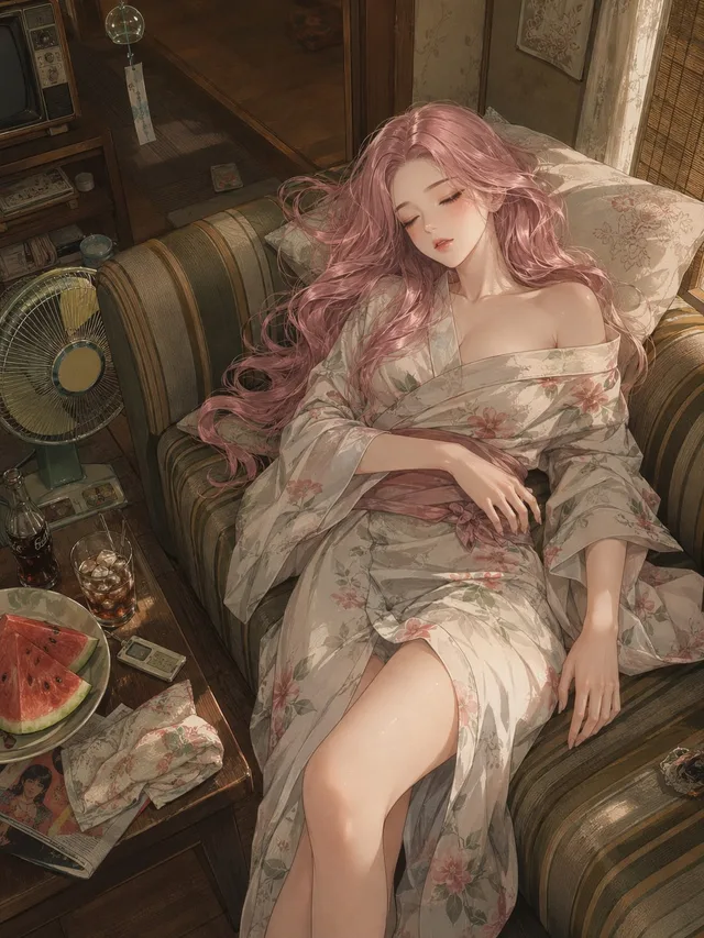
ภาพอนิเมะฤดูร้อนยุคโชวะ: บ่ายวันหยุดที่น่าคิดถึง
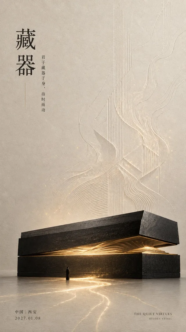
โปสเตอร์ศิลปะจัดวางแนวตะวันออก