โปสเตอร์มินิมัลสไตล์ตะวันออก: ความงามและพิธีกรรม
ที่มา: @xiaoxiaodong01โมเดล: ChatGPT
ภาพตัวอย่าง
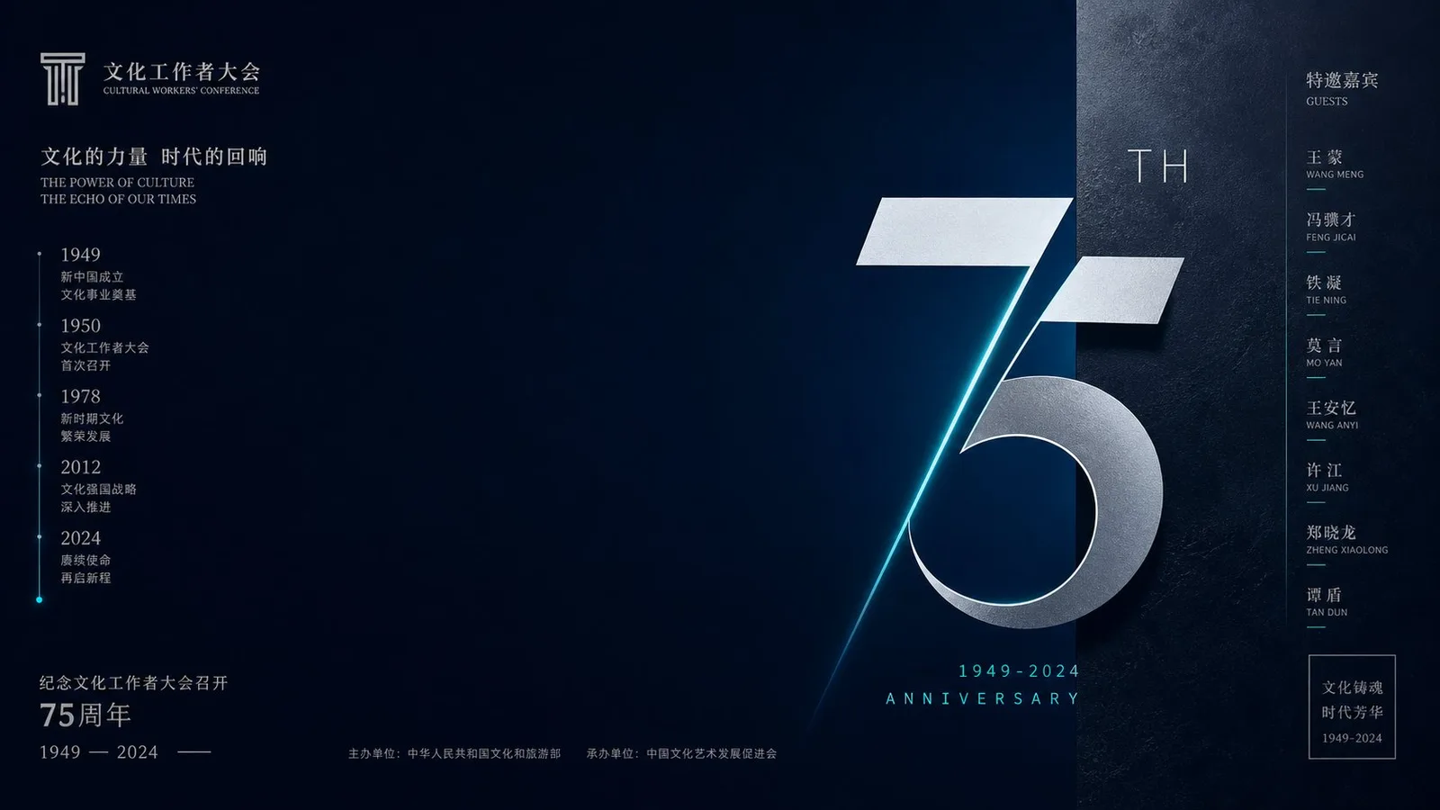
พรอมต์ภาษาไทย
ภาพสร้างขึ้นโดยยึดตามวัตถุธีมหรือเนื้อหาเฉพาะ โดยเน้นที่สุนทรียภาพแบบตะวันออกอันทันสมัยพร้อมผลกระทบทางสายตาที่แข็งแกร่ง นำเสนอความตึงเครียดของพื้นที่ที่เรียบง่ายแต่เปี่ยมด้วยพิธีกรรม **องค์ประกอบและการจัดวางวัตถุหลัก (Composition and Subject Position)**: ละทิ้งองค์ประกอบแบบดั้งเดิมที่จัดกึ่งกลางและเต็มพื้นที่ หันมาใช้พื้นที่สีขาว (negative space) ที่เป็นสีทึบขนาดใหญ่เพื่อสร้างพื้นที่ว่างในการมองเห็นและความสงสัยเชิงพื้นที่ วัตถุธีมไม่ได้ถูกมองว่าเป็นองค์ประกอบที่เติมเต็มเฟรม แต่เป็นจุดโฟกัสภาพที่ละเอียดอ่อน อาจถูกตัดขอบ ขยายบางส่วน หรือจัดวางนอกกึ่งกลางในรูปแบบที่มีลักษณะเป็นประติมากรรมสูง พื้นหลังสะอาดหมดจด ไม่มีองค์ประกอบฉากที่ซ้ำซ้อน เพื่อสร้างความคอนทราสต์กับความตึงเครียดทางสัณฐานของวัตถุผ่านพื้นที่สีขาวที่เน้นหนัก ขอบวัตถุชัดเจนและคมชัด สร้างความรู้สึกของการแยกออกจากพื้นหลังอย่างเด็ดขาด **ระบบสีและอารมณ์ (Color System and Emotion) (ตรรกะการสร้างสี)**: สีนำเสนอความกลมกลืนที่ขัดแย้งกันของ “ความบริสุทธิ์สูงและการควบคุมอย่างเข้มงวด” พร้อมกับโทนอารมณ์ของ “พิธีกรรมที่ทันสมัย ความเคร่งขรึม และความตึงเครียดแบบมินิมัลลิสต์” - **สีพื้น (Base)**: ภาพถูกปกคลุมด้วยพื้นที่ขนาดใหญ่ของสีธีมที่เข้มข้น มีความบริสุทธิ์สูงและบริสุทธิ์ (เช่น สีแดงจีนที่เข้มข้น) สร้างความเด่นทางสายตา สีพื้นต้องแบนราบ สม่ำเสมอ หรือมีพื้นผิวพรีเมียมที่จางมาก คงความสะอาดและปราศจากความขุ่นมัว - **สีวัตถุหลัก (Subject Color)**: สีของวัตถุหลักจะถูกดึงออกมาจากวัสดุของมันเอง สร้างความคอนทราสต์ที่สูงมากกับสีพื้น (เช่น สีดำ สีขาว หรือสีที่มีความบริสุทธิ์สูงที่เติมเต็มสีพื้น) รักษาช่วงความสว่างที่ชัดเจน - **สีเน้น (Accent Color)**: คงเหลือสีที่มีพื้นผิวโลหะจำนวนน้อยมาก (เช่น สีทองด้าน) หรือสีที่มีความสว่างสูงเพื่อเป็นสีเน้น โดยมีพื้นที่เล็กน้อยมากแต่คมชัดอย่างยิ่ง ระบบสีต้องคงความชัดเจน คมชัด และทันสมัย ไม่ซีดจางหรือเก่า **กลไกกราฟิกและพื้นผิววัสดุ (Graphic Mechanism and Material Texture)**: ไม่ว่าวัสดุดั้งเดิมของวัตถุธีมจะเป็นอะไรก็ตาม ต้องแสดงให้เห็นถึงพื้นผิวของ “ศิลปะสำเร็จรูป (readymade art)” หรือ “ผลิตภัณฑ์ดีไซน์พรีเมียม” ที่ได้รับการขัดเกลาอย่างพิถีพิถัน แสงและเงาบนพื้นผิวได้รับการจัดการอย่างสะอาด มั่นคง หรือมีพื้นผิวแบบด้านที่ละเอียดอ่อน เส้นเรขาคณิตที่ละเอียดอ่อนแม่นยำมาก หรือโครงสร้างแบ่งส่วนแบบนามธรรม สามารถถูกรวมเข้ากับภาพในฐานะโครงกระดูกที่รองรับจุดศูนย์ถ่วงทางสายตา เพื่อเพิ่มบริบทการออกแบบที่ทันสมัยของภาพ **การจัดตัวอักษรและชั้นข้อมูล (Typography and Information Layering)**: ข้อความถูกมองว่าเป็นส่วนประกอบกราฟิกที่สำคัญ การจัดวางนำเสนอสไตล์โปสเตอร์แบบโมเดิร์นนิสต์ทั่วไป: ข้อมูลจะถูกจัดแนวอย่างแม่นยำตามขอบเฟรมหรือตามเส้นกริดที่ซ่อนอยู่ ด้วยการเว้นช่องไฟที่ถูกควบคุม ข้อความทำหน้าที่เป็นเส้นโครงสร้างที่แม่นยำ สร้างความคอนทราสต์ที่แข็งแกร่งของความหนาแน่นกับพื้นที่สีขาวขนาดใหญ่ ให้ความรู้สึกของข้อมูลที่สงบและแม่นยำ ไม่บดบังความโดดเด่นของวัตถุหลัก —————— เนื้อหาที่ระลึก: Anniversary of the Cultural Workers Conference + historical years + guest list + commemorative logo วัตถุประสงค์ในการเผยแพร่: Cultural institution anniversary poster โทนสีเย็น: Deep sea blue + silver-gray white + electric cyan + cold dark high contrast จุดโฟกัสภาพหลัก: Giant anniversary numbers on the right + vertical year axis on the left + guest list on the edges + horizontal 16:9 aspect ratio
พรอมต์ภาษาอังกฤษ
Generated around any theme object or specific content, the image centers on modern Oriental aesthetics with strong visual impact, presenting a minimalist yet ritualistic spatial tension. **Composition and Subject Position**: Abandon traditional centered and filled compositions, using large areas of solid color white space (negative space) to create visual breathing room and spatial suspense. The theme object is not treated as an element that fills the frame, but as a refined visual focal point, potentially edge-cut, partially enlarged, or placed off-center in a highly sculptural form. The background is absolutely clean with no redundant scene layout, contrasting the subject's morphological tension through extreme white space. Subject edges are clear and sharp, forming an absolute sense of separation from the background. **Color System and Emotion (Color Derivation Logic)**: Colors present a paradoxical unity of "high purity and extreme restraint," with an emotional tone of strong "modern ritual, solemnity, and minimalist tension." - **Base**: The image is covered by a large area of a strong, high-purity, and pure theme color (such as intense Chinese red), forming visual dominance. The base color must be flat, even, or have very faint premium textures, remaining clean and rejecting muddiness. - **Subject Color**: The subject's color is extracted from its own material, forming a very high contrast with the base color (such as black, white, or a high-purity color complementary to the base), maintaining a clear span of brightness. - **Accent Color**: Retain a very small amount of metallic-textured color (such as matte gold) or high-brightness colors as accents, with a very small but extremely sharp area. The color system must remain clear, sharp, and modern, not gray or old. **Graphic Mechanism and Material Texture**: No matter what the original material of the theme object is, it must exhibit a texture of carefully refined "readymade art" or "premium design product." Surface light and shadow are treated cleanly, firmly, or with a delicate matte texture. Extremely fine, precise geometric lines or abstract segmented structures can be integrated into the image as a skeleton carrying the visual center of gravity, enhancing the modern design context of the image. **Typography and Information Layering**: Text is regarded as an important graphic component. The layout presents a typical modernist poster style: information is precisely aligned along the edges of the frame or based on hidden grid lines, with restrained letter spacing. Text acts as precise structural lines, forming a strong contrast of density with large areas of white space, providing a calm and precise sense of information, never overshadowing the subject's brilliance. —————— Commemorative content: Anniversary of the Cultural Workers Conference + historical years + guest list + commemorative logo Publishing purpose: Cultural institution anniversary poster Cold tone color scheme: Deep sea blue + silver-gray white + electric cyan + cold dark high contrast Main visual focus: Giant anniversary numbers on the right + vertical year axis on the left + guest list on the edges + horizontal 16:9 aspect ratio
พรอมต์ภาษาจีน
围绕任意主题对象或具体内容生成,画面以极具视觉冲击力的现代东方美学为核心,呈现一种极简而充满仪式感的空间张力。 **构图与主体位置**: 摒弃传统的居中填满式构图,采用大面积的纯色留白(负空间)来制造视觉呼吸感和空间悬念。主题对象不作为填满画面的元素,而是被处理为精炼的视觉焦点,可能被边缘切割、局部放大或以极具雕塑感的形式置于画面的偏心位置。背景绝对干净,没有多余的场景铺陈,通过极致的留白反衬主体的形态张力。主体边缘清晰锐利,与背景形成绝对的剥离感。 **色彩系统与情绪(色彩派生逻辑)**: 色彩呈现出“高纯度与极致克制”的矛盾统一,情绪上具有强烈的“现代仪式感、庄重与极简张力”。 - **底色(Base)**:画面被一种强烈的、高纯度且无杂质的主题色(如浓烈的中国红)大面积覆盖,形成视觉统治力。底色必须平整、均匀或带有极微弱的高级肌理,保持干净,拒绝浑浊。 - **主体色(Subject)**:主体的色彩从其自身材质提取,与底色形成极高对比(如黑、白或与底色互补的高纯度色),保持明度的清晰跨度。 - **点缀色(Accent)**:保留极少量的金属质感色彩(如哑光金)或极高明度的亮色作为点缀,面积极小但极其锐利。色彩系统必须保持清透、鲜锐和现代感,不发灰、不老旧。 **图形机制与材质肌理**: 主题对象无论原本是何种物质,均需表现出一种被精心提炼过的“现成品艺术”或“高级设计品”质感。表面光影处理干净、硬朗或带有细腻的哑光质感。画面中可融入极为纤细、精确的几何线条或抽象的切分结构,作为承载视觉重心的骨架,增强画面的现代设计语境。 **排版与信息层叠**: 文字被视为重要的图形构成要素。排版呈现典型的现代主义海报风格:信息沿着画面边缘或依托隐藏的网格线进行精确对齐,字间距克制。文字作为精密的结构线,与大面积留白形成极强的疏密对比,提供一种冷静、精确的信息感,绝不掩盖主体的光芒。 —————— 纪念内容:文化工作者大会周年+历史年份+嘉宾名单+纪念标识 发布用途:文化机构周年纪念海报 冷调配色:深海蓝+银灰白+电光青+冷暗高对比 主视觉重心:偏右巨型周年数字+左侧纵向年份轴+边缘嘉宾名单+横版 16:9
พรอมต์แนะนำ
8 พรอมต์คัดสรร
สาวผมแดงในสตูดิโอ: แฟชั่นมินิมัลลิสต์

สาวเอเชียในชุดคาร์ดิแกนสีฟ้ามิสต์กับกระโปรงขาว

สาวเอเชียในชุดสีน้ำเงิน บนโซฟาหรูในโรงแรม

โปสเตอร์อินโฟกราฟิกสูตรอาหารระดับพรีเมียม

สาวชุดว่ายน้ำขาว-ฟ้า สาดน้ำทะเลริมหาด

ถ่ายภาพคอสเพลย์ฤดูร้อนสไตล์เซลฟี่จากมือถือ
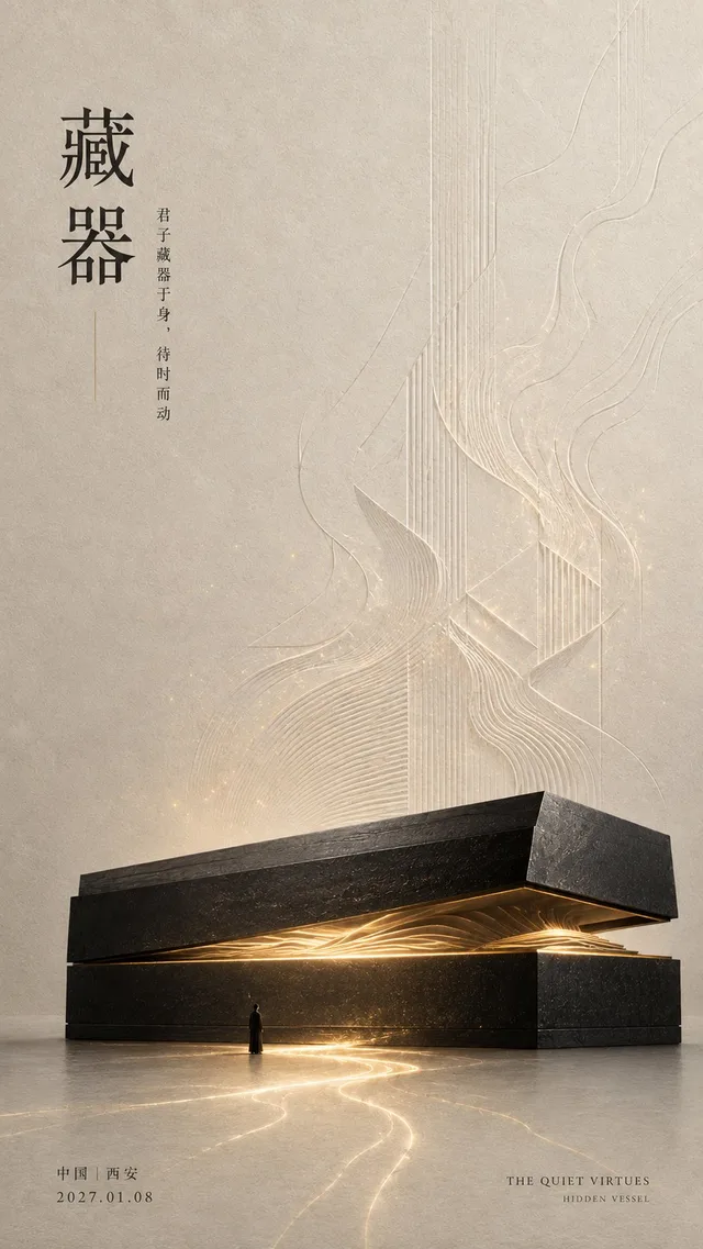
โปสเตอร์ศิลปะจัดวางแนวตะวันออก
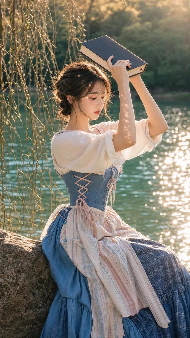
สาวงามริมทะเลสาบสไตล์คอทเทจคอร์สุดสมจริง